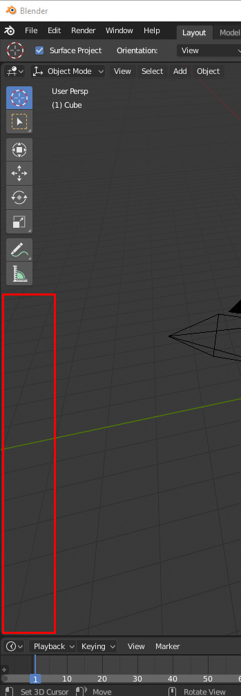
The toolbar should scale with the number of tools (at least when invisible). Now it gives a weird behaviour when we try to click to rotate or pan the view click in that area. It is there, but invisible. Quite annoying. Ana RMB and LMB works well through it, selecting and moving the 3D cursor. MMB should still being able to drag the toolbar content up and down when it doesn’t fits, but not at the bottom clear areas, IMHO.
2 Likes
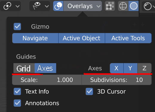
No, this is not good. Sometimes I want the axes without the grid.
12 Likes
I disagree…sometimes. Maybe there could be a lock toggle button that makes it so those settings are linked. I have on many occasions disabled the grid and kept the axes visible for quick orientation reference without having to look away from the object I’m working on, but other times, I’ve been frustrated with having to disable three items when I want to hide the grid.
2 Likes
Just a quick mockup but basically the “Why not both option”:
- Grid and Axes buttons. Axes X Y Z Buttons.
Grid functions as the toggle before and Axes toggles axes selection. (Axes toggled off XYZ gets greyed out)
You can still easily turn off both by ClickGrid-DragRight-Release (if the drag functionality is implemented here I know it works else where)
3 Likes
I think the truly “why not both” option is to also allow the grid to be shown on any axis. Most arguments for the existence of the floor grid would also favor the option of showing a side or back wall grid if desired.
3 Likes
Hmm that sounds like it’d probably be a lot of code work for UI paper cuts topic but then again I don’t know how difficult it would actually be to enable grid for all axes’
I guess if they did, though, they could turn the Grey text before XYZ to a toggle button that toggles between Grid/Axes. Albeit that does add quite a few clicks in some situations.
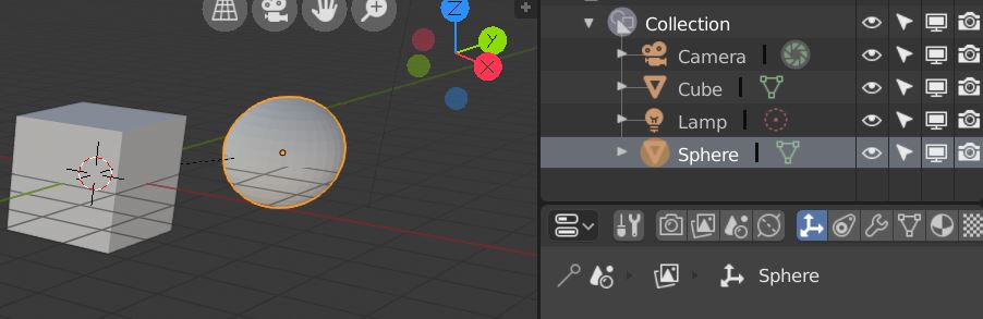
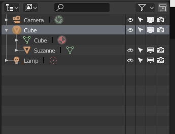
I parented the sphere to the cube but it’s not showhing up in the outliner. Is this on purpose or just not implemented?
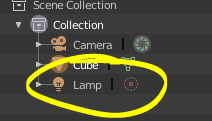
This is by design, I think you have to change to scene view or something like that to see the actual hierarchy. Which makes sense as these objects can be in different collections.
1 Like
Switching between graph editor and dopesheet by a hotkey
2 Likes
You can click the filter menu and turn off collections to see the object hierarchy. Right now, as kio says, the objects in the same hierarchy can belong to different collections. It would be great if maybe the hierarchy was shown but objects that belong to a different collection were grayed out to convey both the hierarchy and the collections in one outliner view.
1 Like
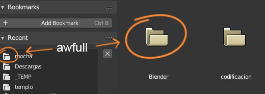
If there’s one thing I dislike about Blender’s UI it’s the folder icon, ugly and old-fashioned. Please change the icon for a more stylish, modern and pretty one.
4 Likes
I like this idea of the papercuts
i’ll begin contributing with the smallest one I could find:
The light source in the default scene is still named “lamp” even after all the find/replace Pablo did some time ago
3 Likes
Not sure because i can’t try it right now but maybe a fresh startup file may fix that? It’s probably still carrying old naming conventions. Just a wild guess.
Edit: just realized you kind of answered it yourself already  pardon!
One little aggravation I had when first starting to use the grease pencil is figuring out where the confounded keyframes were, as they don’t show up in the Dope Sheet or the Timeline. Even now that I’m aware, it’s still a bit annoying to switch back and forth when animating.
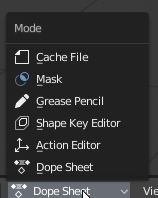
It would be helpful if these could just be filtering options rather than totally separate modes. The Action Editor being the exception, as it behaves differently. That could be split off, like the drivers editor from the curves editor.
2 Likes
Some of the items in the header of the 3D Viewport do not show popup tooltips. Transform Orientation, Snapping options, Pivot Point, Visibility, Overlays dropdown, Shading dropdown.
1 Like
The selection filter popup doesn’t use the eye icon (like in the outliner).
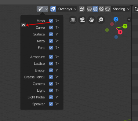
And the cursor selection icon is the other way around? I would expect the filled version to mean “selectable” and the thin version to mean “not selectable”, similarly to the eye icon, where the closed icon is thin.
6 Likes
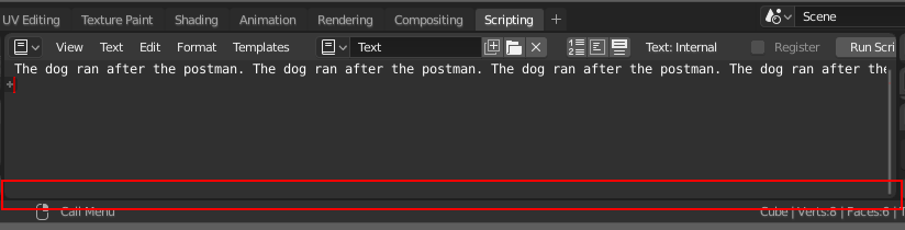
One thing bothering me as a “paper cut”, is that there is no horizontal ruler in the text editor, even though the text continues outside the visible area:
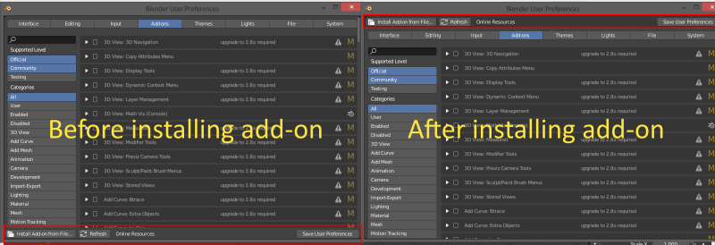
Another thing is when installing add-ons and the folder structure or something like that is not compatible with the Blender standards(typically add-on downloads from Github), then there is no error-message, no nothing, so you might think that it has been installed, but just not visible, so you end up wasting time on trying to search for it.
6 Likes
As @kio said, the objects in the same hierarchy can belong to different collections. So that is the reason that if you hide the collections, hierarchy shows:
The following issue was mentioned by someone elsewhere, but I’ll add it here:
For the Transform gizmo, the fact that the scale handles are inside the rotation handles makes it almost impossible to scale items when viewed on-axis, because the rotation handles then overlap:
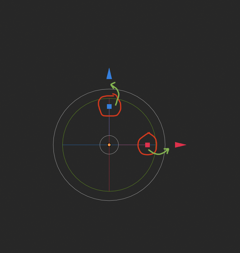
A solution could be to move the scale handles outside the rotation area to avoid the conflict. Or, alternatively, the scale handles could always take precedence even if the rotation handles overlap - there’s plenty of area to drag the rotation handles anyway.
11 Likes