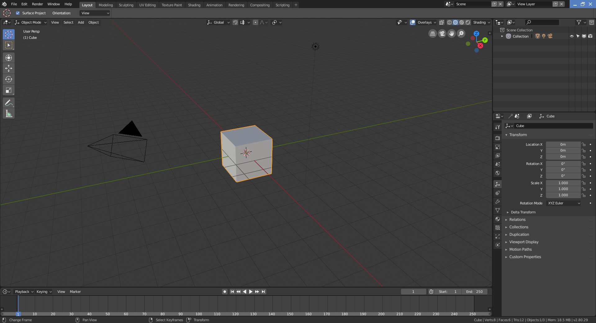
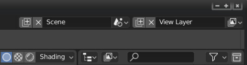
I also find this a little annoying:
Maybe the minimization buttons could be integrated with the tab bar like in chrome in order to have a bigger working space and remove this little annoyance.
The solution could look something like this:
I also find this a little annoying:
Maybe the minimization buttons could be integrated with the tab bar like in chrome in order to have a bigger working space and remove this little annoyance.
The solution could look something like this:
This was part of the very first UI Workshop we had for 2.8 a couple years back and I added it to my ui proposal as well, but it’s not easy to do well for all platforms so it’s not so high priority with all the work that’s left in other areas.
I’m not sure if that depends mostly on the Window Decorator of the OS, and in Linux there are many of them. I think that something simpler to implement is just to change the order of the buttons so that the “close” button does not stay close to the “close” window decorator button.
Or maybe replace “cross” icon with a “trash can” icon or something else.
The few things i can think of from the top of my head is:
The thing that I personally found most frustrating in Blender 2.8 is the fact that at the same time a minimal keymap was introduced, the Help was moved from the space bar to F3. So, at the same time old shortcuts don’t work it’s harder to find what you just tried to do using Help.
I completely understand that there is an important menu occupying the space bar now and it can’t be moved. However couldn’t we have that clever thing whereby if you press space bar twice quickly we can get Help? Then old Blender users could get Help really easily, but you still have the new menu on space bar.
A really small, but (probably) easy-to-fix paper cut…
Most of our popup hints contain just the right amount of useful information. It might just say “location of the object” or “sets the object interaction mode”. However, we have a couple places where the hint text is dumb and/or overly complex.
Hover over a Properties category Icon and it says something like “Type of active object to display or edit: Output” rather than just “Render output”.
Similarly, hover over any of the “change editor” widgets and it will say something like “Current Editor type for this area: 3D Viewport”, rather than just “3D Viewport”.
This seems to happen whenever a bunch of items are related and treated as a group, so sharing some of the help hint code. But it would be nice to be able to set these separately in many cases. That way we can hover over any of the “shading type” icons and not see “method to display/shade objects in the 3D view: Wireframe” but instead can see a much simpler “Wireframe mode”
Put render resolution to the Output Tab will be annoying.
Render resolution its very important, this is not secondary settings, you can"t split this settings and “hid” it in other tab. This is one of the most important render settings, this is not for output settings. Please pay attention to this.
sorry for my english
In Mask mode in Movie Clip editor W-menu is the same as in Tracking mode. Some actions like Switch Direction or Clear Feather can be here, instead disabled menu points:
Hi, BTW - Not in Windows 10, you get no option to save !
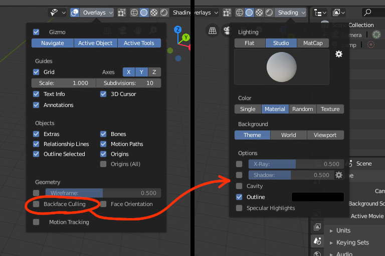
The “Backface Culling” Option should move from “Overlays” to “Shading”, since it is not something that is overlayed on top of the mesh, but a way how the mesh is rendered/shaded. Also, it is not disabled when disabling overlays, which is a good thing.
Regarding Pie Menus, I find it annoying that each time I select an option, my mouse ends up somewhere new. It would be very cool if you could activate a pie menu, select your option and then the mouse pointer returns to where it was when you activated the menu. Switch from solid to wireframe etc shouldn’t move the mouse pointer away from where I was working.
It is not possible to get the right click menu on operators in pie menus or the search window.
For example if I want to assign a shortcut to “Cursor to World Origin”, the only way to do this is to paste view3d.snap_cursor_to_center as operator identifier in the User Preferences.
When the tabs of the properties editor are on the right side, we can’t click the tabs when the mouse is all the way against the border of the screen. Could be useful to be able to click, so we don’t have to aim for the narrow region.
When the 3D viewport is too small, the Lookdev Preview gets cropped.
I feel the same way. So much wasted mouse movements. I continue to laugh each time I see a new 2.8 video pop up and see the mouse swish from left to right and sometimes diagonally (sometimes multiple times as the diagonals are really difficult to hit even from muscle memory quickly)
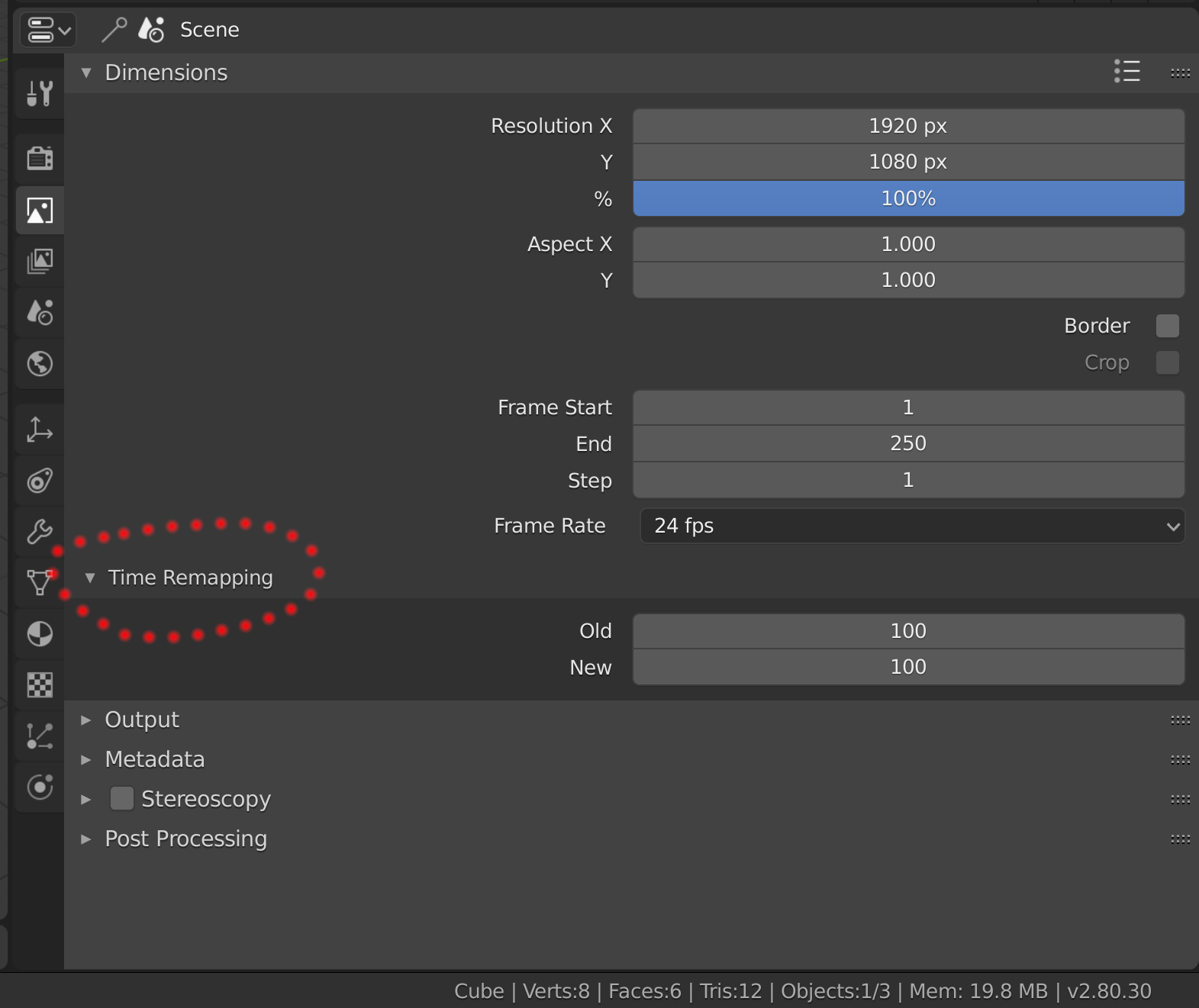
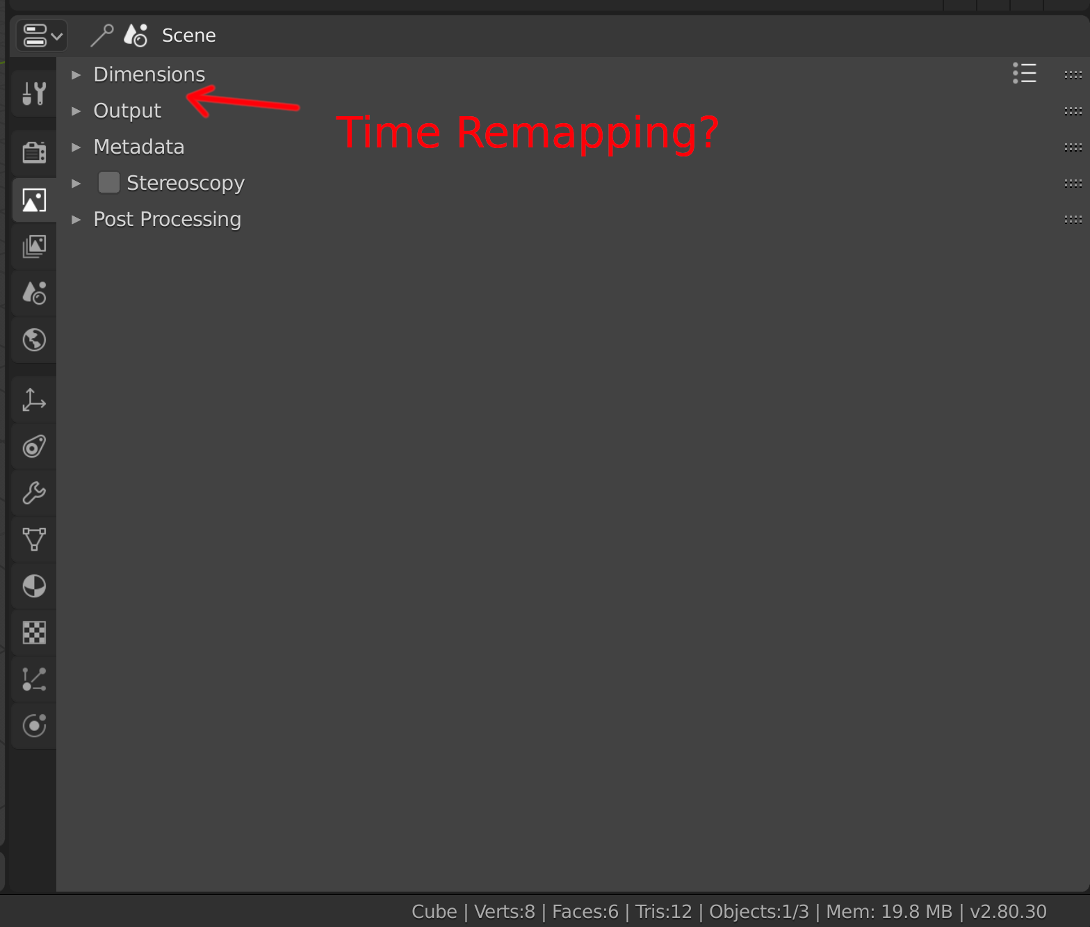
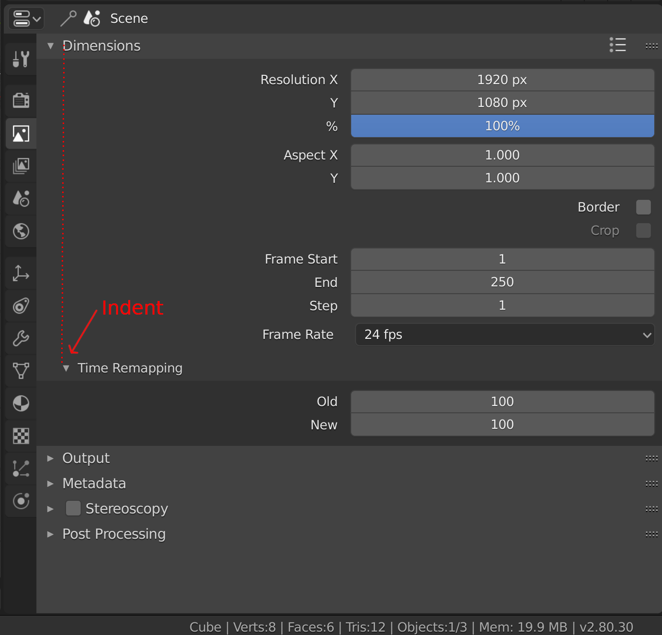
Nested options like “Time Remapping” are not immediate: they are visible only when the “parent” option is open and they seem to disappear when the “parent” option is closed ( Dimensions in this case).
Maybe a little indent could be useful ( a mockup in the last image ).
Mockup:
When you press “alt + a” to deselect in the Outliner, this is not reflected in the viewport. And if you deselect something in the viewport this is not reflected in the Outliner either. Could you synchronize the selection of both? otherwise it is quite confusing, especially for users who come from other software and new users.
I see that Color Management now is under “Render” ( and it can have sense) but i would revert to the usual “Scene” for 3 reasons:
1- In ACES ( Academy Color Encoding System) they talk about “Scene-Referred” colorimetry so it can have sense keep it in “Scene”.
2- “Render” settings tends to be more crowded.
3- we are used to search Color Management under “Scene”.
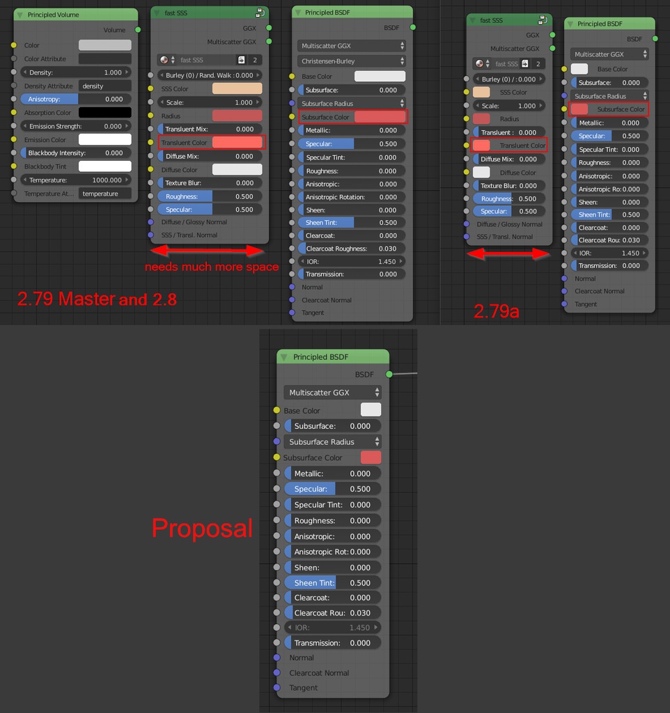
Copying from a rghtlickselect post I already did:
revert the color indicator in Nodes: Up until Blender 2.79 the color indicator was on the left side of nodes and had a small fixed size. In 2.8 this has been changed - now the indicator always stretches to take up half of the space and has been moved to the right. While I aggree with the move to the right, I think the width of it should be small and fixed again. As it is now, longer socket names require the node to be much wider than in the previous design and it looks more cluttered.