In the Overlays menu, when you disable certain options, corresponding sections are conveniently hidden. This works for Grid and Motion Tracking, but not for Gizmo.

7 Likes
Also its the only way to run multiple instances of Blender on a Mac
1 Like
-
1 - Change some themes values to reduce contrast in the interface and reduce the eye fatigue. For example the background of some elements to gray, instead of black. like the search box background. Reduce the white intensity of the fonts to 0.8-0.85 to make more pleasure to read it when you work all day or in the night.
-
2 - Remove shadow of the texts, that create a blurry effect
-
3 - Put the info of the actual tools in the viewport, instead the header. To reduce the constant pop-up that create the change of the header each time that you use a hotkey.
-
4 - Change the layout and icons of the new elements popup in the 3D viewport. It’s hard to understand the behaviour and it has some layouts problems.
-
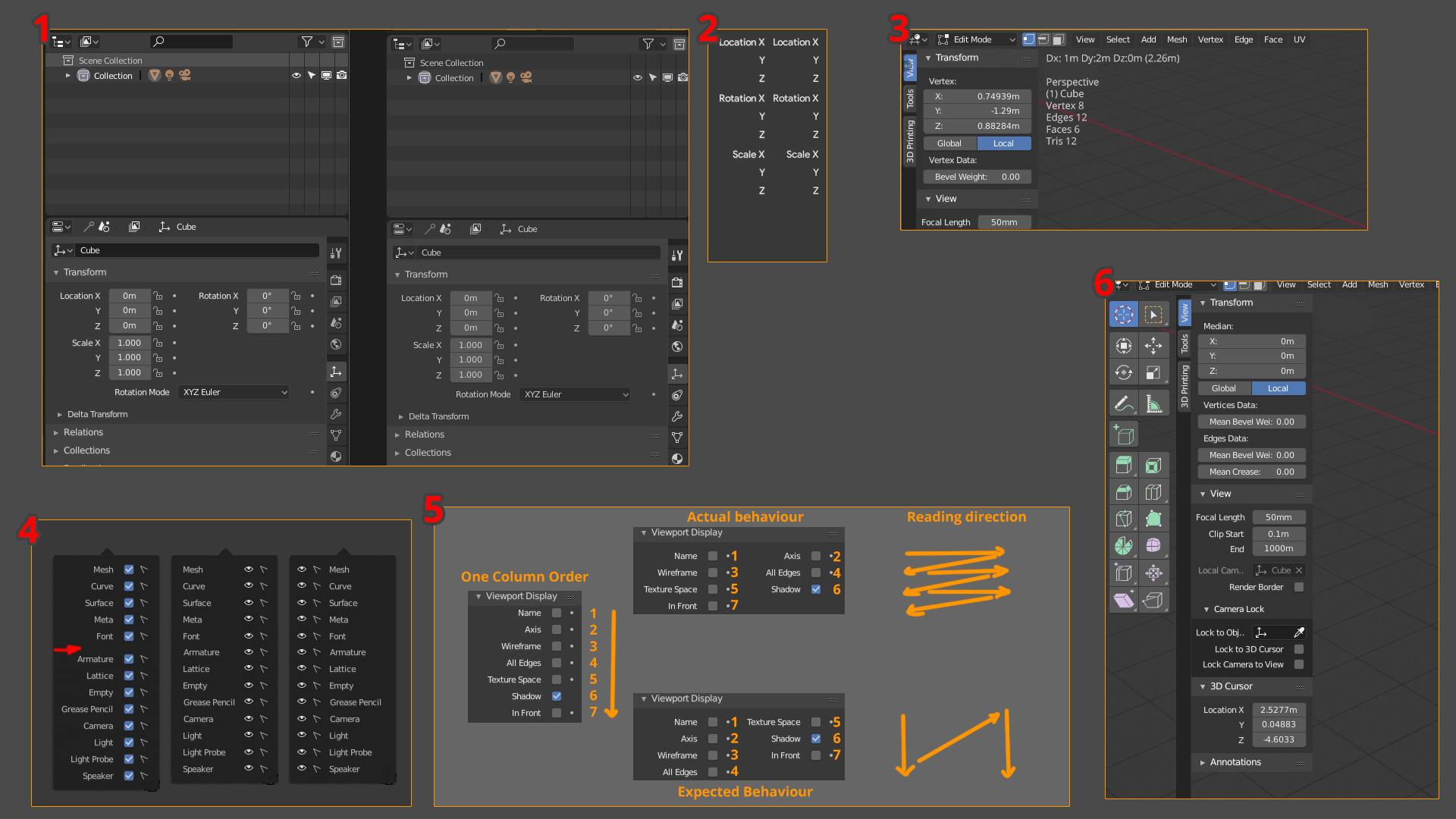
5 - Change the order that generate the automatic columns, it mix all the values in horizontal instead of vertical, like is expected to mantain the order. Make hard to predice the order of the elements and is more hard to read and find something.
-
6 - Change the order of the Toolshelf and sidebar. Like actually we have blender in the UV Editor, where the order is correct.
-
Could be good, like I said before, to have the option of put the Tool Settings in the sidebar (for example when we hide the topbar, or directly an option in the tabs) to use the sidebar like old T-shelf.
-
Reduce/Delete fade in and fade out of the panels when are showed.
-
Replace the topbar right menus by the proposed menus that doesn’t have the controls like X and +
13 Likes
would be great if I could click and drag on the workspace tabs area to see the hidden ones when working on a tablet. (surface pro)
Ahh, blender. Where cubes have Radius, and spheres have Size.
Saw this comment on Reddit, and it is pretty funny that it works this way. It would certainly be more intuitive if spheres and icospheres had a radius property and cubes had size (or better yet, separate length, width and height).
21 Likes
In the node editors:
Snap to Grid - It works great when moving nodes around, but doesn’t apply when resizing nodes. I’d find it preferable if the dragged edge of the node snapped or changed in snap increments rather than being fluid.
The auto-offset feature also doesn’t always maintain grid alignment, requiring nodes to be move-snapped into place in some cases.
16 Likes
Yes. The I’d be ok with giving up the separate length width and height if only we could get away from radius. An argument could be made for making the sphere use the parameter name and functionality of a radius, But for the cube object, it is very counter intuitive to see radius or have your cube come out twice the size of the value you entered into an input field.
2 Likes
Give an option to the user to choose to make Scrollbar always visible.
I know that for some users eyecandy is fancy, but in my case having always visible Scrollbar is something important, especially in the very long single column Properties Editor. Not only that this appearing and disappearing with mouse proximity could be something distracting, the most important thing is that being able to see always scroll bar gives you in advance an idea of position, you can quickly know how much space remains above or below at first sight.
Arrows appearing and disappearing in in sliders/value fields is the same about something that could be distracting for some users, but that to me is much less important than the problem mentioned about scrollbar.
5 Likes
If Region Overlap and transparencies will remain the default as it is now, the Active Tool panel should end up where the buttons end. In a few cases, this could become a small annoyance when arrow to resize panel appears in an area where you are working in 3D View.
30 Likes
In those OS where window decorator has buttons on the right:
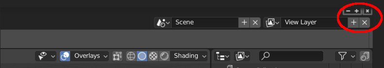
It has happened to me a couple of times that instead of closing Blender, I clicked on the cross button to the right of View Layer. I know it’s not a bigger problem, just saying. Not a problem for Mac users I guess.
3 Likes
@YAFU
It also happens to me and I have commented on it in a couple of post above
2 Likes
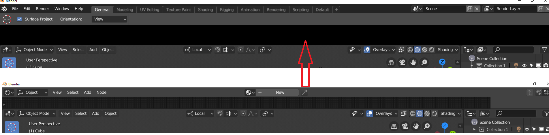
About Header in Editors. Some Editors have Header by default at the top or bottom. If you Flip header to top/bottom in an specific editor in an Area, and then you in the same Area you switch to another editor that has the header on the opposite side, then when you return to the first editor the Header position is not remembered.
For example, you open Blender. In Timeline Flip to Bottom the Header. In the same area you switch to Graph Editor. Now you go back to Timeline. The Header in Timeline will be back on Top (it did not remember at the bottom position).
1 Like
i found this by accident, switching editors with shortcut (shift+F#)while mouse cursor is hovering over top/title-bar or status-bar causes the change, but if you try to collapse it and bring it back it leaves a big black space… i think both bars shouldn’t have that possibility to switch to editors anyway
.
1 Like
12 Likes
One of the first things I notice whenever I try out new builds of 2.8 is a lot of the default pie menus I use heavily in 2.79 seem to be useless in 2.8
Would be great if they worked out of the box again.
Crtl Shift Tab - Snapping Pie in 2.79
Ctrl Shift Tab - Snapping Pie in 2.8 - Missing all the snapping settings but does weirdly have a toggle for snapping on/off?
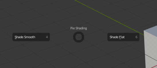
Z - Shading Pie in 2.79
Z - Shading Pie in 2.8 - Missing all viewport modes
Ctrl Spacebar - Manipulator Pie in 2.79
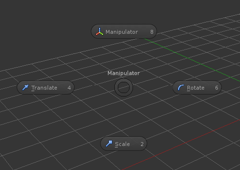
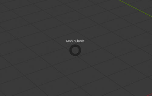
Ctrl Spacebar - Manipulator Pie in 2.8 - Missing literally everything
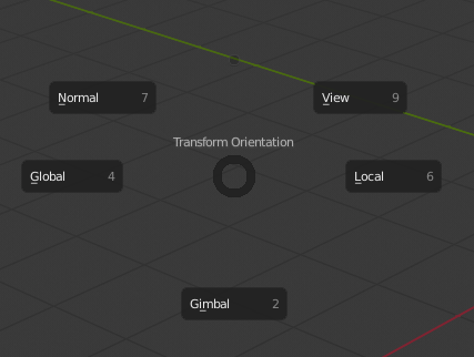
Alt Spacebar - Transform Orientation Pie in 2.79
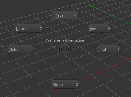
Alt Spacebar - Transform Orientation Pie in 2.8 - Missing the dropdown where custom orientations appeared.
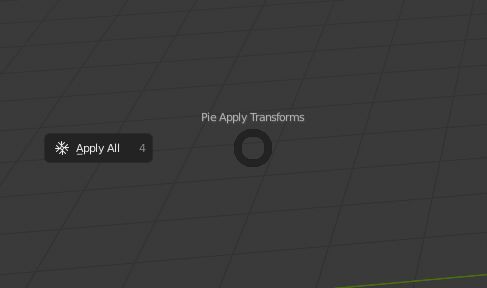
Ctrl A - Apply Transforms Pie in 2.79
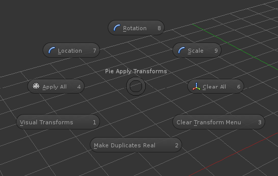
Ctrl A - Apply Transforms Pie in 2.8 - Missing all but Apply All
Above are the ones I actually find useful and noticed through muscle memory while trying out the builds.
To be thorough I checked the ones I don’t use as well and found some more issues which are below.
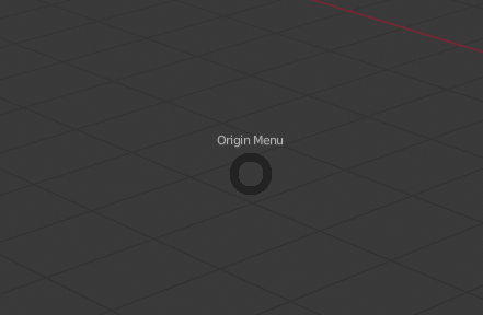
Ctrl Shift O - Origin Pie in 2.79
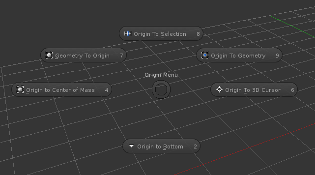
Ctrl Shift O - Origin Pie in 2.8 - Missing everything
A - Object Mode Selection Pie in 2.79
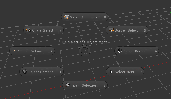
A - Object Mode Selection Pie in 2.8 - Missing most options
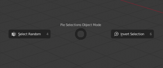
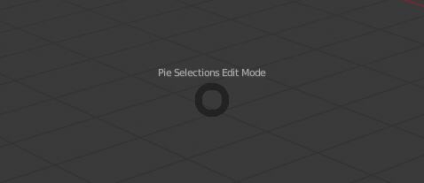
A - Edit Mode Selection Pie in 2.79
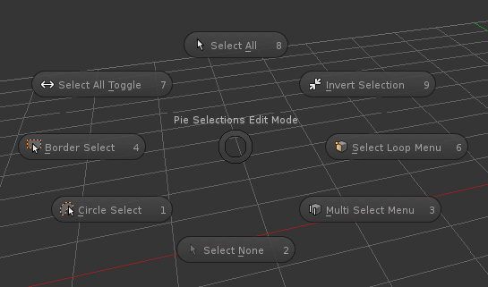
A - Edit Mode Selection Pie in 2.8 - Missing Everything
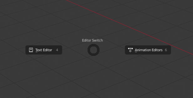
Ctrl Alt S - Editor Switch Pie in 2.79
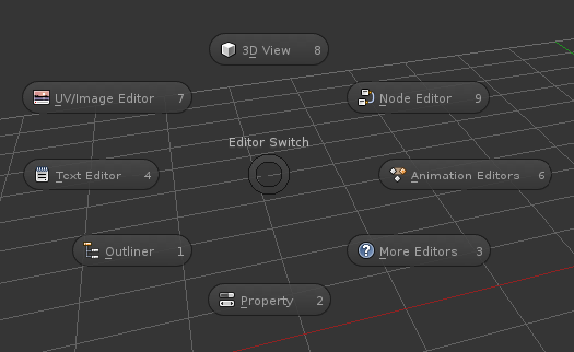
Ctrl Alt S - Editor Switch Pie in 2.8 - Missing most options
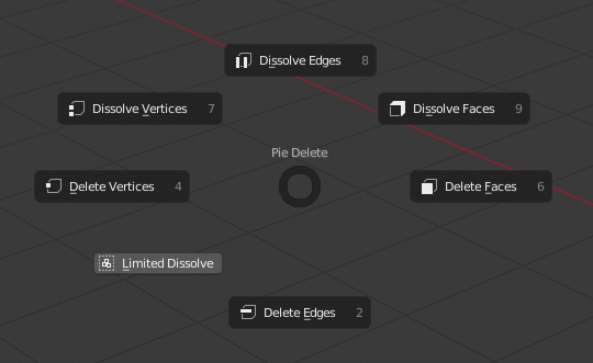
X - Delete Pie in 2.79
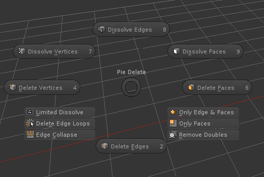
X - Delete Pie in 2.8 - Missing some of the more obscure/specific options
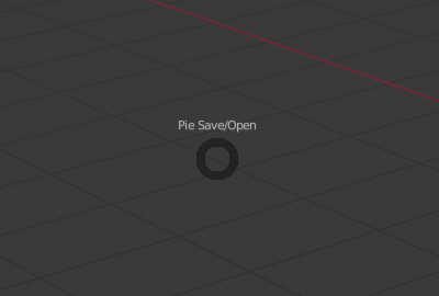
Ctrl S - Save/Open Pie in 2.79
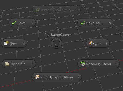
Ctrl S - Save/Open Pie in 2.8 - Missing everything
14 Likes
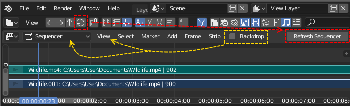
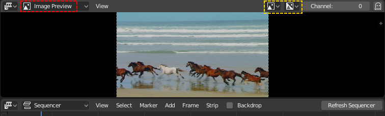
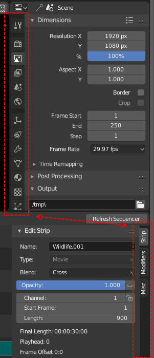
The “Refresh Sequencer” button could be replaced with a “refresh” icon button. The “Backdrop”(which currently is broken in 2.80) checkbox, could be moved into the “Type of Sequencer View” dropdown or into the “View” menu? (Or replace the “Sequencer/Preview” feature?):
The “Image Preview” icon and “Color and Alpha” icon in the Display Mode and Display Channels are too similar. Maybe the “Image Preview” could be called “Video Preview” and have a fitting icon?
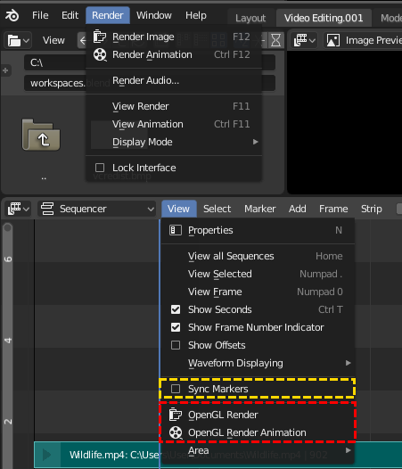
You do not expect to find the OpenGL Render functions in the VSE “View” menu. Either they could go to the main render menu or they could have a “Render” menu entry in the VSE header? The “Sync Markers” - function, doesn’t that belong in the “Markers” menu?
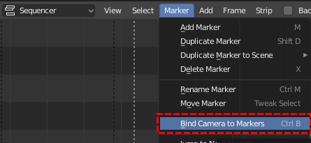
Is it useful to be able to “Bind Camera to Markers” in the sequencer? (I don’t think so)
The ruler disappears behind the properties in the VSE, which makes it impossible to drag the ruler handle. In the Graph Editor, the ruler is adjusted to the size of the properties:
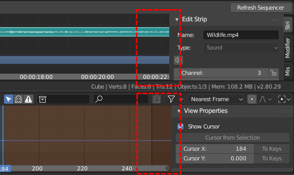
There is no consistency between the tabs in the Properties and in the VSE Strip properties - in placement or in look:
9 Likes
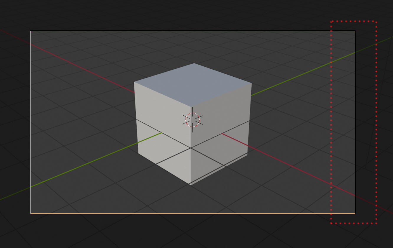
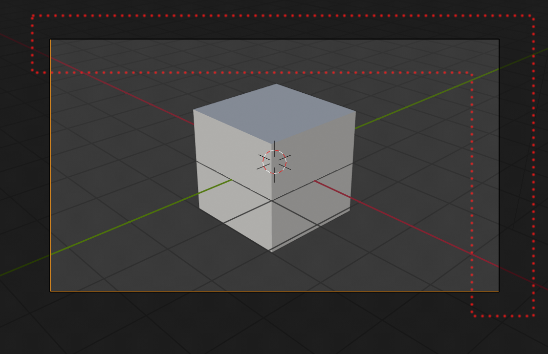
Hello, in the 3D view ( Build 5 November, GNU/Linux) when the camera is active and then i select to camera perspective, the camera borders are not always orange but some sides revert to black changing the “zoom view”:
4 Likes
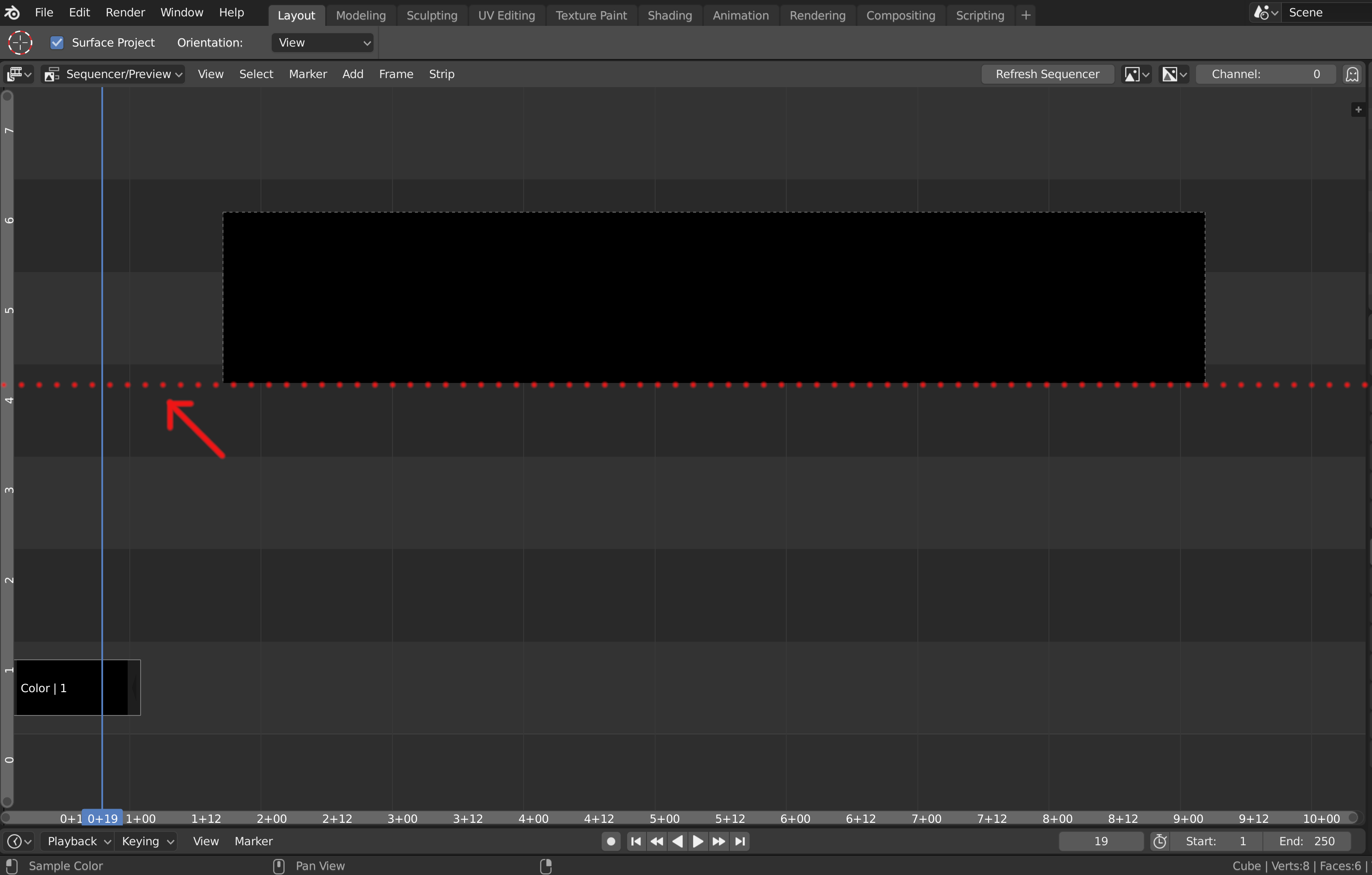
In VSE in “preview” or “sequencer-preview” mode i would hide the “grey dashed border”.
I tried to change theme colors but i cannot find the “grey dashed border” element.
Now in 2.8 the same “grey dashed border” are not visible in the 3D view, camera view perspective.
For consistency i would prefer to hide it in VSE too.
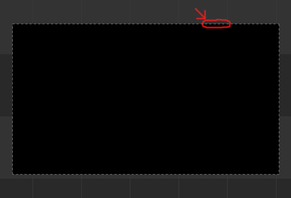
In VSE in "“sequencer-preview” mode, the preview window area limit is invisible, not immediate to select:
2 Likes
Thanks for the feedback! Addressed some of the low-hanging fruit that my abilities allow :]
- Move Sync Markers to Marker menu
- Rename OpenGL render to Sequence Render (still in the View menu, to match the 3D Viewport)
- Use icon for refresh sequencer
- Renamed the Image Preview to just Preview, since the combined option is called Sequencer/Preview anyway
11 Likes