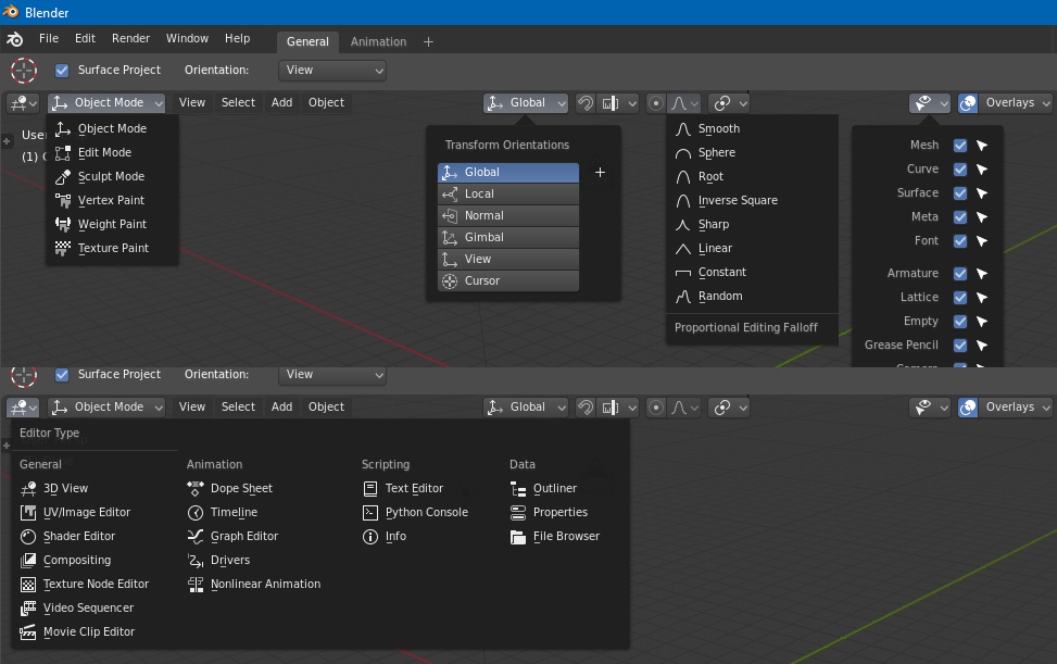
Let’s try to keep this topic about UI, not any (small) improvement in Blender.
4 Likes
I think it would be cool to have the various icons for image “sockets” collapse if they don’t have enough space, something like this:
To avoid this:
19 Likes
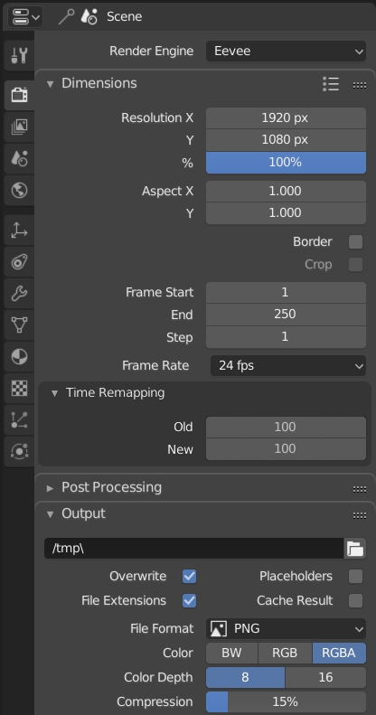
Currently in the properties panel, the background colour changes based on the nesting hiearchy (deeper = darker).
This makes the new vertical tabs seem really disconnected to the properties panel as they can’t share the same colour.
Problem:
My solution:
21 Likes
40 Likes
I am aware of this solution.
I tried to eliminate the need for loosing extra horizontal space though. While matching it with the rest of the rounded UI used everywhere throughout Blender.
Configure the sidebar to stay always in the border of the windows, before the toolshelf. It allow configure blender in other ways like 2.79. Right now the active tools always stay in the border.

It would also be nice to allow the tool controls on the sidebar, optionally, only these really little changes would allow the user to mantain the interface if they want.
The properties area It is a place with almost no vertical space for long menus, where the tools are mixed with the workspace configuration and properties of the scene and object. In addition, it would again be possible to work only with a 3D area without depending on the properties panel.
10 Likes
The list of material slots has a “search” area at the bottom of it - it can be hidden or shown with a little arrow.
If the list of materials is being sorted - ie, the “AZ” button is selected - then the buttons that move materials up and down in the slot list should be hidden. While sort is active the materials will always show in that order, so clicking “up” and “down” have no visible result; they seem to do nothing. But they do actually work, but they do so blindly - you won’t see how they have changed until you turn sorting off.
So, in short, the actual order of the materials is hidden from the user while sorting is enabled, therefore you should not be able to blindly change the actual order at that time.
1 Like
Just a very minor “paper cut”. But the “drag section” icons at the right of the Properties editor are slightly too low and would look nicer if they were vertically aligned with the “open area” icons on the left.
12 Likes
The active area is far too large for splitting and joining editors:
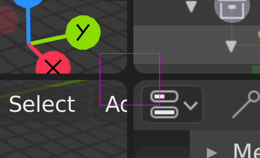
As you can see from the above illustration, it is actually large enough to interfere with the “change editor type” menu. In fact, moving your mouse to the top-left area of that menu button (within the purple box) will cause that button to display as “hot” as if it will work and bring up the Editors List popup. But it will instead split the editor if you drag down from there, or attempt to join the editor above if you drag up from there.
12 Likes
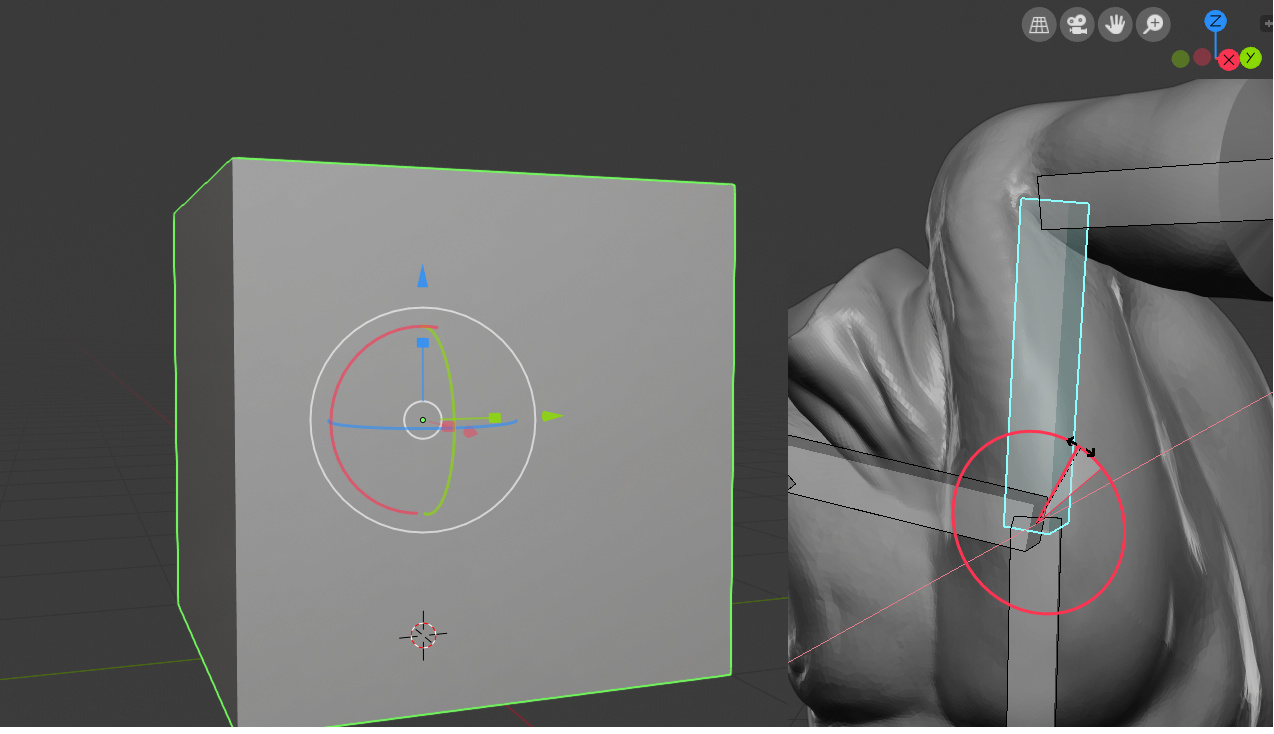
the rotation gizmo shows only one axis not very helpful in Gimbal Lock and Rotation Order we need the other two.
also the Multi Transform is hard to use with scale and rotation always miss clicking maybe a different highlighted color like in the 3d Viewport Navigation gizmo would be helpful.
8 Likes
When in fullscreen mode (on Windows 10 at least), any pop up window, such as the User Preferences, appears behind the main window, and requires alt-tabbing to view. Same issue you’re describing here I think.
5 Likes
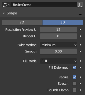
The default Fill Mode of a curve object should be Full instead of Half
I just guess that full cylindrical tubes are used way more often than half tubes (or any of other options).
Maybe a new default of 4 for the bevel resolution would also make sense - so that having a tube spline is one click away.
31 Likes
Something like this might be good to mention in the discussion about better defaults: https://developer.blender.org/T54943
1 Like
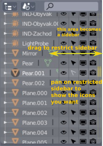
Outliner “hide and block icons zone” become a sidebar
Much of the time I work in two phases one of modeling-animate and one a shading - rendering.
For this reason I do not need to have 4 columns of options available for the management of objects but I need only one or at most two, depending on the work I’m doing.I would rather have much more space available to see the tree of objects in the outliner.
Then I propose to make the area of the icons that hide or block objects a sidebar with the columns that can be displayed that can be moved to preference.
By doing so you can add a column, which you feel is missing, which exchanges the individual objects or groups in wireframe, solid, etc …
3 Likes
Good eye! Fixed it.
23 Likes
I agree and this should include the filtering you apply. Eg. Age, alphabetical, file type etc
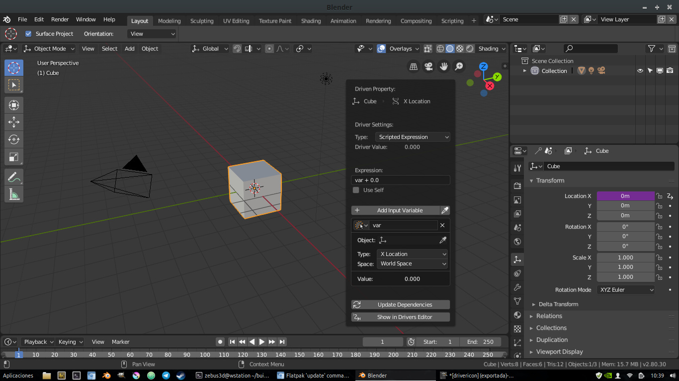
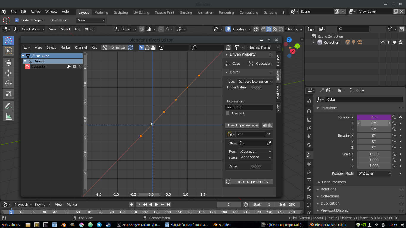
It would be nice if single-click on the driver icon would open the edit driver popover and double-clicking open driver editor. In the keyframe icons by double clicking you could open in floating window the curve editor I think it would be good, or ctrl + left click.
11 Likes
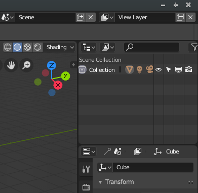
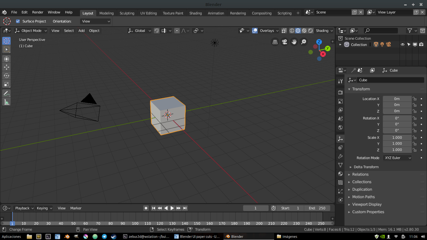
When I open by default my blender on my laptop the first icon of the collections comes out hidden and cut. the camera icon is also cut a bit. It has easy solution but I comment it so that they know it, that in small screens it comes out like this. And also the outliner is too big vertically and the panel properties tabs are cut due to lack of space.
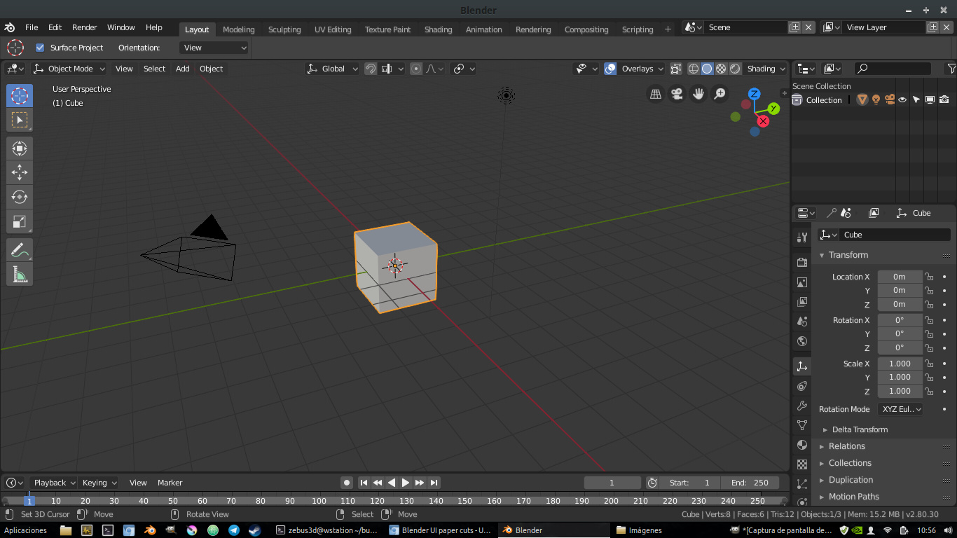
I also see disproportionate icons of active tool, they are too big with respect to the rest of all icons in the interface. If you scale a little I think the interface is more balanced. I also have to climb vertically a little timeline because it comes out too small
my exact screen resolution is: 1366x768
It’s from a fairly common acer laptop.
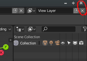
And this was in the list of changes but not yet changed, I comment here because it is still a little confusing. Having two “x” icons so close and so similar at the beginning short circuits your brain.
10 Likes