Blender UI paper cuts

Outliner “hide and block icons zone” become a sidebar

Much of the time I work in two phases one of modeling-animate and one a shading - rendering.
For this reason I do not need to have 4 columns of options available for the management of objects but I need only one or at most two, depending on the work I’m doing.I would rather have much more space available to see the tree of objects in the outliner.
Then I propose to make the area of the icons that hide or block objects a sidebar with the columns that can be displayed that can be moved to preference.

By doing so you can add a column, which you feel is missing, which exchanges the individual objects or groups in wireframe, solid, etc …

3 Likes

Good eye! Fixed it.

23 Likes

better organize the list of material nodes

11 Likes

I agree and this should include the filtering you apply. Eg. Age, alphabetical, file type etc

It would be nice if single-click on the driver icon would open the edit driver popover and double-clicking open driver editor. In the keyframe icons by double clicking you could open in floating window the curve editor I think it would be good, or ctrl + left click.
drivericon


11 Likes

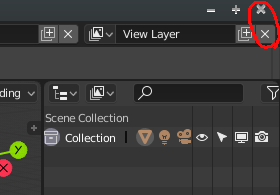
When I open by default my blender on my laptop the first icon of the collections comes out hidden and cut. the camera icon is also cut a bit. It has easy solution but I comment it so that they know it, that in small screens it comes out like this. And also the outliner is too big vertically and the panel properties tabs are cut due to lack of space.
Captura%20de%20pantalla%20de%202018-11-03%2010-52-19

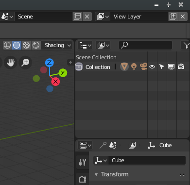
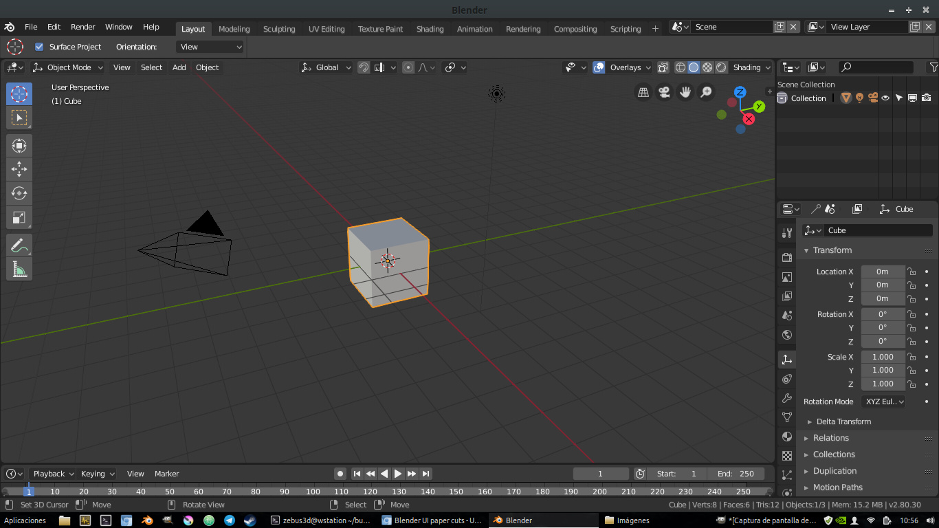
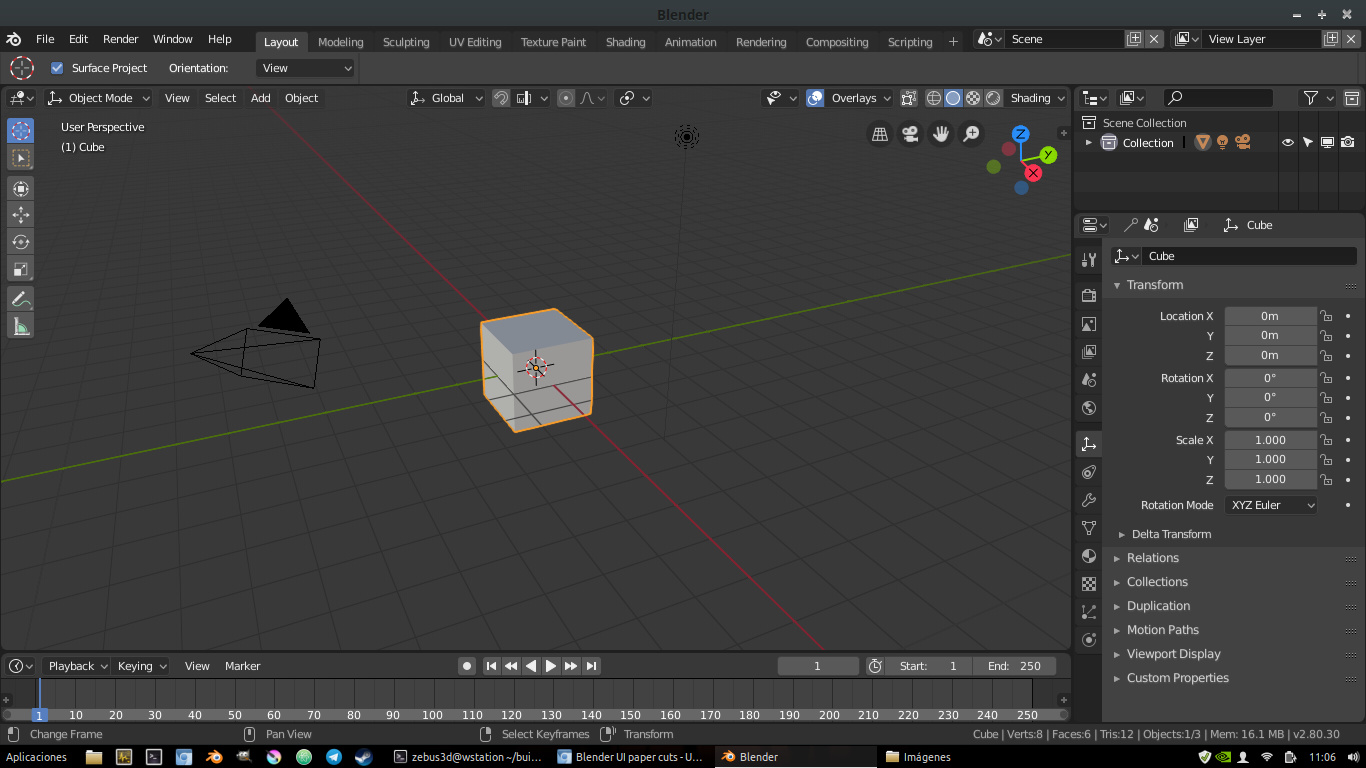
I also see disproportionate icons of active tool, they are too big with respect to the rest of all icons in the interface. If you scale a little I think the interface is more balanced. I also have to climb vertically a little timeline because it comes out too small

my exact screen resolution is: 1366x768
It’s from a fairly common acer laptop.

And this was in the list of changes but not yet changed, I comment here because it is still a little confusing. Having two “x” icons so close and so similar at the beginning short circuits your brain.
doublex

10 Likes

The menus have different styles between them. Some have the new design with the arrow, others are from before 2.8. Even the older menus lack certain consistency. Proportional Editing Falloff and Editor Type have that line and a title, while the mode switcher menu lacks these two elements.

14 Likes

In the Overlays menu, when you disable certain options, corresponding sections are conveniently hidden. This works for Grid and Motion Tracking, but not for Gizmo.

7 Likes

Also its the only way to run multiple instances of Blender on a Mac

1 Like
  • 1 - Change some themes values to reduce contrast in the interface and reduce the eye fatigue. For example the background of some elements to gray, instead of black. like the search box background. Reduce the white intensity of the fonts to 0.8-0.85 to make more pleasure to read it when you work all day or in the night.

  • 2 - Remove shadow of the texts, that create a blurry effect

  • 3 - Put the info of the actual tools in the viewport, instead the header. To reduce the constant pop-up that create the change of the header each time that you use a hotkey.

  • 4 - Change the layout and icons of the new elements popup in the 3D viewport. It’s hard to understand the behaviour and it has some layouts problems.

  • 5 - Change the order that generate the automatic columns, it mix all the values in horizontal instead of vertical, like is expected to mantain the order. Make hard to predice the order of the elements and is more hard to read and find something.

  • 6 - Change the order of the Toolshelf and sidebar. Like actually we have blender in the UV Editor, where the order is correct.

  • Could be good, like I said before, to have the option of put the Tool Settings in the sidebar (for example when we hide the topbar, or directly an option in the tabs) to use the sidebar like old T-shelf.

  • Reduce/Delete fade in and fade out of the panels when are showed.

  • Replace the topbar right menus by the proposed menus that doesn’t have the controls like X and +

13 Likes
11 Likes

would be great if I could click and drag on the workspace tabs area to see the hidden ones when working on a tablet. (surface pro)

Ahh, blender. Where cubes have Radius, and spheres have Size.

Saw this comment on Reddit, and it is pretty funny that it works this way. It would certainly be more intuitive if spheres and icospheres had a radius property and cubes had size (or better yet, separate length, width and height).

21 Likes

In the node editors:

Snap to Grid - It works great when moving nodes around, but doesn’t apply when resizing nodes. I’d find it preferable if the dragged edge of the node snapped or changed in snap increments rather than being fluid.

blender28-nodesnapping03

The auto-offset feature also doesn’t always maintain grid alignment, requiring nodes to be move-snapped into place in some cases.

16 Likes

Yes. The I’d be ok with giving up the separate length width and height if only we could get away from radius. An argument could be made for making the sphere use the parameter name and functionality of a radius, But for the cube object, it is very counter intuitive to see radius or have your cube come out twice the size of the value you entered into an input field.

2 Likes

Give an option to the user to choose to make Scrollbar always visible.
I know that for some users eyecandy is fancy, but in my case having always visible Scrollbar is something important, especially in the very long single column Properties Editor. Not only that this appearing and disappearing with mouse proximity could be something distracting, the most important thing is that being able to see always scroll bar gives you in advance an idea of position, you can quickly know how much space remains above or below at first sight.
Arrows appearing and disappearing in in sliders/value fields is the same about something that could be distracting for some users, but that to me is much less important than the problem mentioned about scrollbar.

5 Likes

If Region Overlap and transparencies will remain the default as it is now, the Active Tool panel should end up where the buttons end. In a few cases, this could become a small annoyance when arrow to resize panel appears in an area where you are working in 3D View.

30 Likes

In those OS where window decorator has buttons on the right:


It has happened to me a couple of times that instead of closing Blender, I clicked on the cross button to the right of View Layer. I know it’s not a bigger problem, just saying. Not a problem for Mac users I guess.

3 Likes

@YAFU
It also happens to me and I have commented on it in a couple of post above

2 Likes

About Header in Editors. Some Editors have Header by default at the top or bottom. If you Flip header to top/bottom in an specific editor in an Area, and then you in the same Area you switch to another editor that has the header on the opposite side, then when you return to the first editor the Header position is not remembered.
For example, you open Blender. In Timeline Flip to Bottom the Header. In the same area you switch to Graph Editor. Now you go back to Timeline. The Header in Timeline will be back on Top (it did not remember at the bottom position).

1 Like