Very Unintuitive, Weird, Annoying, Inconvenient Zoom
The center point of the screen as both start and end of the zoom -the point of changing direction from zoom-in to zoom-out, is a really, really bad idea as you can see bellow, especially when sculpting, as you have to do that all the time, using the pen along with a button and key, so you get this kind of zoom behavior:
Solution: make the zoom-in - zoom-out ONE-direction, eg upwards = zoom-out, downwards = zoom-in.
In most software, when you change a shortcut key and there is another one with the same combination, you get a warning, but not in Blender.
Blender should also facilitate the use of common key-combinations in all modes.
Right now, I have to manually check and alter all modes’ keys in order to create a non-conflicting, global key combination for something I commonly use.
Good one! I looked into it and just added it! With a little change, discussing it with the team it seems that it’d be better to have New Collection first, and group Scene Collection with the rest.
Also added an icon to Scene Collection, once we have collection colors they could be shown next to the collection name as well.
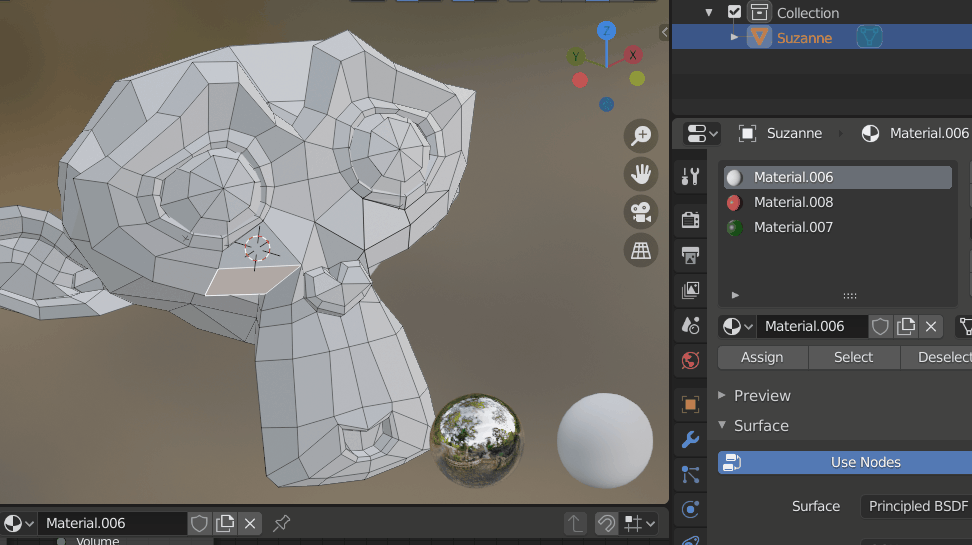
Here are some paper cuts I think they’d be useful in the material panel:
Adding ability to make a Duplicate of the selected material slot.
keep the selected material highlighted when assigning the material ,It’s annoying when assigning material to several faces it consistently goes to the first material slot every time I select new face.
Optional: I think default shortcut for speed assigning material (like: Ctrl+shift+A ) would be neat.
I wouldn’t say that nobody listens. I think one problem is we have thousands of posts here (and many others on right click select), and only a few developers. Also, many of the “papercuts” listed here are actually big projects. I’ve seen a few other papercuts fixed here (and I’ve fixed a few myself), but not everything that seems easy from a UI perspective is actually simple to fix. There has been some discussion lately and a new papercut tag has been created to sort these on phabricator. So posts here do get implemented! It’s just not always an easy or fast process, nor will every suggestion fit the design of Blender
To be transparent: I think overall the focus for the core developers over the next period will probably be reserved for big picture tasks and not so much the smaller paper cut type things.
But, contributers could continue addressing independent smaller scale issues in the meantime.
This might not be the answer many of us wants, but just the fact that it was communicated is a great first step! Thank you for taking your time, I’d love to see more communication in the future too.
Thanks for the transparency, much appreciated indeed!
From my opinion this is great news actually. It makes little sense to focus on details, before the foundation is deeply thought through and build in a rock solid and future proof way.
Focusing on details could even lead to wasted time and effort in some cases
This might be the answer many of us want!
Bigger tasks in the past leveraged Blender higher and higher, from that grey/yellow/pink little toy to what it is today. So patience for some quirkness left here and there (the real papercuts btw) and say hello to the next big feature
Like I said earlier. This thread is pretty horrible way to get any fixes done. It is impossible to search for related tasks when working on specific thing so 99.99% of all these post just get ignored because nobody has time or willingness to sift through all of the thread just in case there might be something there. I mean pablo above posted a fix about the collections menu issue but I’m 100% sure he missed and has never seen this issue about that exact same menu I posted earlier here:
I am not whining that my post is being ignored or anything like that. I am simply stating a fact that this thread is useless for actual feedback or issues collecting. It is impossible to find anything here at all. The sheer massive massive length, random vocabulary and total messy nature of this makes it completely impenetrable for any dev who may even think about looking at what other issues he or she might fix while working on some specific thing.
I wouldn’t say that nobody listens. I think one problem is we have thousands of posts here (and many others on right click select), and only a few developers.
Then priorities should be set, to the most important fixes. As objectively as possible = via organized feedback from the user-base of thousands of advanced users, that’s the only way.
For example, I see dozens of bugs in 2.8 version that I’ve been experiencing back in 2013, like the extremely buggy constraint system.
Ignoring chronic fundamental bugs, is like building on the sand.
It’s ironic to have advanced and competitive features, while one has to struggle for hours in order to make simple things that shouldn’t take more than a few seconds, work. Especially beginners.
So, the actual difference between a beginner and one with 10 years experience, is that the later has found and memorized the workaround paths (acrobatics) to acomplish various things.
But it doesn’t have to cost us years. A few dozen of hours for each developer to solve those chronic, fundamental bugs, would save millions of man-hours from the people who actually use it.
So, that requires more than just an endless pile of opinions (see my suggestion in bold).
PS. Not to be misunderstood, I respect what those few developers do and the work that has been done so far.
Vertex Color:
I my opinion, it would be much more intuitive to have the default “mix factor” for the vertex color on “1” instead of “0”.
This would allow to simply click on the “vertex color mode” button and start painting.
I hope this is not something I inadvertently changed somewhere… However this did quite confuse me, as I never got to see that color…