Yes, this would only apply to the toolbar and sidebar where we have menu entries to open or close them.
1 Like
A problem that I have repeatedly referred to in the past.
1 Like
I swapped them. We use red for remove in Blender, so the tools which remove details I made red. We could also make it so the blue ones are green and the yellow ones are white - this would follow more closely the convention elsewhere in Blender.
3 Likes
It’s not the positioning of the icon that is a problem, that should always be pixel aligned. It’s the layout code that should make aligned buttons one pixel smaller to account for the overlapping outlines.
1 Like
I still thinking that stylish and coloured icons make hard to create new brushes and maintain the style.
Hi! First post here! I’m not sure if my proposal belongs here but, how about automatically renaming single user object data when changing the object name?
I mean, if I duplicate for example, a cube a couple of times, and then I rename the three resulting cubes “cube_a” , “cube_b” and “cube_c”, it would be nice if blender automatically renamed the mesh data as well accordingly. Of course this should happen only if the mesh data has a single user.
It could be an option in the outliner that you can turn on and off, like a checkbox somewhere that says “Auto-Rename Object Data” or “Keep Object and Data Names Consistent”. That’s the default Maya renaming behaviour and that’s one of the few things I miss from.
Having such an option would help keeping the names of the meshes (and object data in general) clean, whithout having to manually rename your object twice basically.
It’s easy to keep in mind to correctly name your objects in your scene while working, since generally you can look at the outliner to check the names at a glance, but It’s easier to forget to rename the mesh data as well.
Keeping the object data names consistent is useful when you want to append just the object data of some object, from a scene to another. If you forget to rename everything correcty, when you open the append windows, you just stare at a list of “Cube.001, Cube.002…ecc”.
3 Likes
So … are you going to change tool properties icon colors , I’m not saying to change colors entirely , just tint it with same color for consistency , here is my proposal
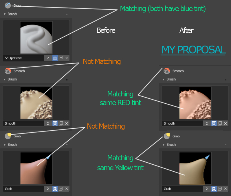
BTW … after coloring T panel sculpt icons are looking amazing thanks @billrey
5 Likes
2 Likes
Yes, we could make the brush icons fit the toolbar icons more. But I’m not too worried about the brush icons, which I hope can become dynamic anyway. With that change, there would be no mismatch.
2 Likes
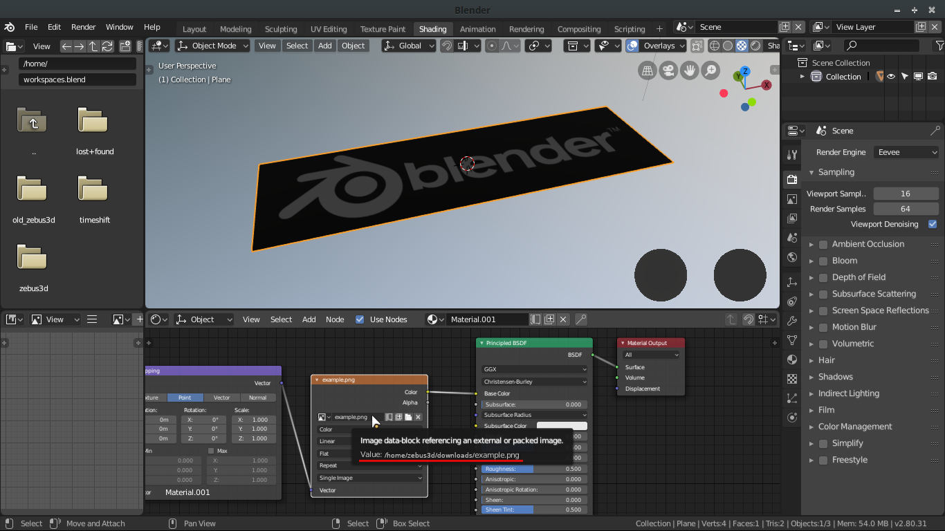
The most important information in an image node is the name of the image and its location, either with relative or absolute paths. My suggestion is that in the legend when you leave the mouse over the name of the image also appear its location as in the following mockup:

12 Likes
I like your suggestion, one step better would be to show a thumbnail of the image on each image texture node.
7 Likes
Oh, my god yes! Thumbnails all the way, like in 3D Studio Max (ugh, can’t believe I said that). 
Every Youtube tutorial on material nodes always put in extra nodes to preview what they are doing in the viewport constantly, and it seems like such a hassle. Especially for a beginner who might not understand what it going on at each step.
3 Likes
Agree,
For BOX selection I proposed solution for 3D viewport and it could be used for other areas as well.
Blender 2.8 - Shortcuts feedback its better than [B] for box selection
Does this issue also apply to Blender 2.79?
Which two tools are those that display in the header and Status Bar? The one that shows the tooltips in the header is likely a bug or mistake.
Unfortunately, AFAIK we can’t have previews for each step in things like material nodes. But there could be a preview image for the bitmap textures I think - I can’t imagine that would be an gigantic task.
2 Likes
In 2.7 hotkey to adding Subdivision Surface modifier (Ctrl+number) works with object mode and edit mod.
In 2.8 this hotkey works only with object mode, in edit mode this hotkey doesn’t work.
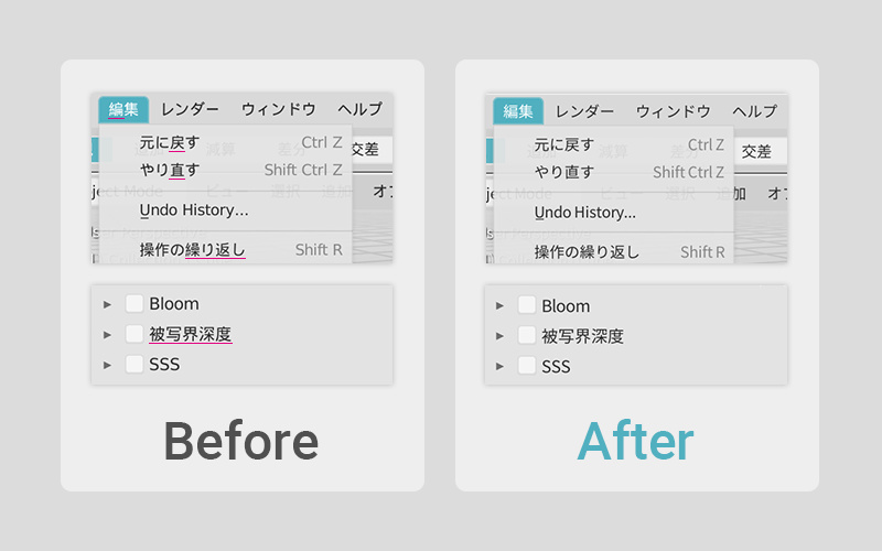
If you scale Shader Editor window then Color Picker menu is scaled with window.
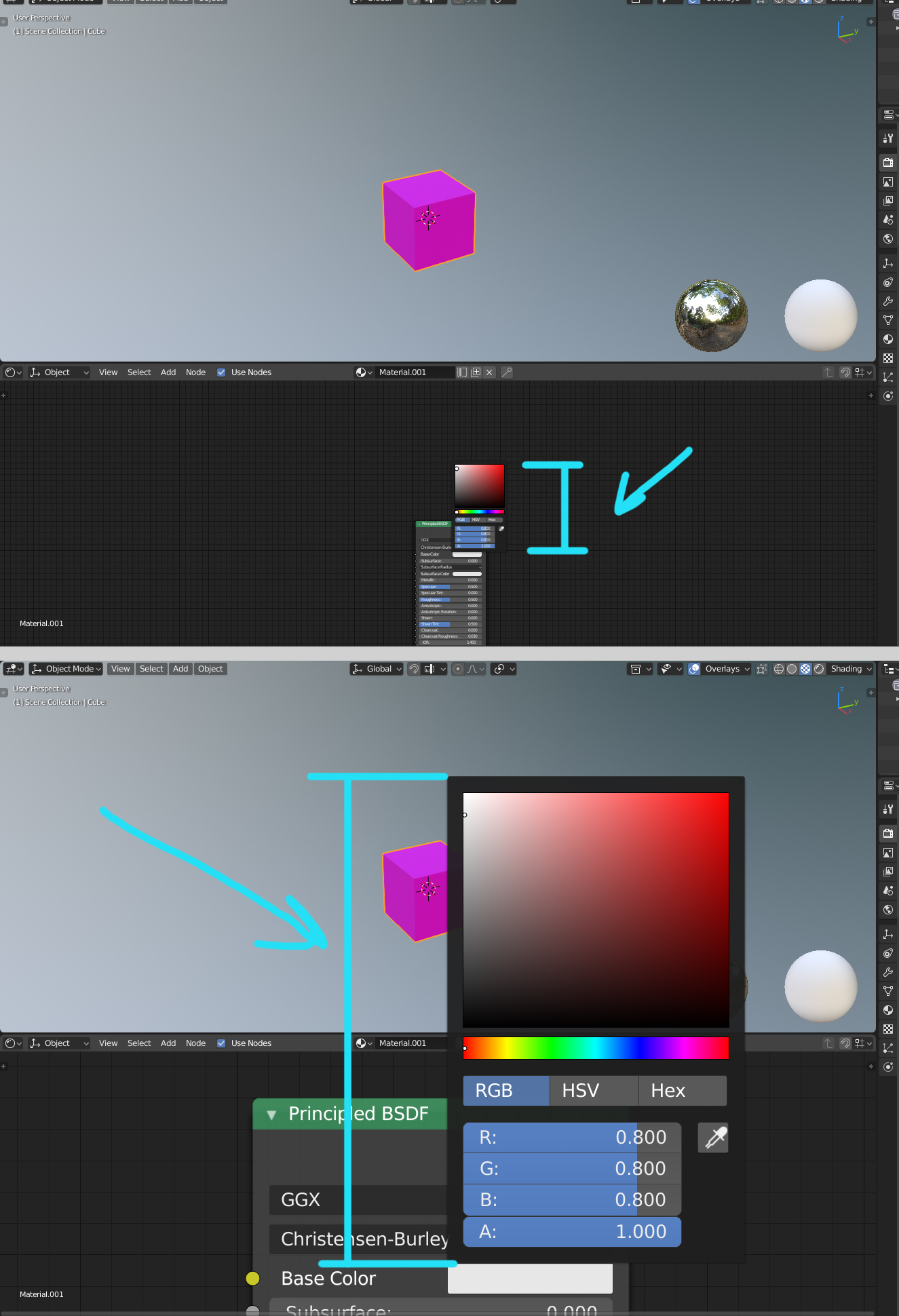
Yes I understand it works like pice of nodes and scaled with them. But I think it would be nice if Color Picer window was always of constant size.
8 Likes
Yes. This issue also exists in 2.79
bevel in the viewport, knife in status.
I think you should rethink bottom bar.
- remove useless navigation icons that also blink and took useful space
- put all tools’ info there instead of icons => header of 3d view will stop blinking too
3 Likes
Not mine, and not exactly a Paper cut but… https://blender.community/c/rightclickselect/Kpcbbc/navigate-gizmo-s-corresponding-viewport-direction
Why not having the HUD view name/mode (and maybe render engine?) on the right side, where view stuff is? This is consistent also with having content stuff (collection | object name) on the left, where content menus are
1 Like