In most windows/applications, you can right-click in the title bar and access the folder hierarchy of current document. Also you can drag and drop the file icon to move or copy it.
Super useful OS default behaviour.
In Blender, this would work, if Blender wouldn’t encode filenames (e. g. %20 for a SPACE character).
Shift mod. key adds to selection when used in companion with LMB Box Select and Ctrl + Box Select removes from so far made selection. But simple point and click with above mentioned mod. keys doesn’t work in consistent way. Shift adds to selection, while Ctrl makes last clicked object selected and active, cancelling the rest of so far made selection.
It should work the same way, no matter what kind of selection is performed - simple click, Box, Lasso, Paint (no-ides-why-it’s-called “Circle”) selection…
Simple click should wipe selection as well. In crowded scene it will start new selection, so as the Box Select does now.
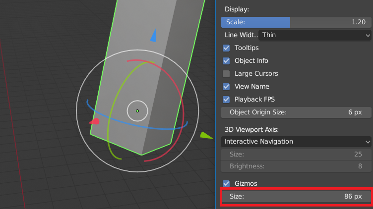
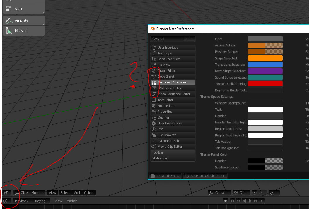
changing gizmo’seize is not easy, you’ll have to go to the preferences and change it while working, maybe putting a duplicate/temp one in the overlays will be more helpful or another way to make it more usable.
One annoying thing I noticed is that the pin icon is now placed on the right top corner in the properties editor. This means that when the space for the top row runs out, the pin will shift further to the right and you have to scroll it back into view. This is constantly happening on the single column properties editor.
Top = The pin on the render tab:
Middle = On the material tab it’s shifted out of view:
Bottom = Scrolling the top row to the side reveals that it’s still there.
Before the icon had a fixed position and that should stay the case.
This was moved to the right by @pablovazquez. I think the rationale was to separate it from the path, but it’s sure annoying that it gets pushed out of view.
I disagree. The problem is not the pin, it’s the breadcrumbs.
The pin icon is useful while the breadcrumbs rarely is. Way too much spacing, Scene and ViewLayer icons are useless since they have no tooltip, no name, no drag-drop. The only useful information is the object data names and I could totally live without them in exchange for more vertical space and less scrolling.
I don’t know how much this could be considered a UI paper cut, but I personally find quite frustrating the fact that switching the Lookdev hdri also change the one used in Studio light mode and vice versa, in my opinion they should be unlinked.
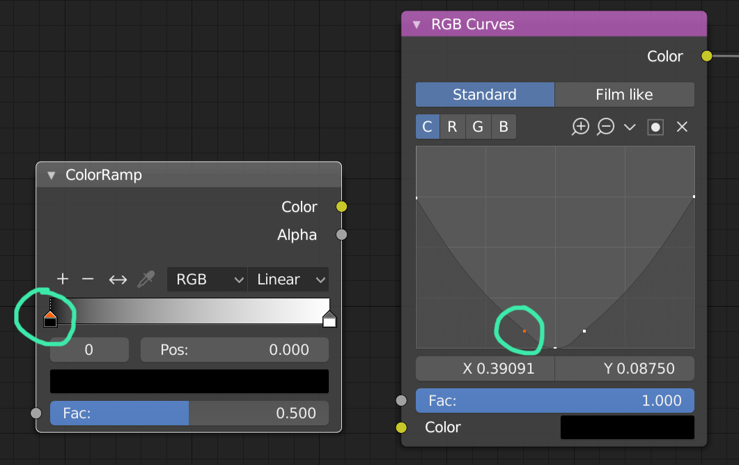
I propose to make a special color for handles in Node Editor. For Color Ramp and especially for RGB Curves, since the selected and unselected handles have the same color. Perhaps a few more nodes have similar problems with handles, need to check them all.
Yes this is a known issue - currently it uses Text Highlight for this color but it doesn’t always work. This needs to be done differently to make the selected handles stand out.
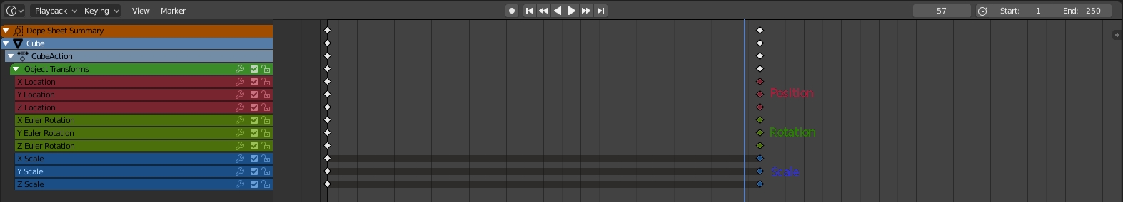
You can’t sort shape keys based on name (like you can with vertex groups) so if you want a shapekey in a specific place and you’ve got lots of shapekeys, welcome to clicking the arrow land.
More generally, there’s no way to add something in a list directly after the thing you’ve selected. For example if you wanted to add a shapekey in a specific spot you can’t (so you have to do the above thing) because when you click + the thing you added (shape key, vertex group, material etc etc) is always added at the bottom of the list, which is good sometimes and bad other times.
There could be a modifier key or something that you hold and click the + and whatever you’re adding is placed directly after the current selection, so if you’ve got shape keys “a”, “c”, “d” and want to create the shapekey “b”, you select “a” and shift click the + (for example) and the newly added shape key ends up between “a” and “c”.
Of course may not seem too useful in this example but think of when you have “a” through “z”. (face animation)
Every time I open a file in 2.8 I’m confused as to why the hierarchy is flat, and I have to switch the Outliner from “View Layer” mode to “Scene View”.
Right clicking a collection in the Outliner and selecting “New” doesn’t seem to do anything at first. The Outliner doesn’t change, no new Collection appears.
BUT, in the “Add” menu (of all places), if you go to the bottom, there’s suddenly a lot of “collection instances” which apparently appeared from the “new” operation… and these can be… added? Why?
And why are all my objects in “Objects” by default, and not “Collection 1”?
I don’t know if it’s a papercut, but could be great unlink the selected object with material in shader editor. To work with different materials without click in some object or without change the material of the object. Actually you can Pin the material, but not to change the material to the material taht you want to touch.