How is this different from turning the magnet icon to blue?
I think the outliner hates me as much as I hate it at this point…

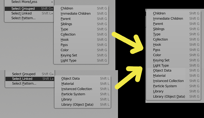
I’ve been using Select Linked (Shift+L) / Select Grouped (Shift+G) a lot recently and always confuse these two which made me think: wouldn’t it better if these two menus were merged? I understand what they have these layout because internal logic with blender datablocks and whatnot. But logically when for example you want to select hundred objects what share object data it’s same thought process as when you want to select hundred objects what belong to same collection. And aren’t objects in same collection are technically linked to it? ![]()
Are there are cons to it besides creating very long menu?
And isn’t name Select Grouped is wrong anyway since Groups were superseded Collections?
- By default blender always adds object in flat shaded mode. I can understand it is good to see the level of quality you are getting with all the edges being visible but at the same time I need to set every object to smooth shading which is repetitive and sometimes causes issues later if forgotten. I’d imagine 99% of people want smooth shaded objects, not flat shaded. So flat shading should be the one to which people opt-into, not that 99% have to change from flat to smooth shading for every object.
My solution is to add an option in the shift-a menu’s next menu called shading which has options for smooth shaded, mark edges sharp and flatshaded. changing this on makes the object flatshaded or smooth. This allows the user to toggle the flat or hard shading during object creation on to see when the quality matches his desires (see that a cylinder has enough loop verts for example) and then turn the smooth shading back on before completing the tool and moving forward.
-
Also in the same menu the align to rotation should remember its last setting. I want all my objects align to view yet all of them are aligned to world and need to be changed every single time.
-
The font system for text objects feelss weird and has no way to preview fonts inside blender. Every font needs to be loaded individually into blender before it can be previewed and used. If possible please let the user scroll through all available fonts while showing the preview in 3d so we can choose the font we want directly and quickly. Having to open word processor just to preview fonts for blender use is not very fun.
-
Also I think it would be a good idea to get rid of the two text fields for the file browser. Even in windows there has not been separate text fields for folder path and file name since windows 3.1 or 95 I think. One text field should be able to write both text path and file name in the same text field. Also some basic things are missing like path autofill and show file structure as you write. It feels very slow and tedious having to write full file paths from memory.
Nate Craddock has been hired for GSoC to work more on the outliner again. Let him know ^^
This… So much this…
I really hope they fix this soon, as it is one of the most infuriating things about using blender and the outliner.
It’s exactly the issue I talked about in the outliner discussion thread.
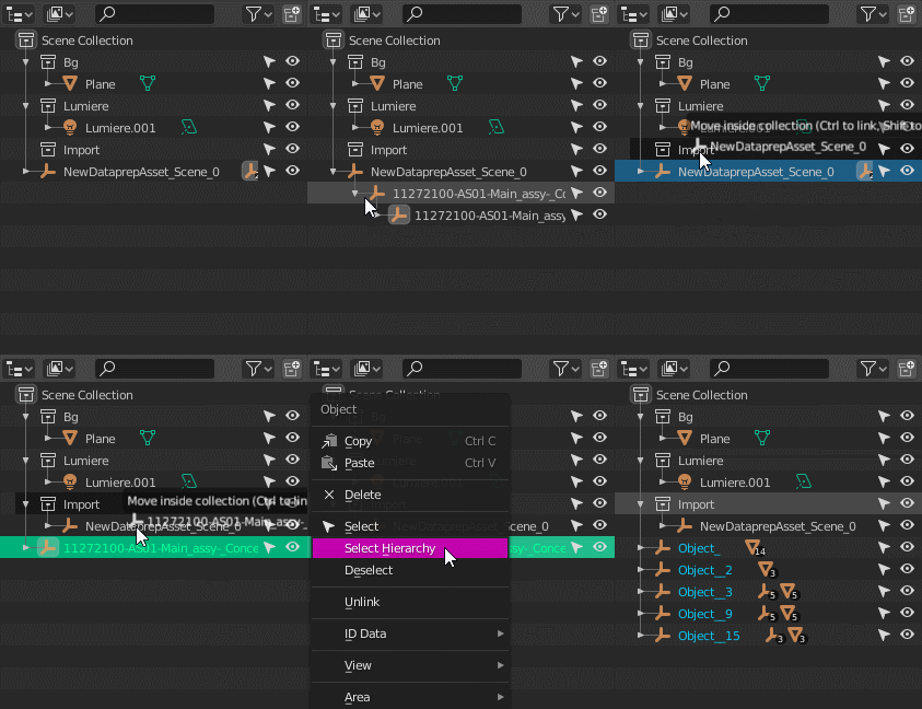
I cannot reproduce that issue here. I can move all selected objects using Select Hierarchy into Collections.
If moving selected objects into Collections fails in some situations, file a bug report with a demo blend file.
Thanks.
It fails when the objects are collapsed.
Not here it doesn’t. I can collapse and move an entire hierarchy of objects between Collections with no issues.
So, if there’s some case where this fails, please submit a bug report.
It does in master, but appear solve in 2.83.
Aha, it is indeed fixed in 2.83 (and 2.9). Thank you for checking this!
I guess I should check all future papercuts against these betas and alphas from now on.
Simple issue but hard to explain.
0. be in edit mode
- have edge mode selection selected and add a new cube object with shift-a
- change from edge to vertex mode
- change size of the new object in the new object menu and your mode switches back to edge.
The issue is that the new object menu should not switch the mode but let it be what the user set it to (vertex). This is annoying issue if you want to add a circle for example but you can not see the vertices because every time you change the new object params the mode switches back to what it was at the start of the shift-a tool. The correct behaviour should be for the new object param menu to never change the selection mode. It is tiny issue but a clear one too.
There’s a “clear parent and keep transform”, but no “parent and keep transform”?
I ask, because swapping parent on any object is impossible without having it move. You need to first clear parent and keep transform, and then re-parent it.
In the outliner, when you shift drag an object on top of another, Blender should always ask about what to do with transforms… (and how many want their objects to jump around?)
@Isscpp and @Hadriscus
I’ll answer with a question, if the point of the snapping elements menu is to do just that, why must the user actively “enable” the actual snap function (the magnet icon) in blender to do so? it feels redundant in terms of snaping a vertex to another for example - other tools have hot keys that does this under the hood, HOTKEY X = SNAP + ELEMENT X1 to ELEMENT X2 .
Understandibly someone may not want to work in blender with the snap fuction always on (for all the other operations they do) which is why I’m suggesting to have an option directly linked each element to “snap during transform” that way the user wouldn’t need to enable “global snap”.
Its either that or provide a native snap element hotkey that does that under the hood like so many other industry software has - but I’m trying to be pragmatic about UI here.
To be clear - my suggestion is meant so that there no need to retool basic task of snaping of elements, just adding an existing function native to increment, vertex, edge, face, volume etc
That’s kinda weird. You should try to report it.
There was a problem with parenting
https://developer.blender.org/T75610
I experience this annoyance but in object mode with viewport visibility. Adding an object, realizing that it is partly/fully inside another object, toggling the occluding object’s visibility to off, then adjusting the new object’s parameters causes the occluding object to become visible. It seems that adjusting the parameters sets Blender to the state it was in when the object was added.
As far as I understand, Ctrl key is the modifier you’re talking about. Magnet icon disabled, when you transform an object and press Ctrl you get snapping happening under the hood.
I don’t know if this is documented though
Not sure if I should cross post stuff from the GSOC thread to here or not… I mean, the guy doing that might not want to fix papercuts, I don’t know?
Anyway, here’s the latest one:

Select hierarchy only works for whatever is active, not the entire selection. Makes deleting multiple hierarchies very tedious.
