number one rule of the universe, if it works, don’t touch it. If it works and the change improves the experience zero, changing it is looking for problems.
9 Likes
It’s fine. I don’t mind. In fact, thank you! I’m glad there is a conversation around it as long as there are no personal attacks.
I don’t claim to be an UI/UX expert but aesthetics matter to me. Toggle “feels” better and easily recognizable in it’s function.
Also, conventions change and mobile influence things. I didn’t even think about mobile when creating this design. I just knew I wanted something better than a checkbox.
When I have had to use that kind of toggles they have confused me a little. Sometimes I don’t know if I just have to click on it or if I have to click on the inner circle and slide it to one side. In the first way (one click) it does not make much sense that it simulates being a button that can be slid to the sides. If this is the second (sliding), it requires more actions than a simple click on a checkbox.
Anyway, if this is going to be optional and doesn’t require a lot of maintenance by the developers, I don’t see why it can’t be introduced as an alternative.
2 Likes
About another UI issue… It is really weird and a bit annoying the behavior of some Presets menus where the settings do not change visually until you move the cursor out of the menu to exit the menu. For example Cycles Render tab, Sampling and Light Paths presets.
1 Like
FWIW, I found that article rather incoherent. As far as I’m concerned, points 5 & 6 are the important things.
Personally, I find toggles clumsy: they’re used a lot in Oculus Quest’s UI, and it suxxxx. In a mouse system, it’s a fussy little drag motion when a simple click is more than adequate.
Yes, I also find this very annoying, and have posted it here before. It used to be centered in early 2.8 versions, and you could immediately start sliding the Radius value.
I also think the essential new Hardness value should be added, or replace Autosmooth.
2 Likes
Apparently addons folr workspace sorted by date of installing, but not alphabetical.
Alphabetical sort seems more reasonable “Type of the addon-Name”
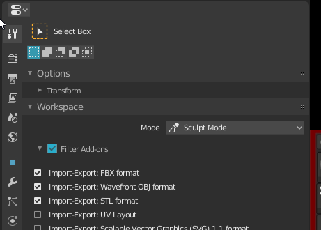
5 Likes
Or a variety of sort criteria. (Someone must have thought “By Date” made sense, don’t know why…)
I am curious, what advantages do you see in toggles? They may be trendy, but how are they better than checkboxes?
A checkbox is unambiguous and clear to see at ta glance. Either it is checked or not. With these slide-toggles the have to be much larger (wider) than a checbox to be able to see the state clearly.
Also, they suggest that you have to click and drag in a given direction to turn on or off. Which might make sense in a touch UI on a smartphone. But I believe less so on a mouse-and-keyboard environment. Or do you only click once on it? It’s not clear.
Aren’t toggles functionally the same as checkboxes ? What is wrong with checkboxes in the first place ?
Have to agree with @jenkm and @Alberto, here. The toggles look cool and I do like the mockups but they don’t serve much new purpose, here. If it ain’t broke don’t fix it. Othersie in a complex ecosystem like a 3D software it may do much more harm than good.
I also think the indetermined state of checkboxes (in the UXPlanet Link above) is something to bear in mind, here. Even if they may not be used often, now. As soon as the “true multi-value editing” comes (finally) they will very much have a purpose and quite an important one, as well.
Usability wise I’d not say that there’s a benefit in this case, either. When you are working in a 3D software you are versed in what a checkbox represents and how it works in the UI. I’d put the toggle switch more in the UI usecases for a software targeted at the general public.
Killed right here: https://developer.blender.org/T72786
Very, very annoying.
3 Likes
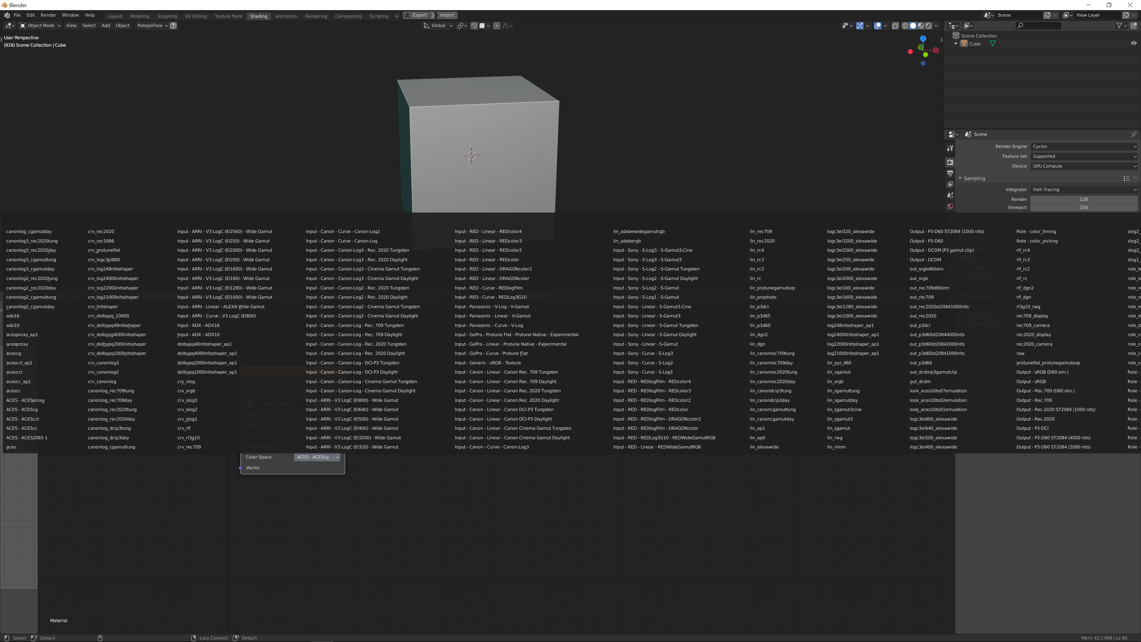
Blender currently does not handle OCIO profiles with a lot of input transforms very well.
This makes working in the Aces colour space pretty frustrating.
Another thing is that blender by default will load an ocio profile from your enviroment variables if you’ve set that up. Would be nice to have an option to turn that off
3 Likes
Looks like a mobile/web app.
Not a fan. 
Yeah, that was my submission. ![]()
2 Likes
This qualifies as a “paper cut” because if forces my eyes to dart over to the toolbar to check the status of the tool:
It would be VERY desirable if the CURSOR SHAPE always gave the user information about the state of the application. For me this is particular aggravating in differentiating between TWEAK, BOX SELECT, and LASSO SELECT, because not only do they share the same cursor shape, they share the same hotkey, so I can never be quite sure which one is active w/o looking.
The cursor could & should be a valuable cue to the user, if it always conveyed some unique information. It is where the user’s eyes are most often going to be focused. This property should not be wasted.
4 Likes
Pray for companion icons to land.
1 Like
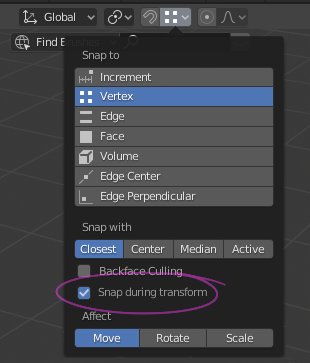
Adding ‘Snap During Transforms’ option in the Snap to Menu
It would be really nice to have an option in the “Snap to” drop down menu, that would enable the SNAP to happen ONLY as you transformed an object from one element to another.
This wouldn’t change any existing blender wokflows, rather enhance it (if one wanted it to with the OPTION box ticked) to a very familiar industry standard -
As opposed to…?
1 Like
There’s some conversation around this. I think they are going to add companion icons and different cursors for each tool eventually.
1 Like