Return the “large cursor” to where it was rest, Please!.
Bad experiment!
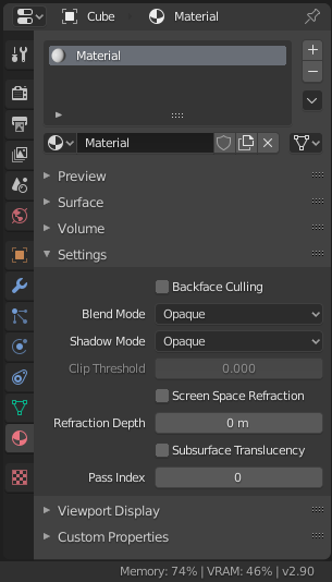
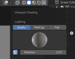
Currently the rotation for world space lighting in solid mode and the HDRI-Rotation use the same value. This means, if you adjust the rotation on the shading in solid mode, it will also rotate the HDRI you use in Lookdev Mode or Rendered mode. This does not make sense, since the lighting in solid mode and Lookdev/Rendered are completely unrelated.
2 Likes
You can talk about that in new icons thread because it appear that we don’t understand our position
1 Like
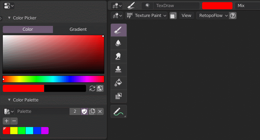
Picking colors from a palette doesn’t update the color slot located in the 3D viewport’s Header.
Notice how it updates only when I click my mouse cursor in the 3D view.
3 Likes
The File browser doesn’t remember the size and the position unless a file is saved, it would be better if it can be done when saving the preferences or with the startup file for the default templates.
Hello everybody!
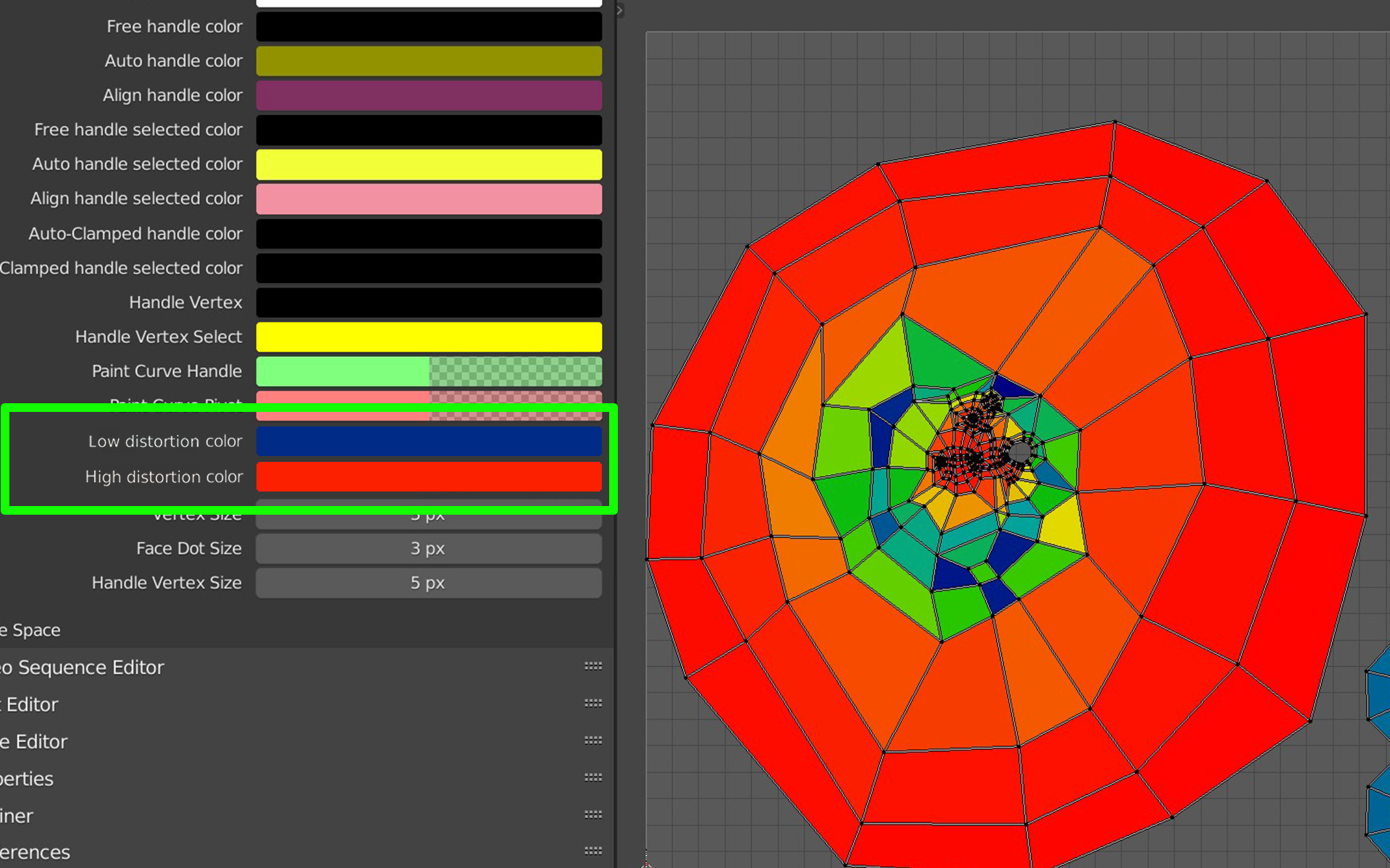
It’d be nice having the possibility in Themes to change the colors for the UV stretching overlays
Mocup below (considering that we are talking about a range of colors, I thought the options could be the lowest and the highest).
4 Likes
I think a color ramp option would make more sense.
2 Likes
Hey! I thought about that and it wouldn’t be a problem for me, I simply choose that option to keep consistency with the rest of the Themes. If you see the gradient option for the 3D view background, also there you can change only the lowest and highest.
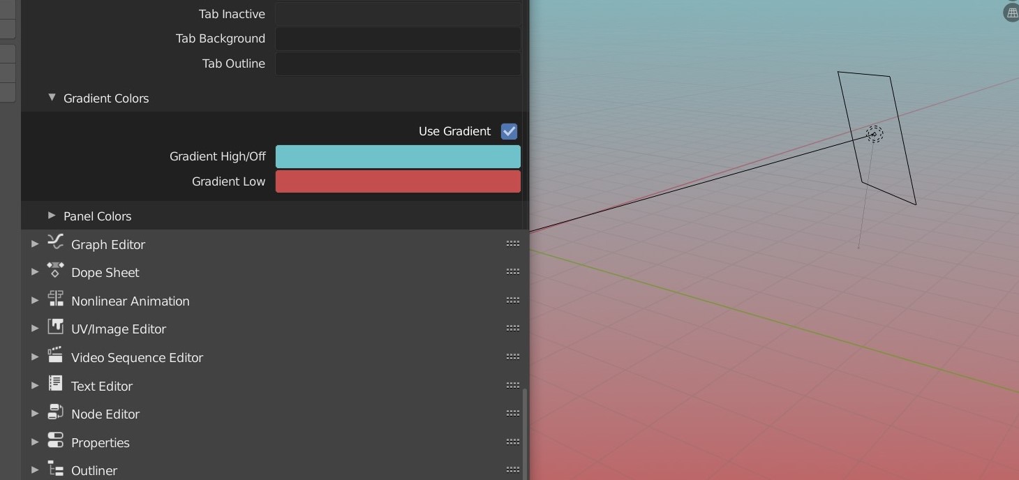
Either we keep this option or we add a gradient ramp also to the 3D view background
1 Like
I noticed in the 2.9 that polygon count information is gone by default:
![]()
I hope it’s not hidden now, because it’s vital information for new users. Where has this moved to?
![]()
I don’t see it in the dreaded hidden N menu (which is usually at least a common place for information).
2 Likes
Thanks, for the info!
But they did that and you still can’t get a poly count on the current selection? 
And one of my earlier papercuts has been made worse from that change:
- The local view is still near invisible (only a small “(local)” text in the corner).
- Those optional statistics are bright white, something a user might want to darken to not stand out as much…
- …but if you do that, the already difficult to spot local text will get even harder to see.
^This x1000
I kinda feel like cube should be 1m instead of 2m, that would immediately fix a lot of scale issues
Every single person can intuitively measure one meter, but two is a lot more abstract
And yeah, the area scales are silly long, Its not a problem until you have 30 cameras and 50 lights in one crammed scene. These changes are small but they would hugely increase speed and accuracy, specially inside busy scenes
1 Like
I bet there’s some technical explanation those working behind the scenes understand, but to a new user, it’s very weird that in a particle system, an object’s scale corresponds to a particle scale of 0.25 and an object’s Y+ axis corresponds to a particle’s global Z axis…

2 Likes
Vertex, Segment and Curve selection toggle buttons and shortcuts should be available for curves:
![]()
EDIT: It’s also super annoying to try to edit straight lines in curve mode, because you always end up selecting control points of handles buried under the vertices instead, so maybe those should have a toggle button as well (slightly separate)…
EDIT 2: Since rotation along a control point’s normal seemingly doesn’t do anything, couldn’t it instead be used to access the tilt feature? Seems natural to me (I had to search for how to twist the bevel since I did not associate it with the word “tilt”).
9 Likes
@Harleya Yo, how about move the status bar’s “stats” text: ![]() a little bit to the right, so it’s more aligned with rest of the stuff?
a little bit to the right, so it’s more aligned with rest of the stuff?
Maybe it’s just me, but it kinda feels out of place in it’s current position… ![]()
7 Likes
it’s not just you. it looks like that text was abandoned in the middle of nowhere ![]()
I can get that text slightly more to the right, but not quite as close as you show. This is how it has looked on my own machine for a couple days…
2 Likes
Much nice already…
But if it could be aligned with the “widgets” that are further to the right, it would be even nicer, IMHO…
2 Likes
yes, more room for the long list of shortcuts that sometimes appear in the status bar