Yes.
Only @natecraddock could fix it. 
Yes.
Only @natecraddock could fix it.
It’s close now, although I know my patch will never be accepted by my amateur code. But as a proof of concept I think it’s understood.
The “Save changes to <fileName> before closing?” dialogue does not not grab focus of the of the Arrow Keys of the keyboard.
I should be able to choose a button with the Left and Right Keys and then hit Enter to accept.
I know I could use ‘s’, ‘d’, and ‘c’ but I like options. 
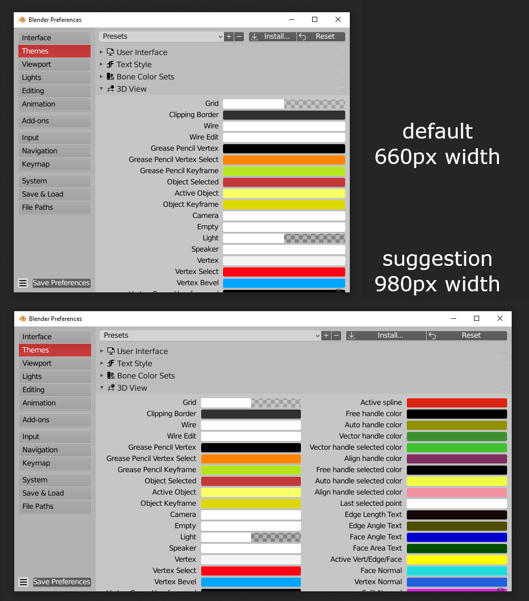
I’m only one who thinks what default width of preference window is too narrow? Currently it’s something around 660px which causes single column layout in some places (especially annoying in theme editor). If it was just a little bit wider (980px or so) then there would be no need to extend preferences window every time you open it:
Currently Image Reference supports Movie Clips, but when you Add > Image > Reference, the default file browser does not have Movie Files enabled from the filters.
Of course you’re not the only one. Every sane person using a modern computer would think the same.
See: https://developer.blender.org/D6670
There is no way to admire a render full screen unimpeded by some kind of overlay. I can disable the toolbar, sidebar, then go into fullscreen mode, and then hit ctrl-alt-space to hide almost everything. The semi-transparent stats bar (showing frame and memory usage) and the Pan and Zoom icons on the right are ALWAYS there. That being said even in normal mode it’d be nice to be able to toggle these annoying overlays.
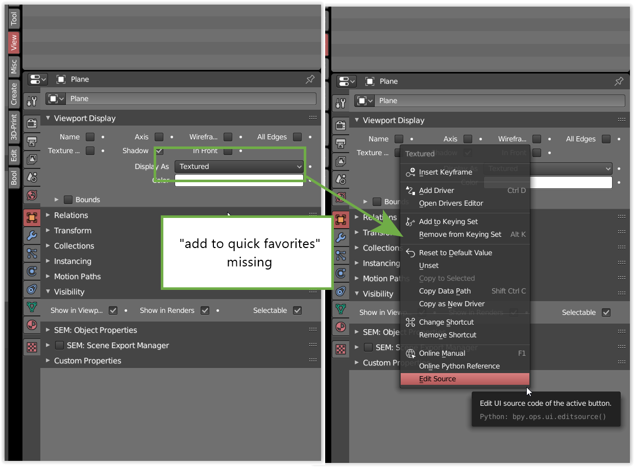
i found that the “add to quick favorites” option is missing from the Viewport Display > Display As and since i use that quite a bit it would be great to be able to add it to the favorites.
The Blender developers who are following this thread might like to know that there’s a parallel discussion about the same subject matter going on at Blender Artists:
Hello! I have a paper cut that really annoys me in Blender 2.83.
I have noticed that the viewport in 2.83 is washy, the edges in edit mode are less visible than in previous versions with the same settings and viewport visibility is not consistent overall for some reason. Sometimes I can barely see edges when I move my camera around the edited object in 2.83. These inconsistencies might seem minor and non-significant, but I saw them right away after trying out 2.83 builds. Themes are very inconsistent because of these issues. Here are some comparison screenshots:
v 2.82a. Notice how thick edges are in edit mode.
v 2.83. same theme same matcaps, camera is a bit closer to the object even, notice how washed out and thin edges are:
Also grid transparency and consistency. It’s inconsistent between the versions and for some reason absolutely the same values in the theme settings for background grid have different results.
Here are comparison screenshots:
2.82a Notice how grid is transparent
In 2.83, however, for some reason grid is super thick and non-transparent. And these are the same themes and value settings.
I know these things are minor and might seem superficial, but edge thickness in 2.83 is way worse (IMO) and thus feels less comfortable to use, please make edges more visible as no settings in theme preferences can influence that. Maybe I’m too fussy, I don’t know =)). But these changes are quite visible.
There is only option to change all lines both for UI and edges to THICK and THIN and auto in preferences which makes absolutely all the lines in Blender either extremely thick or thin. Basically in 2.83 we have 2 extremes and can’t change that. Also, changing colorspace preferences does not seem to affect thickness of lines in the viewport.
Many Blender users, including myself, would absolutely love an improved modifier stack UI, similar to the Modifier List add-on, or have that integrated into Blender.
“Only selected” enabled by default for all exporters.
Seconded. This add-on is fantastic and is honestly essential for making sense of the modifiers. This is the golden standard on how to manage modifiers and I dearly hope that it will be the blueprint when improving baseline Blender.
They’ve actually been working on exactly that for the past few days. It’s coming, with drag and drop reorder and all.
That’s great news! I already read about the drag and drop option, but didn’t know it was part of a modifier UI overhaul. 
The implementation is different, without list
Thanks, I have to admit I haven’t tried the branch. From reading the commit log it seemed as though they were adding a list just like the addon. Hopefully having a drag&drop reorder alleviates the need for a UIList… let’s see.
Or maybe autoexpand.
Ye, maybe as an option.
Cold be more cimplicated when it comes to convoluted production rigs or scene layouts. If a parent has 1000 child objects with complex relationships I’d rather not scroll through all of them.
Many times I’d just need to know where it is, a simple option to change that highlight color, or highlight the parent object with a different color, indicating that the selection is below the hierarchy. Similar to maya for example.
I’ve sortof gotten used to it, but if Blender is introduced as a new tool in a studio pipeline I can see people getting frustrated with not immediately being able to spot their selected objects in the outliner.
What happened with editmode cursor?
In 2.83.13, it is difficult to determine the current mode, focusing on the model rather than the interface.