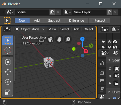
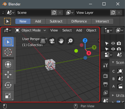
Well, as you may have noticed from my reply, I require an overly obvious UI in order to notice it, so for these quite important things that affect a large part of the view, ideally I’d like them to be very obvious:

Local view - Here I used the same color as a selection, because you require a selection of at least one object in order to enter local view mode.

Auto key - Here I used the color red, which is often used for record, and auto key is one of those really dangerous things as well (I’m actually very glad the button is gone from the default workspace in 2.8, but I did not like that it’s no longer red).