If you have backface culling on (backsides of faces are not drawn) you can not select objects even if they are visible through a culled backface.
For example make a cube. Flip its normals. Add another cube and scale it so it is smaller and inside the first one. Join the two cubes into one object if they are not. Turn on backface culling. Now in edit mode in solid view the bigger cube faces are invisible as per object culling and the face normals but you can see its verts. But you can not select the smaller cube despite it being perfectly visible. Instead invisible face or vert or edge (or typically nothing) is selected because selecting ignores backface culling.
I also really liked the artifacting in blender 2.79 where the corners and inside edges of cubes for example would flicker slowly so you could select edges, faces and verts right behind the visible objects. I understand this was probably a glitch but it was useful. Maybe it was z-fighting…
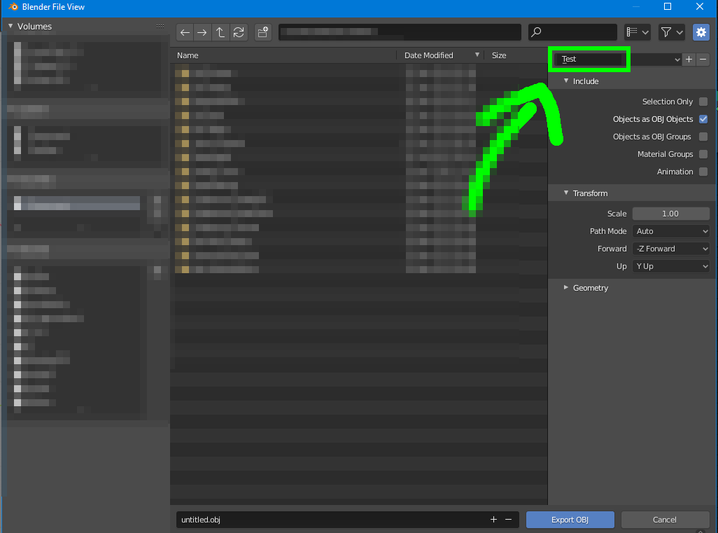
On file export options the active export profile should be shown as chosen. Instead the selection always is shown as just “Operator presets”. In this sample image I have a created “Test” named new export profile and it is active because it is shown as such in the list. Currently you have no idea what export option is selected unless you have either memorized your export options or you remember what you clicked on that list… or if you clicked.
I really think the file explorer needs a second pass. It lacks so many basic functionality features and the THREE separate text fields for file path, file name and search is totally outdated concept. There is no reason to have separate text fields for everything. If you want a path you type a path and press enter. If you want to type file name then you type file nam. If you want to search you can type *.png or help or some an and blender figures out whether it is a path, file name or search query. Like I said earlier there is no auto complete and browsing is still super slow. You can not for example click any file and then start typing the file name to get to it quickly. In 2.81 you just scroll … slowly … until … you … find your file. In windows it is massive time saver when you can just press f for example and the selection moves to first file which starts with f. If you type fol… the first file called fol-something is selected. Having to manually use the mouse to manually search a file from the folder you are already inside in is just slow. If you have long list of files this is pretty tedious repetitive annoyance.
In a couple of weeks I have a lot fo free time to devote to Blender. I have a list of possible improvements to work through but as a starter for 10, If someone could let me know the whether ‘:’ should/should not be used within the Blenders Interface, then I’ll submit changes taking in account the decision, even with my mediocum of Blender knowledge.
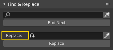
In almost all cases you should try to avoid colons between labels and related items. We used to have them sprinkled everywhere but now we have generally banished them. There are a few stragglers I can think of, but only because we haven’t fixed them yet.
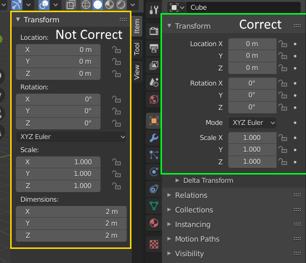
Actually the N panel in Layout is still not formatted according to 2.8+ style guidelines(ex. still use colon, not right aligned, text inside widget and animation icons(the dots) are missing):
It would much improve convenience if the ‘Selected (only)’ checkbox during file export would be checked by default.
Ideally, the checkbox would only be deactivated if nothing is selected.
Right now, the panel with the ‘Selected (only)’ checkbox is hidden by default, so accidentally exporting an entire, heavy scene happens a lot, causing repeated frustration.
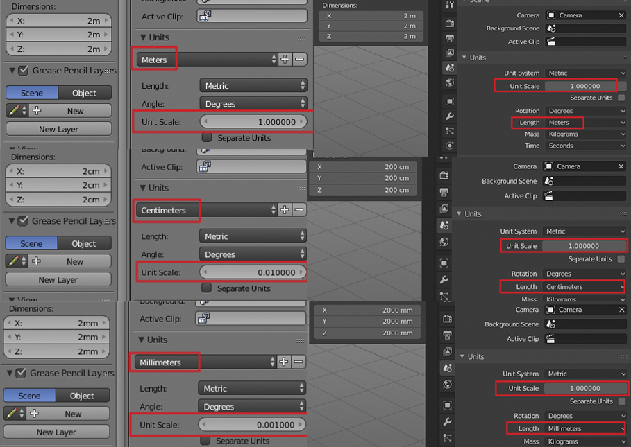
This is intended, and makes a lot more sense anyway. Think about it- when you set Length to Centimeters, that is your unit. If you change length to centimeters and then Unit Scale changes to .001 logically your unit size should be one tenth of a centimeter, not a centimeter. It would make no sense. Also note that in 2.8 there is no “metric” length, because Metric is a unit system. This was an area that 2.7x had completely backward, and I can understand that people might be used to it, but it’s better to rip the bandaid off and just get used to doing it the right way.
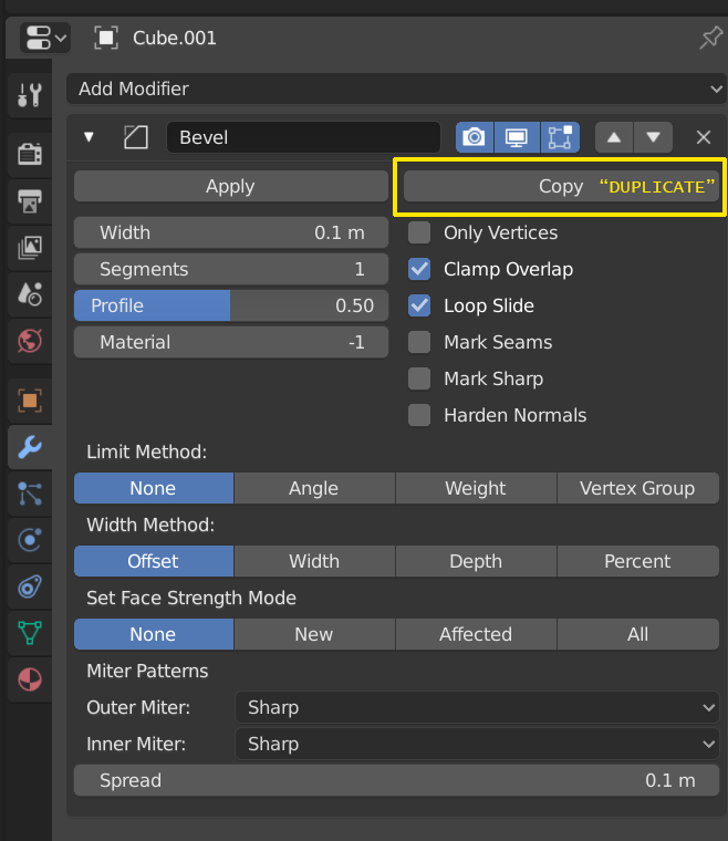
Modifier “Copy” should be labeled “Duplicate” instead. Copy implies it can be pasted somewhere, which is not the case. As new artists at my studio move over to Blender this is one of the “gotchas” that tend to catch everybody. Once I explain it, they always say something along the lines of “why isn’t it called duplicate”.
I have a suggestion for the missing icons for
a) Top Bar = Blender Icon
b) Status Bar = heart rate trace icon.
Whilst not possibly the final icons of choice, they would complete the proper alignment of the list.
Change the title ‘Video Sequence Editor’ to ‘Video Sequencer’, keeping it inline with the drop down list of available editors.
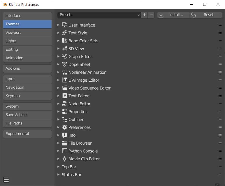
Alphabetic Ordering with the User Preferences panel.
Just out of interest. Would it be better and consistent if all the top level selections in the User Prefenences panel be arranged in Alphabetical order. Most if all of them allow the user to change the ordering, so would it not be preferential to set it in alphabetical order as standard and then let the user customize?
I like the categorization, but hiding render settings is too confusing for new users, who might not realize they have to de-select everything in order to see those options.
I suggested splitting your “show always” out into a separate panel here, but there’s no reason that your “show this if nothing is selected” couldn’t also be split out, which I think would be an improvement: