That has been suggested, along with changing that small arrow to something more visible many times, and Blender developers have always ignored it, so I guess they unfortunately like it the way it is.
My suggestion here was to simply add an entire new panel category that you could place wherever you wanted just like any other panel (the current properties panel is way too crowded, and the N-panel is way too invisible).
Same here: already filled a bugreport over two months ago (video included, which explains it compared to 2.7), but it’s already closed, because it’s not a bug - it’s more a “feature request” - Sad, but true. It still feels not like a feature, but more like a regression: It worked in 2.7 - but not the same way in 2.8.
If you or anyone else has anything else lying on your TODO list, which you think I could tackle, email me. I can tackle from 15th January onwards.
My first port of call from the 15th will be around Preferences Panel, of which there seem to various Paper Cut type amendments. If you wish them to be highlighted here in the UI paper section on a adhoc basis, I’m happy to oblige.
In general my own interests are very obscure little things that nobody else really notices and wouldn’t be interesting to most people. But will keep you in mind.
There are piles. But I would just caution against making a mega-patch containing lots of unrelated changes together as that can make it hard to evaluate and approve. Just remember you have to sell your proposed improvement in the patch description so it can be easier to focus on a thing, or related things, together at a time.
In many places we are choosing to place things in most-used to least-used order. In Preferences also pre-opening the most-used. For better or worse. There are obviously arguments for or against any ordering. I personally don’t have strong opinions on this, nor does mine matter much.
But alphabetical order in this case would be a hard-coded placement in this order based on the English labels. So when using a different language the order would then be incorrect.
Eventually I hope we’ll gain a library like ICU and then we can have language-specific sorting.
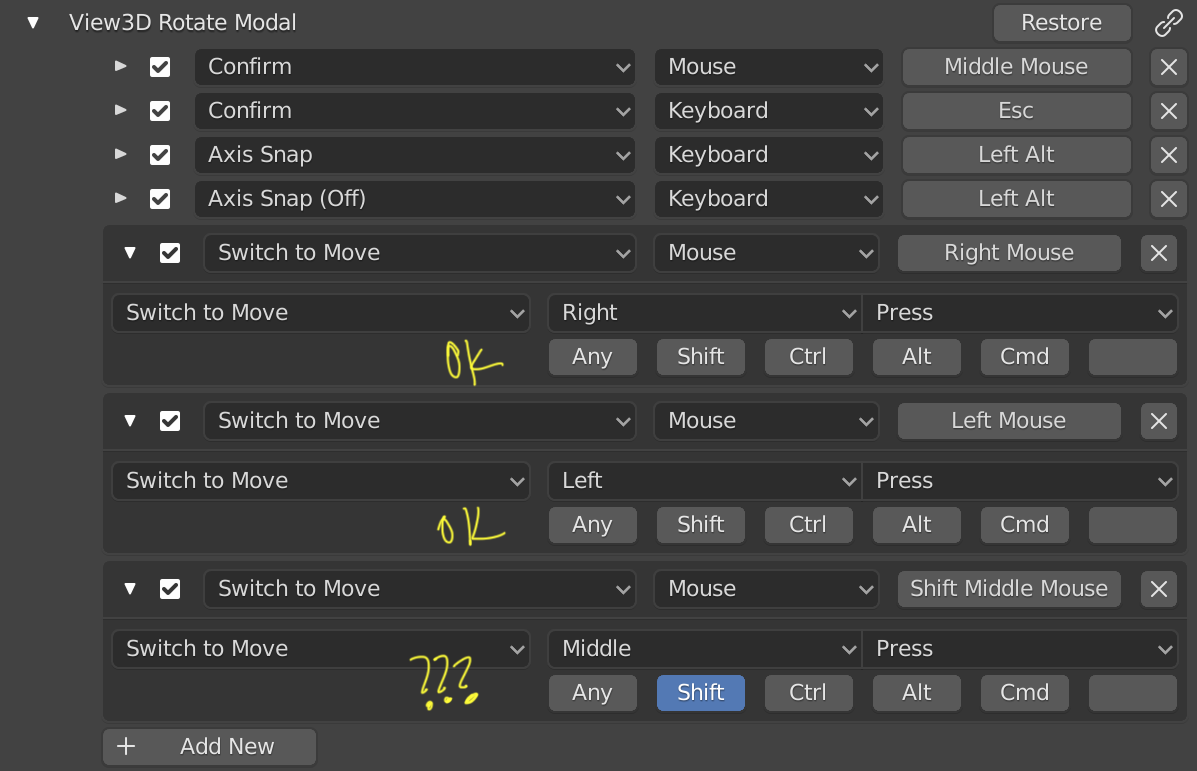
1.- Every time I modify a parameter of a shortcut the panel closes, and I have to reopen it. It makes me lose myself and have to constantly search for the attribute I intend to edit.
2.- I have achieved two new interactions by orbiting the view. By clicking a second mouse or tablet button while orbiting the camera, I can move the camera. This allows working with only one hand, and especially for the disabled I think it can greatly improve the workflow.
I do not get the same interaction by clicking exclusively the Shift key while orbiting, since it does not know how to differentiate it from the action initiated.
Many programs act in this way and I think it should be possible to switch the order in which the keyboard and mouse are pressed.
I would appreciate any information regarding this. I leave a capture so that it can be better understood. Thank you.
2.8 added a new edge ring/loop selection method where you can hold alt and double click an edge to select an edge ring. Sometimes holding alt and clicking once this does not select the edge ring so in 2.8x you can double click while holding alt to select the edge ring. However this is buggy when you want to select two or more edge rings one after another using this double click method. On second selection the double click simply doesn’t work correctly as it select and deselects. Holding shift doesn’t help either. I think this is a bug? Or maybe I just don’t know the correct keyboard buttons…
Steps to demo the issue:
-create a cube
-in edit mode select two opposite faces and press I to use that tool. Make the new faces smaller, finish the tool and then delete those small faces
select these new edge loops in edge select mode and subdivide once
now you have created two edge loops that require alt+double clicking to be selectable
if you hold alt and click once you only select part of the edge loop. Click again and the whole loop is selected. Now try to add the 2nd edge loop to the selection the same way using alt (and shift) and double click. Can’t do.
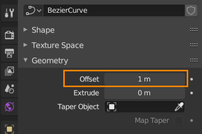
Small thing, but a Curve’s Offset default value is set to 1 instead of 0 when right clicking to Reset to Default Value. Pretty annoying to have to change it to 0 by hand.
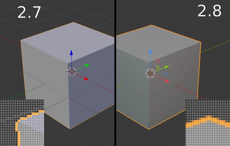
Small annoyance - 2.8 added all sorts of smoothing and anti-aliasing options to the viewport by default, and while i can disable most of them, any UI items that use the “Line Width” parameter are still too thick even with it set to “Thin”:
Here the outline width is set to 1px in the theme parameters, but in reality it’s drawn as 2px or more because of the smoothing. I just want to be able to set everything to look crisp like it did in 2.7…
To move an object to your first collection, you hit m 2, because you can also apparently move it to a scene collection.
But to then toggle the display of that collection, you hit 1.
So if you hit m7, 7 it won’t move an object, then take you to the collection on which that object resides. You have to hit m8, 7.
I thought I was capable of doing this (admittedly simple) math in my head every time I did something like this, which is often. It turns out, I am not capable.
In the render window there is a drop down where you can switch between “render layer” and “composite”.
If you switch from render layer to composite the drop down jumps to a different place.
This is because while in render layers there is the drop down for choosing the passes which is of course not there when switching to composite.
However, this behavior is annoying because often you want to quickly switch between render layers and composite for comparison and it makes it more difficult to hit the menu if it jumps.
So perhaps when switching to composite the drop down could simply be increased in size or something like that to make it stop jumping.
Oh, my god, I thought this was fixed, but apparently not (not even in 2.81a).
Someone new at Blender asked me why their model jumped to a different position after “parent with automatic weights”, and it took me some time to figure it out.
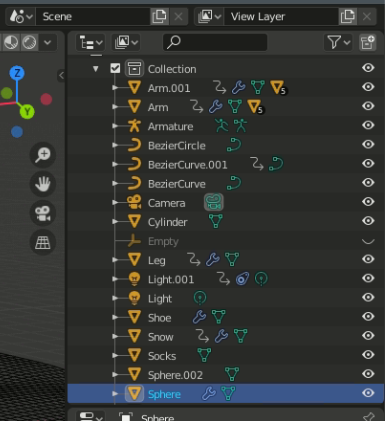
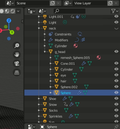
Can you see it?
No, you probably can’t, because it’s f-ing invisible by default!
You have to switch to a different view in order to see what the file structure truly looks like, which is utter insanity, especially to a new user.
Spoiler
Now, if you want to ruin the file structure logic with Collections all over the place, fine, go ahead and screw around however you like, but for the love of god, developers, don’t sabotage the understanding of Blender for new users who might not want/need Collections when they start out! It’s the advanced users who should suffer (because they know how to change that view), not the new ones!
PS. The fact that the model jumps at all should imo also be considered a bug.
In the 2.81 file browser if you are saving a file and you have a folder selected pressing enter saves the file instead of entering into the folder. This is different from expected behaviour (enter the folder) and limits how the folder trees can be navigated using keyboard. Expected behaviour in file browser is that when you have a folder selected and you press enter you enter into that folder and not perform file save action. I’d imagine the reason is that blender doesn’t check what is active. The file name text field or a folder selected in the file browser part of the ui.
This can happen when you create a new folder. You press the button, type your name and press enter. Then you press enter again to enter into that folder. Instead of entering that folder blender saves the file. argh!
Solution is to check what is selected when enter is pressed. If file name is selected then enter saves the file. If folder is selected then open that folder. If file other than .blend is selected and then enter pressed then blender does what it does now. (Use that file name and add .blend to the end.)