i don’t think that’s a good idea- it would be a distracting amount of visibility jitter. Not to mention, I often find myself working on a model and need to adjust the unit settings, or render samples, or world environment- why would I first need to deselect everything to make that change? it’s not necessary. trying to solve a potentially confusing area by adding additional confusion hardly seems intuitive
2 Likes
Why some buttons and checkboxes are now flickering when you click on them?
It used to be fine before. ![]()
1 Like
Looks like a glitchy “Hover States” (https://developer.blender.org/D6098).
When you working with some object you expect that property editor will show you properties and settings related to that selected object, not some unrelated stuff like render settings and output settings. I don’t see a problem deselecting object for getting into this global settings. Another approach would be to make dedicated settings window with all this global stuff like in any other 3d software.
1 Like
by extension, when working with a particular scene I expect to see properties and settings related to that scene.
I’m not quite understanding it yet. What I mean is that I see it every so often but not in a way that I can see what the “rule” is.
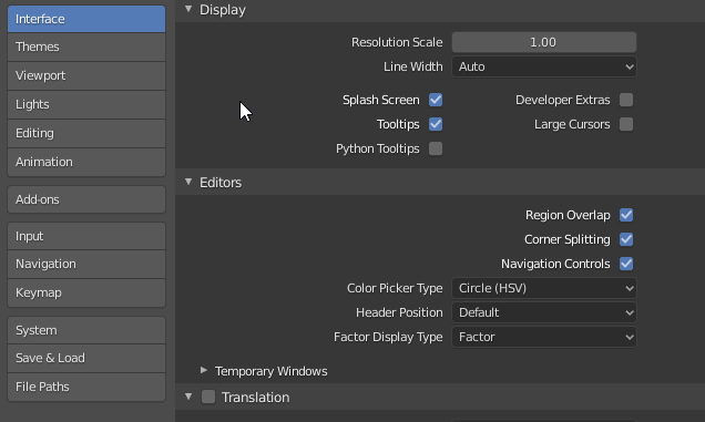
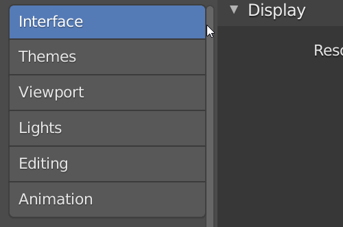
When I am playing around in Properties, as illustrated, if I move slowly and deliberately I will see no such flickering at all. But will see some if I move and click a bit faster. And yes, it seems like something to do with hover states. But…
If I slow things down a bit. And I select one menu item in there, like “Editing” - so it becomes highlighted in blue - but then leave my mouse in there. And then click again, repeatedly, at varying speeds, I will see some flickers. But since I have not moved out of the area of the one button no states have changed. A double-click always seems to result in a flickering. Longer clicks normally do not. Sometimes it happens on mouse release.
Does the above match with what you see?
The issue seem to be on the release of the click.
When you click and hold, you get that brighter “blue” highlight, but when you release the mouse it quickly shows the default “inner selected” blue color and then go back to the brighter “blue” highlight, hence the flickering.
All the button state coloring stuff is done in the same block of code, so hover and selected and all other states are dealt with together. But here this almost looks like there is an additional draw on mouse release that is not taking “hover” into account. Then the next draw does it properly. Something like that.
Also related, if you click and hold, then move your mouse (still hovering at the button), you’ll lose the hover state. It only comes back when you release the mouse…
2 Likes
That sure looks like exactly what I need to help figure it out. Thanks!
1 Like
Okay, the long story on that flicking issue…
My patch didn’t really create the problem, just exposed it. My patch didn’t do much at all really, but it did make it so more UI items are highlighted while hovering with the mouse.
One of those new things that shows a hover highlight are buttons that are already selected. That might seem unnecessary but does add some life. And comes in handy when we place buttons together that act as a group, like the Edit Mode buttons. Otherwise the “on” buttons become a little lifeless.
But it looks like we sometimes get out of sync with our flags for hover (UI_ACTIVE) and selected (UI_SELECT). So we can briefly have times when your mouse is over a selected item but the hover flag is not set correctly.
If I can’t figure this out then I will just revert that part that hovers selected items. This is an annoying but fairly trivial thing, so not something that can go in now as a critical bug. More like another “Harley made something look bad” issue. The project opens up again for patches on Jan 9th, but I am away getting some Sun from the 7th until 22nd. Hopefully I will figure this out soon and have a patch ready to go though.
But if I am underestimating how annoying this is, just let me know with a loud howl and I’ll see what I can do.
1 Like
When oh when will one of the best new 2.8x features finally get some much-needed love: Quick Favorites? It really speeds up workflow, but could be much more efficient if we’d only have some options to organize the lists.
I’d love to see:
- drag and drop list editing for custom arrangement
- separators
- alphabetical ordering
- separate saving of Quick Favorites, so it isn’t tied to the Preferences anymore
- quick favourite adding from the search dialog
5 Likes
I submitted a patch that will fix that UI flickering discussed earlier in this thread. Unfortunately, it does so by removing hover effect on selected items (the behavior before I changed it), but there doesn’t appear to be any other way to avoid that damn flickering.
Just downloaded 2.81a. I really dislike how the scrollbars disappear unless your mouse cursor is straight over them. For example in the outliner this is pretty user unfriendly if I want to collapse lots of collections and I have no idea where I am vertically on the outliner because the scrollbar is only visible when the mouse is over it. Fix here is to make the scrollbar visible at all times and preferrably make it clearer as well (less transparent). Why would ever want scrollbars to disappear? If this is not possible then is there a hack or something to at least make it less transparent and bigger without making the rest of the ui bigger?
It was also sad to learn that the file browser still doesn’t have basic stuff like auto-complete file paths. Having to type the full file path from memory has been outdated concept on windows at least 10 years and I don’t understand why this wasn’t added to the new file browser? Is it a patent issue or something?
Check out this patch…
2 Likes
That looks good, even though I’d prefer to have it at full opacity and thick all the time. 
1 Like
For sure, just trying to find some compromise between what we have now and what you’d find ideal.
At it’s widest it might able to be slightly wider - maybe a pixel or two - without needing other things to be shuffled around.
At its narrowest, it can’t easily get much narrower or it breaks, but could obviously be wider. I personally wouldn’t mind it a touch wider if it were also slightly dimmer. With some work I could probably also manage the reverse: making it a bit narrower but less dim.
But fun playing with.
1 Like
Personally I’d just want the scrollbars to be wider so it is easier to click them. I hate small icons and buttons because they just cause wrist pain because it takes more effort to click them. Same with the really narrow click zones with the ui splitters. The graphical width is fine but the actual click zone could be easily three times as wide.
2 Likes
I’ve got a patch that makes it at least twice as easy to hit the edges for resizing, splitting, etc. There is a chance of getting it in for 2.83.
5 Likes