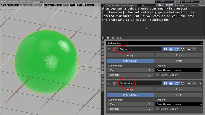
I have to disagree. I always want that to be set so I can pick up right where I left off when I open a file. If I have to go through and open all of the pertinent editors so I can start animating a rig, I’m going to be very very upset.
It really should though. Since there is absolutely no way to accurately place the center without going into edit mode, snapping the cursor to a selection (unfortunately I often have to create a new vertex to really have control here), exit edit mode, and snap the origin to the cursor. This is really a lot of steps especially for something that I have to do with probably about half of the objects I make. It would be nice if one or two of these steps could be shaved off.
I expanded upon that in this post: User Preferences > System has extraneous items - Proposal to change color picker and weight paint options UIs
The active-tool panels in the “UV Editing” and “Texture Paint” workspaces do not obey the region-overlap setting. Their panels are fully opaque.
i don’t know if it’s a paper cut, but i miss the option to have the move gizmo as the main tool. we have to move something all the time and it’s not so pratical keep pressing ''space" “g” or “g” x,y,z to move along an axis.
sorry for my english this community is making me struggle to write 
I use it to help view where some animations and/or meshes doesn’t import correctly when importing a game asset from UE4 and data-minded assets, sometimes I hit the X button and yeah completely closes Blender has OP mentioned.
Fixed in 2.80.31 it seems.
CTRL+Mouse scroll is the new way.
I was about to post my own posting of this also, I agree, few times I started making some models facing right, until I import a pre-made model of mine and it’s facing front on and realize.
I think “International fonts” should be renamed to something more convenient, maybe “Language”, with respective changes in the drop down menu, and move it to the “Interface” section, where i initially search for the language settings.
Just to clarify, as I wrote above I am aware of the quick fixes but was purposing an actual fix which would take a little more work but I still think its worth it.
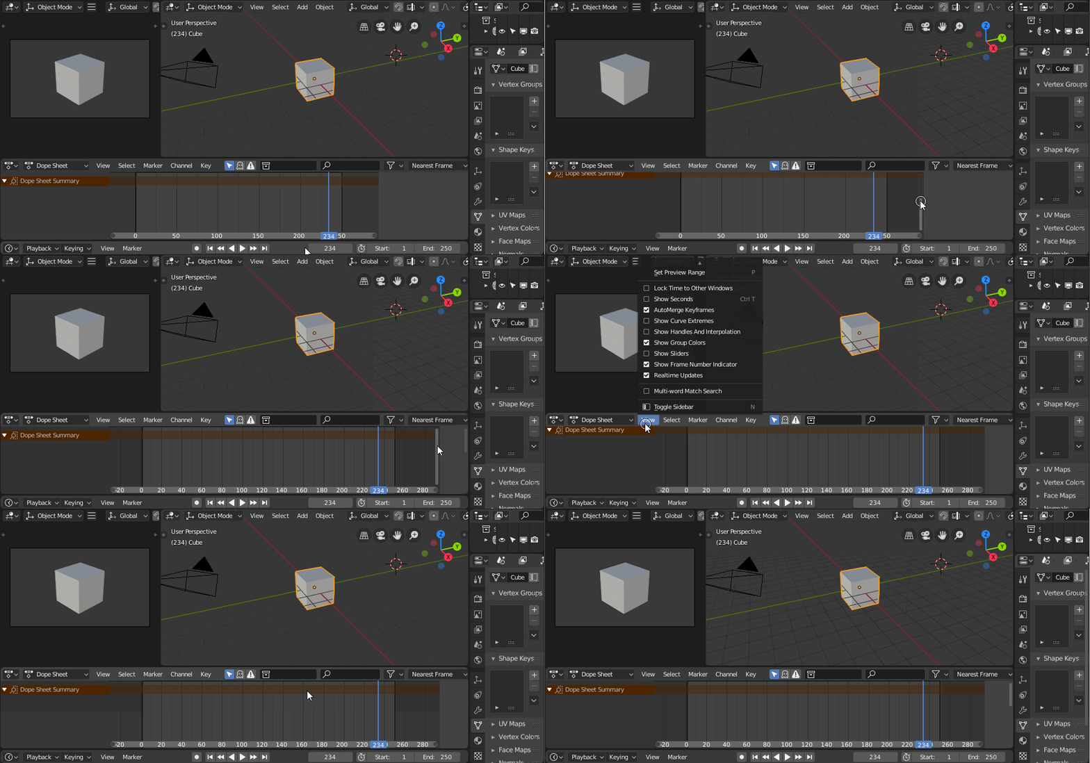
VSE: Strip properties overlap both horizontal and vertical scrollbars:
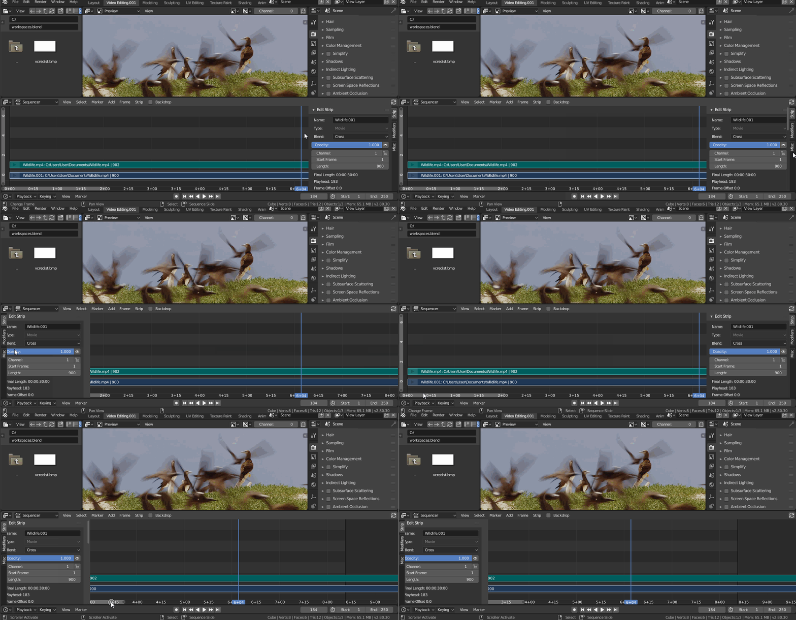
The dope sheet scrollbars for comparison:
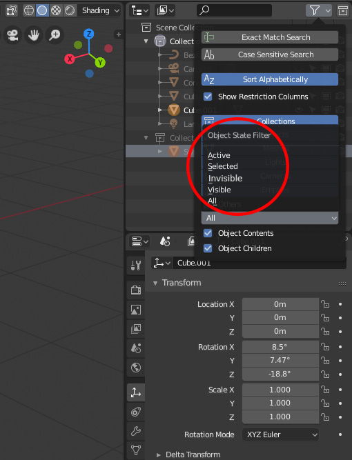
Outliner: Object State Filter for invisible objects!
With large scenes with 10000+ objects is very hard to find/select hidden objects without unhiding all and so to ruin the overall scene configuration.
One helpful feature would be to filter hidden/invisible objects in the outliner. I think if there is a visible search option, it is easy to integrate an invisible search option in the Object State Filter dialog!
I thought I’d create a papercut about this issue too when I found yours, regarding the space reservation in the outliner for the scrollbar.
I was the one patching the code to get that space for the vertical scrollbar.
https://developer.blender.org/D3650
Back then I’ve called for the space at the bottom too… but I’m too stupid to find it myself in the source where I need to be… Guess it needs a bit more than an offset here and there.
So yell there as well… 
You’re right. A better solution would be if we can reset just the UI arrangement to the startup file one, via a command, but that’s not a UI paper cut.
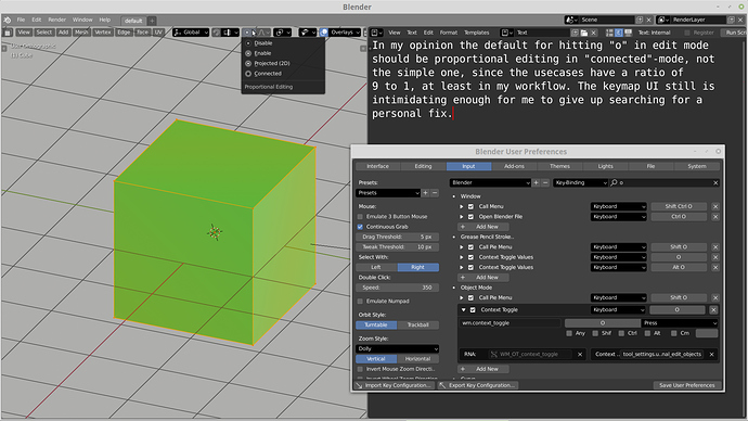
Proportional editing default should be connected. There’s little that this setting can’t do that the simple one can, so there are only a few occasions where “connected” is no good.
this thread is on fire! 
Visibility/selectability restrictions popover for Collections in 3D View allow for fast hiding all items with exception for the one that’s name was clicked. Brilliant, but there’s no easy and similar way to unhide all, despite the key shortcut. Maybe a double click could e used to bring back previous visibility setup? Objects visibility restriction popover should work the same way.
LMB select remarks
The content below was moved to appropriate topic: Left click select keymap
The left-click-select keymap lose grab’n’drag ability. LMB click’n’drag triggers Box Select no matter where or what is clicked. It should go like that:
- LMB click’n’drag within an object shilouette (Object mode) or a vertex/face/edge hotspot (Edit mode) = grab’n’drag
- LMB click’n’drag outside an object shilouette (Object mode) or a vertex/face/edge hotspot (Edit mode) = Box Select
- simple LMB click = remove all selection.
To be consistent the first default collection should be called Collection 1 because when creating a new collection is called Collection 2 by default.

