Alright, thanks for the quick reply!
When saving a file I click the file name field, take the right hand (and pen) off the tablet to type the filename and then press enter when I’m done typing. Often I end up with the mouse cursor in the System box (with the system folders) and pressing enter then focuses a system drive instead of saving the file which is annoying.
Honestly I don’t use the enter way of selecting/clicking things so I would like to be able to disable this across the entire software.
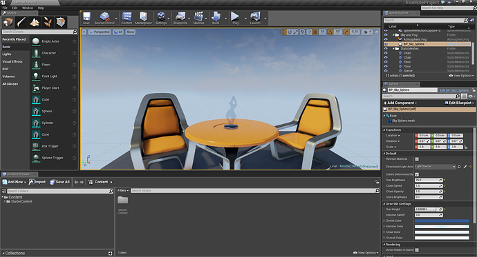
I’m not sure if this is planned, but wouldn’t it be better if the window buttons would be integrated in the topbar, like in the case of UE4 ?
The Windows 10 window topbar is big and white, not always fiting with the Blender’s theme.
Another option could be to have a smaller size topbar for the window settings, with themable colours. Or, just a bit of space that allows you to grab the window, for a borderless effect.
Another thing I find annoying is when dragging the header (with View Select Marker etc for the Dope Sheet for example) you drag the editor type dropdown too. So when you drag it to the right (because you’re using something to the right), then want to change to something else, you need to drag back to the left, choose the new one, do whatever, then when changing back to the dope sheet you need to scroll back again.
I would prefer a Type Editor dropdown button that was always fixed to the left and didn’t move with any dragging/scrolling of the contents.
I got a problem with font rendering where a lot of fonts draw ugly boxes instead of dots.
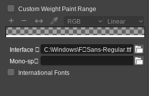
I did fix it at some point but never got around to submitting it. It’s just changing one line in the code.
— a/source/blender/editors/interface/interface_widgets.c
+++ b/source/blender/editors/interface/interface_widgets.c
@@ -1425,7 +1425,8 @@ float UI_text_clip_middle_ex(
        if ((okwidth > 0.0f) && (strwidth > okwidth)) {
                /* utf8 ellipsis '..', some compilers complain */
-               const char sep[] = {0xe2, 0x80, 0xA5, 0x0};
+               //const char sep[] = { 0xe2, 0x80, 0xA5, 0x0 };
+               const char sep[] = { '.', '.', 0x0 };
                const int sep_len = sizeof(sep) - 1;
                const float sep_strwidth = BLF_width(fstyle->uifont_id, sep, sep_len + 1);
                float parts_strwidth;
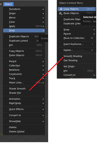
Another quick naming thing. Since Groups have been superseded by Collections
Ctrl + L Make Links > Group should probably be named to Make Links > Collections
Similar to how Shift + L Select Linked > Collections is already done.
I also see that in the Add menu Groups have been renamed to Collection Instances so in the Properties Window > Object > Duplication should also reflect that.
Similarly Ctrl + L Make Links > Dupligroup should also follow suit with Make Links > Collection Instance
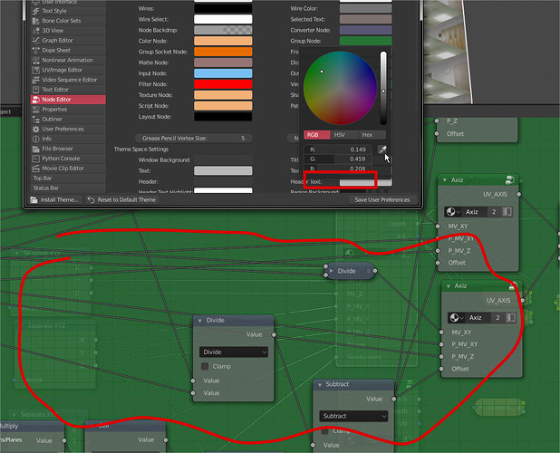
lack of alpha control for the group node background.
the transparency its not that bad but sometimes could be anoying or too confusing, especially like in this case where i didn’t do the node tree, to studying it its really annoying to have all the other nodes behind.
I mention the alpha value because me be situations where having the base node in the bg could be helpful
This seems to be happening for you because they are not actually using an ellipsis character for overflow, but a “two-dot leader” because its a little shorter. But the ellipsis character is far more likely to be supported in fonts than two-dot leader. And two dots in a row, or the two-dot leader, is not ellipsis. Probably done by someone who is typographically challenged. LOL
I’m new to Blender coming from Softimage and one annoying detail is even though blender allows using drag and drop to parent one object to another this feature doesnt work with multiple selections (selecting multiple objects and dragging them to another object to parent).
Should be something simple to implement and a time saver not having to know the shortcuts and confirming dialogs, specially if you are new to blender.
-
THIS: Angular snap needs to be decoupled from incremental snap Please for the love of god finally fix this.

-
Snapping should be per-editor, not global. If I want to snap my nodes to grid in material editor it doesn’t mean I want to snap my object to grid in my viewport as well.
-
Confirmation pop ups for actions such as delete should go away. In the second decade of 21st century, we finally have undo

-
When selecting multiple nodes in node editor and then click-dragging them to move them, it moves only single node under the cursor.
Yes, this is a significant one. It’s almost impossible to look at a grouped node graph without it appearing very confusing and busy.
This disables everything. So not good enough unfortunately.
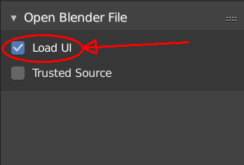
This is annoying. It should be off by default imo. I almost never want changes in my UI when loading a ,blend file.
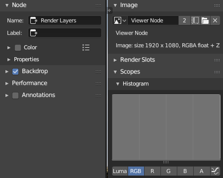
It’s really important to be able to see a histogram or other scopes while color correcting in the compositor, but they’re only available in the image editor. Because of how they’re stacked vertically, it’s really difficult to find a good layout for color correction that doesn’t waste a ton of space.
To improve this, the Scopes section should be found in the compositing sidebar as well and apply to the viewer node.
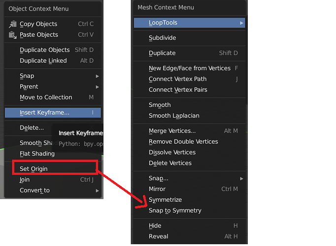
this too… set origin exists in object “W” menu but not mesh “W” menu would be useful to have it in both.
Set Origin doesn’t work in Edit Mode, so that cannot be added there.
yep didn’t know about that, also u can call set origin in the search box all of them don’t work excpet for “set geo to origin” so i thought it wasn’t fixed yet.
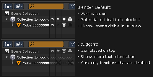
Outliner feels offended.
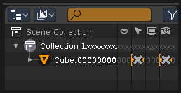
This one looks better.
