There is a bug reported last year, concerning the proportional editing connected not working properly in UV Editor, I don’t know how easy/hard it would be to fix it, but it might be part of a papercut. 
As well as every object created for the first time could be named Cube.001, it is playing with my OCD haha 
Edit : Well not every object should named Cube.001 of course, but more something like [NAME].001, instead of just having [NAME] and then start counting.
I also think that in the default theme the facedots size should be 4 or 5 instead of 3 by default.
Make Remove Double Vertices operator available to all mesh selection mode context menus.
Removing doubles is a staple operator and a frequently used cleanup and optimization tool.
In pre 2.8 one could remove doubles from any selection mode, Vertex, Edge, or Face by accessing the W > Specials menu .
Currently in 2.8 we now have the new and improved W > Mesh Context Menu, but Remove Double Vertices is only available while in Vertex selection mode. While this makes sense from an organizational point of view, in day to day usage it is probably more of an annoyance, forcing you to needlessly switch modes for such a common task, when it works well regardless of selection mode.
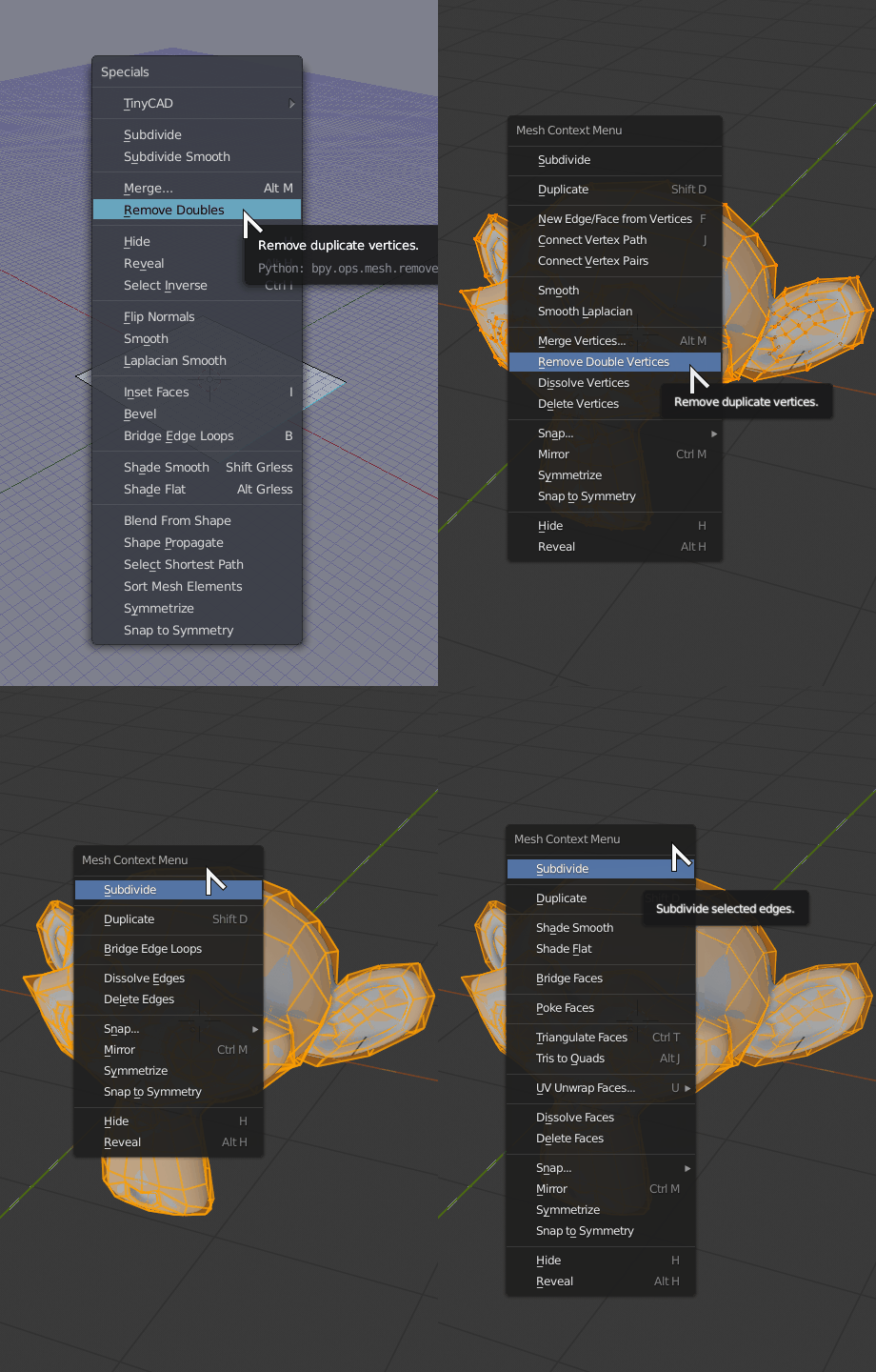
I think this fits well here since it is probably just a simple UI change of adding the entry to the menus.
I agree. But only for files 2.79 and previous Blender version.
I like the idea of streamlining this common workflow, but I disagree that the per-material refraction should go away. Sometimes, you do want to limit which materials receive SS refraction, especially if the refraction isn’t looking the way you want and you just need the material to appear clear or transmissive.
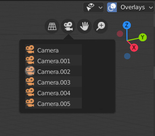
Make camera navigation widget list cameras in scene.
This probably not as simple UI task. Instead of switching immediately, the camera navigation widget could be made more versatile by becoming a popover and listing all cameras in scene.
Currently active one could be highlighted clicking any other would set it as active one.
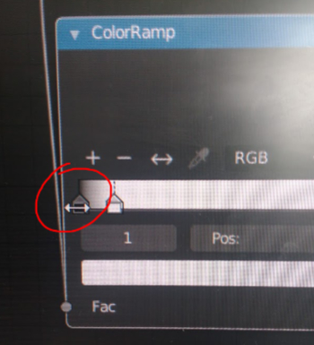
Very, very annoying, when trying to drag the black color slider, the cursor changes to Node resize mode, and resizes the node,…
I´d love to click on the black color handle and actually move the color handle.
Maybe a simple margin should solve this one!
I just use basic nodes setups and I’m not an expert, all the color selectors in the nodes and materials have an alpha input and I think that aren’t used, the difuse, the principle, emision etc. Will be better to remove that if it isn’t used .
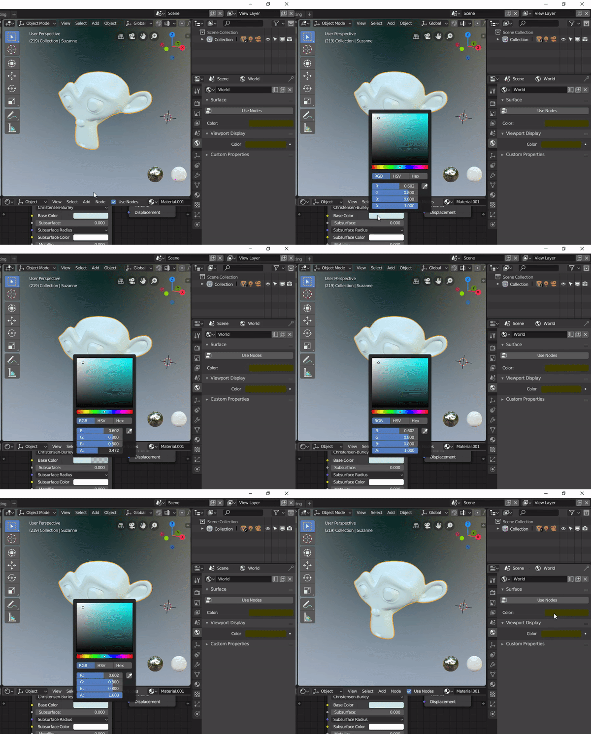
Empty / Image / Transparency I think it should be Opacity, since with value 1 it is completely opaque, and zero is transparent.
If you name your collection “Collection 1” and save it as a startup file, it will start next time with “Collection 1” instead of “Collection”.
The Extrude function is composed of two functions, on the one hand it generates new faces and on the other hand it moves them. When performing Undo you need to perform two to completely reverse the action, otherwise the new faces do not disappear.
The Inset function is very similar, but it is executed in a single stroke.
I think both should work the same way, in my opinion executing only one action. Just as there are Rip vertices and extend, there should be Rip faces and extend (Alt + D) to duplicate the faces and keep them pasted.
Viewport current view plane lock (orbit/view rotation lock toggle)
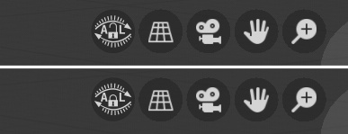
In case i’m doing 2D modeling/layout and i have to push some vertices on one (view) plane then shift (pan) the view, and then push some more vertices on the same (view) plane, i can accidentally tilt the view when i release shift key before stopping mouse move + mmb or when i place my finger on CapsLock and start mouse move + mmb (shift + mmb = pan and just mmb= view rotate by default, great for 3D, not always so great if i want to lock myself in 2D for certain work ), and if change in view is insignificant to notice at first i end up with half of vertices slightly misaligned, i realize that after extrusion and inspection in all dimensions, then i have to go tweek it and i get annoyed ![]() . My idea is to add one more icon to top right viewport corner
. My idea is to add one more icon to top right viewport corner
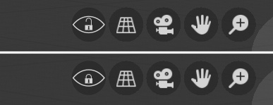
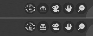
or add keyboard shortcut to quickly toggle orbit/view rotation lock
BTW. I’m aware of axis lock, but if i know i’m gonna do a lot of 2D straight, extra dimension is annoying, and pressing g + shift + z is extra step, repeating that for every operation is time consuming, it is better to lock orbit/view rotation, press g move, apply, pan and so on…
Update:
Add option to enable/disable autolock for main views (left, right, front, back, top, bottom) - thanks Remake @ blender.community for this idea. Updated concept icons for visual feedback in case of autolock is on.
Just to support your proposal. As I find the same thing very annoying too when pulling noodles out from nodes.
Please fix the Proportional Editing hotkey inconsistency between 3D and UV editors:
In the 3D view:
O enable proportional editing
alt O enable proportional editing with connected components
ctrl O open file
In the UV/Image editor:
O enable proportional editing
alt O open file ← This one, right here, WHY???
ctrl O open file
For some reason there is a redundant hotkey for opening files, that replaces a needed hotkey.
Please switch ‘alt O’ in the UV/Image editor to enable proportional editing with connected components.
While we’re at it ‘UV Edit’ mode should be default again in the UV / Image editor instead of ‘View’ mode. 
I agree this is bad, but the reason why it works this way is to distinguish between Ctrl/Cmd O for opening your Blender file vs Alt O for opening an image inside the Image Editor.
We could make a different tradeoff where Ctrl/Cmd O opens an image while in the Image Editor, but then that would be inconsistent. Ctrl/Cmd O opens Blender files in all other contexts.
On the other point, of course, the Image Editor should be set to UV in the UV workspace.
Oh, I missed the difference between ‘open .blend files’, and ‘open image files’. At least that makes more sense than a completely redundant hotkey.
This would obviously take more work; but what if the ‘open .blend files’, and ‘open image files’ windows were merged; it should know what to do depending on the type of file you select. Then they could both be ctrl O.
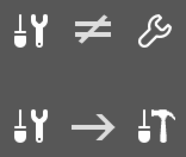
The tool settings icon should not have a wrench in it.
The modifiers tab already uses a wrench and this can cause confusion among new users.
Imagine teaching someone how to use Blender and this happens:
Teacher: “Click on the modifiers tab in the properties panel, it’s the one that looks like a wrench!”
New students will undoubtedly think they’ve found the correct tab when they see the tool settings icon.
The image I’ve posted here is not meant to be a perfect replacement, it’s just a suggestion for a more unique icon.

