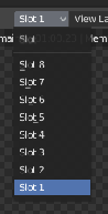
Render slots are listed from 8 to 1 instead of 1 to 8. When the list is top-down, it should go from 1 to 8.
At the very least, going from 1 to 8 would make the first few render slots closer to the mouse pointer, but in my opinion, reading top to bottom is more natural for a list or passage.
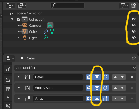
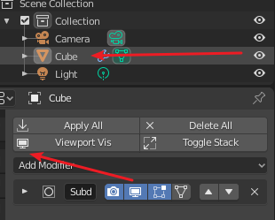
Can someone point out to me why the eye icon for modifiers had to change?
I found out that there are new icons for global (monitor) and local (eye), but where is the difference and especially why is it necessary for modifiers?
My point is, its confusing that the Outliner highlights the eye symbol and on the other hand the modifiers are using the monitor (which isnt as selfexplanatory). Since there seems to be no conflict between local or global, why not use the eye like in 2.7 for the modifier section?
Btw I like it very much that we have the option to manage whats visible in the outliner.
There was a long discussion about those icons, the difference is that local visibility affects only the object itself, while the global one also affects linked objects and instances within the same blend file. That’s why the modifiers have the monitor icon, their visibility is global.
That said, it is indeed a bit confusing imo, but it’s a compromise, at least for 2.80 I guess.
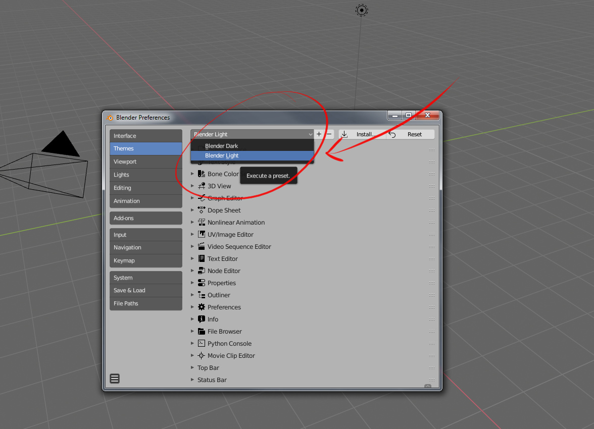
The black on…lighter-black is litteraly head ache inducing. Where as 2.78 is change-able to bright and colorful. Right now I have to guess what does what
The 3D cursor or something related to it makes it so as simply clicking on a object or placing stuff is a mess. For example yesterday while working on something I needed to trace part of a picture I had put in as a refrence. First the line to make a simple trace doesn’t stand out because those are black and right now the grid for the bottom is…also grey. That made it total guess work to where the drawing line (bazie in this case) was in part because the 3d cursor, placing things and all that related stuff makes no sense.
Compare that to tinkercad or 3ds max (for example) and they stand out much better with collorfull cheerful highlights that are easy to see.
Lastly it’s way to easy for what ever you make to get lost. is their an reason their a reason the grid you get when first starting a new project isn’t “bottom” and hard so as you don’t accidentally loose things and also give it a beep sound when to try to go under it?
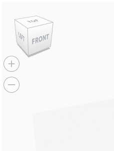
On top of that: AutoCad does one thing pretty well tinkercad (for example again) their’s a nice cube in the corner it says top botom right left etc. like this would make it a lot less of a learning curve and more fun to work with blender
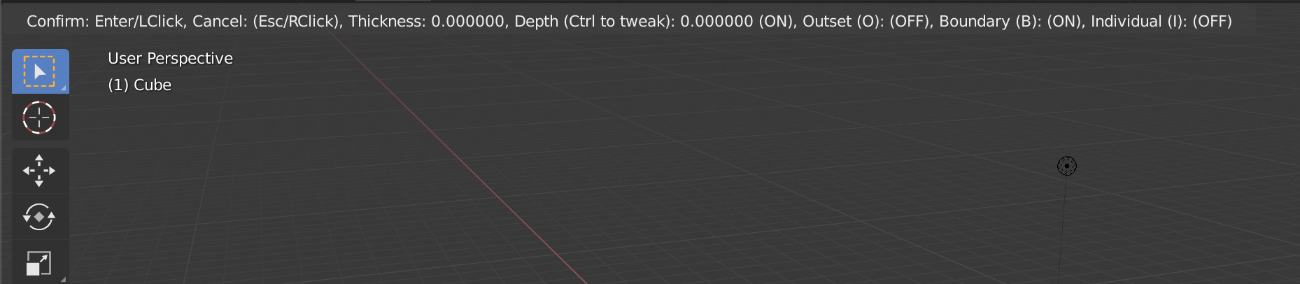
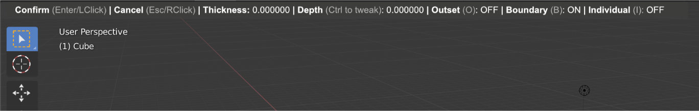
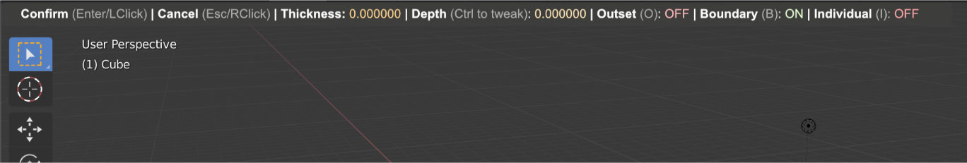
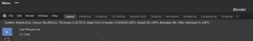
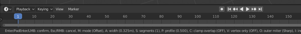
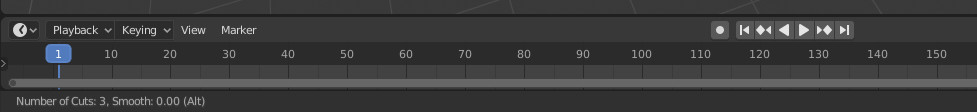
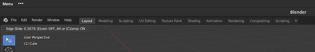
More than that, when one uses loop cut and slide operator, the info is placed at bottom till number of cuts is set but then sliding edges mode pops in and operator info jumps to the top.
That^ Adobe photoshop has a setting for colorfullness. I don’t like adobe’s black on black nonsense either. It can be changed from a light black on a dark matte black by way of a setting that says light or dark theming
Either way a light grey on a flat black background ground brown text doesn’t make sense.
.
Compared to the horizontal version, vertical version advantages may be that there is more space available for many more items and it is clearer to understand due to the clear separation between items. As a disadvantage, it occupies a lot of vertical space in viewport and it can be intrusive with elements of your scene.
Just mentioning this, I do not have a position taken on which version I prefer.
can we get this this function but with cylinders and circles so as to be able to see radius and diameter for the working object as though it was a square.
it would help allot for people like me in the 3d printing world mixing cad and blender.
also i noticed a small problem using scale and the keypad.
in object mode if i scale a square and press left keypad it scales up in tiny increments and if i press downkey it scales down
if i scale a cylinder they both scale down but in different amounts of increments.
seems a bit odd
im unsure as to why left isnt used to scale down and right to scale up and up down keys used for larger increments.