I know you quoted me while probably talking in a more general manner, but I have not seen any harassment on this forum. Everyone seems to have great feedback, although there is some conflicting opinions. Heated discussion is not harassment. “Kill your darlings” is a saying commonly used in any creative field. It means you have to have thick skin and don’t feel harassed when someone tells you what you are doing isn’t good.
Blender seems to have more money than ever before, so I think it is a great idea to dedicate a person to this thread (and the new sub-forum) full time for a few months. “Death by a 1000 cuts” is also a saying and if someone could create new tasks for most of them (just sort the thread by hearts), I think the result could be amazing.
Plus, all bug reports with even the slightest hints of usability issues immediately gets closed, so this is the only venue Blender users have!
…or they are a small team who can’t fix every thing that every person sees as a papercut. Also, developers can often see how a request may conflict with other functionality or otherwise not fit into the bigger picture in a way that a casual user may not.
I don’t know which default you are referring to, but sometimes certain changes have unintended consequences. For example, the default animation playback was set to AV Sync, which does make much more sense in many cases, but this setting has issues with physics caching.
At that point the issue is then not really a small issue that takes a short time to fix, but requires bigger changes to caching.
The way the setup works, is that people can mention issues, and then the module owners can collect those issues in order to fix them.
The module owners pick the ones with the highest priority, which is why things like losing data via unsaved changes has been tackled.
Sometimes, there may not be agreement on a design, be it technical design, or UI design or similar, which has different tradeoffs.
In that case the module owners evaluate the various options and make a decision, so that progress can be made. Obviously, not everyone might agree, but at a certain point someone has to decide, while keeping the big picture in mind.
Things like left click select, some of the hotkey changes, and many others had users with very strong opinions on both sides, but still, something was decided as the default, based on looking at the various options.
So, you give me the reason. Like i told, by experience, if something is not implemented and without answer we must to assume that it was rejected. That devs take decisions internally without warning the user.
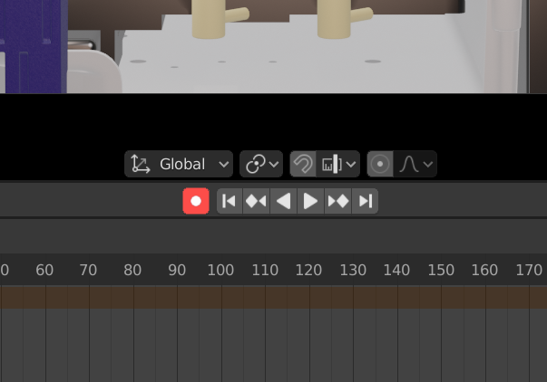
I hope we can make the record keyframes button stand out a bit more from the rest of UI, my hope is that it’s a red color when on. I think this both better makes it obvious it’s on and reflects the long standing idea that red = recording
(I’m personally pushing for this because using 2.8 for a while I’ve found I often miss the fact I’m recording keyframes and mess up animations as a result, I’m in favor of any tweaks that makes it more obvious keyframes are being recorded)
That would indeed be nice, but isn’t easy with the current way the themes work. All UI widgets of the same type share the same theme.
It’s one of the things that would be easier if the themes were more like cascading style sheets, but currently they just aren’t.
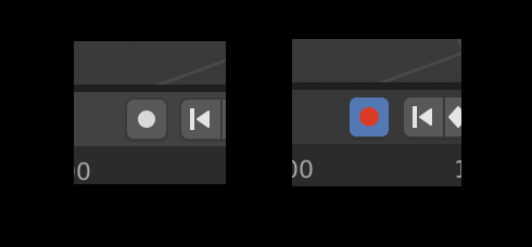
An easier way would be to add an icon category, or just use the Shading category, which would by default make the record button red - although it would be nice if it was only red when recording (could be done by adding a separate icon in the icon sheet).
But, at least in the default theme, the red and the blue would probably clash and look rather odd:
As you can see, this doesn’t look too great - it would require more changes to how themes work.
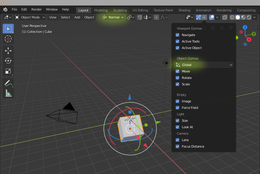
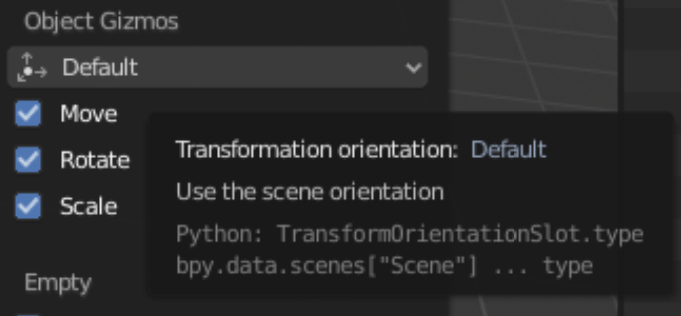
In the screenshot above I find really confusing the Gizmo menu in the popover: it basically overrides the transform orientation; not only for the permanent gizmos that you can enable in that popover, but also for the tools gizmos and also for G R S shortcuts!
It seems to me redundant and confusing to have it. Please remove it or make its use understandable
I’m having the same thoughts as BagelCo above - this button really doesn’t stand out enough. I understand the technical reasons behind it, but couldn’t we come up with an ad-hoc solution until the theming system supports more granular color palettes ? As far as I understand, the ‘pressed button’ color comes from ‘inner_selected’ from the ‘regular’ interface element (not sure why it’s called that way, since it’s a kind of toggle) - adding a new button category especially for the autokey button sounds like overkill but it would solve the issue in the short term. White on red would do it for me, as long as it’s visible… or we could convert it to a decorator instead, and have it change to an icon that’s part of the ‘red’ category like you suggested - then we wouldn’t have the ‘red-on-blue’ problem (agreed it’s ugly).
Yes of course it will. I know.
Yet so, what is the use for it? Isn’t it a duplicated feature? Doesn’t it bypass/override the one in the header? Is there some useful use case that I can’t somehow see?
Yes that may be the reason, but I still think it is not very clear to the user, and I’d say that should be the other way around: the header should override the popover, because as it is now while working the popover is closed and the only visible UI elements are the gizmo and the transform orientation that (might) don’t match!
Yeah I dunno but that’s what I imagine the intent is. Like basically everything you have to play around to figure it out. Something is going to be confusing to people and if they can wrap their head around 3d in general they’ll be used to winging it a little bit to get their bearings
By the way it is really nice to know that you guys are more or less done tweaking the ui. Makes any customization I do a little more stable, rather than wondering for the next couple months if there are going to be any drastic changes.
I guess the next thing is not considered a bug in 2.8 because it works the same way in 2.7x.
In Screw modifier, “Angle” slider does not show decimal part starting from 10º. So when you click on arrows to the extremes to increase/decrease, it could become confusing when not noticing changes in field when clicking.
The same for Simple Deform modifier starting from 100º.
Edit:
Well, I think the problem could also be present in many other places in Blender where angle settings are available.