these tooltips should be expanded to indicate different edititing modes like Automerging, X mirror, Proportional editing when this options are turned on. The text should be centered on top.
As for the other tooltips, Horizontal display , all the way
these tooltips should be expanded to indicate different edititing modes like Automerging, X mirror, Proportional editing when this options are turned on. The text should be centered on top.
As for the other tooltips, Horizontal display , all the way
as long as i could eventually see the diameter of a circle or cylinder im happy with that.
the horizontal is much better and with bold text i think we can even reduce the size of it which makes it less intrusive.
In reality actual layout have a lot of inconsistency, you can reduce a fe the space only with it.
About the operation info:
Anyone thought about placing it in the lower-left? It wouldn’t block the header, and it makes sense because the ‘modify last operation’ window also appears there. 
Hopefully they do add more…personally I like the Elysium Flat theme I think it’s called it’s kind of cartoony in a way that I like.
I still think it should it’d help to make also make how bright and light and the over all pop and colofulnes a slider adjustment. That way it can be fine tuned to taste better. Though why on earth the dark theme is even a thing I know not and is a mystery in of itself.
Right now t’s possible to turn off “Edges” in the Overlays popover, so the Vertex Selection Mode doesn’t highlight the edge between two selected vertices, yet it still draws selected edges when one changes the Selection Mode to Edge Mode. That’s fine. That’s good and predictable.
But the same scenario doesn’t apply to “Faces” in the mentioned popover. Faces are still highlighted when all polygon’s vertices or edges are selected. That’s inconsistent.
Hi, I am not a developer therefore I don’t understand Blender’s code much nor the whole development structure (tasks etc.) so I am asking here.
Several months ago I created this papercut:
As a response a task has been made: https://developer.blender.org/T58072 .
After a while this task has been marked as resolved and the issue has been transfered to this commit: https://developer.blender.org/rBdec9e34361b4ca0c3b90926f753477944818f80a (I hope I am using OK terminology here).
Is this commit included in the latest Blender builds and the whole problem considered fixed? Or is it still unresolved waiting for someone to do the work? I guess the latter. Because it still doesn’t work correctly (there has been an improvement though).
I would like to give a feedback in case it is considered fixed but like I said I don’t orient well in this development structure of tasks, commits etc.
Thank you.
I imagine something similar for the Statistics in the bottom right corner. Using a tad more formated text with bits of color will make better visible the number of faces, vertices and memoray usage etc. Can you make a mockup and a suggestion for this too !
an alternative solution is to use icons istead of text there that will make the thing more compact and arguably even more readable, icons for faces, eddges, etc.
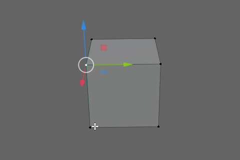
Yes, now you can drag inside the center circle to transform - you don’t have to drag from the circle perimeter itself. So that specific issue has been addressed.
I don’t think taht icons will solve nothing, maybe the contrary in this case.
why is that ? I was talking about statistic info. Users are very familiar with he icons for faces, edges, vertices. this will create some visual separation instead of a single chain of plain text and numbers. Plus the statistics will take a lot less horizontal space this way. By doing this other usefull info could be added there.
I think that viewport with more icons is bad. Text is less intrusive.
the statistics are on the bottom bar not in the viewport. I also agree that other icons overlayed on the viewport would be kinda more intrusive than text since usually icons there are associated with viewport controls instead of infos. This is not the case.
In today’s Blender today (https://www.youtube.com/watch?v=IJ8iMb9WBKo), there was a showcase of change of timeline scrubbing with Pablo saying there was no good way of having ability to scrub timeline now that there’s RMB context menu.
Why? You have implemented click and click-drag action differentiation. Just use it!
You can easily have context menu mapped to RMB “click” and timeline scrub to RMB “click-drag”, and both will work. Why don’t you use features you spent time implementing?
Because the timeline can already be scrubbed from the playhead?
That’s not the point jesus… The point in that video was specifically about being able to scrub large timeline window from anywhere…
My only concern with that might be when using a graphics tablet (important due to grease pencil). It can be difficult to hold your hand perfectly steady when pressing buttons on the pen, thus executing the wrong thing. I’d have to try it to be sure, though.
As it stands there is four ways to do it, so I don’t know that it’s really a problem that will affect most users:
Thanks for reply.
Unfortunately it is still not completely fixed. At certain angles if a beginning of an axis happens to be inside the circle the axis takes priority. See the video:
blender 28beta Win64 y2019-m05-d25 caf52e3779a9
Should I post this feedback here: https://developer.blender.org/T58072 or here: https://developer.blender.org/rBdec9e34361b4ca0c3b90926f753477944818f80a ?
That is an issue, but a different and separate thing.
Inside the circle, priority should always go to to the circle and not the axis handles, yes.