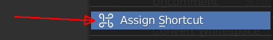
What’s that symbol next to Assign Shortcut?
Weird stuff.
What’s that symbol next to Assign Shortcut?
Weird stuff.
It’s a symbol of “command” in the world of Cupertino fruit-growers.
Ok, then it shouldn’t be visible on Windows machines.
That symbol is really weird, I’m sure it has a hidden meaning behind it. Hahaha.
It’s a looped square symbol: https://en.wikipedia.org/wiki/Looped_square
It has viking roots and means ‘point of interest’. It’s also used by Apple for the Command (⌘) key.
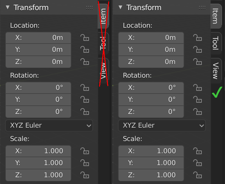
Usually when vertical tabs are located on the right side of a window, the text of the tab is placed to be read from top to bottom. Currently it’s the other way around, as if it was on the left side.
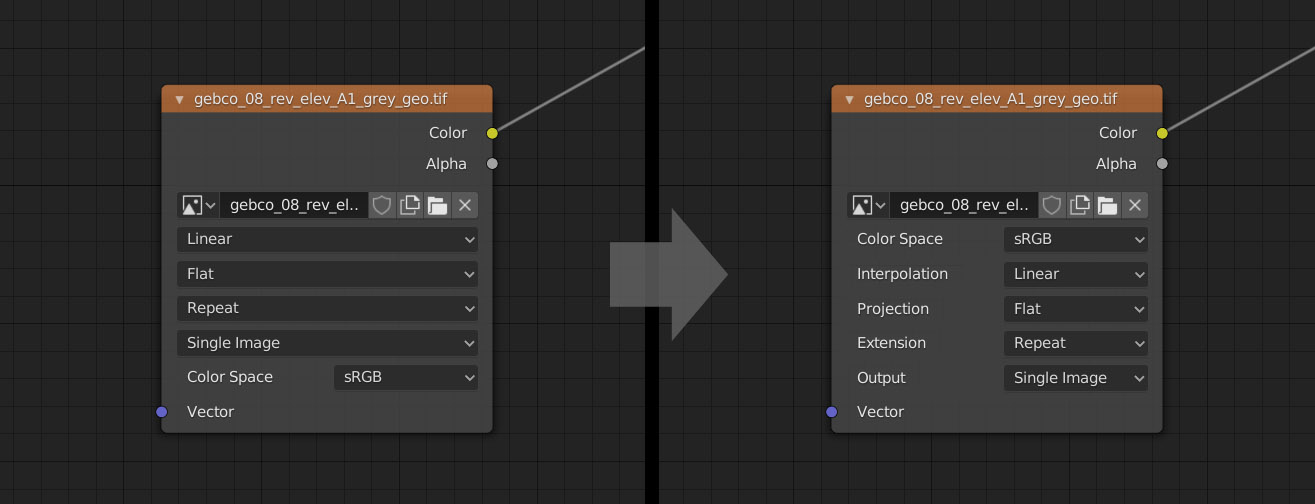
What about making it more clear what those drop-down menus represent?
Flat what? You have to click on it to understand it’s about Projection.
Linear could stand for a color space and/or interpolation.
I think we can do better than that.
Instead of clicking on it to see what it means we could tidy it up like so.
What do you think?
That symbol definitely means “Command” to Apple users, but I don’t think anyone would think it also means “Assign Shortcut”. Shouldn’t the icon on the menu be a curved arrow, or a finger or something?
Looks like it’s fixed!
Using 2.8 I find myself many times expecting Blender’s UI work similar to Photoshop’s.
But that one is polished for decades now in the same principles so they have a lot to catch up to.
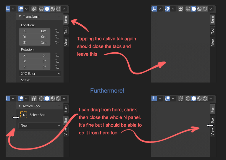
One particular thing is tapping on tabs in the N panel. I tap on them many times expecting this:
This would also be handy for tablet users
The other idea is not a paper-cut but because it’s related I’d like to post it here.
I hope it still lands in the right person’s brain. 
Again it’s a PS paradigm that every panel is movable and dockable anywhere. AND I JUST LOVE THAT.
And it’s super-complementary to Blender’s ideology with one key difference:
Blender treats the different panel structures as islands. Bars, panels and editors are not interchangeable.
Forget bars, that’s limited in PS too, but would solutions like this be from the devil?
They could be dragged and duplicated to the N panel freely.
(I used the scene icon for the View tab and dragged in the Shader options as an example.)
Also they could be removed from where we feel they are duplicate and wouldn’t be used.
Now this is what I’d call customizability!
Only issue with that, is that then addons need to always supply an icon if they want to add their own category. Technically I would think it should be simple enough - @ideasman42 ?
Custom icons for addons are not needed. Just take closer look at my mockup - first two letters of addon’s name if no icon provided (or first letters of words making up the add-on’s name). This could be suplemented with random colouring of letters / icons.
Could be great, i made that proposal a lot of times since 2.79
Also the solution with first letters of addons without icons
You can’t replace all the text with icons. Sometimes text is just easier to understand.
I agree with you. This is overkill, blender is not a mobile app.
You should replace the categorical statement “you can not” with the words “you should not”.
When? I don’t remember any example where a text is easy to find in vertical between 15 elements than a icon
I didn’t say find. I said understand.
Use case is important.