Other about tool settings options, now is clear, so, why not?
and My favorite
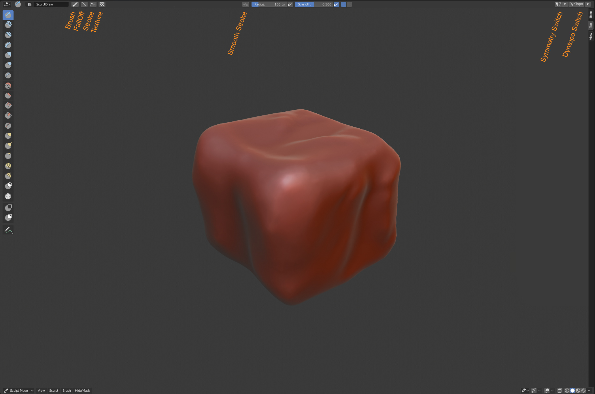
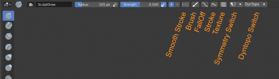
The idea behind this is allow to access by popover to all panels, but also allow have some important switches like symmetry, smooth stroke near to the user.
Other about tool settings options, now is clear, so, why not?
and My favorite
The idea behind this is allow to access by popover to all panels, but also allow have some important switches like symmetry, smooth stroke near to the user.
When using Duplicate/Extrude to cursor in edit mode, and Blender’s selection mode is in (tweak) Select, if you click too close to another unselected component, Blender decides to pick it and duplicate/extrudes from that newly selected component. When in Lasso or Box select mode this doesn’t happen. However, Its a bit cumbersome when retopologizing something to have to keep switching between selection modes - using (tweak) Select mode while Duplicate/Extruding to cursor is best since its quick to grab newly created components.
Is this a bug?
Also, is there an option to adjust the radius/threshold which Blender uses to select an object or component when in (tweak) Select mode? This also affects the uv editor.
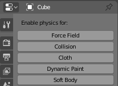
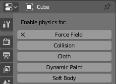
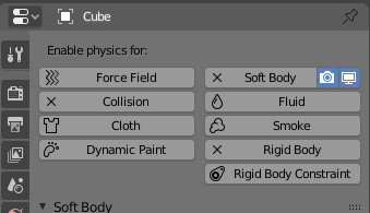
Text not fully centered in those buttons…
Adding/Removing Collection to View layer:
Is a little complicated
Should be better.
When an object/collection has a hidden child, we cannot notice it when the children are folded.
I noticed that as well: it’s centered in the space not taking into account the X that appears when you activate a button. How could this be adjusted?
Maybe get rid of the X and make those buttons behave like this type of buttons that stays highlighted when activated:
![]()
Yes, I thought that too, but then when the user wants to delete a simulation there would be no X, which is a more consistent symbol to tell you’re deleting something.
Maybe the whole thing should be more like modifiers’ UI?
That’s because there’s a blank icon assigned when the button is inactive.
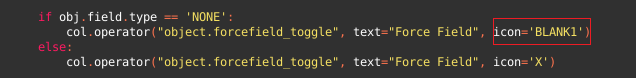
If you remove it they get centred, the only problem is that when you click them the text will shift a bit on the right, I guess this would still be better than the current behaviour.
Or, we could do as in 2.7 and have the icons change to the X while the button is enabled
@pablovazquez is there a reason why this haven’t been done yet? I noticed that the correct icons were already defined in the operators, but overridden by the blank one .
That looks like the lowest - and best - hanging fruit
Hey, with the tabbed ‘N’ panel in the 3dview now, the tab area background runs all the way down and is currently almost opaque, which eats a chunk out of the usable 3dview when the N panel is open. Could we make this more (maybe completely) transparent?
Current example of the dark bar running down below the view tab:
Please take a look at my proposal related to making transparent that N-panel tab bar: N-Panel proposal and Pool
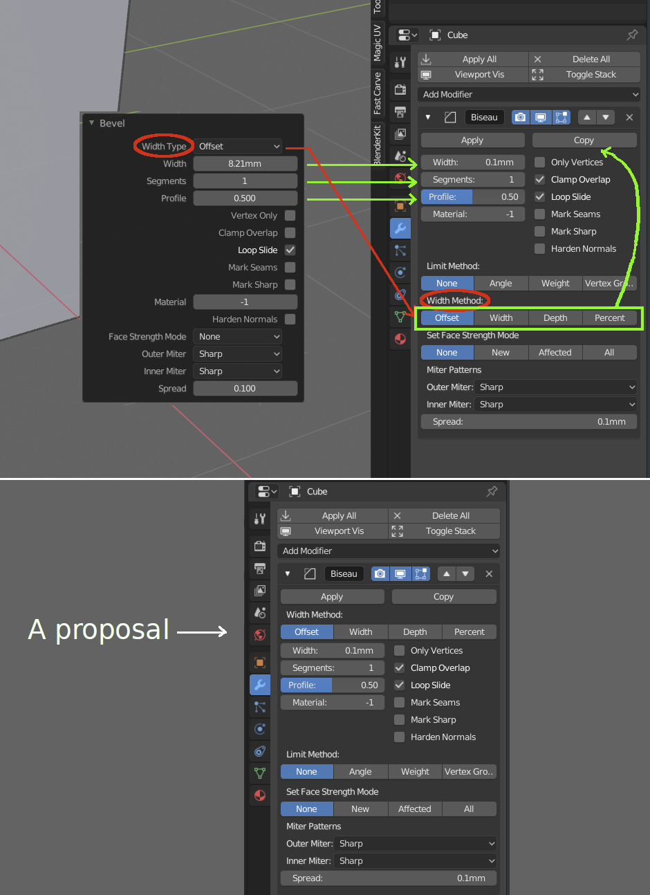
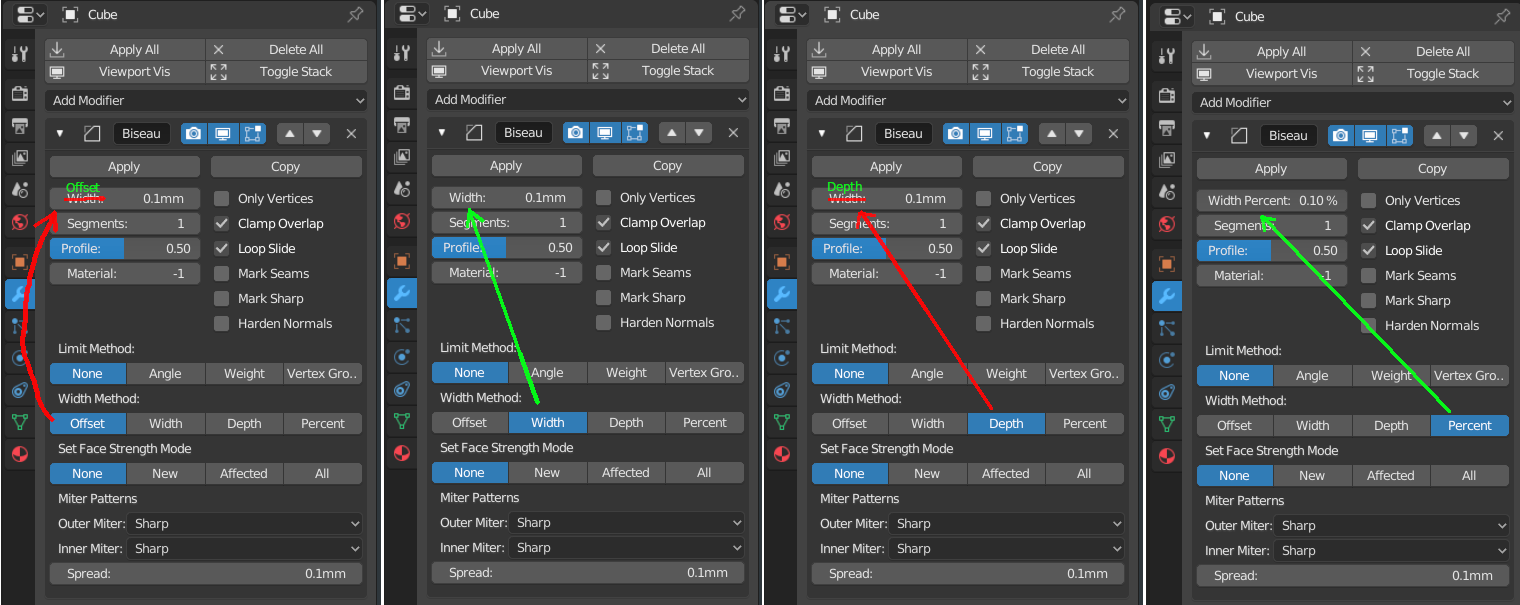
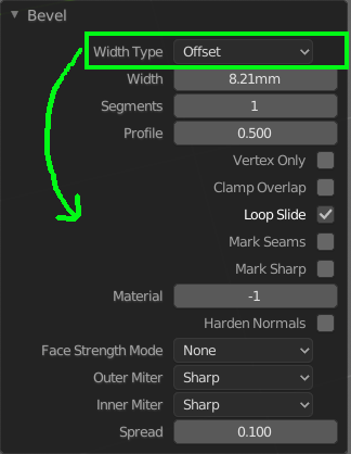
After playing with the bevel tool (Ctrl B), I wanted to try the bevel modifier and was surprised by the location of the options:
With the bevel modifier, I wanted to change the width type in the box value named “Width”: impossible. Off course, the selection is 7 lines below.
So a proposal for change below:
A other proposal, like that:
Or a mix or anything else to have more consistency in the location of the options between the bevel tool and the bevel modifier.
I’m the Bevel developer.
Yeah, I can see the point.
One downside I see to the proposal to move the method choice up is that I suspect it is a very rarely used option (readers: correct me if I’m wrong). It feels like the things that change most often (the amount, the # of segments) should be the easiest to find and the least subject to being something you have to scroll to see.
Your second point would be to make the order in the tool redo panel and the modifier more consistent. I can see that too.
When joining two objects which are already unwrapped, Blender seems to add names to UV maps and then only display one of them, with no apparent options on how to merge/show both:
Howard, would you like that I made a mockup for this bevel modifier and normals panels?
Or, in the bevel tool pop-up (?), drop the “Width Type” option, to have a match with the bevel modifier, even if the options are arranged differently between the bevel tool (Ctrl B) and the bevel modifier.
And the same name: Widht Type or Widht Method… or anything else.
Thank a lot for the great job.
Man, those buttons are just too small for that.
What’s the point?
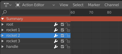
Tiny visual snag - the Dope Sheet Summary in the source list is one pixel taller than in the sheet itself: