I agree to that in many points @eobet. Don’t get me wrong here. Just like you I think blender has to gain ground in many aspects to make it more userfriendly and easier to grasp. Many settings are splattered across or “hidden” within the gui in unexpected places, or simply are designed too complex.
But I can hardly see that we are getting heard here at all, it’s very frustrating.
Once again, AutoBake mode that supervises visibility flag changes might be a really good idea to ease that problem.
I just disagree that a user, new or not, will be unable to differentiate between two icons in the outliner, one for hide in viewport and another hide in render.
New user aren’t dumb, they are just new, very often they even aren’t new to the subject, just to the tool, so if both icons were there by default, and if the BakeButton would be titled “Bake Rendering to Cubemap” then everybody would get it. I don’t understand why you are laughing about both visibilitiy options being visible, C4D has also both render and viewport settings available directly and is an extremely userfriendly tool.
I totally agree with your statement to make things easier by default and put complexity to optional tweaks, it’s just unspecific. And by changing the hide in viewport to something that changes also rendervisibility, I don’t think we were on the road to make things easier.
Instead “Hide in Viewport” should no longer be the default icon, but another new “Deactivate” icon that unifies all submodes for hiding and greys them out (“Hide in Viewport”,“Disable in Viewport”, “Disable in Render”, “Selectable”) to signalize they are controlled indirectly. Or perhaps a system of tristate icons like C4D has is even better.
But there have to stay indiviual visibility settings for viewport and render. And then the render cubemap problem will also stay. The Autobaking has to be deactivatable for performance reasons and a user will at some point be confronted the first time with a cubemap not fitting the viewport display or the render result is wrong.
But enough of that, take a look at this guy. Quite fitting too. He’s no newbie at all, just new to blender:
I made a few of those videos myself, and most of it is actually fixed now (just a hair under a year later, and a few more things is coming in 2.81), which is great progress!
Let’s hope his issues get fixed too. I heard Blender has a dedicated UI developer now (although I don’t know who it is and if they were mentioned in the Blender conference, I must have missed it).
I’d like to make a suggestion for alignment in all drop down panels more specifically the alignment of the text for groupings, within Panels/Drop Downs
I’m assuming the Text Indentation was a design decision to aid in identifying groupings within the Panel/Drop Down lists?
I think think it would be better and cleaner for the interface if the text was left aligned and I don’t think you lose anything to do with clarity.
Lock Vertex :
Now the 2 workflows to lock vextex in edit mode, at least the ones that I know, are hide if you want to lock them, but you don’t have visibility, or to use the shape keys, you can modify the whole mesh but you “save” that vertex positions in object mode, I think it would be nice to lock the position and add a color too, the same workflow as the mark sharp or mark seam, and keep the visibility that way.
There is a disussion about it.
This problem is not so easy to handle)
Addons list can be easily too long to scroll, while workbenches list is mostly defined.
That discussion was born because there were highlighted problems and solutions here as papercuts
Anyway, better a very long strip than the current situation … at least it is an easy step forward …
Then if better ideas come along, so much the better.
the ideal solution would be to have the possibility to have custom presets of addon collections, so from group to group the users make the combinations of addon that they prefer.
in this way the problem of length strip becomes completely marginal.
THat would charge users of further work on customization though. But… you may say, there is already a categorization for addons, as you can see in preferences. Maybe starting from there…
don’t work, too slow … better custom preset lists, with a click you can clone them and rename them and add or remove addons and you’re done.
talking muscle memory is much more effective.
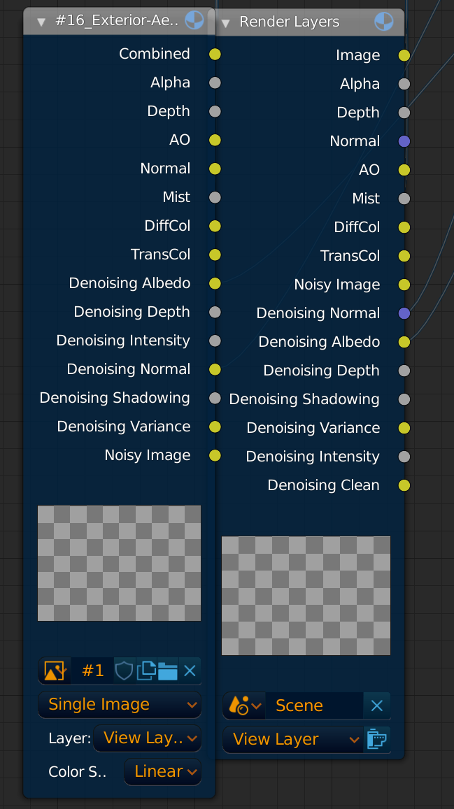
@billrey Could be made that these two Nodes in the Compositor would be almost equal and also use the same ordering? It’s harder to remember this way
(those are two different EXRs from different renderings (some passes are missing in one) but still for example albedo and normal is interchanged and also in the Image Node (left) the Normal socket isn’t blue. While AO is yellow in both but shouldn’t it be grey?)
cloning a list is like copying a text file, or rather an xml file like that of the themes and things like that … neither more nor less …
indeed in my opinion the current categorization system is more complex… the only drawback of the current system which is that it is not fast at all, and to every addon you add you should reconfigure it for each workspace and working mode … it becomes obvious something very boring to do …
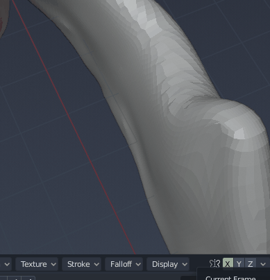
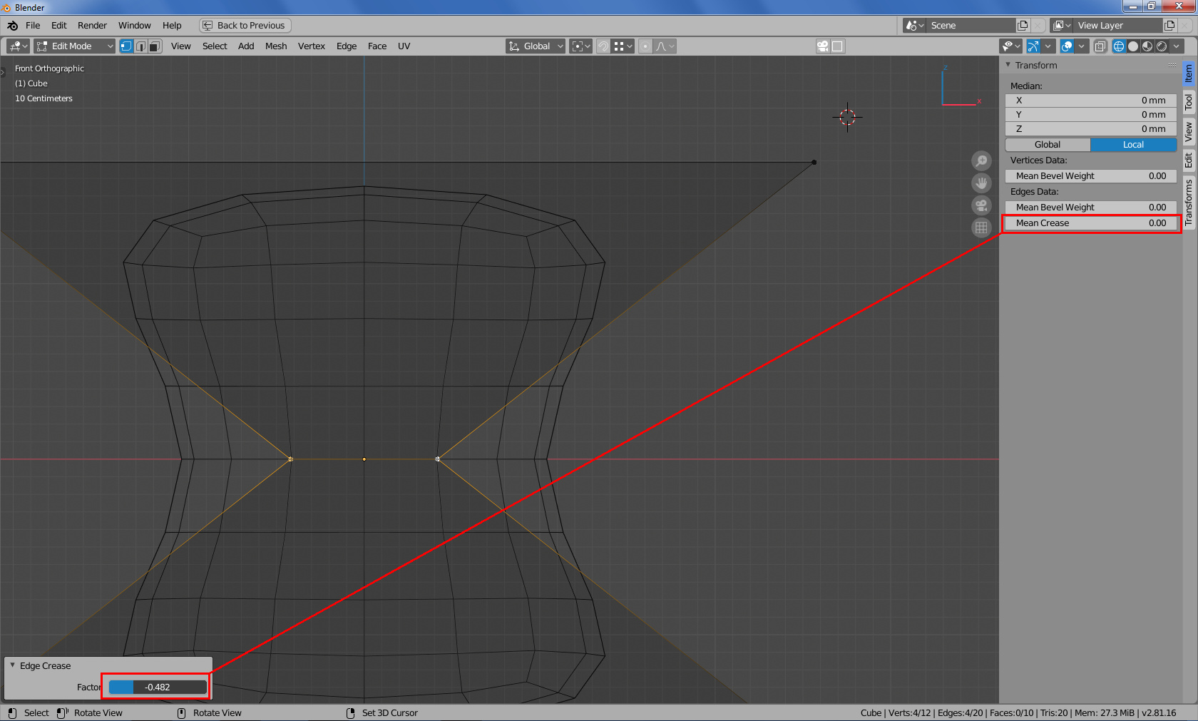
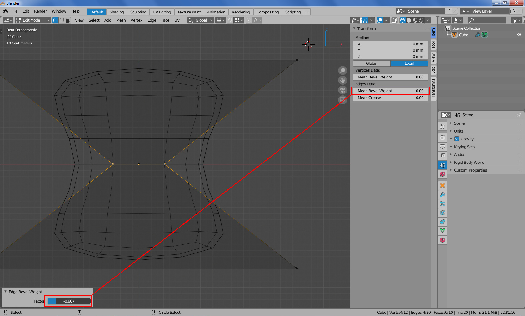
Both tools add or substract to actual selection, not put the same value to all edges. So the -1 is necessary to substract fue example 0,5 to selected edges