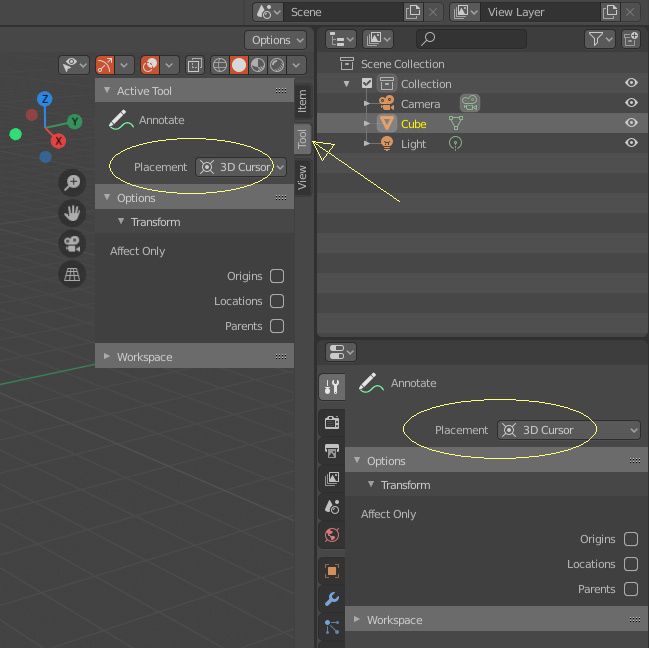
Checked the Tool tab?
I’m not using active tool but quick annotation (holdding the d key)
Ah yeah. Blender needs to be more smart for that, and start working more like zbrush, like, when you hold the D key, the settings of that tool should appear on those panels and be tweakable while you’re holding the key. Until then, we’re screwed.
Hi I’m not sure if this is an UI paper cut but it is an paper cut.
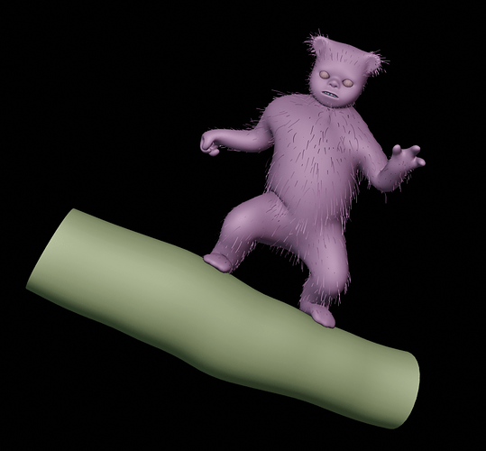
The random color per object is a cool feature but it would be even more usefull for doing diagnostics for hair dynamics.
The way it works now is that it treats the emmiter and the hair particle system as the same object. If they were seperated that would be nice since in the example I attached it is kind of hard to see the hairs.
(If they would be blue for exaple you could easly see them)
Thank you and have a nice day!
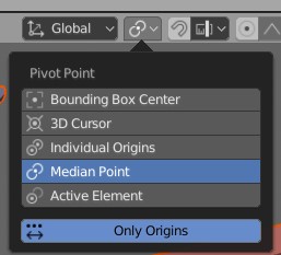
is it just me or there is no “only origins” button in blender 2.81 and 2.82?
I mean it’s in blender manual so why remove it?
making it a 3 button row would be much much more user friendly.
Check this hidden button
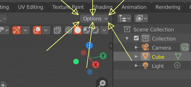
I promise you I NEVER saw that button in 2.81 and 2!
This is some next level stealth!
thanks for the tip btw.
Another one that is a huge pain is the overall lack of description tool tips in all node editors. 99.9% of the time, hovering your mouse over any node settings just gives you “Input value used for unconnected socket”. That’s not helpful and can induce users into error by driving them into throwing mud at the wall until it sticks. This is particularly painful with things like the Principled node, where some settings are dependent or only work when another setting is a specific way and none of the settings of the node has any description.
Especially since this is sooooooo easy to do in the node definition…
Another one. The new file explorer in 2.81 requires you to manually click on the search bar to look for files and doesn’t have alphanumerical search, where pressing a letter will automatically select the first file starting with that letter, for example. Pretty much any software has a mix of both (in Linux, doing the method I described either puts you on the search bar automatically or opens one) or just the letter method with a search bar you can click.
Here’s something I’ve noticed: Ctrl + Scroll on the render passes scrolls in the opposite direction as everywhere else, such as render engine, for example.
While on everywhere else I’ve tried it’s done as in render engine, the one on render passes is the most intuitive way for me, as scrolling up goes up in the list.
So it resumes as changing on only one place for consistency or everywhere else (lots of work probably) depending what we think is more intuitive.

Hi. I found some differences (marked in red) between cycles and eevee context material panels.
Look at the gif:
Thx
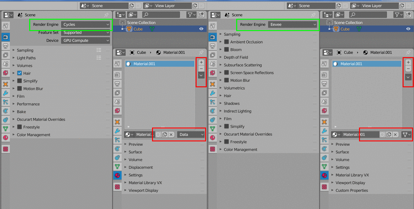
this shows that there is duplicate code where it shouldn’t be, so upgrades have been made to one place, but the other place for oversight has automatically become “obsolete- not updated”
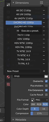
Apart from looking at the value changes, there’s no way to know if you have a preset selected. That makes the presets not as practical as they should be.
This might not be a paper-cut, but just a silly newbie question, but what does the follow path option here actually do?
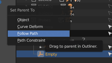
Perhaps it is not relevant when you attempt to drag an empty/camera onto a curve, similar to curve deform, so a paper-cut could be to remove options which aren’t applicable in the current context?
Again, paper-cut or newbie but:
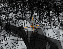
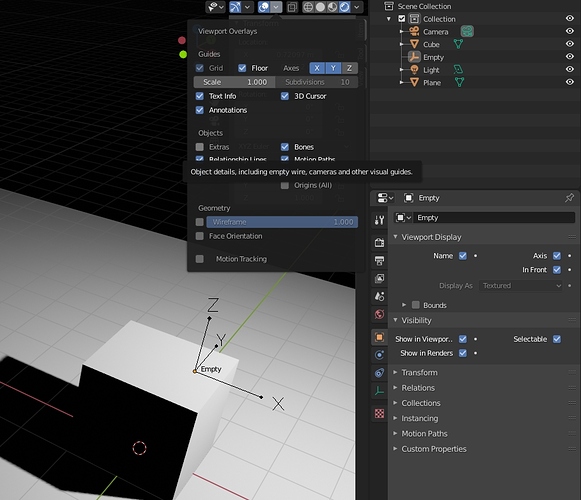
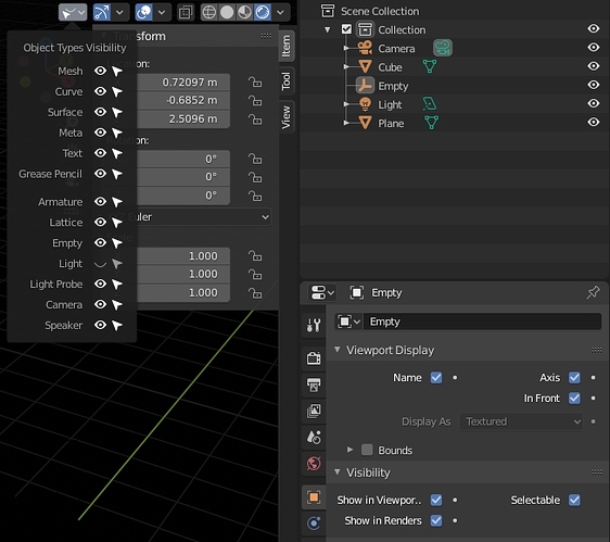
I have an empty in a sea of reflection probes and spotlights, yet if I hide them, they stop working, and if I turn off extras, I also hide the empty…
Is there no way of selectively turning of gizmos while keeping the object function visible?
Nothing on that list works?
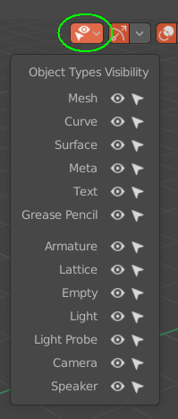
@eobet Thanks to your question, I found a work around for your (and my) situation!
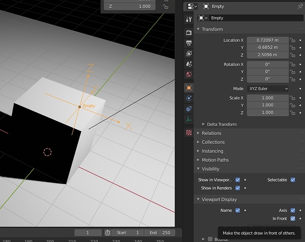
Turn on the axis, and optionally Name and In Front
You can then turn off extras, which will hid the light and light probe gizmos but leave the empty selectable in the 3D viewport.
Regnas, using the object visibility panel will work for turning off the light probe gizmos, as the baked light is still shown. However, the turning off anything else turns off both the function and the gizmo.
When the feature was added I thought it would just turn off the gizmos, I think it would be nice if that feature was added to that menu.
No, because that turns off their functionality too (ie it turns off lights… not sure about reflection probes).
Also, adjacent paper cut (or just straight up bug):
Reflection probes bake hidden lights. 
@MisquotedSource thanks for the workaround! Can you figure out a similar one for bezier curves? 
EDIT: Oh, I remembered two other visual “bugs” from hiding extras… a yellow dot from the last selected spotlight remains visible (even if you deselected all with alt-a first), and also, a yellow frame from a camera remained visible for me.
