Give people the best, fastest, workflow by default. So they can learn once and use forever. Also predispose all of those people who stick to default to have a faster workflow, and not have to configure every hotkey in order to do it, which would result in every workstation having entirely different settings.
This is the same issue that crops up every single time blender’s ux cops flak. It’s YOUR responsibility to learn the damn software, or look at the settings if you can’t adapt.
This crap is why we now have awful defaults for workflow.
Yes I have believed , it should be considered. eg windows file exploler, Ctrl-click exchange selection status. Shift -click decide the end of selection list., then remove item from selection by Ctrl key
About blneder file browser, there seems up-date (by Blender Today), but I could not clear confrim,
the option already added or not,
As for me which modifier key is not matter. (Alt or Shift or Ctrl)
But I prefer to select with simple 2 click begin and End as boundary. (not Border select)
I often hope it when I select bones o in outliner too.
Hello! This is a Blender UI paper cut i am reporting. This is how Blender 2.8 Outliner, in its first startup, looks on a computer screen with a 1366x768 resolution. I am using Windows 8.1. Thanks!
I share with you some interference I’ve noticed while teaching blender.
The first one is it always happening, in 3 university:
People who have never used blender often choose the wrong add.
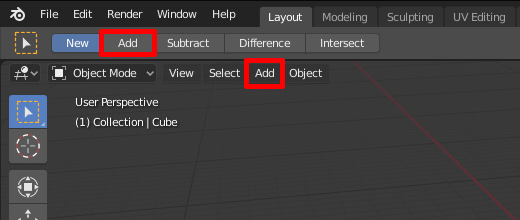
I don’t think it’s right to have two buttons, so close in the interface, with the same text doing different operations.
This second one happens less often and has the same pattern as the one before.
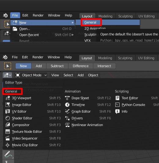
People are trying to click the “general” editor type. Also in this case the same word is on the top right of the screen, on a sub-menu. Even if it seems trivial, it happens and it has to be considered.
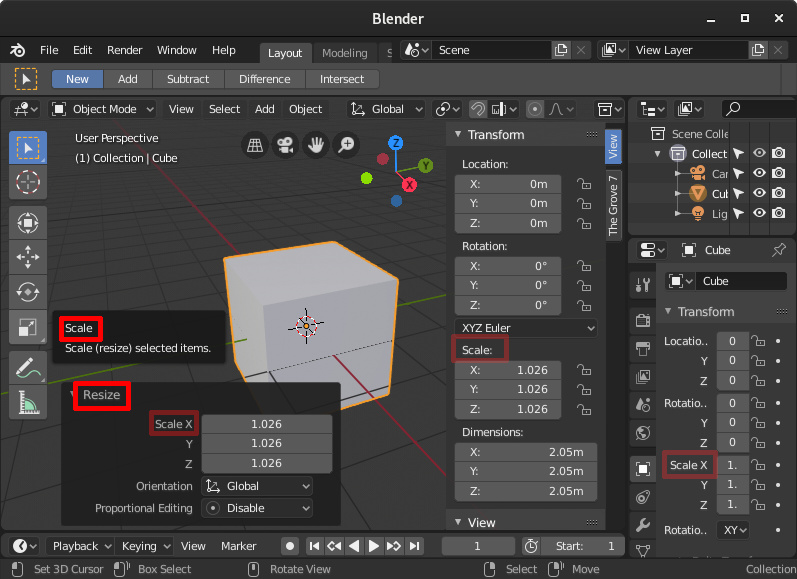
The third image instead underlines a small indecision on the terms: scale and resize.
Looking at the last operator and remembering that the commands are the initial of the transform command (grab, rotate, scale), students look in the “resize” panel and tries to scale with R.
I think this is easy to fix: isn’t to scale a verb too? Can be used instead of the word resize in the last operator panel?
If they are going to cater to people who don’t know much, who can’t be bothered to open the settings or look around the internet for help, efficiency is a lower priority than retention. Most of these people are either unfamiliar with working in 3d space, or used to using software that works like everything else.
Intuitiveness and some adherence to convention (redundant?) goes a long way towards retaining these people rather than them sticking with, or switching to, the competition. I think this is the direction 2.8 has gone in. It got me to have another try with Blender, to stop treating it like that awkward teenager that does everything backwards just because it can. As cool as speedmodelling at 3 gigapolys per second is, I can work fast enough, and I can’t exist in Blenderland alone. Not having to shut my brain off every time I go between Blender and other software is really nice.
User hostile is the term I have always seen when people talk about Blender, and as hard as it is to get that stink off, I am confident that Blender will be treated differently going forward. It starts with a few compromises here and there, and it’s not like it isn’t open source with a huge built-in community of people that want it to stay like it used to be. If 2.8 really is that awful for OG Blendologists I imagine there will be some sort of great schism and multiple devteams rise from the ashes of UX warfare
This is not a paper cut, but i just learned (the hard way) that making linked data single user is not currently implemented in 2.80 .
Since we’re already in the bug fixing phase, and apparently not adding new features, does that mean this won’t be added till the next version?
Update: I was trying to access this from the outliner (right click> ID Data> Make Single User). I’ve since learned that the command can also be accessed from Object > Relations > Make Single User - and this actually works!
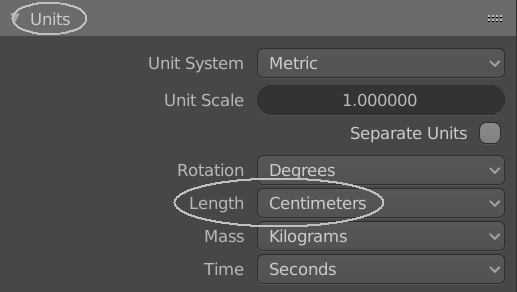
It’s just more compatible with everything else. I don’t recall seeing any major 3D app running meters as it’s default unit. Blender is alone on this one. It’s too much.
Why?
Anyone with that attitude will fail at learning any 3d app, or 3d work in general. It’s stupid to try and retain people whose very lack of effort are going to mean they fail anyway. It’s more worthwhile to put good habits into those passionate about continuing, and push the boundaries and preconceptions of 3d workflows - something blender has been all about until 2.8: https://code.blender.org/2013/10/redefining-blender/.
Meters is the base SI unit. That should be enough said.
But I’ll add it means that with two zeroes you can have scenes the size of football fields, or the size of small everyday objects.
If you want a real size scene in centimetres, you’l end up with stupid amounts of zeroes.
@Antaioz, it seems you have a misconception about blender users, read Riccardo’s post above. Most people are stupid, they are not able to read the manual and change the settings. Well, they can do it, of course, but they won’t, they’ll just switch to another program that’s more intuitive.
It is just a feature of the brain, to save energy, the brain avoid learning as much as possible.
Therefore, for example, if you suggest a person to use the right mouse button to select objects, the brain will resist and no logical explanations will help, it is an unconscious reaction.
Total guesswork of course, and I agree that yeah, the cleanest handholdy walled garden ux doesn’t change the fact that most lazy people aren’t going to keep at it and are wasted effort. But not all of them.
The goal is to get as many people as possible, and ux is ground zero. Not actively scaring filthy casuals away is worth the effort. You keep them around blender long enough to learn.
You do this by providing a more conventional experience, because good luck getting the world to conform to blenders way of doing things. They gave it a good shot for the last decade but it’s run its course. Fortunately you can do this while offering and encouraging most if not all of the things that make blender great.
The other big hurdle is studio adoption. Being more comporable and friendly to other apps from ux standpoint can only help.
Paper cut: in left click input mode I can place the cursor only if I select the cursor tool, in right-click mode no matter what tool I have left click always place the cursor around the view. Is this intended?