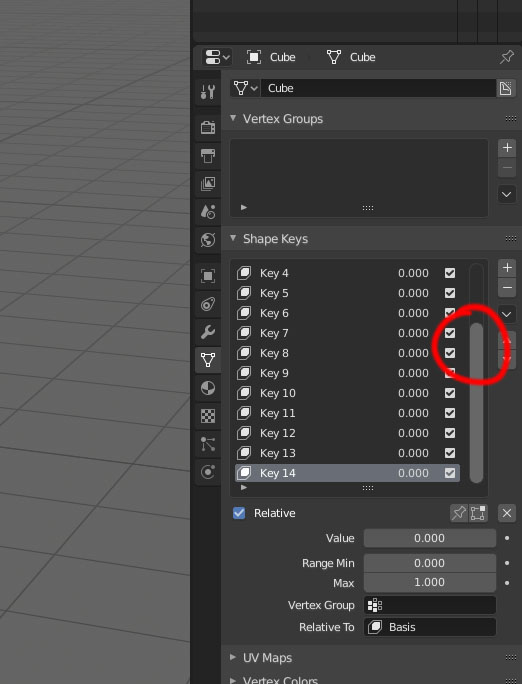
Old scroolbar in shape keys menu
1 Like
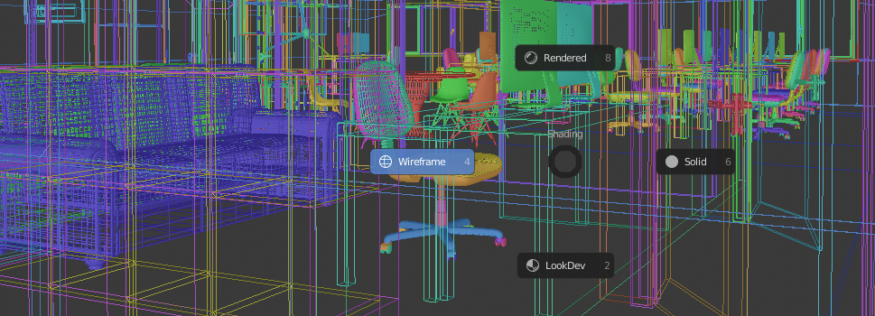
When you have a complex scene with eevee and the performance is slow, you when you switch between wireframe and solid mode, you could include a pre-check (if) to avoid that if you are already in wireframe and you give wireframe again do nothing and do not compute, the same if you are already in solid and you accidentally give solid again do nothing, and do not start again to compute absurdly.
7 Likes
indeed you are right, it makes no sense for buttons to appear in the way we already are …
1 Like
I don’t know what’s consistent about this…
1 Like
It’s live information consistently in the header for every tool. It also has nothing to do with the last operator/history panel.
As for the splitting up of information and work-areas over the window, well that’s a separate, larger issue with 2.8, and it’s throwing things all over the interface and inflating mouse distances.
2 Likes
I’m fully aware of that, thanks. My question still stands.
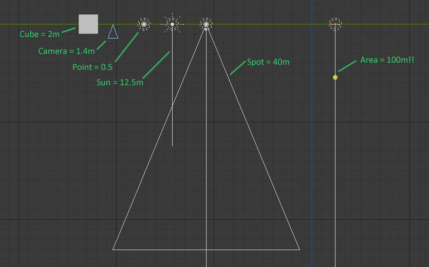
I just discovered how big some objects and the lights are in the viewport!
Camera = 1.4m - perhaps a good size for professional camera and and good visible in the viewport.
Point light = 0.5m - normal size.
Sun = 12.5m - the sun is big in real life, so maybe a good size and clearly visible in the viewport.
Spot = 40m - too big.
Area = 100m! - insanely big!
And maybe other objects need to be resized to more real ones? Or change the standard size from 1 meter in radius, to 1 meter in diameter?
Primitives, Emptyes, Helpers, Curves etc = 1m long instead of 2?
Forces = 1m long instead of 4-2?
8 Likes
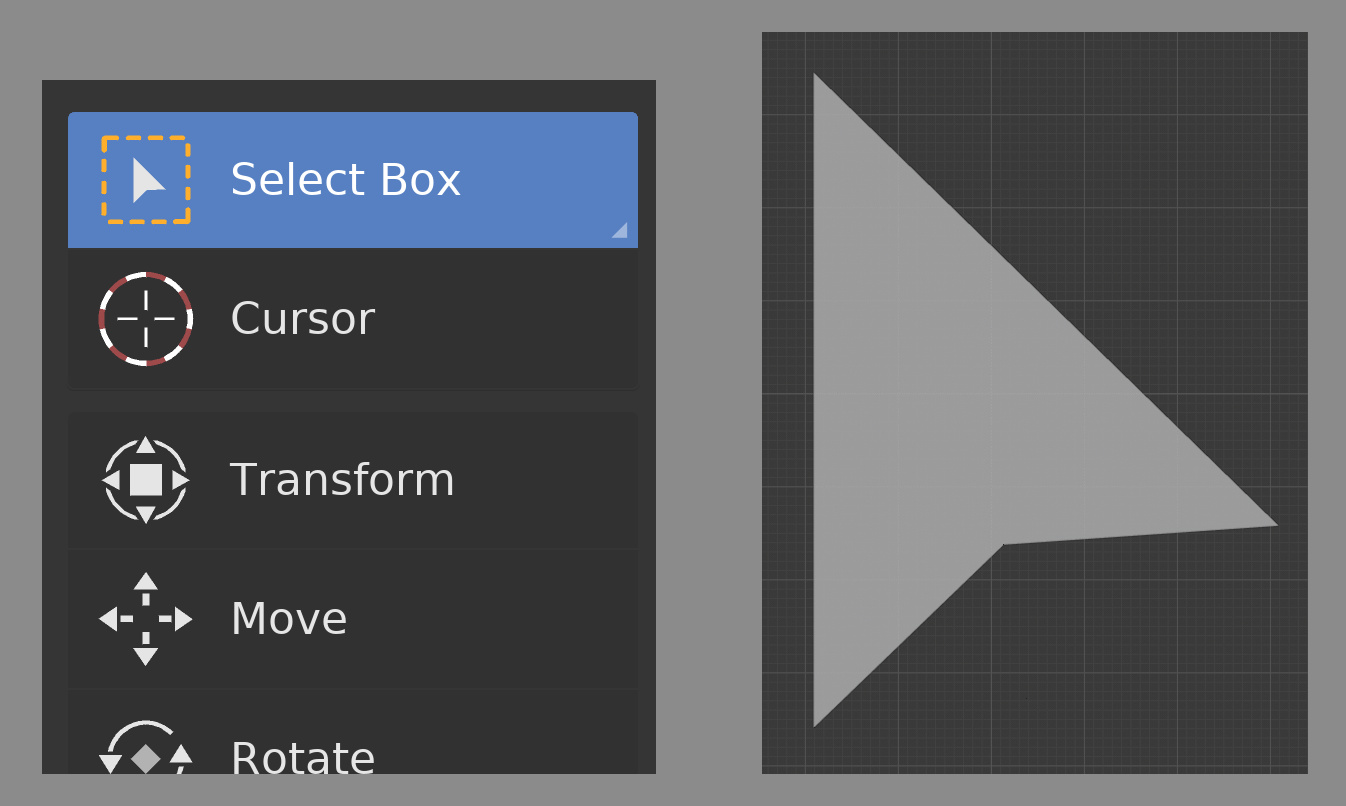
Admittedly this is an extremely small paper cut that I’m sure bothers nobody else, but just kills me…
The toolbar “Select” icons all have a “cursor” shape inside. But the right bottom corner always looks weird and off. You’ll have to view the image below full screen to see what I mean. It looks smudgy and blurry.
Those cursors are defined as shapes in icon_geom.blend. And that shape has a perfectly vertical left side, the right side is close to (but not exactly) a 45 degree angle. The opposite 45 degree angle at the bottom is not exactly so. But the main issue is the horizontal portion is close to, but not quite, horizontal. And so the bottom of the arrow has segments that are not equal is length too.
This thing just needs to be made with angles that are exactly horizontal, vertical and 45 degrees and it will look almost identical but will not have that wonky edge.
10 Likes
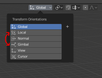
A small inversion, i think.
In the last build of blender i’ve downloaded today, i’ve noticed that the new local and gimbal icons were inverted.
1 Like
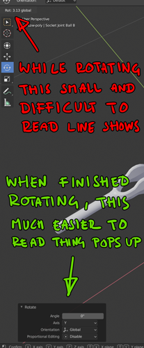
I get that the live info header displays what’s currently happening, and the last operator panel shows up after an operation is complete…
But your post made me wonder, why not have the last operator panel display while doing an operation? Couldn’t it do the job of the live-info-text, but better?
There must be some reason it wouldn’t work or would be a bad idea that I’m not considering.
These should be off by default. We don’t have the mesh normals on by default, so why are they on for curves?
NO!!! This is one of the most useful and innovative things about the Blender interface. This behavior makes it so that (in the case of a left click select keymap, but similarly elsewhere in the interface) if you need to do a single command to multiple objects or mesh elements, you just right click then immediately left click, because the last used command is right under your mouse and already highlighted. Or, for instance, if you’re trying to dissolve several edges, you can select the edge, hit the x or del key, and immediately left click or hit enter. This really, really speeds up the workflow.
4 Likes
Because you have no way of otherwise inferring the normal/tilt of the curve.
Well, we keep saying the same thing over and over again.
- No one denies that this feature is useful in some specific cases.
- No one offers to remove this feature completely.
It just needs to be possible to turn it off. I would even say that this is a special feature and it should be turned off by default.
And a bit of trolling, if this is such a cool feature then should we apply it to all menu and popovers?
1 Like
As far as I know, it is applied to all context-menus.
I meant the menu on the editor header, for example the “Select” menu. What if I need to select the same thing many times in a row. Should the mouse cursor automatically jump to the last used menu item?
Because you should never ever move the users mouse, and they’re a different kind of menu with different use-cases.
You’re just being facetious.

I personally think the numpad shortcuts is a terrible idea. I either have to lift my right hand from mouse or move left hand away from all the other common shortcut keys to the numpad. This not ergonomic at all. I have mapped all numpad functionality to regular keys and find it much more ergonomic.
2 Likes
Holding down control temporarily toggles snapping…
…unless you have the 3D cursor tool active…
…then it instead for some reason temporarilty toggles the select tool? 