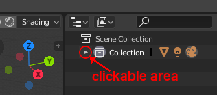
arrows to collapse panels in outliner and in properties editors are too small, actual clickable area is bigger (which is a good thing) but doesn’t help if you keep trying hit the arrow itself
The icon used here is wrong BTW.
2 Likes
reassigning keyboard shortcuts could be easier
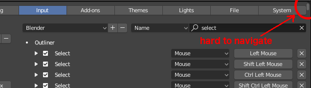
as you can see the scrollbar is unnecessary small, I’m glad scrollbars are that light and thin and not in the way where it counts (e.g. viewer), here however IMHO it could be bigger (wider). I propose to add an option to filter results based on editor type and to include a possibility to view all editors at once (it would be the same as we have now)
6 Likes
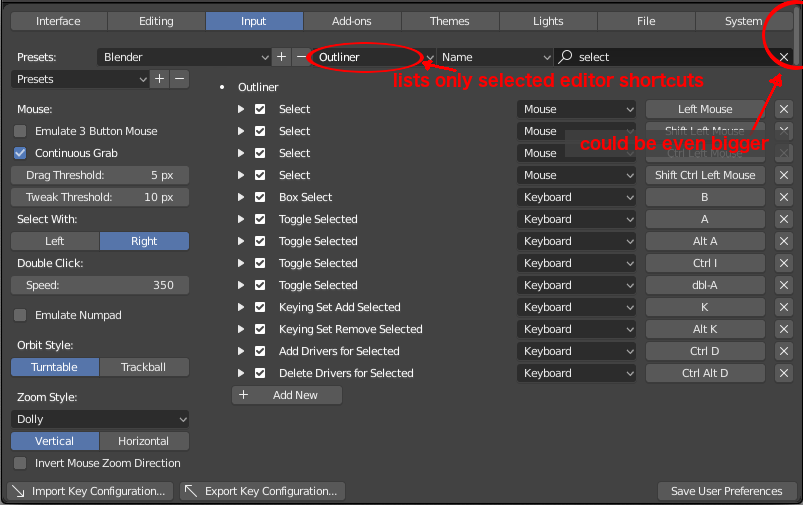
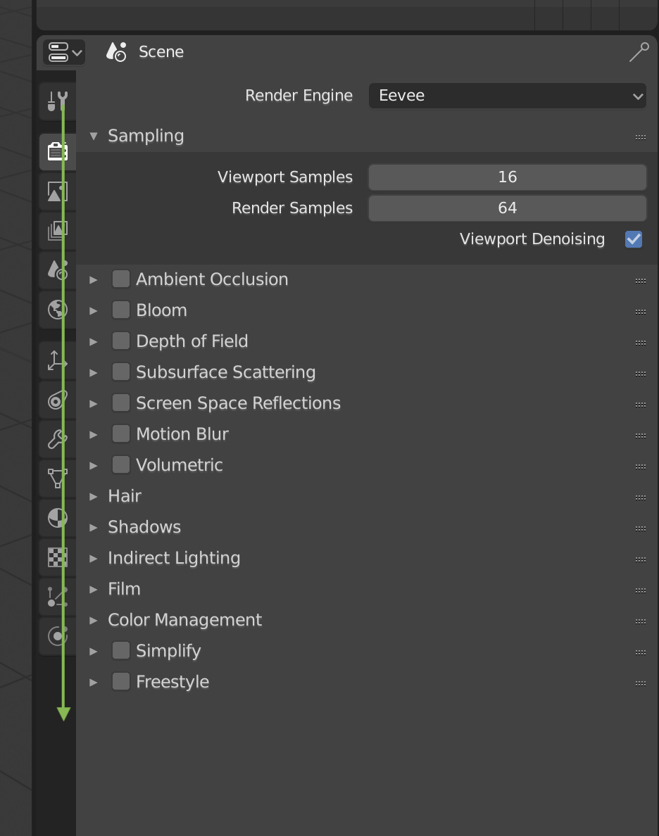
The scrollbar shouldn’t go all the way to the top of the window IMO, the top buttons in the preferences panel should always be visible if that is not the case (I don’t have blender in front of me, can’t really check).
3 Likes
@billrey @pablovazquez
Here’s something you guys could do to minimize the big issue introduced by the removal of the global brush palette in sculpt mode.
Since you are treating the brushes now as tools, then everytime a new brush preset is created, they should appear nested in the tool they were created in the toolbar as well, not just in the topbar/tool settings…
This will minimize the hassle of brush switching, otherwise it will be 3 clicks to switch brush presets, which is bad.
Please think about it. The sculpting workflow is very important.
6 Likes
Dragging over the Properties tabs should switch context as you drag down the list.
With the old radio buttons at the top, it was possible to drag over them to change context. This no longer works with the tabs.
6 Likes
This is a bug. I won’t add it to the list, but it should be fixed.
2 Likes
If you select strips from right to left before adding a cross dissolve they will go wrong:
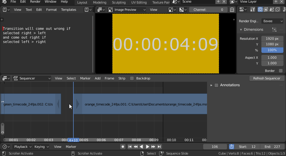
I guess they just needs to be sorted by start/end framenumber before added to the strip cross effect?
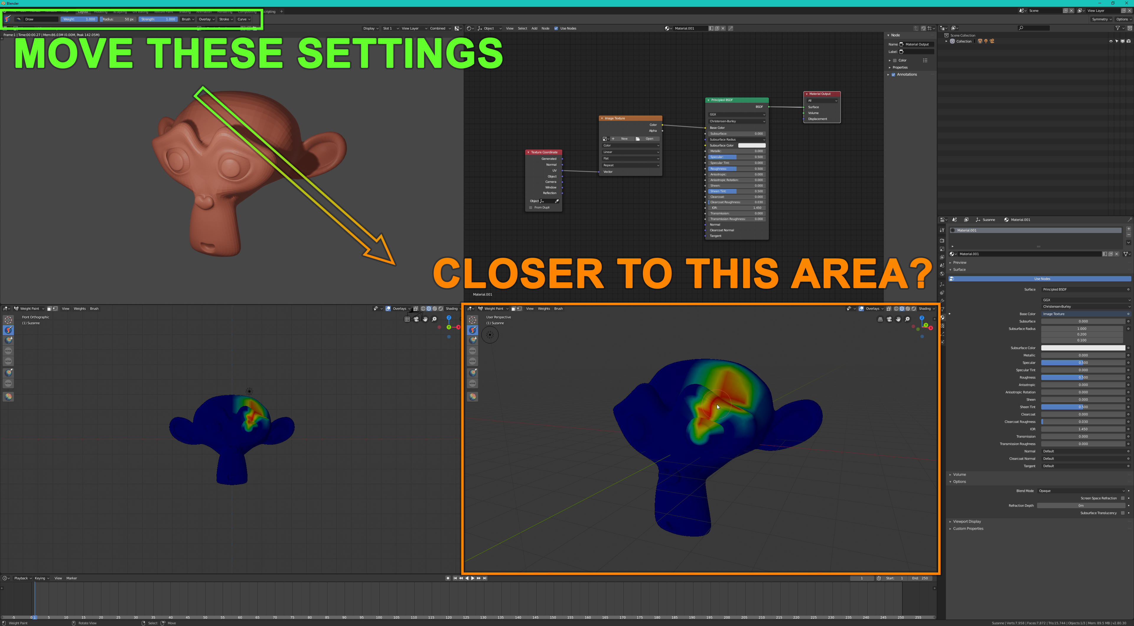
Is there a way to move this bar closer to the space where I’m actually working?
When using a brush, all the brush settings are too far away from my preferred working area.
This makes working much more difficult and slower when using a big/high resolution monitor.
4 Likes
I’ll add that not only should the top row of radio buttons (tabs) always be visible in the user preferences window, but the search field should always be visible. It’s pretty painful to use such a long list of shortcuts, but this would be one way to make it easier to deal with.
1 Like
There is a project to completely redesign the Preferences, here:
https://developer.blender.org/T54115
This is spearheaded by Julian Eisel. I hope this can be done before long, to tackle the kinds of issues brought up here.
1 Like
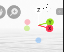
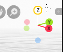
current navigation gizmo
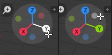
need more bright when mouse over
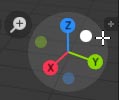
current navigation when background bright
add outline
2 Likes
Agree it should be back as an editor type, it have been bring 2 times to the RightClick select site so you can support it there also
Also here:
1 Like
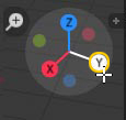
The nav. gizmo must use the same backdrop colour as nav. icons do - the dark one. No need for outlines.
1 Like
even just having the toolbar open by default could be a decent solution
i mentioned this before and since the “topbar” only shows tools related to the 3d view, maybe it should be part of the 3D view header instead of the whole blender.
2 Likes
The toolbar is open by default in Blender.