Moving visible objects to a hidden collection doesn’t hide the objects.
I’m working on a project with thousands of objects - all imported from cad that has every detail (screws, washers, hinges, panels, etc.) as a separate object. I need to be able to organize these into collections to make working with the data easier. To make it easy to see what has and hasn’t been moved, I would like to do something that was possible with layers in Blender 2.79 and hide the collection I’m collecting objects in and have them hidden so I can see what screws or whatever are left behind, still needing to be moved. It’s a big papercut when I have to manually go and hide these objects after moving them to a collection. I’m going to be here doing this for hours. (melodrama) Seriously the H key is right next to the M key, so it’s not that bad, but a papercut nonetheless.
Blender REALLY needs a dedicated deselect modifier. It is impossible to deselect an object in many situations using SHIFT+Click. It’s really painful, this paper cut.
I would LOVE if the margin and spacing in the layers panel were adjusted. Fixing it to the left and reducing the spacing would help to show more info (still without cluttering it).
When setting a parent, it would be nice if instead of the options being Object and Object (Keep Transforms) should instead be Object (Remove Transforms) and Object. I think the expected behavior (at least for former Max users) is that the object stay in place when parenting. I think it would also be the expected behavior of beginners that their objects stay in place when parenting. The same could be true for removing parents as well.
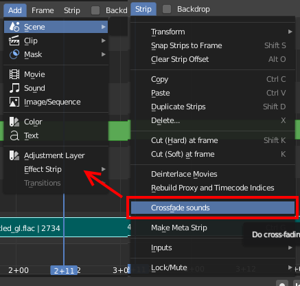
In the VSE, maybe the “Crossfade Sound” could be added to the “Add” menu?
[ @pablovazquez A strange bug in the new Shift+A menu and VSE Header Add menu is when making a copy of the scene choosing new this menu will not open anymore. It will only open if the new scene is created by Full Copy]
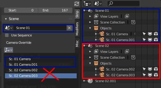
On the VSE Scene Strips, I guess that it is not correct to be able to add cameras from a different scene than the strip-chosen-scene:
Btw. the camera selection drop-down seems to have the wrong icon and the drop-down starts below the button, which is inconsistent with how all other drop-downs are working?
When grabbing a strip handle and dragging it, the mouse cursor icon is pointing in four directions, where as you can only move left or right, so maybe a left-right icon would be better?
And for consistency moving an entire strip could have the full arrow left/right/up/down icon?
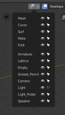
If you have the filter deactivated the selection in the lights, and then you press the key “a”, blender continues to select you lights. This happens with all object types. Also continues to select it even if it is invisible.
When rigging mechanical objects, I used to parent objects to bones a lot. In 2.79 it’s very concenient that an Armature remembers the state it was in - Object or Pose mode, and also you could select objects even if you had a bone selected at the moment. So you could select an object, then directly select a bone of an Armature which was in Pose Mode already, and parent in the Viewport.
In 2.8 I have to switch to object mode, select my object, select the armature, switch the mode to Pose, then select the bone, and then parent.That’s quite a few clicks added, especially because you need to switch back to Object mode again before you can select the next object.
First of all, I’m a rookie at Blender and there are things I still don’t understand. I’m not a native English speaker either. But I would like to add my grain of sand.
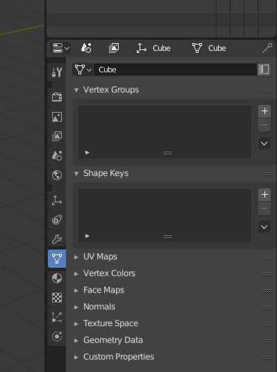
I like the new UI of Blender 2.8, in general, but I think the properties tab is more confusing with the icons on the sidebar. I like the sidebar, but lack contrast, at the moment it is difficult to know which icon is selected at a glance. If we pay attention well yes, but there is not much contrast between the selected icon and those that are not:
Even if we tune a little eliminating the separation between the icons not selected and also matching the background color of the active icon with the background color of the panel, the lack of contrast is still almost the same:
On the contrary, in Blender 2.79 it is very easy to distinguish the active icon with the blue background. I suggest the same solution for 2.8. I think it’s a simple solution that fits well with the general UI:
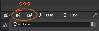
Finally, why are these icons here? They can’t be clicked, and I don’t know what they mean, they confuse me. If they don’t have a function, wouldn’t it be better to remove them and put here the name of the panel, to help identify it better, instead of these icons?
Right, or another possible solution: Remove the + buttons completely. They are often in the way, and there are already menu entries to open/close these. We could do this in the 3D viewport too.
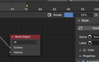
It’s strange that there is a render progress bar in the bottom bar of the main window and in the header of the node editor but there isn’t one in the render window (image editor) that pops up, often covering the rest of the blender interface, when you render your scene.
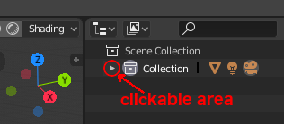
arrows to collapse panels in outliner and in properties editors are too small, actual clickable area is bigger (which is a good thing) but doesn’t help if you keep trying hit the arrow itself
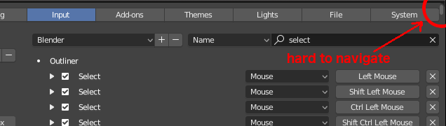
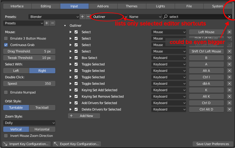
as you can see the scrollbar is unnecessary small, I’m glad scrollbars are that light and thin and not in the way where it counts (e.g. viewer), here however IMHO it could be bigger (wider). I propose to add an option to filter results based on editor type and to include a possibility to view all editors at once (it would be the same as we have now)
The scrollbar shouldn’t go all the way to the top of the window IMO, the top buttons in the preferences panel should always be visible if that is not the case (I don’t have blender in front of me, can’t really check).