maybe text orientation should be horizontal by character.
3 Likes
No, this would be horrible!
2 Likes
I think we should have an option to toggle top bar on and off in each 3D viewport.
By default it could be as it is now, but users could show/hide another top bar in any 3D viewport.
Like this:
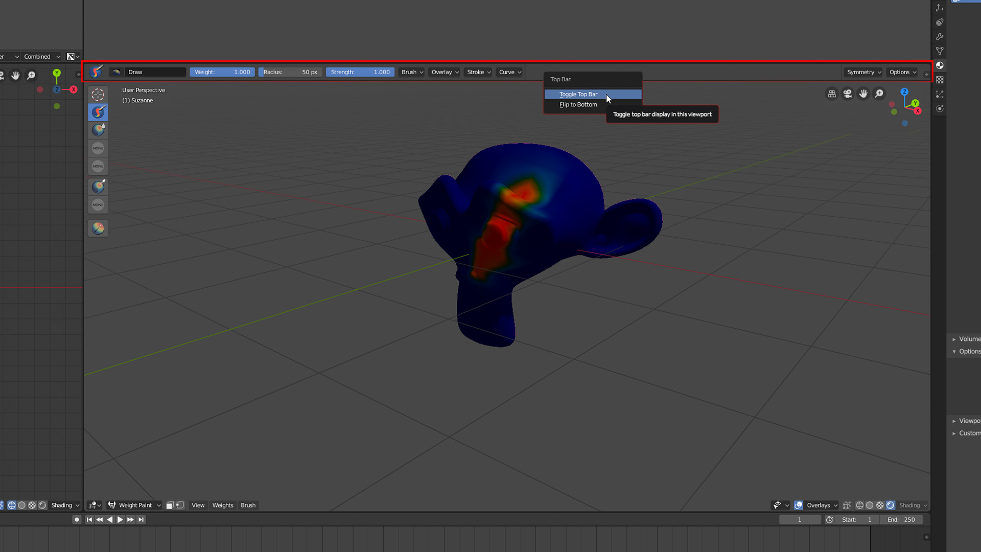
The way the top bar currently works in Blender 2.8 is unacceptable.
9 Likes
why?.. no one likes to turn their head side-wise…and with tons of addons it’ll be worse to distinguish each one.
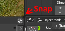
When wanting to join two areas, it is often quite difficult to place the area splitter at the exact same pixel as the area you want to join, so how about some light snapping to nearest area splitter?
13 Likes
We proposed, months ago, to make the topbar a editor area to put where the user need and not only in the top part of the window.
The same with the preferences, that was better to have in an area type instead a fixed window.
@nokipaike I think it should be an area not because it is omnipresent, because it can be hidden. If not because it is fixed for no reason. And since the blender interface is historically 100% customizable, the logical thing is that the topbar and preferences are also an area that the user can place where he prefers to accommodate his workflow and his workspace. Not to mention that people have different monitor layouts.
7 Likes
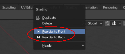
Shoudn’t it say Left/Right, instead of Front/Back? ![]()
1 Like
Note: I am a left-click-select guy and I am speaking from this perspective.
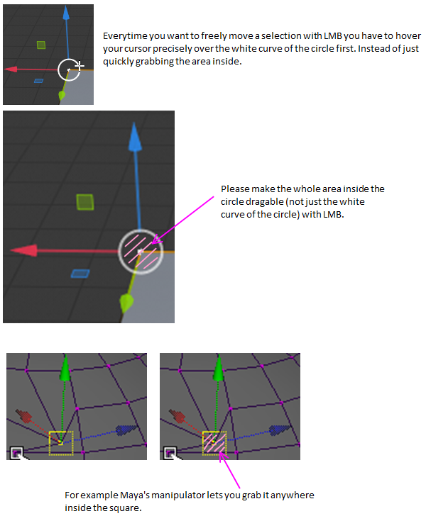
Hi, there is one issue with the Move tool manipulator that always gets me.
In order to freely move the selected element (or object etc.) with the Left Mouse Button you have to click precisely on the white curve of the circle and drag it , you cannot drag the area inside the circle - you will hit one of the axes instead.
This slows you down considerably. Moreover, every time you do that, it requires you to focus on this fiddly operation. It steals your attention from other issues (like thinking about topology etc.).
Please make the whole area inside the circle dragable like it is implemented for example in Maya.
I know there is a workaround for this issue - to drag the selection freely with the Right Mouse Button instead of the LMB. However I always work with a Wacom stylus inside 3D apps (and in almost every app). Using the Left Button (= tapping the stylus on the surface of the tablet) is very direct, quick, easy and ergonomic (frequently pressing the Right or Middle Button on a stylus can still strain your thumb or tendons in your wrist after a while).
It is also quicker - after a selection with the LMB you don’t have to reposition your thumb or adjust the position of the stylus etc.
Another reason to use the LMB would be in a multi-app environment. If you are used to doing that in say Maya you will want to do the same in Blender. Especially if you use both of the apps side by side.
So the the main reasons are:
- speed
- ergonomics (when using a stylus)
- it plays well with other (industry standard) apps
This also applies to the Scale tool.
Sorry if this has already been requested. Thank you.
11 Likes
Im not sure if this would go here but here i go:
very many times when you deselect, by any method, blender keeps an active object and this usually leads to problems, like pivot in the wrong position or such stuff, also in the vse when doing the same a strip appears like is still selected so then you start selecting and deselecting sort of loosing track of wether someting is selected or not.
Can we have (maybe an option) for when you deselect, nothing remains active?.
2 Likes
One thing I have issue with that should be quite easy to fix is the shifting round of buttons in the VSE.
In the “N” panel of the VSE, the tabs “Misc” and “Modifiers” switch place when the backdrop is toggled.
Note: A Video file, image sequence, or audio file must be selected to see this.
I’ve also noticed that the backdrop is located behind frame 1 rather than in the middle of the screen as it used to in Blender 2.79. I’ve decided not to report this on developer.blender.org as we’re not allowed to report bugs for 2.8 yet and I hear it’s possibly getting a rework.
1 Like
I always found the whole fake user thing a little strange and counter-intuitive.
Could the behavior be changed so that everything is saved unless you explicitly delete it?
Maybe the F or the new safe icon could be replaced with a delete button or x icon and prompt a confirmation pop-up to ensure that you actually wanted to delete the material or whatever you wanted to delete.
2 Likes
I think it should, yes, but it’s really outside the scope of a UI paper cut. And I also think we can wait for the Asset Manager here, to better get an overview of the data in your scene, so users can more easily delete data or check which users each datablock has.
I prefer having both, because if you work with Fullscreen 3D View you still need that panel.
If you don’t want it, you can just keep it close.
1 Like
Could even be the status bar
1 Like
Property editors on the 2D Animation workspace. It’s not obvious that these are two separate editors so having a separator of some sort between them would be helpful in this case.
Sorry, I don’t like complaining without constructive feedback but having two property editors together is visually very confusing.
2 Likes
even better on top, just after the tool properties tab
Of course. Hence the also in my suggestion ![]()
.
2 Likes
-
Would it be possible to display when a node is not compatible with EEVEE, so it doesn’t seem to be broken (I’m sure it can save a lot of bug reports haha)
-
Merge Viewer node and Compositor node ? But it looks like it is a bigger task that probably need a design

2 Likes
I think that the ideal site would be in the viewport but if they put it in the status bar is also worth it.
It has a lot of support in RightClickSelect but I haven’t seen it included in the list yet…
Text labels use some kind of backdrop or shadow, which dramatically improoves the local contrast. It would be fantastic to get something similar for icons, since now they look dull and flat next to the text.
No shadow:
Shadow:
3 Likes