Blender UI paper cuts

Just put an alpha transparent ‘outline’ in middle of the arrow and the key and it’ll be a real winner, IMO. Currently they melt together into a single shape.

2 Likes

Right Clicking and Joining Mesh is very easy, but once joined it is a lot more tricky to separate them again.Can we add separate too right click please.

Here it this modded with a transparent outline in the middle.

NextPrevKeyframeMock01Outlinetransp04c

2 Likes

methinks the arrow should be over the keyframe, no? Also, it’s missing frame stepping.

3 Likes

This would be hard since Linux doesn’t have a standard GUI. It might involve looking up the window manager at use in the current display, and I’m not very sure there’s a standard way of gathering this information reliably. Also supporting each available WM conventions, and keeping up with them, seems like too much work for not so much return. Supporting just the mainstream ones (say gnome/KDE) might not be fair enough. Showing the standard OS/WM dialogs breaks the whole theme feel.

I do like the idea. Everybody likes a standardized workflow and a popup with buttons in the wrong order than usual can screw things if one is fast enough to click. I just personally think accommodating to the OS/WM ways and maintaining might involve too much work not worth the return, and showing standard dialogs is ugly.

I think Blender interface is already specialized enough that users may expect dialogs not to fit their OS/WM way.

1 Like

Another UI paper Cuts for me. What do you think…?
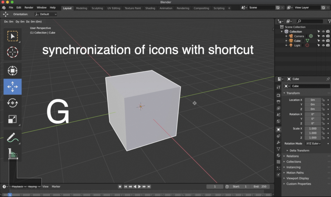
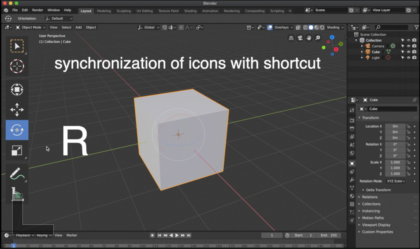
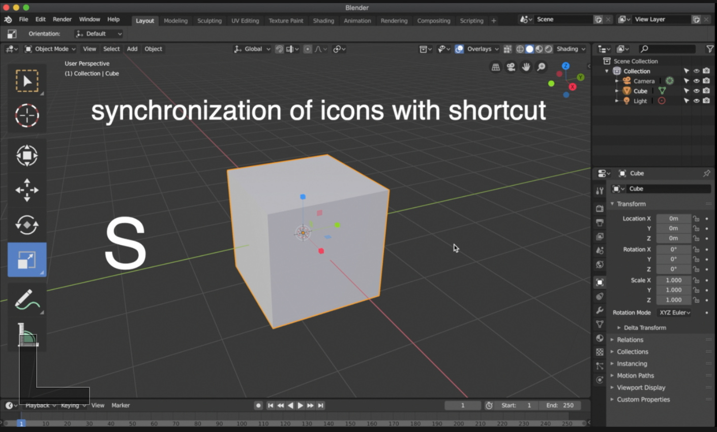
The keyboard shortcut is not synchronized with the icons. Also in edit mode.


13 Likes

21 posts were split to a new topic: Tool shortcut keys

(repost because it was accidentally posted as a reply to an unrelated comment)

When animating in stepped and using autokey animators often scrub with the mouse to quickly look at poses. In order to actually change a pose, they need to be directly on it otherwise a new frame is created.
Could we get a button that enables Snap-scrubbing?
I wrote a little python script, it should be fairly easy to implement. It only needs to be connected to a button. It detects if you’re moving to higher or lower numbers and according to that snaps next or previous.

bl_info = {
    "name": "ScrubSnapper",
    "author": "Karlo Pavicic Ravlic",
    "version": (1, 0),
    "blender": (2, 80, 0),
    "location": "View3D> N > Handy Anim Tools",
    "description": "Snap frame to nearest keyframe in drag direction",
    }

import bpy
from bpy.utils import register_class, unregister_class
from bpy.props import BoolProperty, EnumProperty
from bpy.types import Panel, Menu
from rna_prop_ui import PropertyPanel

CurrentFrame = 0

def frame_handler(scene):
    global CurrentFrame
    
    if not scene.asset_manager.snapscrub:
        return
    if CurrentFrame > scene.frame_current:
        bpy.ops.screen.keyframe_jump(next=False)
    if CurrentFrame < scene.frame_current:
        bpy.ops.screen.keyframe_jump(next=False)
    if CurrentFrame == 0:
        CurrentFrame = scene.frame_current
        
    CurrentFrame = scene.frame_current


#Booleas
class PropertyGroup(bpy.types.PropertyGroup):

    snapscrub: bpy.props.BoolProperty(
        name='SnapScrub',
        description='Snap to frames while scrubbing on the timeline')


# Draw the control panel
class HATOOLS_PT_ButtonPanel(bpy.types.Panel):
    """Panel Creation"""
    bl_label = "Handy Anim Tools"
    bl_idname = "object.hatoolss_pt_handytoolspanel"
    bl_space_type = 'DOPESHEET_EDITOR'
    bl_region_type = 'UI'
    bl_category = "Handy Anim Tools"


    def draw(self, context):
        layout = self.layout
        view = context.space_data
        scene = context.scene
        wm = context.window_manager
        manager = context.scene.asset_manager
        activeArmature = bpy.context.active_object
        
        # Display menu if armature belongs to MSW

            
        row = layout.row()
        row.prop(manager, "snapscrub", text="SnapScrub", toggle=True)
        
            
classes = (
    HATOOLS_PT_ButtonPanel,
    PropertyGroup,
)
   
register, unregister = bpy.utils.register_classes_factory(classes)


#Register booleans
def register():
    for i in classes:
        register_class(i)

    # storing property in scene for this example
    bpy.types.Scene.asset_manager = bpy.props.PointerProperty(type=PropertyGroup)


def unregister():
    for i in classes:
        unregister_class(i)


if __name__ == "__main__":
    register()


try:
	bpy.app.handlers.frame_change_pre.remove(frame_handler)
except:
	pass
bpy.app.handlers.frame_change_pre.clear()
bpy.app.handlers.frame_change_pre.append(frame_handler)

scrub_demo2
I hope my script can help.

14 Likes

That’s probably not just a UI papercut, but I second the idea. Mad props for writing it yourself. I proposed a little something on the same topic a while ago : https://blender.community/c/rightclickselect/P0bbbc/

2 Likes

Just to add to this: the modifiers could do better with a description. The motion tracking constraints are missing one too.

Thanks!
I’ve updated the code to have a button in the dope sheet and uploaded a better gif. Copy-paste it, run it, and it should work.

1 Like

What affects the collections affects all the objects that it contains, for this reason I think that highlight the icons according to the hierarchy, and darken the “children” when the “father” is inactive, it can help to visualize the final result. Currently only the name of the children is darkened, when the parents are deactivated.

1 Like

Filled Key makes the whole icon look blobby. I’d go this route:
playback%20buttons%20-%20mock_2

15 Likes

I’ve just done this mockup but i like your route too.

PlayerControlExtendedMock

1 Like

Maybe to make the prev/next keyframe buttons in a separate block nearby, and actually prev/next frame are already exist, where the Current Frame field.

next

8 Likes

Mind, that the “jump to the key” would be one pixel wider, than the rest of icons, but maybe it’s not a problem, since only two pixels would cross the 14x14 pix boundary. There’re some pictograms that are already designed this way. Another possiblity is to shrink the arrow horizontally by one pixel.
Still my version is the clearest, and most distinct, while the overall style is preserved.
playback%20buttons%20-%20mock_3

1 Like

I was in the same questioning :slight_smile: That’s why at first I tried not to take too much width. But I think the road you chose works well. A mockup to quick preview it.

PlayerControlExtendedMock02

10 Likes

Darn… the bottom one looks very good too (the one with horizontally shrinked arrow). @thecavelap - could You make a mockup with it too? Just for the sake of comparison…

1 Like

Here it is.

PlayerControlExtendedMock03

4 Likes

What do You think, guys and gals? Which one?