like this: https://drive.google.com/file/d/1Vn9axr-7CXZ7ZoUx5bnSuaH31Vs1qgeN/view (I couldn’t strip the thumbnail so it may be a bit heavier than before)
Wow! That’s neatpicking! 
2 Likes
Since many menu items and settings were re-arranged in 2.8, it would be nice if you could search for them (kind of like the Help menu search in all native apps on OS X, which also has a really neat result highlight)…
1 Like
I don’t think that it’s a papercut, but it’s a good idea to future projects allow to access any data by the search field
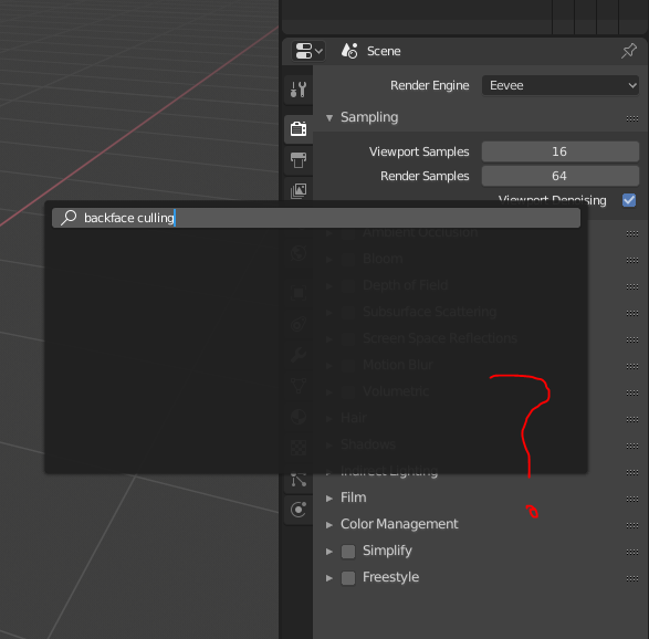
Should take most of the non-papercut Preferences feedback elsewhere - to the BA link above. However, here’s 1 paper cut in there that I also mentioned at BA.
Panel-only sections need some breathing room – look at alignment of the text (1 is too close to the top edge and looks weird):
1 Like
What if I try my first diff with this modification @billrey ?
Instead of “Add new material” write “Copy this material” in the tooltip (when a material already exist, and properties are copied to the new one).
Thank you,
Ricky
1 Like
Opening a 2.7x .blend file on 2.80 sometimes causes errors, so I would like to have a warning: “This file is made in 2.7x. It may cause unintended changes in 2.80”.
Vice versa if possible.
BONE OVERLAYS – improvements!!:
- IMPORTANT: Enable “In Front” (x-ray option) found in Armature’s “Display” area to be shown in “Overlay” dropdown in viewport for fast access to manage prominent visibility of armature overlays.
(And maybe even add visibility toggle for groups of controls in this menu for more complex rigs?)
Amazing job in 2.8 guys!!! – I want to deeply thank you all for your hard work in making this release something special!!! You guys all rock so hard! 
1 Like
This would be neat - even if it were just the letters X, Y and Z. I’m not sure how we could do this in practice though.
1 Like
It would make the UI very ugly imo.
7 Likes
Rename “Blackbody” to “Color temperature”.
Blackbody - is physics term, not everybody knows it. Color temperature - used everywhere, from photography in white balance to lamp packages.
18 Likes
Though “ugly” is a strong word – individual values would definitely be MUCH harder to read at a glance.
Your eyes would have to adjust to each individual color to read the values in each field.
Unless you’re genetically-inclined to reading in rainbows (most humans read black and white), gentle contrast is easier on the eyes (and requires much less processing power too.)
I wonder why it got so many likes…? – Do people actually think about this sort of “ease-of-use” stuff? D:
Here are some questions to ask ourselves before making a UI suggestion:
- What genuine usability problem does it solve? (aesthetics don’t count as a “usability problem” btw)
- What usability problems might it introduce to others? (not being able to read a field’s value is BAD, even if the field looks aesthetically pleasing…)
3 Likes
It’s probably nicer to just color code the axis names, rather than the values.
The reason for color coding should be obvious: To enhance the visual connection between the axis lines in the viewport and the values in the transform panel.
In any case, this is most likely not going to happen any time soon, simply because I don’t think it would be very easy to do in the current UI code. Unless someone pops up with a patch.
In fact this should happen in:
- Materials
- Textures
- World
- Particles
- Brushes
- Action …
and maybe others.
In the code they are really two different functions: BKE_material_copy and BKE_material_add …
Things are handled differently for view layers, Texture paint slots and Scene, though.
In Scene, a popup menu ask you what you want to copy: same icon, same description but a different behavior.
2 Likes
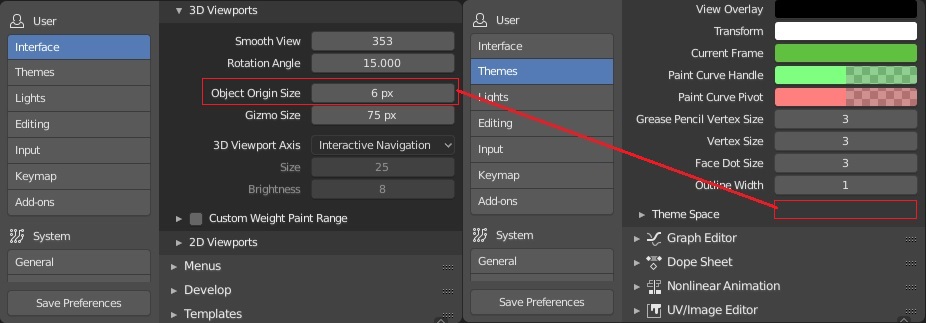
Yes, I noticed that too while working on the Preferences. It seems quite out of place that the Origin size is under Interface, while all other size preferences are in Themes. I’ll see if I can figure out how to move it.
This post was flagged by the community and is temporarily hidden.
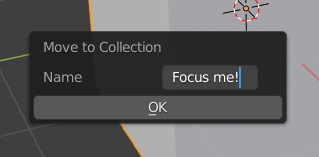
Move to Collection should automatically focus the text input when revealed, and pressing ENTER should commit the name of the new collection even when the text box is in focus. Currently, you have to select the text box, type the name, then click OK, or hit ENTER twice.
13 Likes