It would make the UI very ugly imo.
Rename “Blackbody” to “Color temperature”.
Blackbody - is physics term, not everybody knows it. Color temperature - used everywhere, from photography in white balance to lamp packages.
Though “ugly” is a strong word – individual values would definitely be MUCH harder to read at a glance.
Your eyes would have to adjust to each individual color to read the values in each field.
Unless you’re genetically-inclined to reading in rainbows (most humans read black and white), gentle contrast is easier on the eyes (and requires much less processing power too.)
I wonder why it got so many likes…? – Do people actually think about this sort of “ease-of-use” stuff? D:
Here are some questions to ask ourselves before making a UI suggestion:
- What genuine usability problem does it solve? (aesthetics don’t count as a “usability problem” btw)
- What usability problems might it introduce to others? (not being able to read a field’s value is BAD, even if the field looks aesthetically pleasing…)
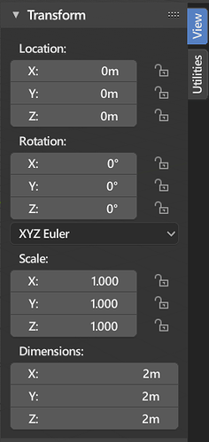
It’s probably nicer to just color code the axis names, rather than the values.
The reason for color coding should be obvious: To enhance the visual connection between the axis lines in the viewport and the values in the transform panel.
In any case, this is most likely not going to happen any time soon, simply because I don’t think it would be very easy to do in the current UI code. Unless someone pops up with a patch.
In fact this should happen in:
- Materials
- Textures
- World
- Particles
- Brushes
- Action …
and maybe others.
In the code they are really two different functions: BKE_material_copy and BKE_material_add …
Things are handled differently for view layers, Texture paint slots and Scene, though.
In Scene, a popup menu ask you what you want to copy: same icon, same description but a different behavior.
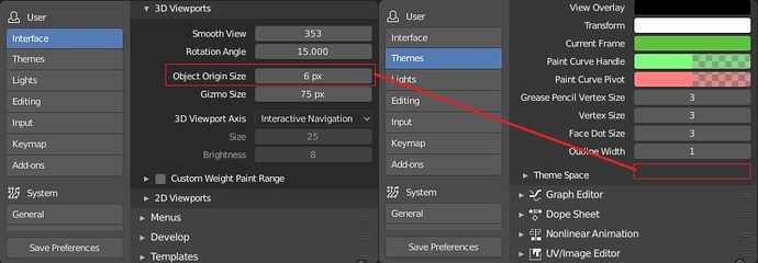
Yes, I noticed that too while working on the Preferences. It seems quite out of place that the Origin size is under Interface, while all other size preferences are in Themes. I’ll see if I can figure out how to move it.
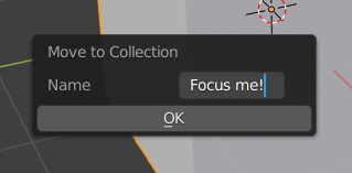
Move to Collection should automatically focus the text input when revealed, and pressing ENTER should commit the name of the new collection even when the text box is in focus. Currently, you have to select the text box, type the name, then click OK, or hit ENTER twice.
would be nice that the theming part of blender would me much more simple, at this point there is hundreads of colors to adress, it should be down to something like 5 colors that are always used everywhere so the palettes stay consistent and if you need to tweak the back of something because the contrast is not good enough you dont have to go through the whole theme trying to do that.
In the Image Editor if you right click on an image, a black bar appears at the bottom showing some info… How can we change the colors of it (text/background)? This seems totally incompatible with the default theme.
I think Sidebar duplicated Transform from Properties-> Object. If you remove Transform from Sidebar (dimensions move to Properties-> Object), then you can win a lot of space in Sidebar (for add-ons). Wouldn’t it be better to turn Sidebar into Add-onbar?
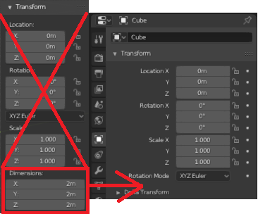
Yeah, I never saw the point of having those duplicates cluttering the UI.
Do you use the sidebar in edit mode? It has a lot of utility for placing vertices at exact positions (usually for placing verts on a mirror plane so they merge). It also holds the bevel weight and skinning radii inputs for verts.
Yes, I use Sidebar in edit mode. And I think it should be in Active Tool-> Transform.
At the expense of cleaning Sidebar. I think some elements are out of place.
For example:
 1. The Location Panel of the 3D cursor. It should be in the Active Tool (when you click on the 3D cursor icon in the Toolbar).
 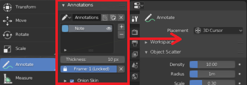 2. Similarly with Annotations.
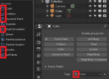 3. Add icons to Physics (I did not find an icon for Rigid Body and for Rigid Body Constraint).
It’s not only useful in Edit mode as abatea describes, it comes very very handy in Object mode (for various purposes) and Pose Mode (for animators alike) as well. And specially, when we take into consideration of going full screen for the 3D Viewport editor and still you have these utilities on the sidebar panel.
As for making more space for add-ons, it’s already grouped under default View vertical tab, and you can have your own custom add-ons with a specific and different bl_category name for bpy.types.Panel class object (which will make it appear as a different vertical tab, which in turn makes it much easier to manage, organise and segregate things of common utility of your choice)
You still can’t apply scale to instanced meshes (multi-user bodies as Blender likes to call it). 
EDIT: Also, it STILL says “not yet implemented” when you right-click a mesh and choose unlink/make single-use… what the heck, it’s been like this for years now?
UV Editor - UI Improvements
-
A button to add a simple image texture and a material (at the same time) to a slot on the selected object or faces.
-
A faster UI to manage layering textures (instead of digging into the node graph) by using buttons like the one mentioned above to automatically connect relevant nodes for you. To further this – the ability to define the types of nodes to add when the “Add Layer” button is clicked (and automatically connect them where possible so that they will display). Most times we “stair-step” particular node groups, so these “Add/Remove” buttons would append/remove the nodes in the graph based on NodeLayer ID (the nodes could be given a “Layer ID” for this explicit purpose of adding/removing or connecting them as a group from the graph.)
-
A tool or button to align vertices as a grid (for fast texturing of quads), or repeat them horizontally or vertically at particular pixel intervals (by typing the number directly in the viewport, then a “,” then another number)
I’ve always found it annoying that the name of a modifier is hidden unless you set an unreasonable width to the properties panel, justified only to show the modifier name, but creating useless empty space for all other elements of the properties panel, and reducing space for the 3D view.
Although the idea of having modifiers with only one line on the header sounds better, maybe adding one line so the name of the modifier could be visible would be a good idea, or some other solution. I would keep the name, up/down arrows, and X in the same line and put elsewhere the display options.
