There is a new material icon. It just doesn’t look the same when it first shows up and after you use it. The following are the same icons:
![]()
and
![]()
I’m thinking the double page icon as “new” is not obvious. So perhaps the initial idea of a + symbol gets continued as in this mockup:
![]()
The “double page” icon doesn’t read “new”. It says “duplicate” and that’s what happenes when You press a button with this very pictogram on it.
I do agree that “+” is really clear if the action is “Add a new material”.
But, if the action is “Copy/duplicate this material”, as it is now, I’d rather change the command name…
And more, the “force” to “save data-block without users” icon does not communicate so well… the “F” was quite clear and easy to remember (but not so fancy).
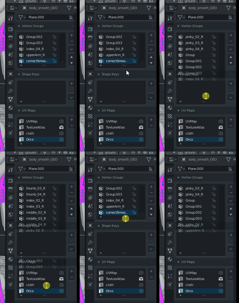
This has bothered me from day one. Trying to split a window using the corners is as bad as this. 90% of the time, it tries to merge or resize the window.
X 1,000
I wish the blend mode on materials was set to alpha blend by default. I often wonder why I have no transparency and then I finally remember I have to change the blend mode.
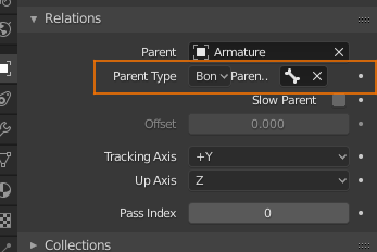
When parenting an object to a bone, you can hardly, if at all, read the bones name in the object tab because the the field is too narrow. Placing Parent Bone below the Parent Type could solve this issue.
I have a paper cut.
Shouldn’t the colour of the blank user Interface, when Blender starts up, reflect the theme that’s currently selected?
Currently (December 28, 17:15:46 - a7c5f4f20657) the colour is still that of 2.7X.
Removing the IK constraints from the “Add Object Constraint” menu. Or rename it to “click here to see the error message about IK only applying to bones” =)
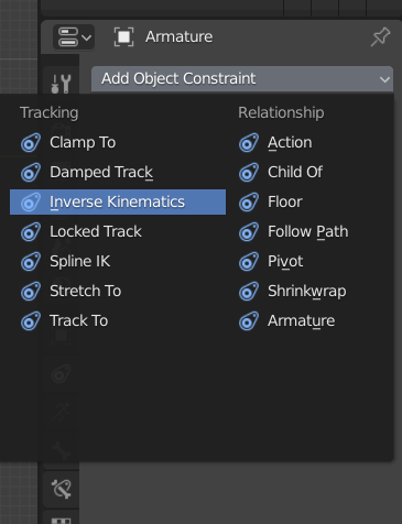

Maybe remove the object constraints tab when in armature pose mode, rather than showing a link to the correct tab?

Delete your preferences folder.
Maybe I was not clear…
I’m talking about was Blender first starts. The Colour of the Blank UI is still 2.7X Gray.
Ah, right. This should be an easy fix, I guess.
I can’t reproduce this here. Strange.
I’m missing the ‘More’ selection in the View Pie Menu (the one called by pressing `)
In 2.7x this had view options like Persp/Ortho, Align Camera to View, Toggle Quad View, Local View, etc. I found these really useful to have in the pie menu. I could stick those all in Quick Favourites, but if I stuck everything that used to be in a pie menu in there it would rapidly cease to be particularly quick.
Also it’d be nice if you could add the functions of the overlay buttons to the quick favourites menu by right-clicking them. Right-clicking any of the navigation overlay buttons does nothing.
I did other tests, but with a more recent build, the old one I deleted, so I can not verify anymore, the defect no longer appears
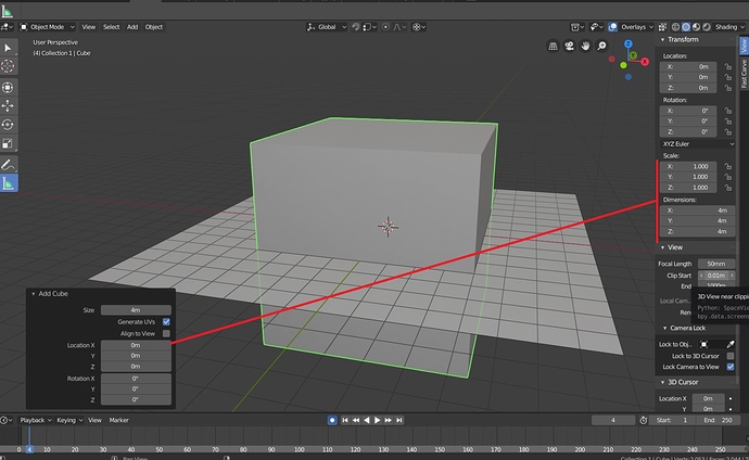
i have noticed that u can modify most mesh objects creation properties in the redo panel but only Plane and box meshes are in the N panel, and the only one property is ‘size’ which works like a uniform scale ,wouldn’t be better to add individual scale and dimensions there? i know there is grid for plane with divisons which to be honest does not make sense it could be just plane with those options…and btw the divison on the grid works really oddly.
well, I have been suggesting replacing the Cube primitive with a Box with dimensions… so yes I guess
The Shift-A add cube is based on the global xyz.
The Add cube tool is based on the 3d cursor xyz.
I am not sure about the best default value, but at least, I would like to have a toggle just like Align to view.
In the node editor, there are custom cursors for resizing a node’s width (the usual <–>).
Could we also have a different cursor for when you’re over a node input/output so that you know if you click there that you’ll successfully be grabbing the socket?
P.S. Happy New Year everyone!
