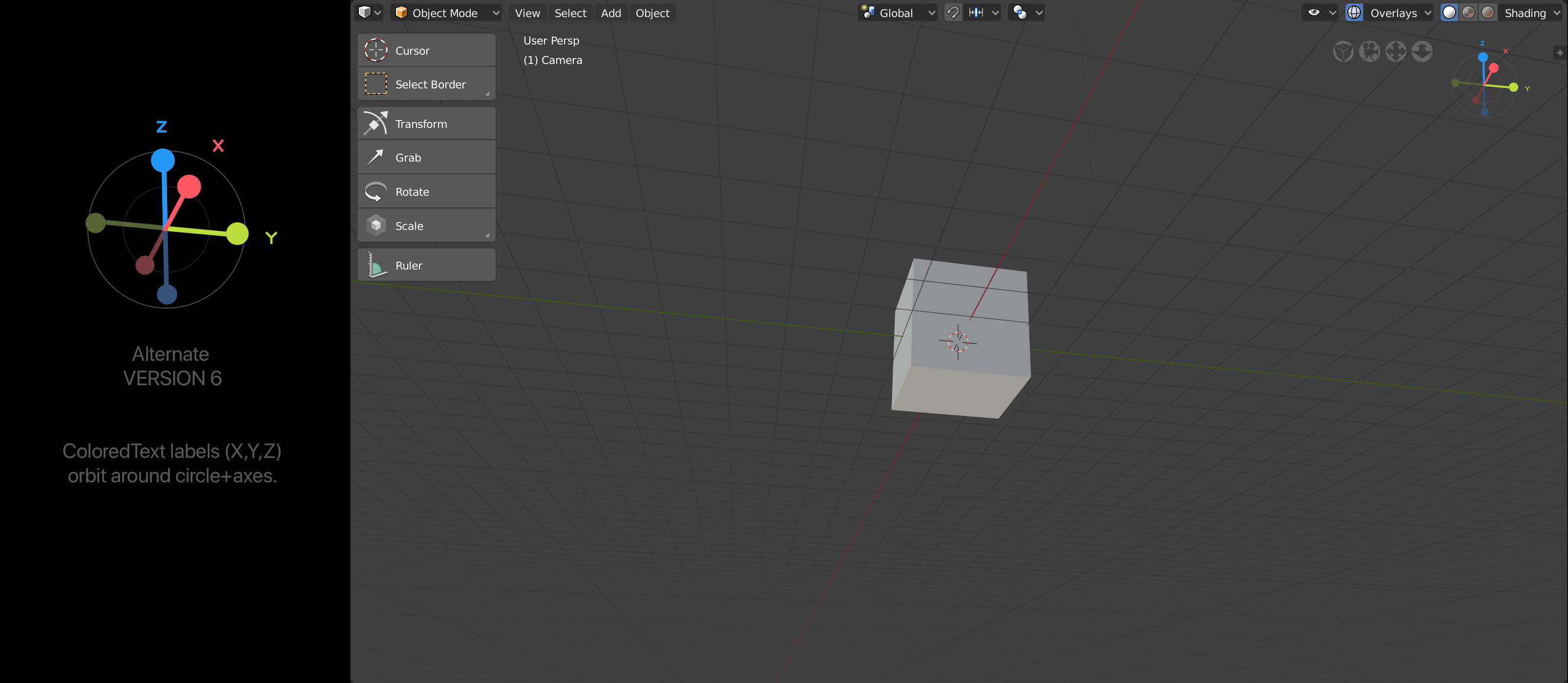
Maybe having the letters each one having its own color they can be at the edge of the circle as you proposed before.
Since the new orbiter was introduced, I also hoped it was just a work in progress. So I strongly support this options. I think the first post options are good because the style matches the objects manipulators (translate, rotate, scale)
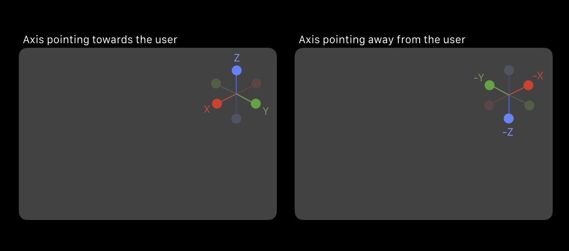
For me it’s really important that the negative and positive direction of the axis are visually recognizable at a glance.
Thank you for your positive feedback! 
I’m new to this process, so I don’t know how the Blender UI team makes decisions or how the approval process even works.
Essentially, I don’t know if these designs will even been seen by the Blender team.
But I wanted to try and put some options out there just in case the Blender team was interested in some alternatives. I have a pretty busy schedule, so I tried to squeeze in some ideas while I had the chance.
cc @zebus3d
Hi.
I like the design of those circles, but maybe only for negative part of axes as another had proposed.
In blenderartists there are other discussions about Gizmo. Your design is also applicable for my proposal
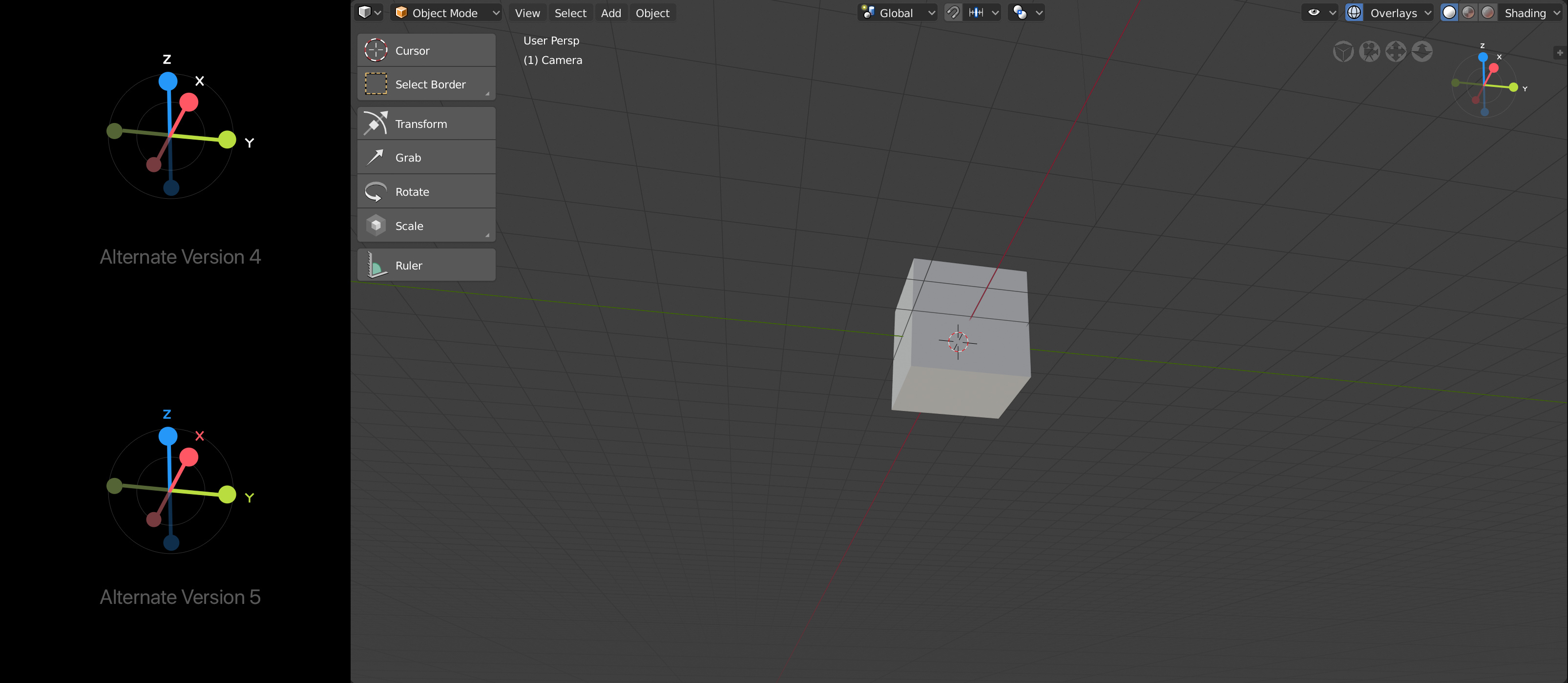
I think Alternate Version 4 works best, since the axis letter is easier to see.
What’s the purpose of the inner circle?
Hi @pablovazquez,
Originally, it was part of a working mental model I had in my head.
As of now, it no longer serves any real value, thus it should be ignored.
Thank you for the feedback!
Alternate version 4 looks good to me too, although I think we should color code the axis titles if they are not placed inside the circle itself, as you did in version 5. Otherwise, the connection is not clear enough at all angles.
Also, we may have to adjust the sizes of the ‘balls’ to make them easy enough to hit. Even if the hit zone is larger than the visual circles, it could still be an issue when two circles are close or overlapping.
Other related design topic are the four navigation icons next to the viewport gizmo. These are just programmer-art temporary icons. They are too busy, and too big, esp if we include them in other editors too. So, anyone in here want to give them a go?
Other related design topic are the four navigation icons next to the viewport gizmo. These are just programmer-art temporary icons. They are too busy, and too big, esp if we include them in other editors too. So, anyone in here want to give them a go?
I’d simply use the Blender icons we already have for the moment, until we can replace them with better ones. (the cube in perspective for ortho/perspective switch, camera icon for camera view, magnifying glass for zoom, hand/grab for pan)
We could, though the current shaded and outlined icons would not be a good fit. Also, it’d be good not to mix meanings. Search means something quite different from zoom, for example.
Hi @billrey,
You, I and several others have all shared the same concern for the axis titles; that it gets confusing if they are all the same color (white). Three other people mentioned that having the axis titles having matching colors (version 5) has a lot of merit and value as well.
Agree that the “balls” could be bigger.
So, do try and design some icons? I have some bandwidth today and might be able to suggest some ideas if you are interested. Your call.
You are very welcome to contribute ideas on how to design those icons.
So here, I’ve taken your design tweaks and also added a clearer indication of the negative axis direction. This is a problem in the current design, where it’s almost impossible to see if the axes are pointing towards you or away from you.
In this design, it only shows the axis that is pointing in your direction, otherwise it gets quite visually noisy.