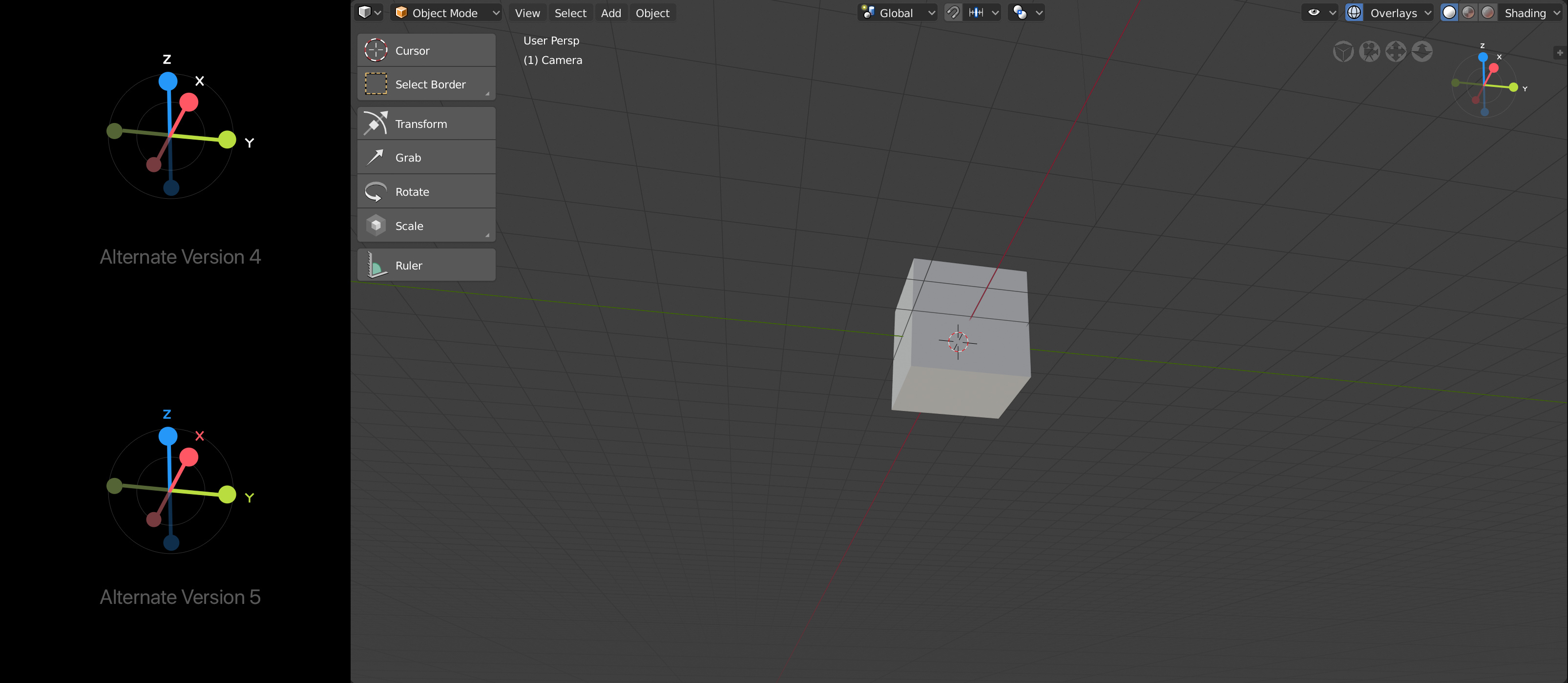
probably the best way to solve; show some examples of the component in those situations.
I can think of a few ways around it.
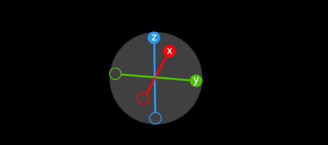
Immediate solution I would try is to put circles behind the labels that are the same color as the background, you would need to play with the transparency to see what percentage of transparency and the size the circle would need to be
Said another way, imagine that there are circles behind the labels that appear invisible in my layout; but when there is overlap the background circles would become visible. So the background label circles are always there, but visible only upon overlap
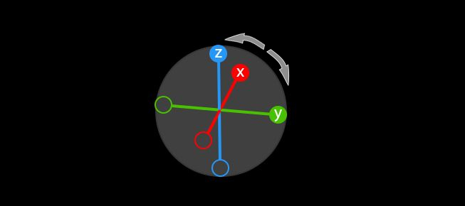
@AndrewC Just thinking out loud, but I wonder how it would look with the labels always rotating around the outside of the circle (yet always aligned with axis/color). just another way of thinking about it
I don’t know, could be weird…but wanted to put that out there
Hello @nathanima1 what do you think about this octahedron concept it’s like the one here but joining the dot’s and giving the platonic shape, perhaps you can make it more nice than the one I’ve made. Love to see it : )
@belamat Its a unique solution. If I were to move that direction with the octahedron shape; I would add a white circled stroke around the shape to give it a sphere effect. That way it has an orbital feel to it. Obviously, I like the similarity between your execution and mine
Not sure when I will have another go at playing with the design, but we’ll see
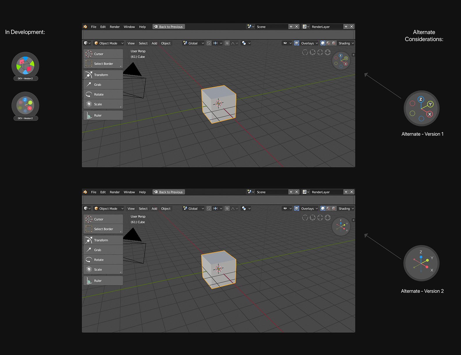
@AndrewC One other thought for version 2, the labels could be ghosted upon overlap. The closer the proximity to overlap the more the labels lose visibility. That way there is not this weird overlapping of multiple elements stacked on top of each other.
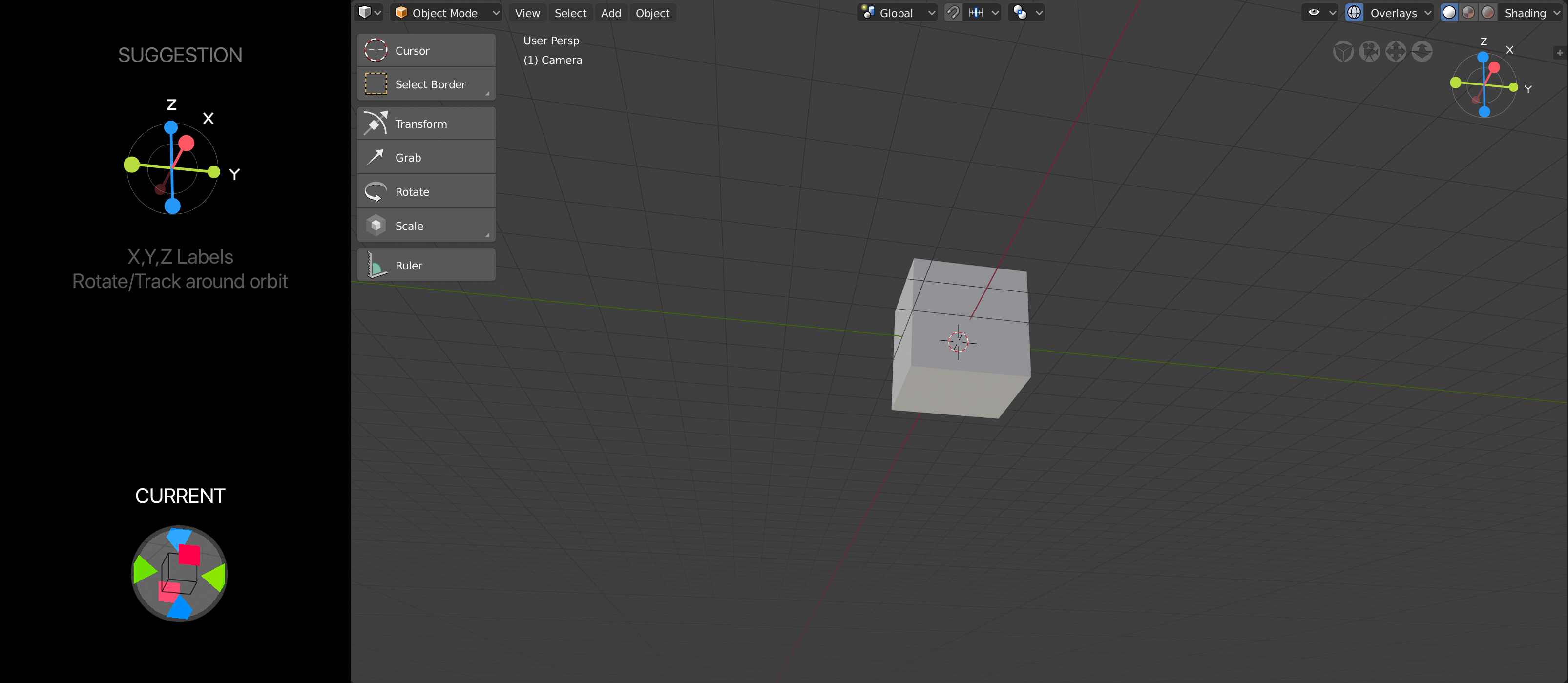
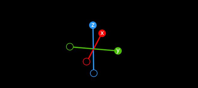
Adding a visual that shows how the labels would rotate around the orbit. People will still get the gist as the axis x, y, z will line up with the corresponding color. Anyways, just wanted post what I mentioned earlier.
Nice suggestion! I couldn’t resist trying an iteration mixed with the current design. The issue I have with the current one is that it’s sometimes not obvious which disconnected circle goes with which axis, and the circle for navigating around doesn’t always need to be present.