For good measure, let me power thru a few different executions so you and others can see some legitimate visuals. Don’t want to throw the baby out with the bathwater just yet
I see your point. That is an issue.
So, I do agree that going back a step does seem like a more logical solution; in light of the inevitable overlap. As much as I like the titles outside, inside seems to be the simple and logical solution.
I originally avoided titles inside the circles because I believed that they were more difficult to read.
But, at this point…it looks like your solution works best.
My advice would be to have someone (could be me, or anyone) create 3 more iterations to pass the legibility/readability test. And just see which execution reads the best.
to be more specific, I’m referring to the size of the circle/ball and the size of the text (size, boldness, brightness etc)
For sure, ideas & design are always very welcome, esp when nicely illustrated as you’ve done. Please do go ahead - you and others are most welcome to explore ideas and designs. I do think some of the adjustments listed above improve the gizmo and makes it more clear & readable.
2 Likes
Agreed. The changes mentioned above and the current visual you provided are solid.
I will design a few more iterations that build on your current model and have them in context and see how well they read.
Appreciate the feedback, and allowing me to contribute!
2 Likes
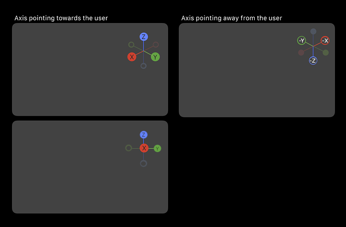
I’m liking this last iteration, where axes that are pointing toward you are more saturated and are the only ones labeled. Much easier to get a read on the orientation.
However, the devil in the details…
What happens at the transition? How do far axes turn in to near axes? You probably don’t want them popping in and out as you rotate. Yet, if you transition from one state to another then how do you deal with them when, for example, “X” and “-X” are equidistant? Are they shown similarly? Both labeled?
If not smoothly transitioned there will be a popping that will be annoying. If transitioned then you will probably show equal items similarly. But then you have the oddness of a a horizontal axis looking the same from end to end except for a tiny “-” beside one X…
Hi @harleya,
These are good points.
From the moment I sent in my first design, I had hoped that these ideas would be tested for validation.
That is really the only way to gauge all the instances the Gizmo will encounter.
So, things like overlapping elements and transitions would be field-tested.
This particular gizmo component is very dynamic, unlike icons which are static. So there are too many variables to account for (cognitive overload) unless you go ahead test a concept to see if it will work.
I wish I was able to contribute more time to this, that way I could establish a solutions for all the given scenarios.
So, I really hope this concept receives enough attention for someone to create at least a crude prototype that gives people like me something to work with.
My gut feeling is that smooth transitions will be found to be required. Otherwise too much jumping and popping elements as things move. So the saturation needs to smoothly change as the axes goes from behind to in front. And the text labels would need to fade in as well as they move forward.
This would mean that if an axis is equidistant then we’d see both sides, each circle being the same saturation, and both ends would need to be labelled. Therefore I think we either need some indication of the positive direction (an arrow somewhere), or show the circle on one side reversed, or maybe just the outline rather than filled in for negative. The last option sounds the most promising…
And another detail. William’s last iteration also implies that the sizes of the axis circles change as they move from front to back, and so will have to be done smoothly. This is great though, as the widget will finally have some proper depth cues as now the circles furthest away will be smaller, rather than making the negative ones smaller regardless of distance.
But then this obviously implies that there is more than one circle size. So when the X axis is parallel from us the circles would have a size that is midway between the large and small ones we see in the mockup.
1 Like
Now, just to complete the derailing of this thread…
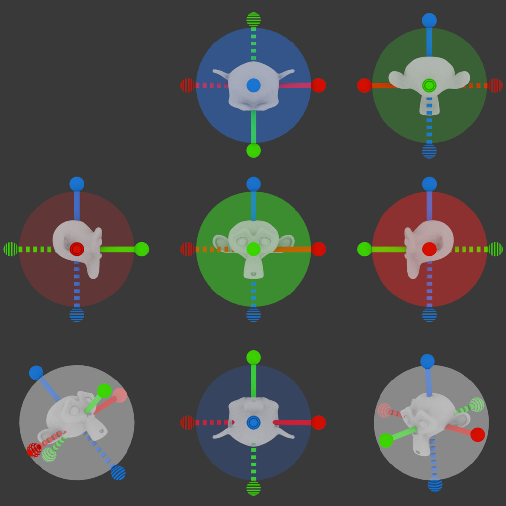
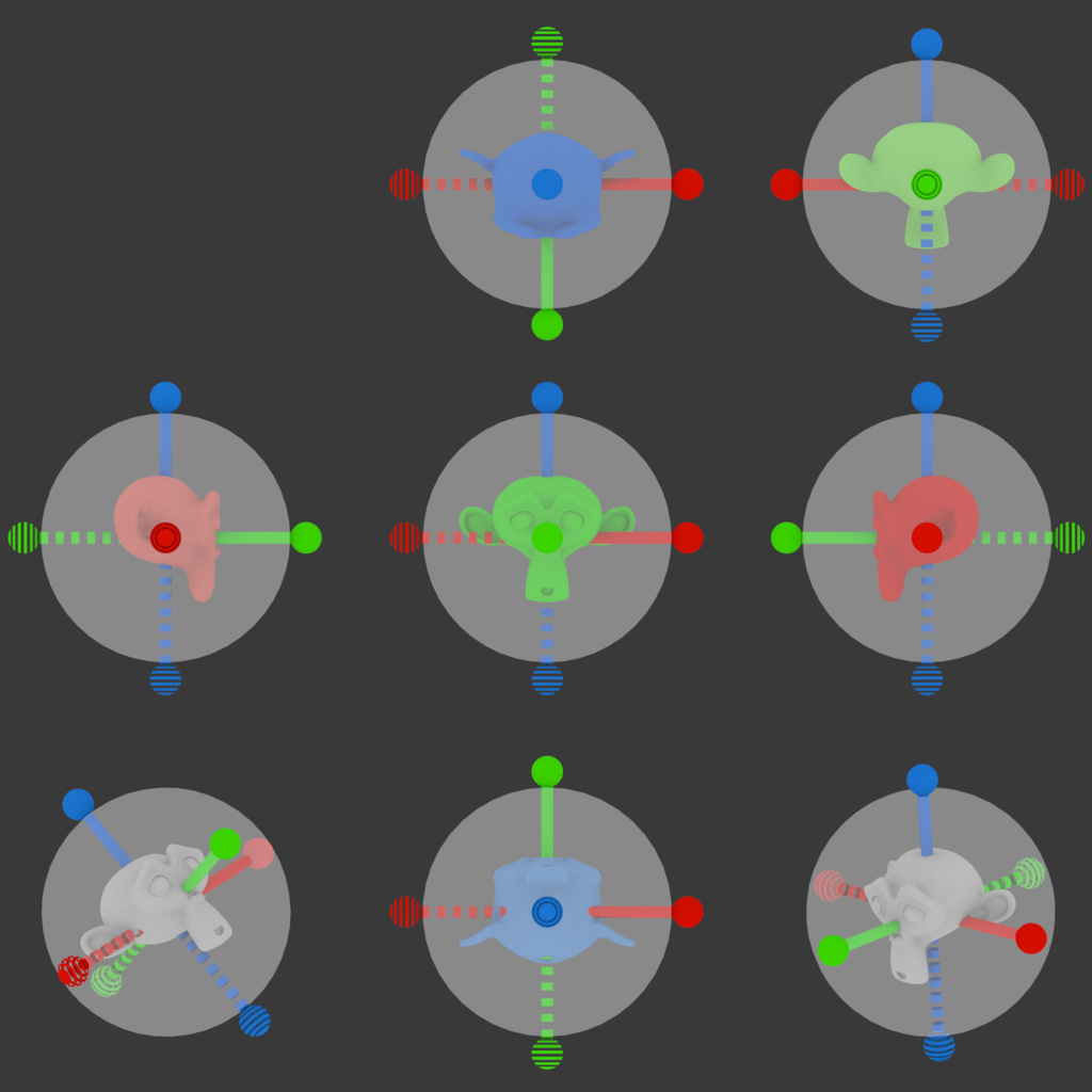
In the mockup above, when you click on any of the axis balls you go directly to a “face view” as shown in the bottom of the three images.
This type of view is special and so it can be overloaded with some extra features. When in this view (only) clicking on the central axis will reverse the view.
But we can also enable hidden hit areas in this view that take you to hybrid views. Obviously the black lines in the mockup below would not be shown, just there to indicate the placement of the hit zones:
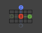
So clicking between the “X” and “Y” will take you to a level view between X and Y (front-right view). Clicking above that takes you a view between X and Y and looking down (top front-right view). Etc.
1 Like
Cool. Your “view sphere” looks something like my first post on this thread at Blenderartists. It’s a pretty interesting thread, all sorts of neat and odd ideas:
Yes, I think many of us think similar ideas
1 Like
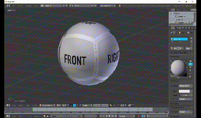
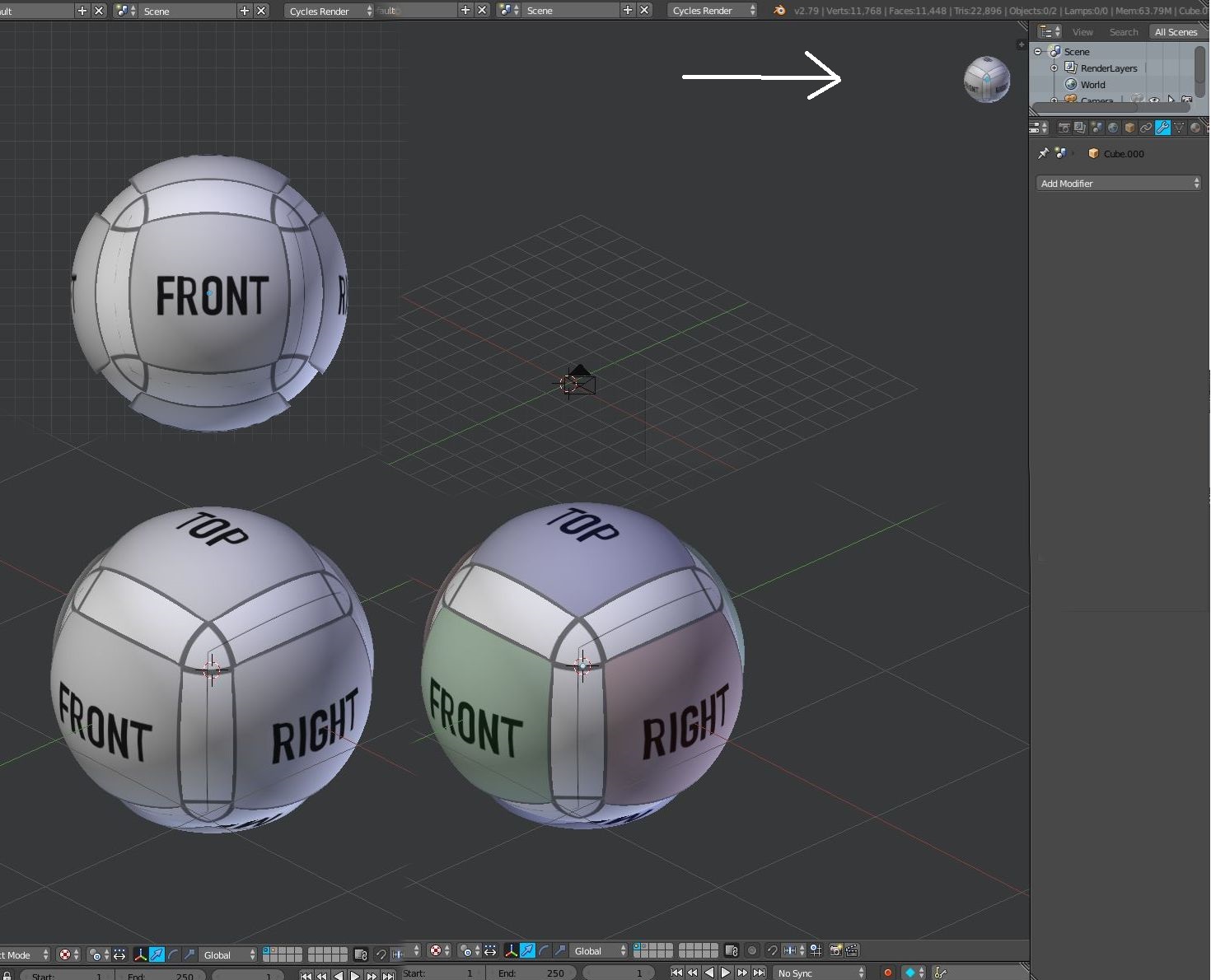
Here’s my concept design for the Blender 2.8 3d Manipulator, as I found the placeholder widget during the buildquest… in desperate need ![]() but yours will do nicely @nathanima1
but yours will do nicely @nathanima1
Note elegant 3d model in the center quickly tells the artist what angle they have. The shortcuts can be set by clicking the menu button in the top right.
Here is the axis mesh as I rotate it. Axis Mesh 2.avi - Google Drive
1 Like
Your model looks pretty, especially its distribution of icons around, you use the colors very well, it is the best I saw so far, although in waves I would make you another figure, like a circle for example. You can also try the red, green and blue canes in front of your central model for a quick visual orientation.
I think if the axis is pointing directly towards the user, it should just not be displayed at all. Perhaps it could fade out as it approaches that angle.
1 Like
Harleya: The popping you refer to already happens a bit, because the opacity changes depending on if the balls are facing towards or away from you. I don’t think it’s that bad, but will be slightly more prominent if the text also switches. In theory, we could do some sort of fade, but that’d probably be quite complicated, and perhaps not necessary.
I think if the gizmo is axis-aligned, then we only need to display the positive axis text. You are right that ideally, all the circles would probably be the same size when viewed on-axis, yes. This helps communicate that they are all equally far away.
Please think like a new user in 3D world. There are positions in current Gizmo that are very confusing, for example these:
Make an experience with new users in 3D world, take screenshots of various positions only of the current gizmo (without suzanne or any reference). Then ask new users to quickly identify where an axis points, or if it is viewed from below or from above.
There in that thread I have published a variation of current gizmo. The ring showing Z +, Z- colors helps a lot. And believe me, arrows in + axes are always very helpful.
I am not saying that you should choose my proposal, but somehow those problems must be solved in current gizmo.
This is my proposal: [https://blender.community/c/rightclickselect/7Qbbbc/proposal-for-gizmo-simple](http://3d Viewport Axis)
Option 1
Option 2
1 Like