With Grease Pencil 3.0 we’re going to have Layer Groups by default. This raises some questions for how layer groups should be shown in the UI as well as how layers are presented. I’d like to address this in this thread and collect some feedback.
What are Layer Groups ?
First, let me clear up what layer groups are and how they are currently used.
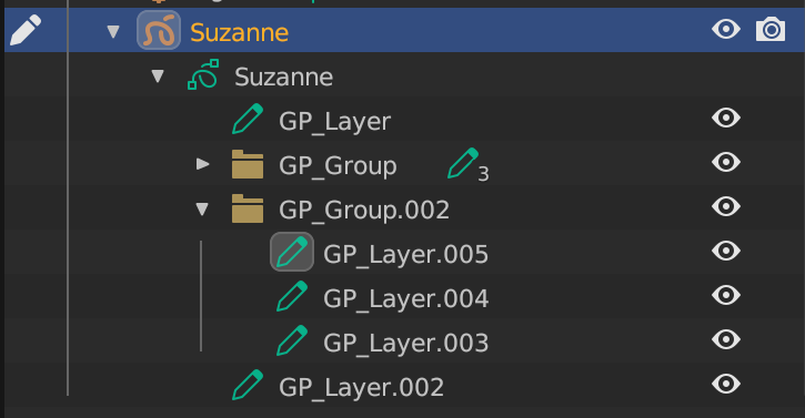
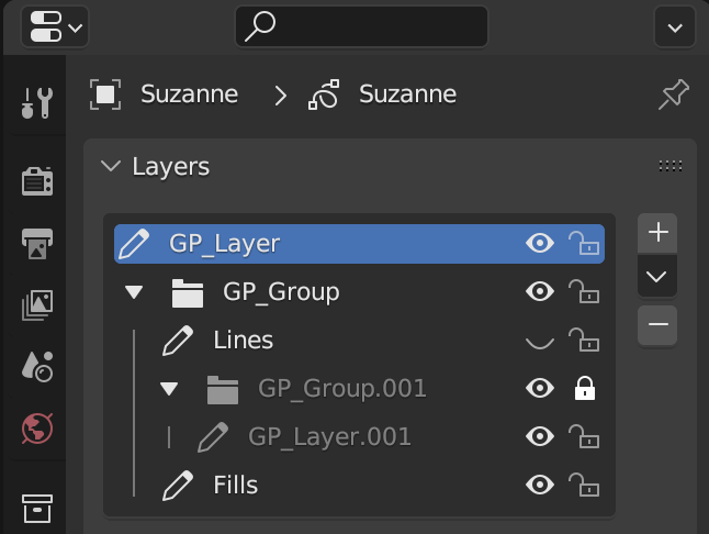
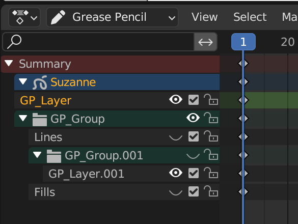
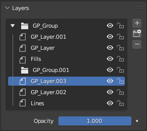
A layer group contains zero or more grease pencil layers or layer groups (layer groups can be nested). Apart from a flag (used e.g. for selection, visibility, locking, etc.) and a color tag, this is the only data it contains. A layer (or a layer group for that matter) can only be in one layer group (contrary to how objects can be in multiple collections at a time).
Example: A user can put layers that logically belong together into a group. This allows them to easily collapse the layers, toggle the visibility, and lock all the layers and groups inside it.
In short, it’s a way to better organize the layers when there are lots of them.
There might be some more ways we want to utilize layer groups in the future, like allowing a modifier to accept a layer group for filtering, etc.
How do Layer Groups currently look like in the UI?
(some of these screenshots are from PRs that are not in main yet)
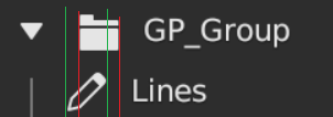
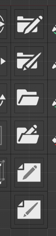
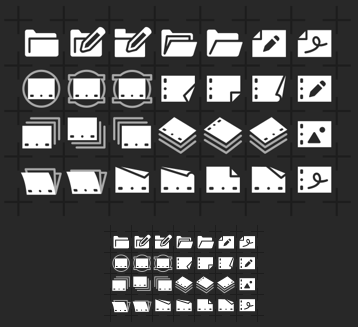
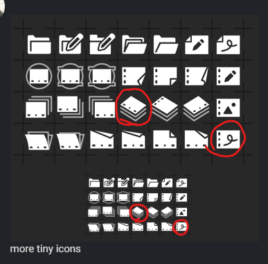
We need an icon for layer groups (we are currently using ICON_FILE_FOLDER). One suggestion from @pablovazquez was to use the folder icon with a pencil on the side. Also, the default theme color (e.g. in the outliner) should be the grey like for collections. The plan is to also have color tags for layer groups at some point.
Should the layer icon be revisited? Layers didn’t really have an icon before. It’s almost the same as the “Draw Mode” icon, but maybe it should be different? A canvas maybe?
We shouldn’t use the term “Group” on it’s own in the UI. Layer Groups should always be referred to as Layer Groups. E.g. right now the default name for a layer group is “GP_Group”. This might be confusing in the outliner if we ever have something else that uses groups. I’m proposing to make the default names be “Layer” and “Layer_Group” (or “Layer Group” with a space).
a group can be viewed as ordered set (structured set mathematically) IMHO we may change E.g vertex group to be renamed as vertex set and and i’m with keeping the group name as ‘layer group’.
about the icone we can put above the icone the number of layers that contains in the layers list 'not in outliner like this
I would like to try to design some icons for it, I dont know where I start, I know it is probably in SVG or PNG, but I dont know the size, where I can find the current icons in image format to me to open it and check the style, gray ton, line thickness, etc.
I quite like new draggable UI list menus with folders/groups. I would owe you one @Harleya if you could add that to Vertex Groups and Shape Keys. Organization of those is impossible at the moment.
Question: Is it possible that in the future layers have previews like Photoshop layers?
I think the Pencil icon is a good choice. It represents the idea of the feature (drawing lines), and does not have the same “square box” shape as the folder. I think the default Outliner color should perhaps be a separate listing for GP groups, than existing groups. (So, not both grey).
I’m not sure the name “Group”_Anything is ideal name, unless the top-most parent in the hierarchy truly treats all children as a group. In something like PS, this sort of thing is indeed called a Group. But in 3D, “grouping” is a different concept - one that Blender doesn’t currently have, of course, but I feel like the term maybe shouldn’t be taken over and reapplied.
Perhaps something like “Stack” or “Comp”? I don’t love those so much either, just thinking out loud here.
These are great! I really like the ones with the pegbar slots. Maybe another idea is to put the slots horizontal at the bottom, without something on the page but have the fold in the corner?
Something else we discussed: The folder icon for a group might not be the best idea. Another approach could be to have three of the layer icons stacked (without the fold).
Whatever you will come up with, I think that rigging also needs collections or layers at some point. Would be great to have the UI consistent if this makes sense
IMO right now, adding a layer group is a little hidden on a dropdown. For such useful feature, I propose to use the same folder icon that we’ll use for layer groups with a plus sign on a single button.


