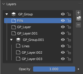
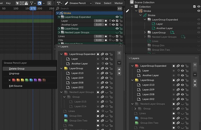
here is the SVG file if someone want to make some tests, the original blender svg file is “blender_icons.svg”
Note there are 2 pegbar paper, bottom (used in original cell animation) and left, so if choose the layer pegbar paper, maybe make sense choose the stack paper (group) according with that.
1 Like
Thanks! I will try it out 
Julian’s choices of the stack and the page, read well for me at small sizes. (One 3D, the other 2D, does help quick vis recognition).
Agree, combining 3D for layer group and 2D for layers, helps on readibility.
But the icons need to be way more simple, there will be a lot of them in the layers list.
I’d try to avoid filled ones and also the angle used for 3D ones need to follow the rest of the icon set.
Here a proposal

6 Likes
I dont think a good idea to reuse vertical paper icon to layer, but it made to notice that both being white (like the first one) looks confusing, dark layers looks better and it have a constrast with group icon.
8 Likes
yes, filled white icons should be avoided on lists.
The icons in your mockups seems to be a bit oversized, here is a version with the idea that convinces me the most, the simplest one, but with the correct icon size.

6 Likes
I personally find most of these variations to be inferior to the “simple” folder icon, which is very universal. They seem to convey something a little different too, as if they weren’t just a container, but a stack of layers themselves, or something. The fact that the icon is mostly filled also helps it stand out from the actual layers around it.
6 Likes
A default folder icon denotes a container for files; the layers aren’t files. In the earlier examples, I felt the folder was a strong choice due to the silhouette, but I think the “stack” icon accomplishes this well too.
The fact that the icon is mostly filled also helps it stand out from the actual layers around it.
Agreed.
2 Likes
What confuses me with the stack is that it implies that GP is a 2D object which it isn’t, if that approach would continue, the implication of that would really make sense that it is technically a 3D object. (which will even change more if geometry nodes is ever supported)
I think the folder icon works because it implies a container (not specifically a container with files in them.) like Hadrien said.
3 Likes
GP is generally used to fake 2D, isn’t it?
As to the folder icon: folders icons have an established meaning in an OS. Blender already has a problem with using non-standard terms/definitions for standard words/terms.
I believe not doing also this with visual elements should be avoided when possible.
2 Likes
hiii personally i also like the folder best as generally in traditional 2d animation you use folders to contain cuts so in my eyes having the acme hole punched animation with a folder group icon is probably the nicest solution.
2 Likes
GP is generally used to fake 2D, isn’t it?
I think that tunnel visions the use case of the tool.
As to the folder icon: folders icons have an established meaning in an OS. Blender already has a problem with using non-standard terms/definitions for standard words/terms.
When I look at Krita, Photoshop, Clip Studio Paint and Substance painter. they happen to use folders for groups, what would be non-standard about using a folder in that case for GP layers?
A stack of papers in the 2D industry, implies that there is an image sequence in it.
Can you explain what the iconography behind using a folder inside a timeline or dopesheet would be? I can’t imagine anything else inside that context and would like to know your vision for it.
9 Likes


