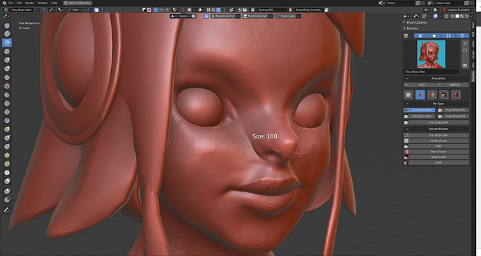
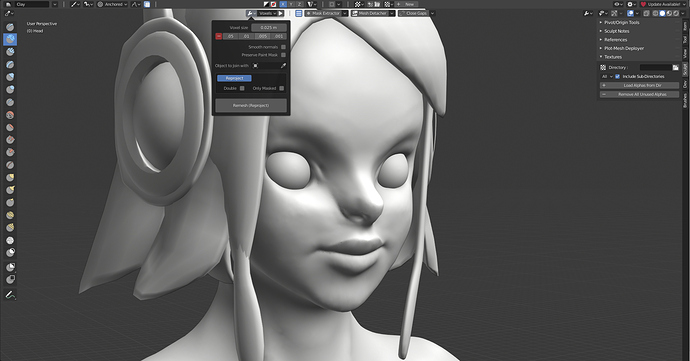
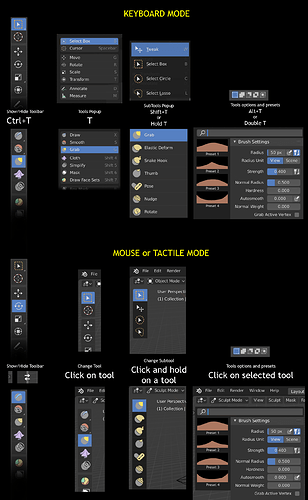
that’s true,we could leave the names as they are with the tooltips… but i would prefer the static tray over using the “Spacebar” or keeping pressing doulbe keys to access them like in zbrush, users don’t have to fill all the rows with brushes only few secondary ones there and the main ones invoked with the hotkeys and i believe the UI can be adjusted with Ctrl+MMB… but i like what you did with the RMB context menu.
This could be really handy. I’d probably prefer a customizable pie menu for things like these, using right click with a tablet is not all that comfortable, since for blender viewport navigation I found it best to map middlemouse to the lower pen button. Something like Krita’s right click menu as a pie menu maybe?
In my opinion, I see the actual context menu and (sorry) any proposal around that idea an error to go with the new brand Blender 2.80 and above. If we want to aspire higher and to be different (and much better) from other well-known softwares such as Zbrush, Adobe’s suit (+SP, etc…) and so on (with similar concept). We must think in a better solution for that + thinking for future.
About context menu: We can’t pretend 100% to have a popoup menu that contents that much: brushes, brush settings and what else…? or the same: just copy other softwares because they also have that exact kind of not practical context menu, then what’s the difference? I will always think about a problem about UI/UX design that is not about the context menu itself - that “solution” that maybe you create to respond the lack of consistence in the rest of the UI - but about all around the UI. What I want you to think about is about what happend with the header, the tool header, the panels, the tool properties, the context menu… they are not consistence (in set) at all.
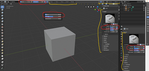
Just think about this sentence: “I have 5 ways (that I know) to change the size of the brush with the actual and default UI/settings for sculpt mode”. With that over the table I want to ask you: It’s ok for you guys to drag this inconsistency over and over again? Or do you want to fix it and make the best UI that users and professionals really need… How people is going to fully switch to Blender for sculpt from other sculpting softwares? We just need 1 + shortcut, not 4 copies + shortcut, at least 2 copies, but no more. The crazy thing that I’m asking for is not as crazy as it is now. It’s a sacrifice, but I believe is necessary for the good future of Blender. I can take all day taking out defects but let’s continue …
Just as a note, I don’t use the default UI for sculpt mode, I learned python and the API just to change it, only because of that, that was my first motivation to start that project, and my roadmap to go it’s not even finished but is much practical as it is as default. Also If I don’t use another tool is because of they awful UI/UX that I can’t change, but I can change Blender, and cool because is my favourite software. So with that I want you to know I’m not saying this is because I want it, for me, I already tuned Blender but I believe in the great future of Blender since 2.80 alpha ![]()
About future:
- The idea to replace the actual system of brush by tools to a unic brush system shared between brushes with even their differente behavoiurs (like every other software such as Krita, if I understand it right) is REALLY the way to go + nodes, and that gave me some proposals and further solutions for the UI: the first one is to separate all brush options to a new tab “Brush Options” or something like that (or keep “tool”) and then all not related to the new brush tool will go to a “Sculpt” Tab such like: display (separating custom icon to “Brush Options” tab), dyntopo, options, remesh, workspace…
- About favourites, is a nice proposal but doesn’t ‘Q’ make it? Is actually the same concept pressing ‘Q’, popup and select a brush, just like with RMB, only changes the key to press, Is necessary to have it x2?
- Another thing we need is a real brush manager and sure… Brush Sets by categories (like collections more/less) and different filters (they are also something I have planned). The new brushes can be saved into Blender (shared across all your projects) or in the actual project itself.
- For brush sets and favourites, etc… the way to go is another tab, UI section or panel for brushes that will contain only brush sets (and their brushes depends in which one is active) as well as favourite list, recent brushes or whatever related to a “list” or “set” of brushes. We can change between list view and thumnails view and is responsive. I already make some of this and I’m completely noob so it’s not hard to do.
- To make things consistent all over the UI to not depend of a context menu to supply the needs we already have with just a restructuration of the UI. Context menu must be the last solution.
- To not repeat the same and the same over all different places, actually the same things are over the panels, the properties and the headers - Make a better use of space! - Plus active tool panel is not really that useful, the same for the new brush context menu in the panel (for this I can recommend/aport something useful to you If you want… that can replace that for a while).
- You have different things being repeated over different places but other things are not that well… accesible (specially working on fullscreen/only with 3dviewport), and yes… I’m talking about texture/Image. I have much improvements for it that I can propose too.
- The proposal of @ThinkingPolygons to have a context menu over each brush in the grid is needed but I want to extend that to the ability of remove/reset/duplicate/export/change settings(opens popup with brush settings) (? etc…
Also, I want to know if I can make some proposals (code) to coredevs to add/modify things and how, I’m interested in contribute as much as I can
What I did (visually) in general:
(Is not a mockup!)
I think we should focus on improving the blender interface to sculpt, not look for false fights that do not contribute anything. What is the problem with changing the size of the tool in several places? Zbrush allows you to change most tool settings in 3-4 different sites. No complaints have been heard about the Zbrush UI for such a thing.
I know you liked my proposal of how to use the header I put in RCS, so I know we have similar ideas. We shouldn’t focus on debates that aren’t going anywhere like the one where you should see the tool options.
What is the problem?
Going to sculpt and have all the brush settings duplicated over the header, the panels, tool props, and now… context menu (partially)
Probably is not a problem for soo much people - and is not as it is - people can work with the headers or with the panel and hide the other area. But I wanted to throw the bomb because I think people have to be aware somehow in having duplicate content over the UI - that’s not a good praxis for a good UI - specially for future when new tools are coming to Blender… Is pretty much that.
Zbrush allows you to change most tool settings in 3-4 different sites.
Then we know what Blender have to avoid when talking about a good UI/UX - specially for new users.
I put in RCS
Please pass me the link, can’t find it… But if my mind doesn’t fail and is what I think… It was about the clean design of the proposal.
If the most user software for sculpt do the same, yes, blender can avoid it, but not, it is not a problem for UX and UI.
You did not really throw a bomb.
Same topic was already mentioned here.
Cool! Thanks for the info!
I was just about to post that 
Would be great to continue the conversation about the UI there!
Sculpt Mode is rapidly progressing, I love the direction it is heading towards.
What I really miss from the otherwise idiosyncratic ZBrush UI:
-
The fast keyboard shortcuts for essential tools, such as masking using Control, and trimming and clipping using Shift + Control.
-
Quick and easy controls to polish the complete mesh or masked area: smoothing with effective volume preservation. In ZBrush I’ve got the Deformation ➔ Polish slider in a custom UI, which brings me to the next point…
-
Don’t underestimate the power of UI customization. Once you’re able to arrange your own personal workspace, it can double your workflow speed and pleasure.
The Quick Favorites are a good step in the right direction, but it needs modification options, and a custom toolbar you can place at the bottom, top or side of a view would be very useful. -
I really miss the ZBrush polygroup workflow, but I guess that’s out of the scope of this UI discussion.
+1 for these points.
As nice as the pose brush is, without the option to pick an origin for the rotation it’s just a guesswork, way slower than anything with the traditional transpose tools, for which the topological ctrl-drag masking/lasso masking was just minor extra step. For example making the head to turn to any axis from a fixed view is pretty tricky, not to mention to rotate an arm by the shoulder.
A big +1 for polygroups as well. Hide, isolate, mask parts of the mesh as easy as 1 click away. Mask modifiers are not respected for sculpting operations. Want to sculpt the inside/on isolated parts of a mesh? Tough luck, separate it, do it in edit mode with vert groups or some other convoluted way instead of clicking autogroups with UVs and ctrl/shift clicking.
If asked for changes by the client - layers and the morph brush are your best friends, able to constrain them to certain axis as well.
Don’t get me wrong, I like all the changes in sculpt mode, a lot. It’s good to see all the momentum. It’s just certain parts of the zbrush workflow is waaaay more efficient - even if it’s just a couple more clicks the achieve the same thing - professionals wouldn’t make a compromise.
Of course realizing that not every part of development can bring such frequent updates, it’d be still good to have some news on development in other areas, as I’m sure it’s just as much appreciated. I’m sure anything towards better performance, rigging, animation, particles, grease pencil, rendering or anything really is very much valued by the community.
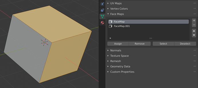
I didn’t know about the new Face Maps in Blender yet. These seem perfect for the introduction of a Polygroup workflow in Blender Sculpt Mode.
Where did we land on a global brush panel? I’ve recently pulled in a pretty common custom brush set, and either some of the brushes were lost on append, or they’re hidden in the UI.
It seems like a borderline bug that we can’t search all of our brushes.
Today I published a proposal on Right Click Select
which I see compatible with your proposal to add filters to the brushes.
The proposal itself consists of associating everything that refers to Tools to the T key, grouping tools as is done in the other modes, and accessing the subtools and properties directly from tool icons.
I think that some idea that I comment, you can take.
Read the thread for a more detailed explanation, please.
Cheers
Nice proposal! Voted for it.
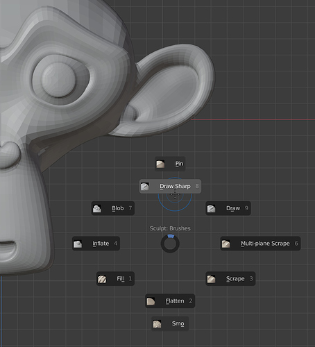
In the mean time, I’m enjoying Pie Menu Editor a lot. I’ve made a number of convenient custom menus for Sculpt Mode, Edit Mode, Object Mode and the Node Editor.
Here’s an example, tied to Control + RMB:
Is there somewhere I can get peoples Pie Menu for that addon? lol
You can check out the Blender Artists thread about Pie Menu Editor. Lots of info about the add-on can be found there.
Adding columns to the tool pop-up menu, to make use of the horizontal space, would be more convenient, like in this add-on:
