This is it. Well done…
1 Like
I added a couple of mockups. Let me know what you think!
More mockups of the panels, spacebar menu & dynamic brush icons are coming as well and don’t forget to read the description next to the mockups for context 
2 Likes
please don’t beat me …
as reminder, since we are talking about general refactoring of sculpting/brush interface to make everything more comfortable and faster …
At least for sculpting and painting tools, take this proposal into consideration on an optional level…
1 Like
I don’t think this is really related to the issues and proposals listed above
obviously, for this reason I asked Venia, not to bother me.
I, on the other hand, think that sometimes we need to have a minimum of flexibility, otherwise things that are fairly important and fairly correlated, and even rather trivial to obtain, are lost in oblivion and always remain a step less than the competition…
i want the best, so the have to risk.
@JulienKaspar I like it that you are bring up this conversation. I agreed in many things that you wrote there, the very first thing that hit me hard is the merge, please don’t merge blender default brushes.
We need more brushes to be exposed in Blender not hide them and we will need couple click before reaching them.
The idea of changing 3-6 settings before getting the feeling of the brush will slow the sculpting process. Think about it for awhile when a non-digital sculptor or a traditional painter is working, he already has all the tools ready and know how each tool stroke’s effect is and then he starts working on the subject, but if we are planning to merge some brushes and before accessing them we have to tweak some settings before having the desired effect it seems like making tools while doing the work. This will be such slow process.
About the problem of infinite brush, the truth is in Blender everything is limited nothing is infinite we can agreed on specific number of brushes that will be in blender by default, let’s say global brush panel should have 40 brushes ( just a example), user can edit that and like @ThinkingPolygons mock-up user should have the ability to drag and drop( assign) them to the another panel like a toolbar.
Thx!
We need more brushes to be exposed in Blender not hide them and we will need couple click before reaching them.
The idea of changing 3-6 settings before getting the feeling of the brush will slow the sculpting process.
No brushes would be lost. All current brushes and more would still exist. The difference would be that instead of picking your brush behaviour from the Tools, you would pick the brush behaviour within the brush settings. This would be a lot more convenient than the current system ![]()
like @ThinkingPolygons mock-up user should have the ability to drag and drop( assign) them to the another panel like a toolbar.
I would go with my proposal of using the planned brush categories. It would be far easier to manage the displayed brushes instead of manually assigning each brush to the toolbar every time.
I love the idea so in total you have space for more brushes. It could give other developers space to create brushes / presents / libraries like this one:
3 Likes
Just quickly reading over the topic, so might have missed some points, but - when sculpting there are many types of brush tools that are used frequently which are not related to deformation. Masking, isolating parts of an object, clip brushes for quick boolen operations, mesh insert brushed for scattering custom objects, morph brush to paint in parts of layers, etc. It’s very convenient to have access to all of these at once in zbrush - it also makes it necessary to have a quick and easy way to customize, reorganize brush sets, being able to group some of them.
Depending on the project it’d be also handy to store sets - if I have to work on rocks one day, an organic creature the next and hard surface a day later it’d be handy to be able to load a whole toolset with grouped tools/brushes.
1 Like
Basically, same answer as I gave to erick ![]()
Hard to tell, it may work fine. But you could save toolbar setups as presets. One for working with drapery, one for hard surface, etc. Brushes used can come from many categories, and many times one does only use a fraction of the available brushes for a specific job.
1 Like
I think you’re mistaking “Active Tools” (The buttons in the toolbar) for “Brush categories” (a sorting system that doesn’t exist yet)
Sorry, you are right. I made a confusion with what you wrote before taking into account first commentaries.
After re-reading point 2 of modified first post, I agree that “Brush Categories” created by user and defining Brush Palette is what we need.
I think that a mock-up describing a Brush Category creation and showing active Brush Category name would be welcomed.
1 Like
I don’t see any point in using development time to create a dynamic preview system that simply has nothing to do with what we’ll see when we finally use the tool.
And that in the end we will have to justify the time wasted on this by putting that preview everywhere where the user only wants a grid of brushes. What has been asked for since 2.5.
The problem with blender sculpt if that we cannot access to sculpt brushes in a normal and fast way. If we add a new layer and make a list of hundreds of brushes where we have a icon list we only will do a worst solution.
3 Likes
Something that hasn’t been brought up, and might fall inbetween this task and the Asset Manager: currently, adding brushes with custom alphas means those alphas show up everywhere in Blender: in the image editor, dropdowns for textures in the node editor…
I’d prefer if that was no longer the case!
3 Likes
I like your proposal much better than the others,it’s very practical for sculpting. having a tray at the bottom means your hand doesn’t have to travel too much to look for a brush,and you don’t have to keep hitting hotkeys to call it or to switch brushes something that blender sufferers from a lot. this way i can rearrange my list from left/ right or top/bottom for the tasks i am doing and if not need it then just hide it.
this should be the design to build upon and i have one suggestion is to add brush name at the bottom of each, that way would be easy to know them instead of just flat icons.
thanks, you are right names underneath the brush’s icons will be more helpful.
I added a couple more mockups to make some points clearer:
I’m still not sure about the dynamic brush previews in sculpt mode.
I think they can be incredibly useful if they are efficient in giving you a sense of what the brush does and its brush settings without going directly into all the settings yourself. But I can’t think of a way that this could be achievable …
So I would rather have effort put into a versatile selection of brush icons to keep users from creating and importing lots of icons themselves. These need to be recognisable & need to cover a lot of possible brushes that the user could build. Leaving the color of the icons to the user would also be ideal.
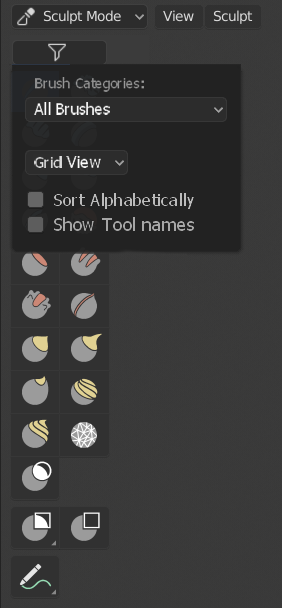
I was wondering it it would be better to make the spacebar menu a big Grid view like in the Zbrush brush selection popup, since the list might easily exceed the height of the window.
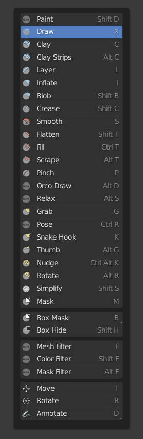
Brush names under each icon would be great in that case but then each icon needs more padding to make the chances higher of fitting the name under each tool/brush. This would make the window possibly insanely big. What do you think?
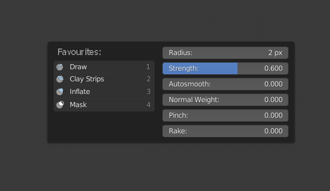
For the RMB context menu it would be great to add some more functionality and I really like the idea of William to make the favourites brush category accessable here.
I see many people asking to bring back the 1-0 shortcuts for brush selection and I think this could really come in handy in this menu:
4 Likes
I like the first image the all brushes idea is great and and the different way to show brushes is great too. It will be even greater to tag some brushes to create a personalized panel grid.
I don’t know they might be a way to do this and satisfy everybody, IMHO this idea can be dropped.
Space bar for is a good idea and we can take advantage of our screen by expanding the big Grid view horizontally
Oh dios mio thank you Pablo for this stroke of good sense and good design. We’re on the right track !!