The Tools/Brush Workflow

This is a WIP thread that I will continuously update based on feedback & discussions. There’s a lot to talk & think about so I’d like to share my thoughts while fleshing out the proposal :slight_smile:

Based on the proposals and discussions on:

The proposal by William Reynish is a bit outdated since the Toolbar changed in layout & functionality based on the previous issues, but his points are still incredibly valuable. Ideally read through that first

I am going to include planned features like the ones by Pablo Dobarro here as well.

Once the proposal is more fleshed out I’ll start adding visual mockups.


The Issues

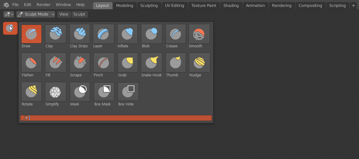
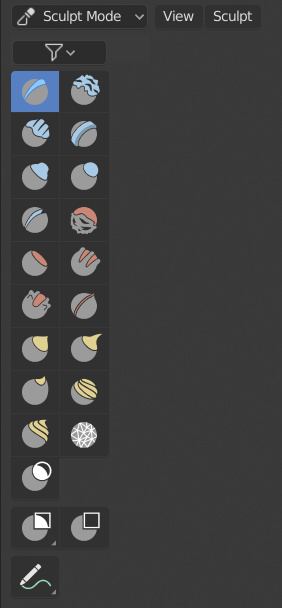
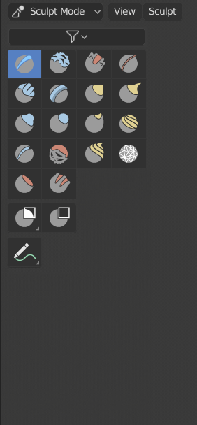
The Toolbar is designed as an easy way to access all Active Tools and any Sculpting, Painting or Grease Pencil brushes that the user needs without obscuring them with too much clutter.
At first this was great for all Sculpt & Painting Modes but once the definitions of Tools vs Brushes got more defined and separate, the Tools became less useful as a way of selecting brushes.
The Active Tools are not the thing the user wants to access. The Brushes are.
Most users don’t care about Tools, they just want a global, easily accessible brush pallet for all brushes.

With the new addition Brushes and Tools of Pablo Dobarros sculpting branch, another issue becomes harder to ignore:
In most cases there’s only one Brush per Active Tool.
This is an issue that will become worse the more functionality gets added over time and it already makes the Toolbar in Sculpt Mode the messiest of all of them.

The Design Task T56744 by William Reynish would be a great step in the right direction with the RMB context menu for quick brush selection, favourites, dynamic brush previews & categories.


But this introduces a new issue:
The proposed improvements also makes the Active Tools UI of the Toolbar useless.
The click & dragging to bring up the brush selection from Willimas proposal is a good idea but the Toolbar needs a bit more than that. It already drove people nuts to click & drag and then select from the list to access their brushes in previous design iterations.
Users are always going to rather use shortcuts or access their favorites via the proposed RMB brush selection.
The previous issue of having usually one Brush per Active Tool makes this worse.

There’s another smaller issue with the proposal:
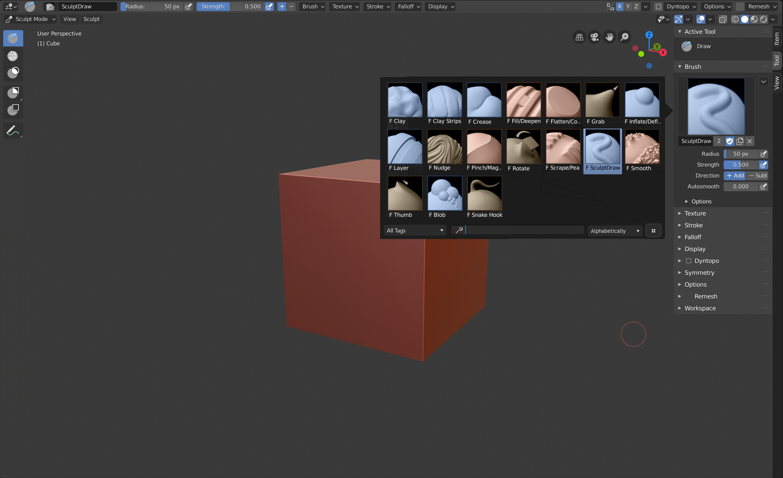
Dynamic brush previews have to be a lot more complex for Sculpting Tools.
If we would try to give a helpful preview the same way painting brushes are previewed, then the depictions are going to be very misleading or could hide the important information. The functionality of sculpting brushes is generally just way too complex for a simple preview like the proposed one.

But the dynamic brush previews are also taking up way too much space.
The current design in the Toolbar of selecting from a grid of Tools is great and the most optimal way of selecting from a large pool of brushes.
So ideally there would need to be a square version of the dynamic brush previews or perhaps another way of displaying brush icons in a square format as an alternative to the wide dynamic previews.

Also, even if we would try to push the Active Tools into the background and revolve everything around a constantly growing and potentially infinite amount of brushes, we run into the last issue:
How do we create a left keyboard focused keymap for every (alternatively the most important) Brushes?

The Proposal

Step 1: Merge all Active Tools that include Brushes

The first issue that needs to be solved is the distinction between Active Tools and Brushes.
Having Active Tools as a set of options and Brushes as saved presets of those options is a good design idea but obscures the Brushes that the user wants to access.

Here's what Pablo Dobarro said

What we are currently calling “tools” are just different formulas that run on each vertex to produce certain deformation. They all run under the same operator and they fundamentally share most of the parameters (some parameters may not be used in some formulas, that is why they are hidden).

We are presenting these formulas on the interface as tools, under a name and an icon that we assume should be the default behavior but which does not communicate any information about what that formula really does. If you are editing custom brushes, a description like “move vertex along its normal” is more descriptive than “inflate”.

Under the brush panel, there should be a “Deformation” dropdown to choose which deformation formula you want to use for that preset. This dropdown should contain all deformation formulas we have in Blender. When a deformation formula is loaded, it’s parameters can be shown under the same panel.

Users can create an unlimited number of brushes, they can import brushes to the same place on the UI and search them from there. They won’t lose any brush effect because they can create them from scratch any time just by adding a new brush and selecting the deformation formula they want.

Users can name the brushes the way they want and organize them as they want in a way that is meaningful to them

So the purpose of this step is to essentially invert the Tool/Brush releationship:
Instead of using Tools to access Brushes, we access the Brushes directly and change the deformation formula within the Brush settings to change their behaviour.

deformation_presets

The Deformation presets could be short & descriptive like the current Tools, with detailed Tooltips of what effects they will add to the Brush.
Based on the selected Deformation preset, the Brush options will change.

Most likely the Deformation presets will remain similar to the set of Tools we have right now but a few could be merged to share their settings or because they were already so close to identical.
An example of this is the Grab & Thumb Tool, which have the only main difference that Grab is using a View Plane and Thumb an Area Plane for sculpting.

Step 2: Bring the Brushes back to the front!

Next we would need to adjust the UI to support Brushes instead of just Tools.
A Brush in this case would mostly need to be visually identical to an Active Tool in the Toolbar.
My proposal is to:

  • Remove all Active Tools that use Brushes from the Toolbar and instead replace them with the Brushes themselves

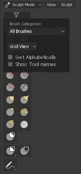
  • Manually switch between List or Grid view in the Toolbar with a toggle
    (This ill make it possible to show a large brush pallete of square icons)

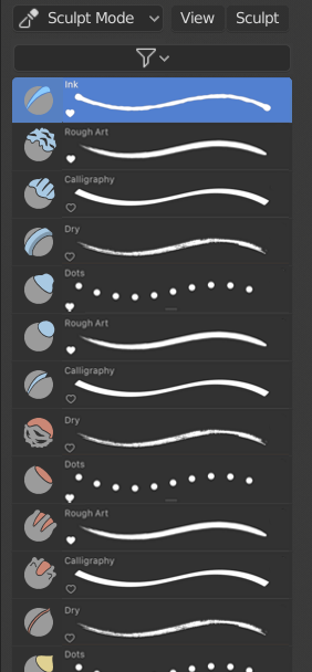
  • List view would show both the square icon, the brush name and a dynamic brush preview as in T56744

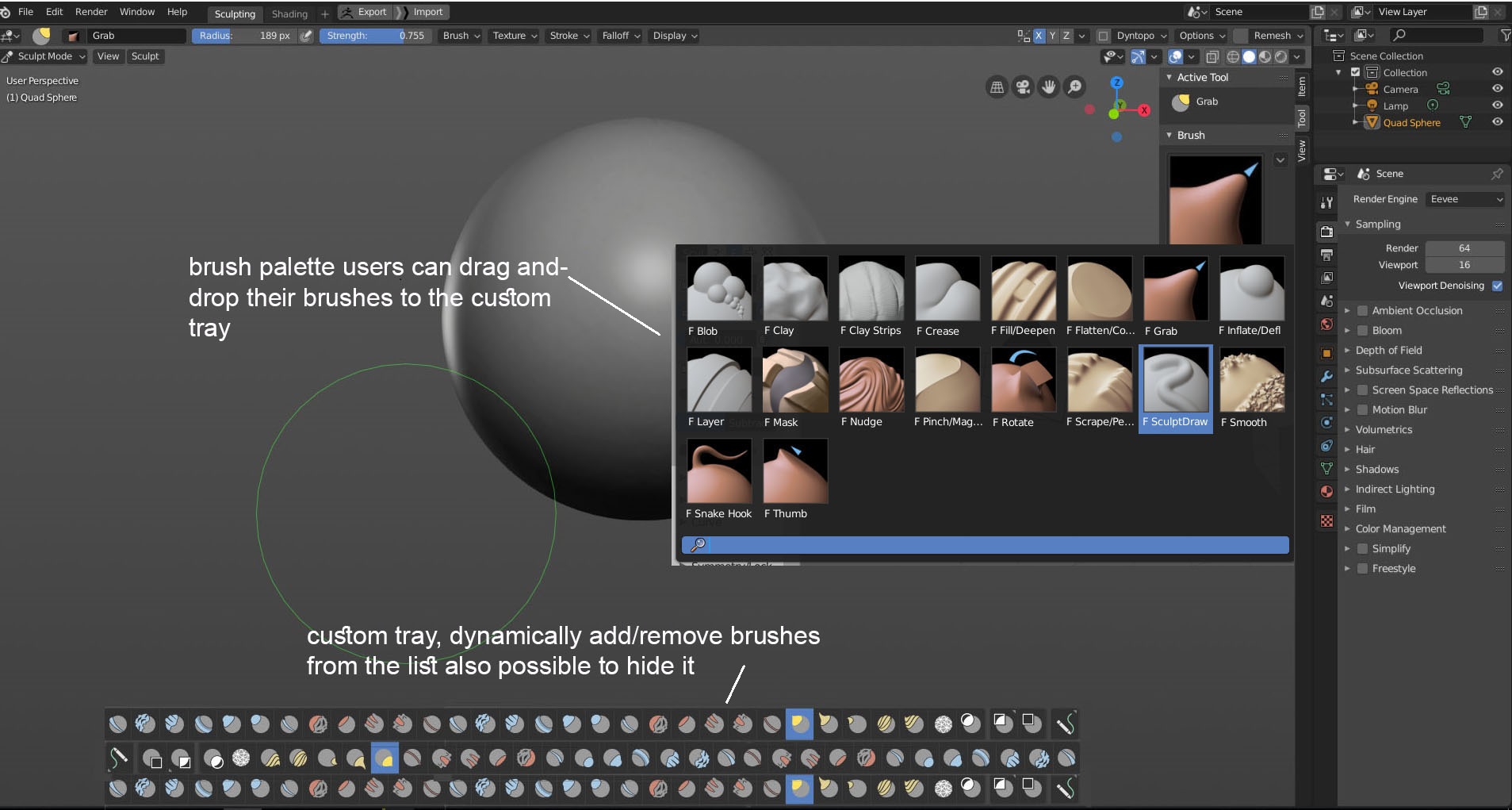
  • Add a simple dropdown to the top of the Toolbar to choose the brush category to display.
    By default this would be ‘All’ Brushes but it could also be switched to ‘Favourites’, or any custom created categories like ‘Skin Brushes’.
    This would keep the Toolbar potentially from exploding when too many Brushes are present and give the user the option to customise the brush pallete of the Toolbar based on the current task.

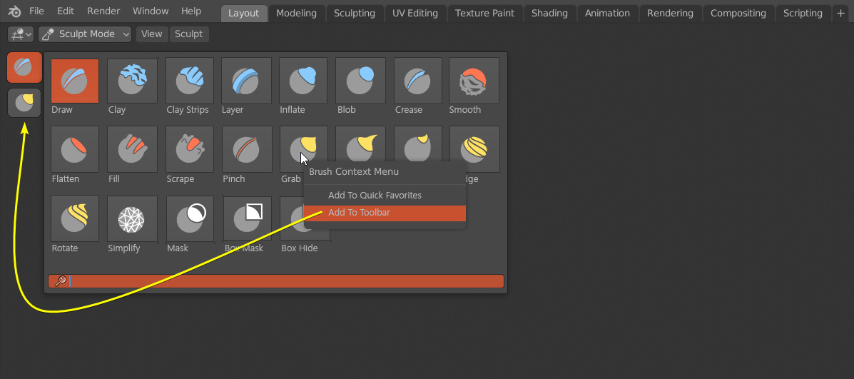
  • RMB clicking on a Brush will give you the usual options such as assigning a shortcut or quick favourites, but also an option to assign a category to manage your brushes directly in the Toolbar.

Here are some rough mockups:

Step 3: Improved Brush previews

The proposal T56744 by William is sound and dynamic brush previews would be a great addition, since it can show you at a glance what the effect & settings of the Brush are.
Unfortunately the current design proposal does not fit the more complex 3 dimensional sculpting Brushes since the information they present can be misleading or too lacking to be useful.
In my opinion i’s basically impossible to achieve this kind of system properly so here are my suggestions:

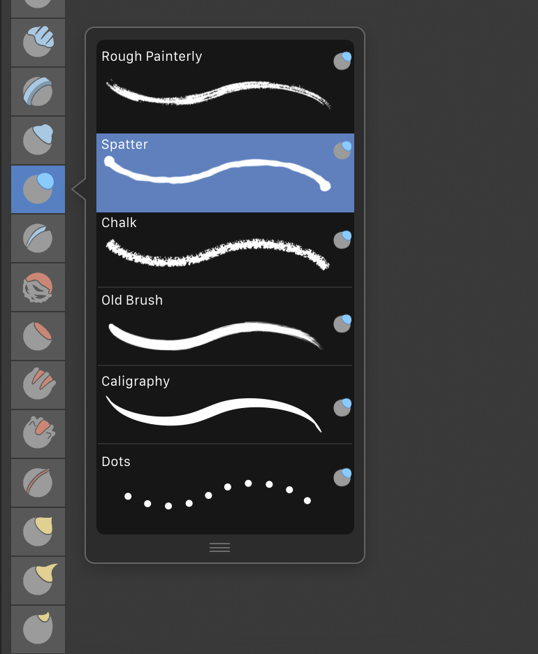
Instead of mostly relying on dynamic brush previews, a much more universal system would be to use distinct icons. We could expand the amount of available icons that are currently used for the Brush-Tools.
These could then be automatically picked based on the current deformation preset & additional brush options.
The user could then also choose an icon themselves from a big selection of pre-made icons & colors. This way the user doesn’t need to make all their brushes distinct by importing their own icons, which is very tedious and takes a lot of effort (Although this could still be an option like before)

(Mockup coming soon)

Instead of using dynamic brush previews in Sculpt Mode when viewing the Brushes in a List, this could be replaced by plain information on the current brush settings.
So we could show icons based on the stroke method, falloff curve, the used texture & sculpt plane.
This is less sleek but more informative.

(Mockup coming soon)

Step 4: Improving the overall Brush accessibility

The more Tools and Brushes are being added and created the harder it is to set up a good UI & default keymap to support all of them.
Ideally all Tools/Brushes should be harboured in the Toolbar and should have a shortcut but this is not something very easy to do if the amount of Brushes can be endless.
So there needs to be a way to access all your most used brushes and every brush in a scaleable way:

With the changes of step 1:

  • Shortcuts would now also assigned to Brushes instead just of the Tools
  • Cycle between the Brushes with the same shortcut
  • Give the spacebar Tool selection menu the same treatment as the Toolbar (Brushes more prominently featured)

While the Toolbar can be used to show a specific category of Brushes, there always needs to be a way to access all Brushes there are. This would have to be the spacebar menu since this would be consistent with all the other modes & Tools. It would be great to update the layout to fit a much bigger selection of Tools/Brushes though:

  • I would propose to keep the List view since it shows more information (Name, Shortcut) but the list would continue horizontally if it becomes too long.
  • Create a full keymap for the spacebar menu to make it the best method to access any Tool/Brush reliably.

(Mockup coming soon)

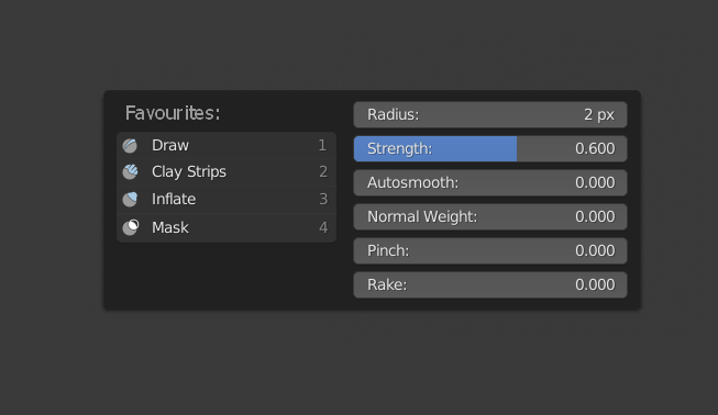
Outside of the spacebar menu we should keep a minimal keymap (Similar to the current one) to access the most used Tools/Brushes by primarily using the left side of the keyboard.
This should also give the user enough possible shortcuts to add their own shortcuts:

Another big remaining question is: What should we do with the RMB context menu?
We could show, just like in the other modes, the most commonly used options for quick access and add even the Favourites category of brushes. I open for more suggestions for this.

sculpt_context_menu

In Conclusion

This proposal is still WIP but if these ideas would become a bit more fleshed out they would drastically improve the Brush system in Blender, how we customise & organise our Brushes and how we access them quickly & effortlessly.

If you have different ideas or want to add to the proposal leave a comment below.

25 Likes

Unnecessary hassle imo.
All that is needed is a global brush palette, and maybe the ability to customize the toolbar.

1 Like

this is how i imagined sculpting mode will be, i made a mock up a long time ago but since they went with more of a 2d solution then i never posted it, i think this way you can customize your favorite brushes without the fight for hotkeys and it’s more accessible than the Active tools system, i strongly believe their should be a seperation for 2d/painting & sculpting workflows but that might require alot of work under the hood.

5 Likes

@ThinkingPolygons I agree that those things would be great additions but that’s easier said than done. This hassle is the way to do it :wink:

@Znio.G The Toolbar could ultimately become this sort of brush tray. If it would support the selection of brushes instead of Tools, category sorting like proposed in T56744, and a toggle between List & Grid arrangement you could have the Toolbar look like that.

1 Like

I just want a panel where I can access all my brushes at once… just like zbrush:slight_smile:

2019-08-22_15-32-23

4 Likes

yeah, it pretty much aligns with your proposal.

I don’t think so.
We basically had that before, but unfortunately out of nowhere this new 2D concept shows up and destroys everything. This photoshop style of brush management has no place in a sculpting environment.
We need to go back, bring back the global brush panel and start improving from there.

That’s what I’m talking about. Clean and direct, no BS. :v:

I think the Spacebar menu could be a great place to access all Tools & Brushes with a keymap that enables the user to quickly choose any of them. Luckily we are not at Zbrush levels of brush diversity yet :sweat_smile:

Some people have a lot of custom brushes, and without a panel like that it’s a nightmare to access them.

Under this step, you don’t make distinction between active tools like Box Mask, Lasso Mask, Box HIde or Annotate and brushes.
You are almost only talking about brush tools and insisting in a need to merge them to have less of them.

I am a bit skeptical about the idea that just adding a texture to a Draw brush would be sufficient to retrieve sensation of a Clay Strips brush. Currently, you can add a texture to a Clay Strips brush.
In you system, user would have to merge default texture with the one he wants.

Suggested Draw category means that you add settings of layer brush about persistent base, a pinch slider + a switch to change its effect to magnify.
So, it is not really like adding 5 settings to a clay brush panel but rather adding 8 settings to it.

With recent additions like Normal radius and Topology Rake sliders, that means that we are more than doubling number of settings of the brush panel of current most complicated brush for what should be future default brush.

For sure, that would allow more customization. But that does not simplify UI at all.
Initial proposal was to allow same customization through Node Brush. With ability to ignore in UI, settings user is not interested in.

Then, step 2 is about getting a direct access to brushes instead of Brush tools. Step 4 says an unlimited amount of brushes.
So, why do we have to care about number of brush tools ?
OK ! 2 dozen of them is a lot. But merging 8 of them into one tool, that is pretty extreme.
I think that we could avoid to complexify a lot UI of default brushes by accepting 15 tools instead of forcing reduction to 10.
Anyways, default brush set will continue to contain 2 dozen or will expand to 3 or 4 dozen of brushes.
Why not waiting node brush to be mature to drastically reduce number of brush tools ?

About dynamic previews, I think that is an effort for no gain. Like most of people, I will probably not trust them.
I would prefer a grid mesh available to test my settings rather than an automatic preview that gives no indication about what result corresponds to what on pressure on my tablet.

I think the main problem in the brush/tool management in sculpt mode is the arbitrary division of brushes into tools based on the deformation formula they are using.

What we are currently calling “tools” are just different formulas that run on each vertex to produce certain deformation. They all run under the same operator and they fundamentally share most of the parameters (some parameters may not be used in some formulas, that is why they are hidden).

In the implementation of the sculpt brushes, there is a switch-case that runs the corresponding formula based on the sculpt_tool attribute of the brush. If we want, we can merge all these formulas into one, add even more parameters and replicate with that the behavior of all brushes, but I don’t think that is necessary.

So, basically:

  • We are assuming that a deformation formula produces only one kind of effect for the user, which is not true. For example, you can achieve a "crease"effect with the crease formula or with the orco formula. You can use the simplify formula to smooth the mesh, you can use the scrape formula to polish hard surface edges, you can use the flatten formula to smooth large areas…
  • We are presenting these formulas on the interface as tools, under a name and an icon that we assume should be the default behavior but which does not communicate any information about what that formula really does. If you are editing custom brushes, a description like “move vertex along its normal” is more descriptive than “inflate”.
  • When sculpting/painting, users will try brushes until they find the desired effect, without caring about what deformation formula the brush is using. When you start getting familiar with a sculpting/painting software, you start to memorize which brush presets do certain effects, so you want to search for them in one place. In most cases, you should not care about what deformation is running under the hood.

Example: Krita

Krita has a freehand brush tool and it has a panel which is called brush and prests. From this panel you can load any preset you want into the tool.

Krita hasta different brush engines (our sculpt deformation formulas) that run when you are painting with the brush tool. Brush presets store the engine that they use and its parameters, but they are all accessible under the same tool.

Each engine can produce a different kind of effect. They have deform, smudge, pixel, particles… Despite this, all brush presets are accessible from the same place and they run under the same brush tool. Most users are not going to care which engine is the brush presets using, they are going to see if they like the effect of the brush or not, and based of this they are going to organize the brush library accordingly.

Solution: Only one brush tool with brush preset library.

Sculpt mode should only have one brush tool. Brush presets should store the deformation formula they use and its parameters. They all should be accessible under the brush tool.

If we want to keep something similar to the current toolbar UI, we can add some of these brush presets to the toolbar, but they won’t change the active tool. They just load a predefined brush preset into the brush tool.

Under the brush panel, there should be a “Deformation” dropdown to choose which deformation formula you want to use for that preset. This dropdown should contain all deformation formulas we have in Blender. When a deformation formula is loaded, it’s parameters can be shown under the same panel.

As an initial version we don’t need anything fancy for the brush library. Just a simple list with icons and a search menu will do. In the future, we can add categories, folders, import/export selections and so on.

This approach solves the current (and future) problems:

  • Users can create an unlimited number of brushes, they can import brushes to the same place on the UI and search them from there. They won’t lose any brush effect because they can create them from scratch any time just by adding a new brush and selecting the deformation formula they want.
  • When we have the “node brush” it is just going to be another deformation formula that runs a node network. No changes on the UI are required.
  • If we merge Sculpt and Vertex Paint, there should be a formula that produces no deformation (SCULPT_TOOL_PAINT in the sculpt branch). This way, users can create brush presets that only apply color.
  • We can have a deformation formula and a color formula for each brush presets to allow further customization of the sculpt/vertex paint mode.
  • Users can name the brushes the way they want and organize them as they want in a way that is meaningful to them
  • We can add configurable pie menus or the ability to assign shortcuts to brush presets to be able to switch them faster. Users can easily configure this as they need so we don’t need to enforce any specific keymap for brush switching.
28 Likes

I don’t like the “Zbrush” solution because unless I already know the brush strokes by heart, I don’t realize the difference. Zbrush is very powerful, but its interface is very unfriendly.

1 Like

Yes Pablo, Krita has the solution.
Apart from the above, just remember that Krita also allows you to label the brushes, so that you can group the brushes in panels according to the needs, in the case of sculpture for example, we could group the brushes to create basic volumes, add details, hard modeling , or to create folds in tissues …

Little recordatory of this proposals. Where I talk about brushes system and sculpt interface

the main points

  • unify brushes system, at least from a user point of view
  • unify thumbnails with a zbrush style, easy to create for new users the brushes
  • popup to select icons, with hotkeys to select easily or filter?
7 Likes

I see it that way. The bar or horizontal panel to choose according to user preferences.
It would be necessary to improve the coloration, of course :wink:

2 Likes

i dont see a reason to use colorations, each brush make what we want. and they could have various deformations

1 Like

So you’re saying that we would have just one tool in sculpt mode, where we can access all the brush presets, like:


This is what we want, yeah. But with proper icons of course. :wink:

And with a customizable toolbar in mind, we would be able to right click on a brush preset and add it to the toolbar, like:


Sweet :wink:

Alright, perfect. I’m in. :wink:

26 Likes

I don’t see the need either, it was to preserve the coloration according to the function of version 2.80.
If version 2.81 allowed to paint the vertex color while sculpting, it would be very simple to make thumbnails like the ones attached.

Good
However, I don’t know if it would be better to use “Asset Manager” to have the presets permanently accessible, as in Substance Painter.

3 Likes

+1 for custom toolbar for brush modes.

I would have managed brushes set creation from a panel in sidebar or properties.
But main idea is there.

A discrete switch into header between custom brushes set and other active tools could allow to switch from such toolbar to the one in @wevon mock-up.

Thanks a lot for the feedback everyone! <3
I started updating the description of the thread to mirror the common viewpoints in the comments a bit more. I hope I can soon create some properly written descriptions and mockups for the current design proposals and add them as well.

Click on the little orange pencil icon on the top-right corner of the description to see the changed texts :wink:

1 Like