with text, you can easily specify additional information, such as hold, drag, double-click, and so on; if you have icons this will be more difficult to do
not all events can be shown as understandable icons, for example, scrolling mouse wheel up or numpad keys
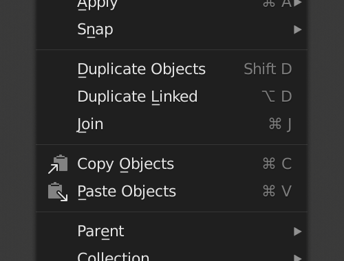
there is no separator between shortcuts; it is not clear whether the shortcuts on the left or right refer to the label; what makes it worse is that you know what, in the menu, the hotkeys are on the right
But I still thinking that it’s necessary, new users don’t understand this. Various times that I teach blender to some people I have seen that they don’t understand the icons and utility of the status bar tips.
So you need text on your keyboard instead of icons ? Wow text is more readable , thats implacable logic. No way to argue here…Because UI is like an article or book for you to read. Why do we use street signs anyway lol. The concept of graphical UI means iconography first and foremost.
The iconography is simply used to identify an element quickly, thanks to different characteristics such as shape, contrast, colors,… But they are difficult to read, hence the use of hieroglyphics as puzzles.
Mixing a list of icons with a list of text only makes it difficult to read something that is very easy to read in text. For many reasons, besides the current choice of icons, you are forcing the brain to read two completely different things like icons and text and keep changing. Instead of simply using text that is transparent to the brain, it doesn’t matter what experience you have
Now you can easily see the icon (shortcut) and then you can read what it does. Although in reality you are looking for the option you need and then want to see which key is assigned. But icons make it difficult to read text quickly.
You are absolutely right that the icons are more noticeable, they attract attention, and this is what makes it difficult to read a long line of text, the icons work as a stopper.
And comparing it with a keyboard and a street sign is inappropriate, these are different things. Here we are talking specifically about the status bar.
By the way, about the keyboard is a bit funny, many keyboard, has mostly text.
Tab, Caps Lock, Shift, Return, Delete… it’s all written in text, see here.
I keep looking at that footer stuff and have yet to think of some nice unifying design. It is used in a few different ways, each drawn in quite different styles. The central problem seems to be a lack of tools to do this well. Most of the clumsy alignment and odd ordering is from using existing widget-drawing code. If trying to do it with text output you’d see that we don’t have much support for complex mixed-style text.
The symbols shown there are generally font glyphs and text, not icons. But the routines showing those, and borders around them, are a bit complex because some symbols are in one font but not in others and most have inconsistent size and alignment. I make sure all the symbols we use are in all our fonts, and are the same size and alignment here: https://developer.blender.org/D6055 and once in then maybe I can experiment with things like not showing those borders.
What would be really nice though, would be support for more complex text styles, like bold and italics and perhaps background color, borders, padding, etc.
So I’d love to help with this, if anyone has detailed plans. Or will welcome help, or collaborate, etc.
Not at real computer now, so a bit fuzzy on details. But at the point that we draw text in blender we are passing a struct that contains formatting hints (FontStyle?) for the block of outputted text. Surprisingly, that does contain flags for bold and italics. But we don’t pass that down to the text output routines (that use FreeType). We are also caching rasterized font glyphs, but only by size so we’d need to add bold and italic to that too.
I don’t think it would worth it to do all this “properly”, like operating systems do, with multiple versions of each font face. Instead probably just use a couple cheats that FreeType can do with a single font: embolden for bold, and obliquing for italics. But I personally find all the blender-FreeType glue to be far too confusing so have never gotten far. However I heard that someone (smarter) has a patch in progress somewhere doing most of this though.
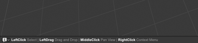
In general, I see the status bar as a line of text, not conspicuous hints, in ordinary human language, preferably without " | " and “”, commas and periods are used for separation.
So, it’s not distracting at work, and when important notifications appear, they are clearly visible in the contrast.
You can highlight shortcuts using a different text color.
And you can try a trick to simulate bold text: overlay two layers of the same text with an offset of one pixel, at low dpi additionally add opacity 0.5 for the second layer. Or the same effect can be done using the text shadow.
Also, if you use just plain text, you can easily replace the ⌥ ⌘ characters with text (Option Cmd), if the font used does not contain them. In this case, the appearance/style of the status bar will not change. Unlike if you use icons (glyph with borders around them).
Are you thinking of some FT_Outline_Embolden trickery? No clue if that’d be easier or not, given the amount of glue you’d need to cut through. Extending uiFontStyle to use a triplet of font ID’s and creating a keymap-entry-to-bold-string function might be easier, but it’d be incredibly hacky.
@jenkm - overprinting for bold looks okay at larger sizes, but just look fuzzy and crappy at 1x scale. Might be something we can improve somehow though.
@ThatAsherGuy - I can’t remember much details at the moment - stuck with only an iPad until I get back in about 10 days so can’t check source or my notes.
Look like FT_Outline_Embolden was what I was wanting to use. Otherwise we’d need to ship a bold version of our international font just to have it in the UI. And users would also have to specify multiple font files if they want something better for their language. Would be a hard sell and probably not worth the trouble. That FreeType function should result in a bolded character that is good enough since it is widening the strokes and properly. I think. LOL. Same with using their obliquing for italics - it should work well enough
With icons versus text, we might ultimately want to be a bit more platform-specific with Windows users seeing more text and Mac users seeing more symbols. But can’t do that with the current design and tools. Each key icon (or text) needing to fit in the same little square. To get there I think I’m back to my wish list of being able to add a border to text sections. That way we can put either “ALT” or a Mac symbol in a box (assuming we want them) and the boxes can grow to fit contents.
Just checked on the old computer, looks even better than I thought it would. But of course it’s not perfect, it’s just hack.
symbol/text in a boxes
That’s the first thing I want to avoid. Now in the interface, all icons or text in the box are buttons. We don’t use just labels (not clickable) with this design, it would be very confusing.
With bold I think the only place we’ve had that was in the tooltips. I remember that being quite nice at 2x and blurry at 1x, but perhaps it wasn’t done as well as it could have been or maybe there’s been changes in the FreeType rasterization that helps. Worth looking at again for sure.
For those Event Icons I’d also like to at least see how they look without the boxes. Easy to try though, all in event_icons.c (or a file closely named).
I think readability is issue #1 and #2 is they need to be compacted in a nice way.
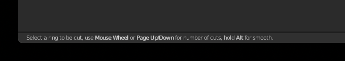
Just take a look at this, it occupies the whole Statusbar and pushes the stats outside.
It’ll take you at least 10sec each time to read it and understand what you’re tying to do.


 way,
way, 
 about the
  keyboard is a bit
  funny, many
  keyboard, has mostly
  text.
text.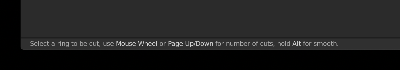
