Yes, so also include a mockup of how you propose to improve it so we can compare and evaluate.
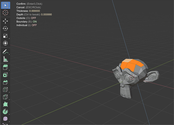
The current design (T56599) is as follows:
- The statusbar shows keymaps, with the new keymap drawing with icons.
- Area header shows values and state being edited, so it’s close to where the user is looking.
Replacing the header with “values and state” is terrible. Disappearing buttons and gizmo looks like a bug. And that annoying flicker… This information must be in the viewport, replacing/supplements the scene/object information already available there. And it’ll be a lot easier to read when it’s a column instead of a line.
We can even show (optional) hotkeys here in the viewport as well. For example, if during the modal operation the user presses F1, we show all available hotkeys in a convenient way, as a column in the viewport.
And you have to remember that status bar (I will emphasize the status) is not a user manual.
By the way, here’s the link: https://docs.microsoft.com/en-us/windows/win32/uxguide/ctrl-status-bars.
I am not a designer but i’ll see what i can do, it might take me a few days to come up with something good though.
we have done mockups to solve readibility problems
And? My comment was a direct reply to John1, who I am assuming is not included in your “we” since that was his first comment here. And I see nothing in this thread that addresses the monstrosity that he posted about.
He basically said “look at how bad this one is” and so I replied that I want to know how he imagines that particular one could be improved.
If you had at least seen the proposals that have been made you would have discovered that this problem was already solved in some proposal.
I can give another example:
You need a 5K monitor to see this.
How do I fix this? No way. Just get rid of it. As I said above, this is a status bar and not a user manual.
Well of course just removing it is an option. But that is not what was going through John1’s head as he said “I think readability is issue #1 and #2 is they need to be compacted in a nice way”, which is why I asked him to elaborate.
Maybe by treating as something of a user manual. Make a new Editor type for this so newbies could show all these in a nice vertical area and all items would be visible regardless of monitor size. And experienced user would never see it.
Actually divide the old header in header and statusbar is a bad solution. Divide also in a editor will be a terrible option.
A simple list inside the editor is the only good solution for all users. A simple and stylized solution, like the popup inside the viewport proposal, will be good for newbies/hobbiest and bad for experienced and profesional users. Also that actually blender have that system near to complete.
The new type of editor is a bit overkill, but you can show it as a tooltips next to the cursor, when you press a certain button like F1. I think it’ll work well for modal operators, if you need an extra hint you press the “help” key.
Why? An example above had 23 options that would be impossible for most people to see. For newbies who would enable it then it would be no different from having all these modal options shown in a vertical side-bar. A bonus is that there would be no more issues with space so you could spell out some of the ambiguous options more fully.
Could even make it a floating window and drag it anywhere you want. And everyone else just ignores it.
By default it would just show operator name, description, link to online manual, and the current options. Not in the middle of an operation? Then use the same window to search for operators and see the same information. Just a thought anyway.
I have 10 years of experience in blender. And I still seeing all days the hotkeys in a lot of tools. I can’t depend of a new editor to see basic information or a new sidebar. I need the info in my workspace, in the viewport, where I have seen that info the last 10 years without any problem.
Please, don’t make a simple solution complex for no reason.
But of course my musing above would only give new users a way to get guidance while learning. It doesn’t have to change or impact in any way what you now see in the footer. That other people have options doesn’t affect what you choose to see.
I’m a professional, but I was a newbie in blender before that, the step from max to blender was hard. But I can assure you that header info of the tool was not only enought, it was also the best thing to learn the use of all modals tools.
keep it simple is also a good feature of blender. If I need to extend some tool I only need to use internet or help.
If I got your idea right, it will be like a small user manual inside the application, which can be permanently opened. Whereas I see the need for tips during the operation. That is, the ability to show additional hints in the middle of the modal operation, but only if I need it to not interfere constantly.
Also note that all these options are available later in the redo panel (which of course should be improved too). So it’s not some very important thing to show.
And of course the complexity of implementing.

