There is Status bar design (Using icons in the status bar) thread, but there are also objective problems with the icons themselves.

This icon looks more like wheel scrolling then pressing MMB. Scrolling is much more common than the third mouse button, new users will think it is scrolling.
Even when you know it’s a third mouse button, it’s still confusing. There are two different icons, one for just click and the other for ‘tweak’ (click and drag), for example:

And then the following example (rotate view) looks wrong as a click, though there should be a click and drag.

While using the Box Select tool, I see “Shift-LMB - Begin”. What’s the meaning of that? How can I click if I’m already holding down the button?
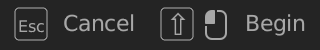
Or for example, when transforming using a tool, I see “Click LMB to confirm”, while it should be release the button:

And so on… So that in general this all looks unclear and confusing users.