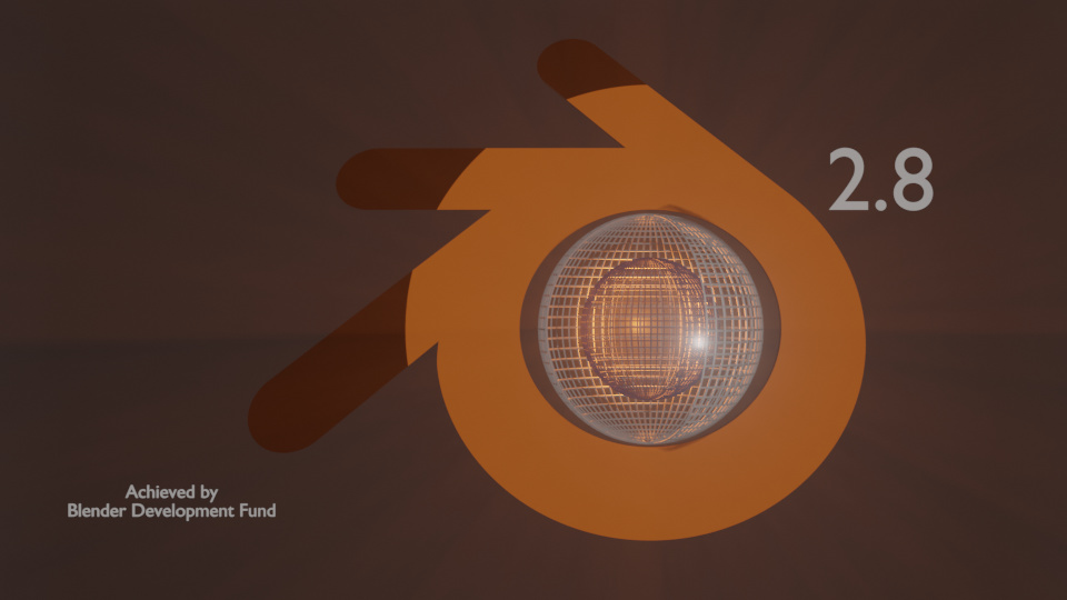
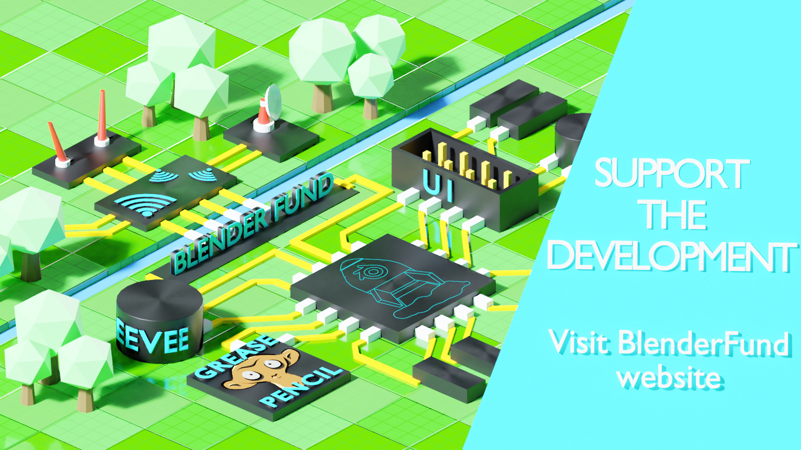
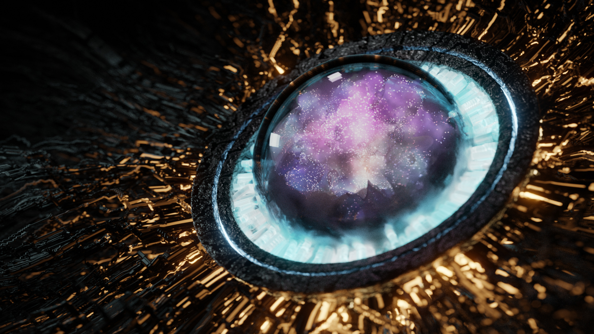
I was experementing a bit with the Logo itself.
Its just a short experiment, the shaders need to be adjusted .
But as a quick demonstaration of what eevvee actually can do and
who has made this project with what kind of ressources,
it can be a good demonstation in my opinion.
basic explanation of the meaning:
its a basic test of the representation of:
The World = Community
and the core of the world = core dev team
It´s also Animated a bit.
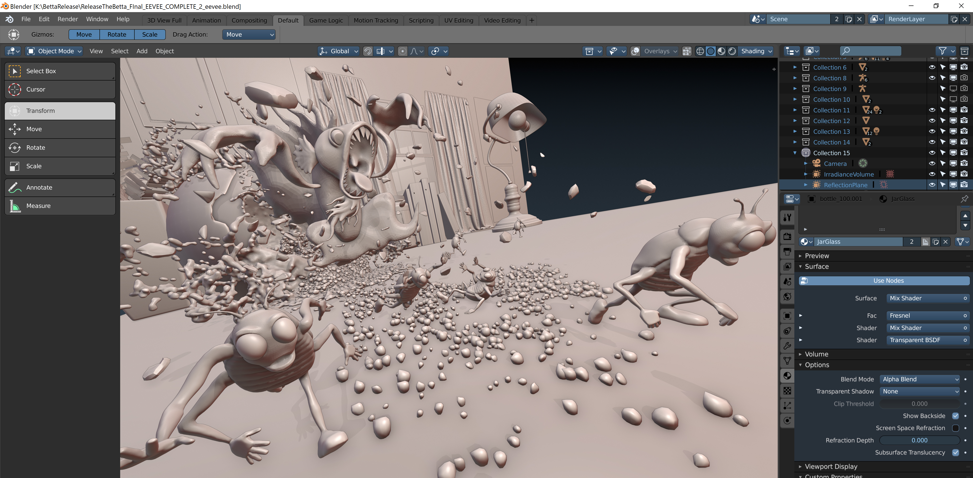
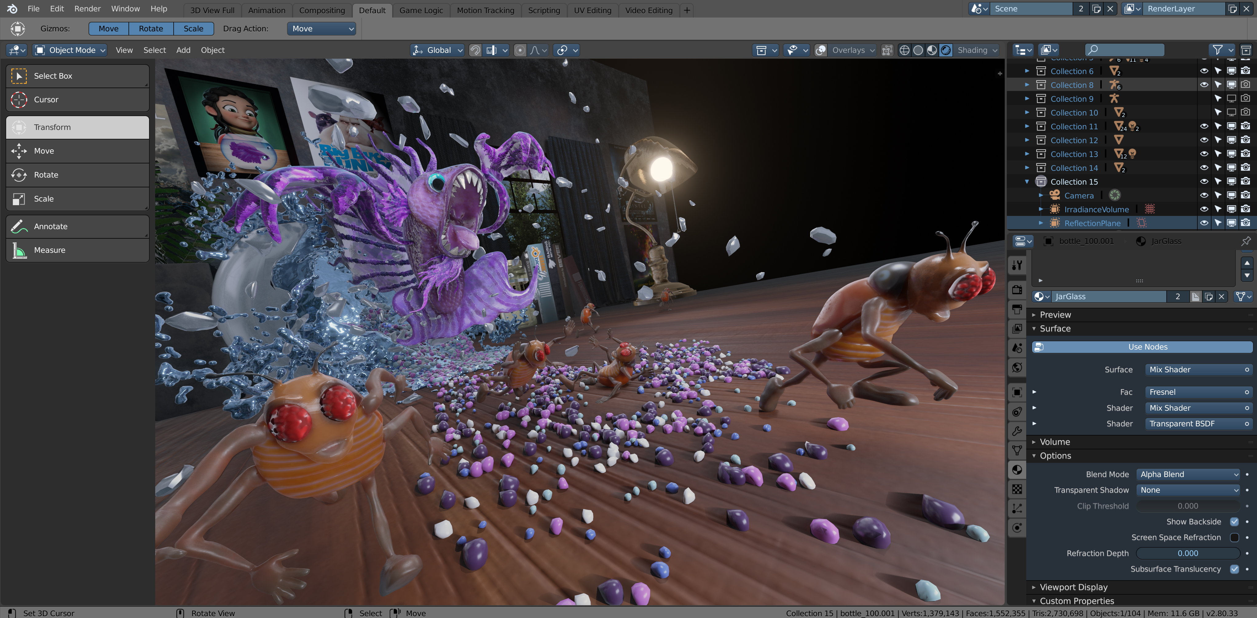
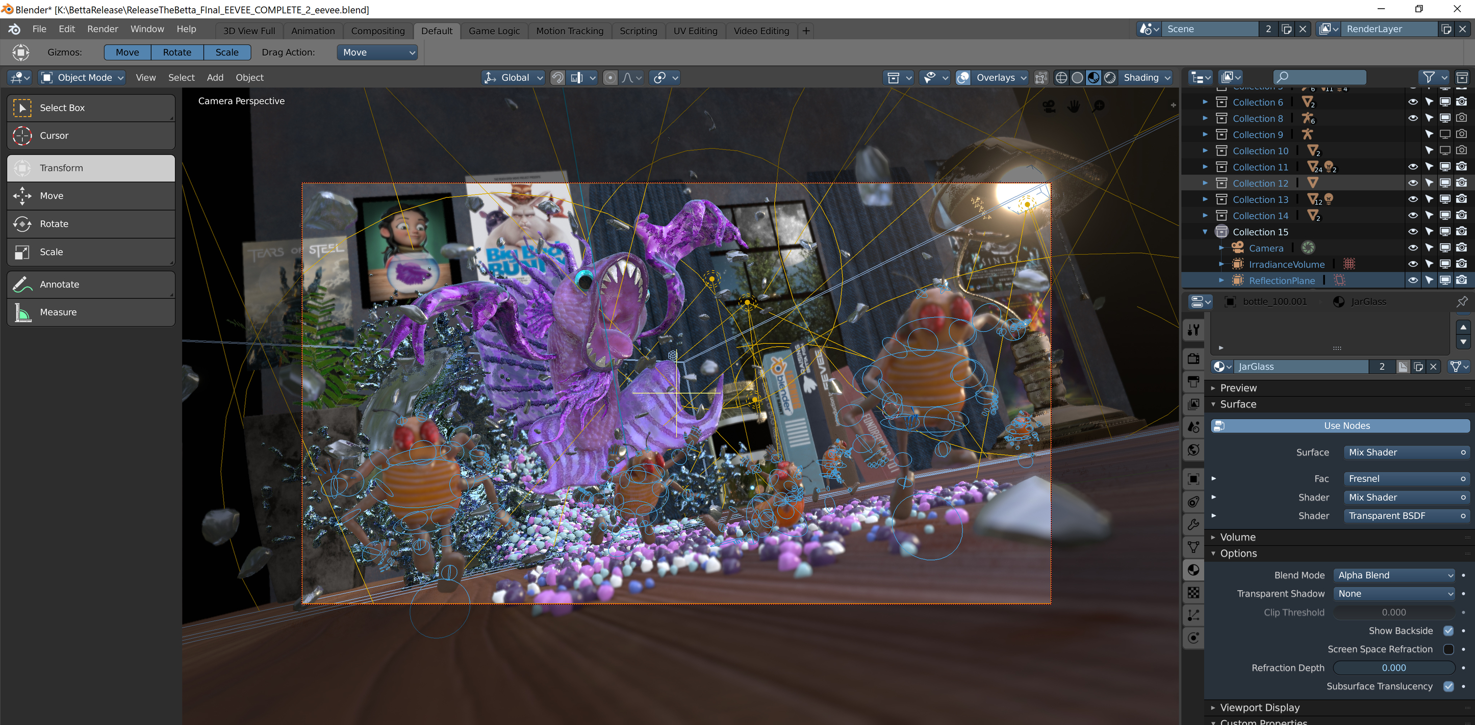
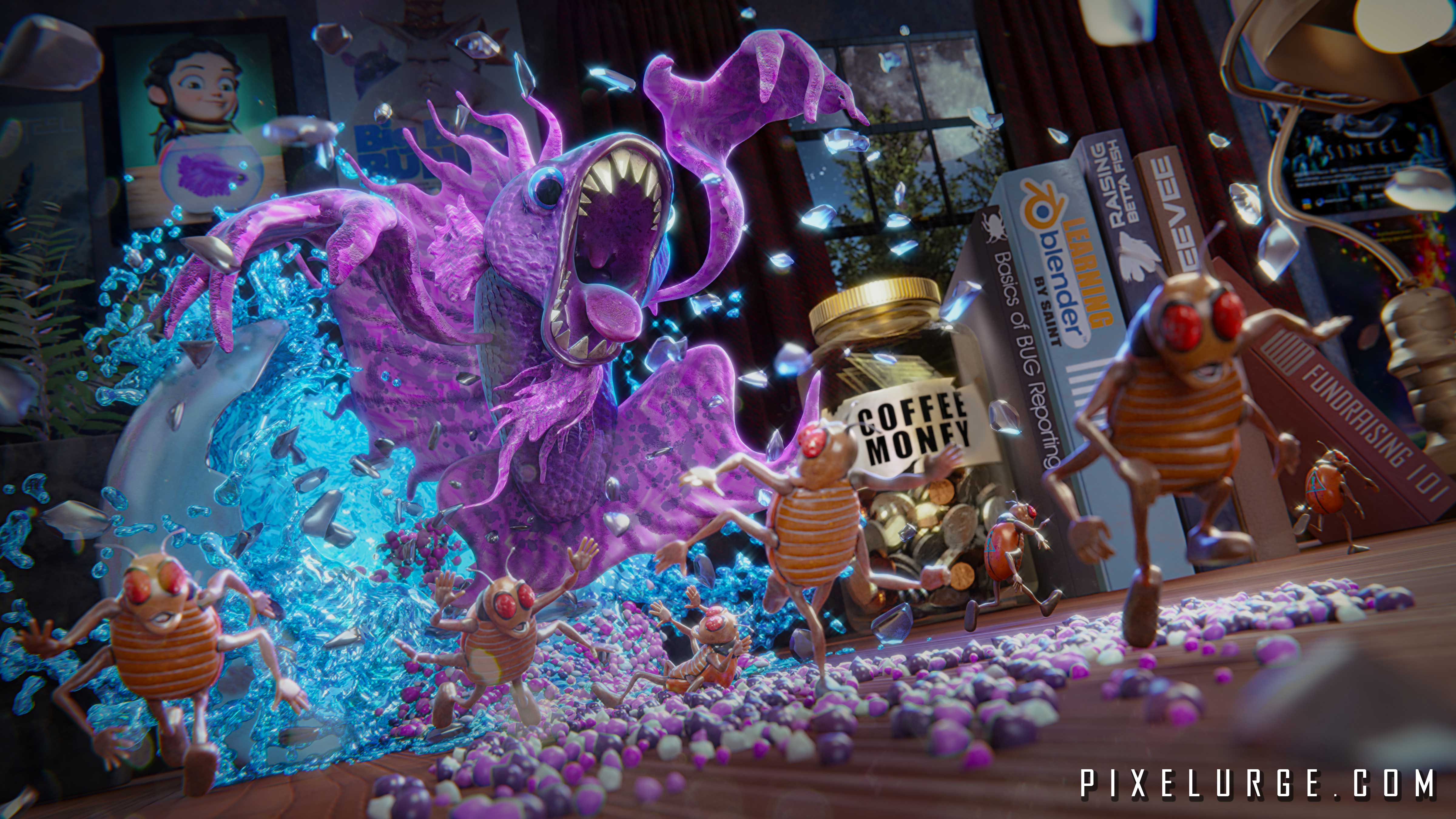
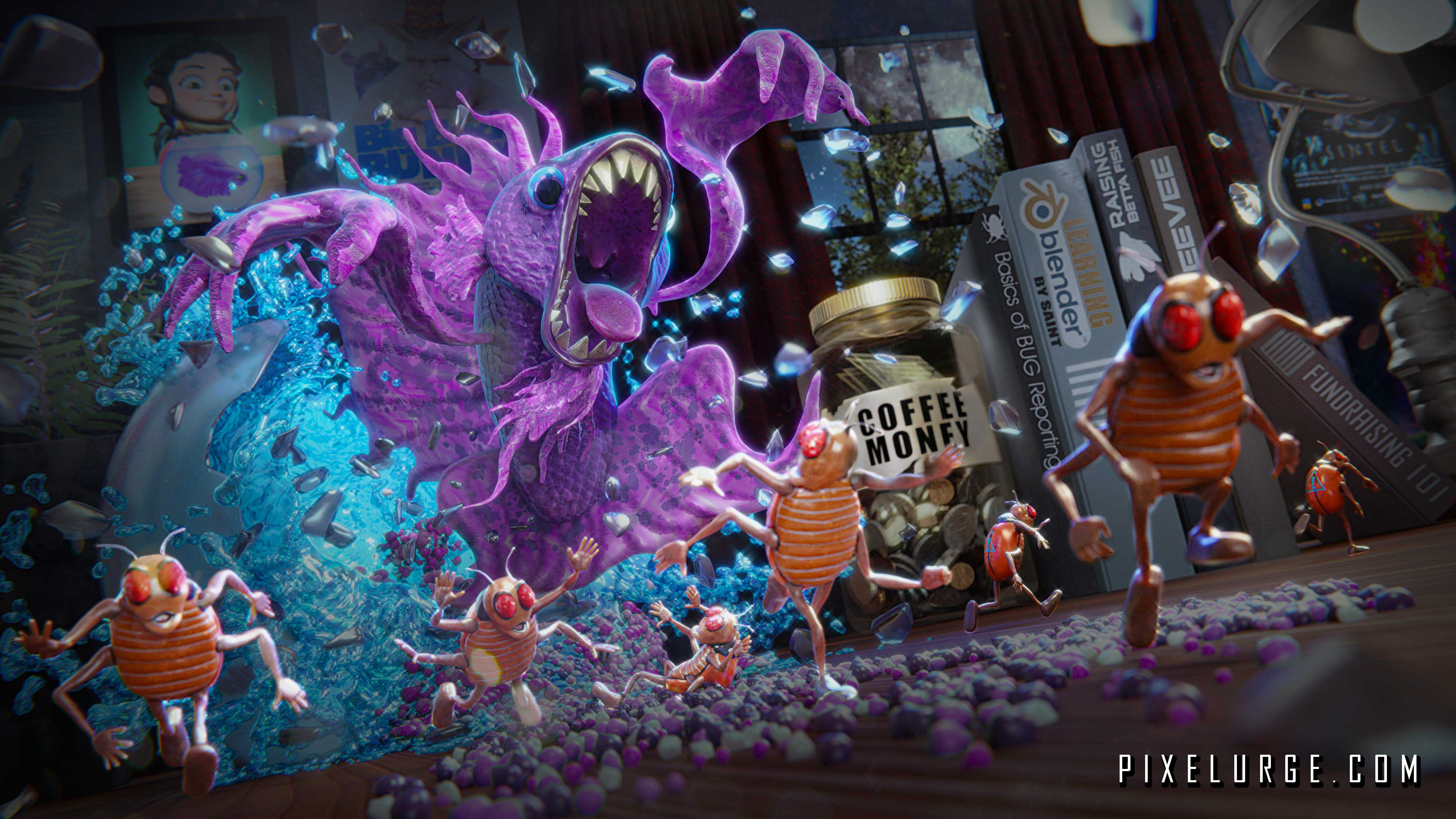
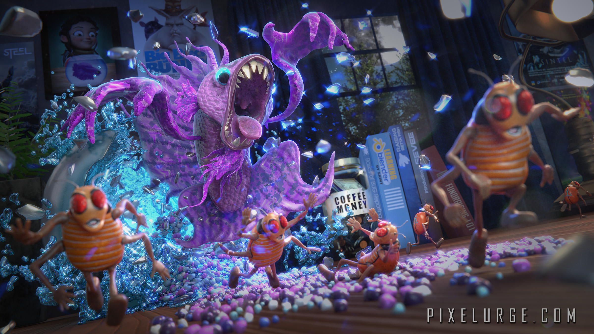
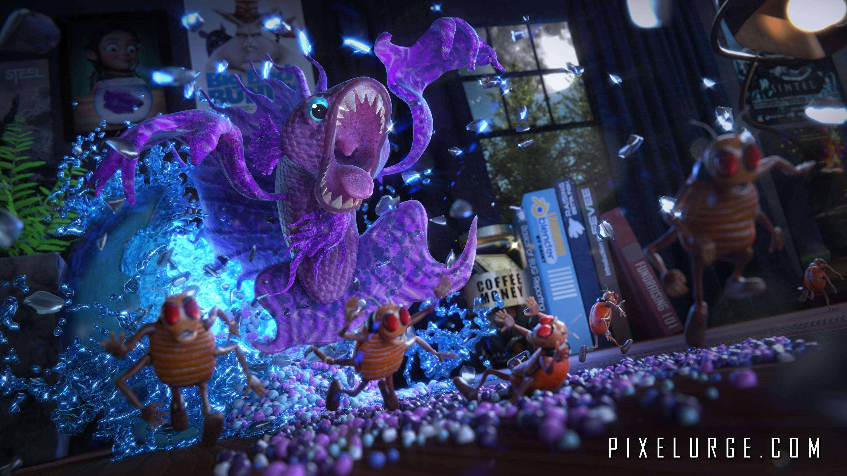
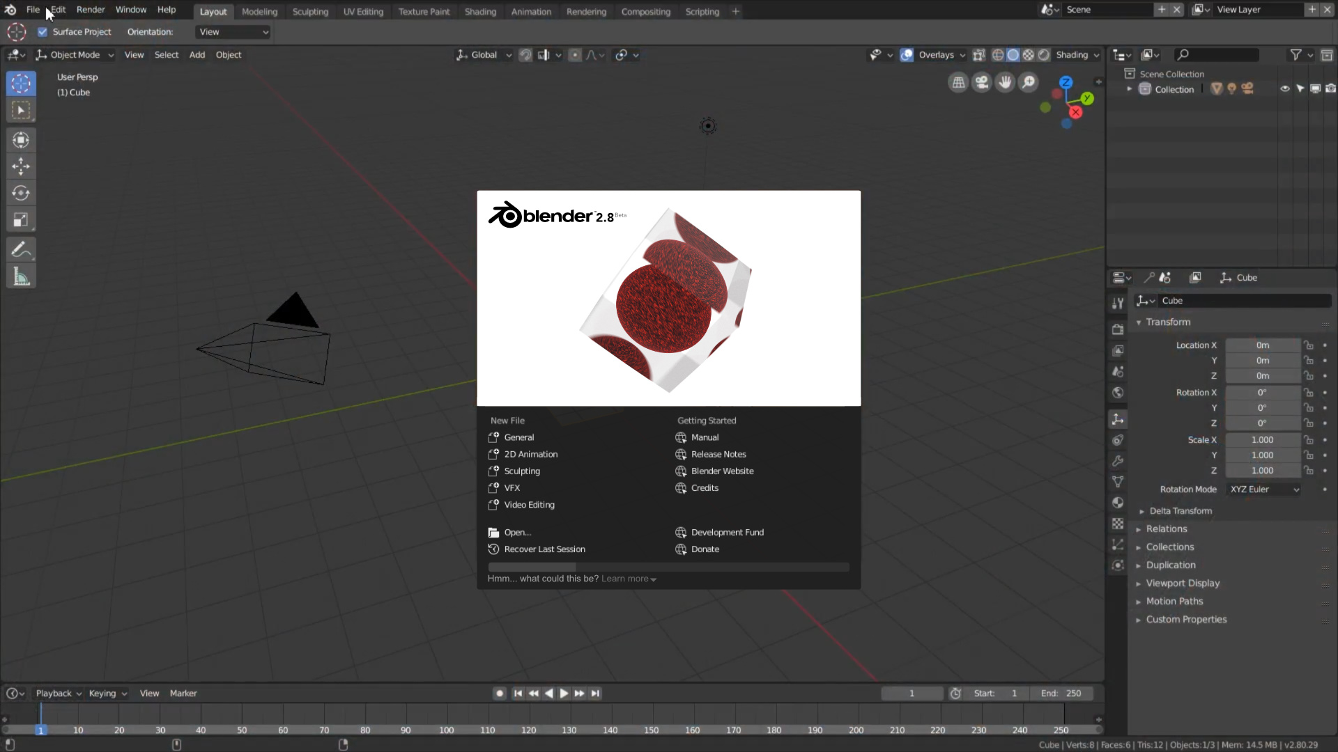
Here is my Splash Screen submission called “Release The Betta” which of course is a play on words between Beta and Betta Fish and also a literal “splash” screen. It is breaking free of its fishbowl to devour all those “bugs”. A small hint about dev funding in there as well with a few Easter eggs. Hope you all like it. I was able to use the Cryptomatte feature from 2.8 but I am not sure I optimized it correctly as the render took 2 hours and 38 min with 768 samples 1600 x 900 at 300%. also did some minor tweaks in photoshop. Used CPU+GPU to render (Tile Size: 64x64) Rig: i7700k 2x Zotac 1080ti 32 gigs of RAM Windows 10 64 bit! Source file available as CC0
Some BTS of the file in clay, EEVEE and material:
amazing!!! May if you could standing out the idea of supporting dev fund by making the “coffee money” jar more visible because its hard to read or notice from a distance but overall its an astonishing piece
i would say this is a winner but instead of ‘learning blender’ you could put ‘the essential blender’, that iconic oldschool Blender foundation book, plus like abdo20050 said make more visible the tip jar or with a stronger font.
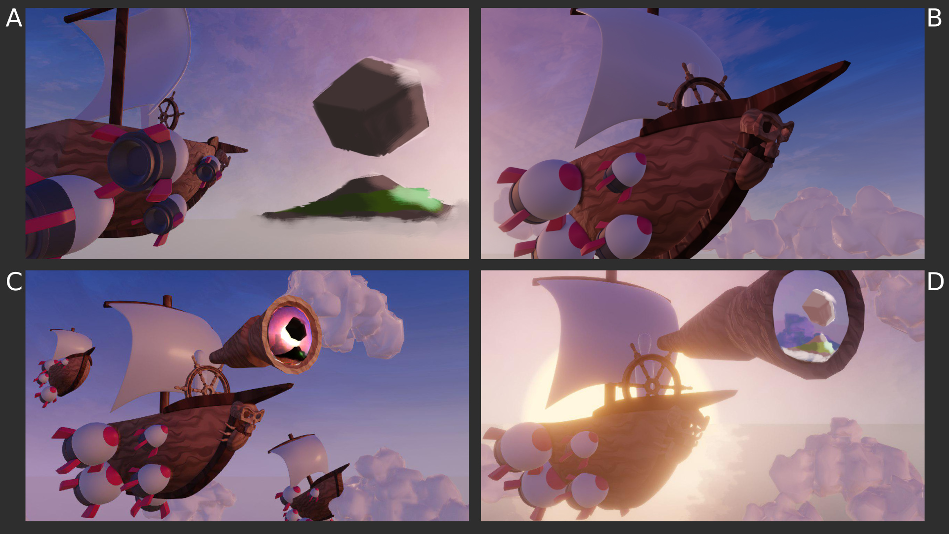
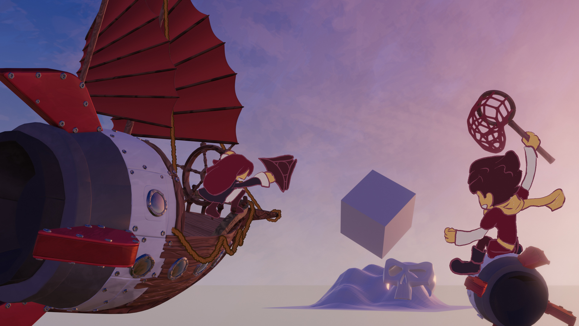
I have worked together with betalars (who unfortunately can’t post any more replies to this post) to create a blockout for an epic scene, where brave bughunters set sail to the mysterious 2.8 island to catch the remaining bugs. They are propelled on their journey by little code quest rockets…
We will finish this project tomorrow and add in a few grease pencil characters. Let us know, what you think about our blockouts
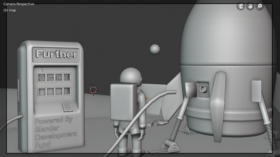
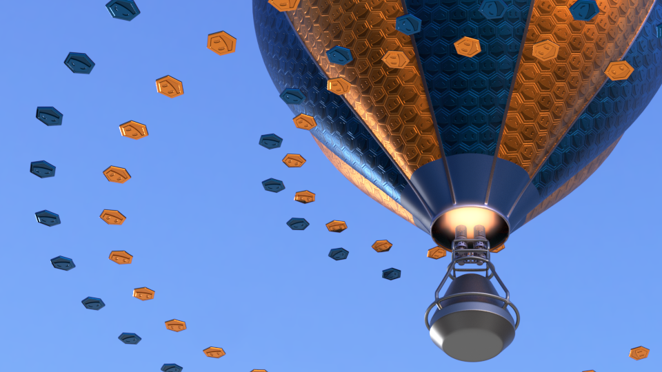
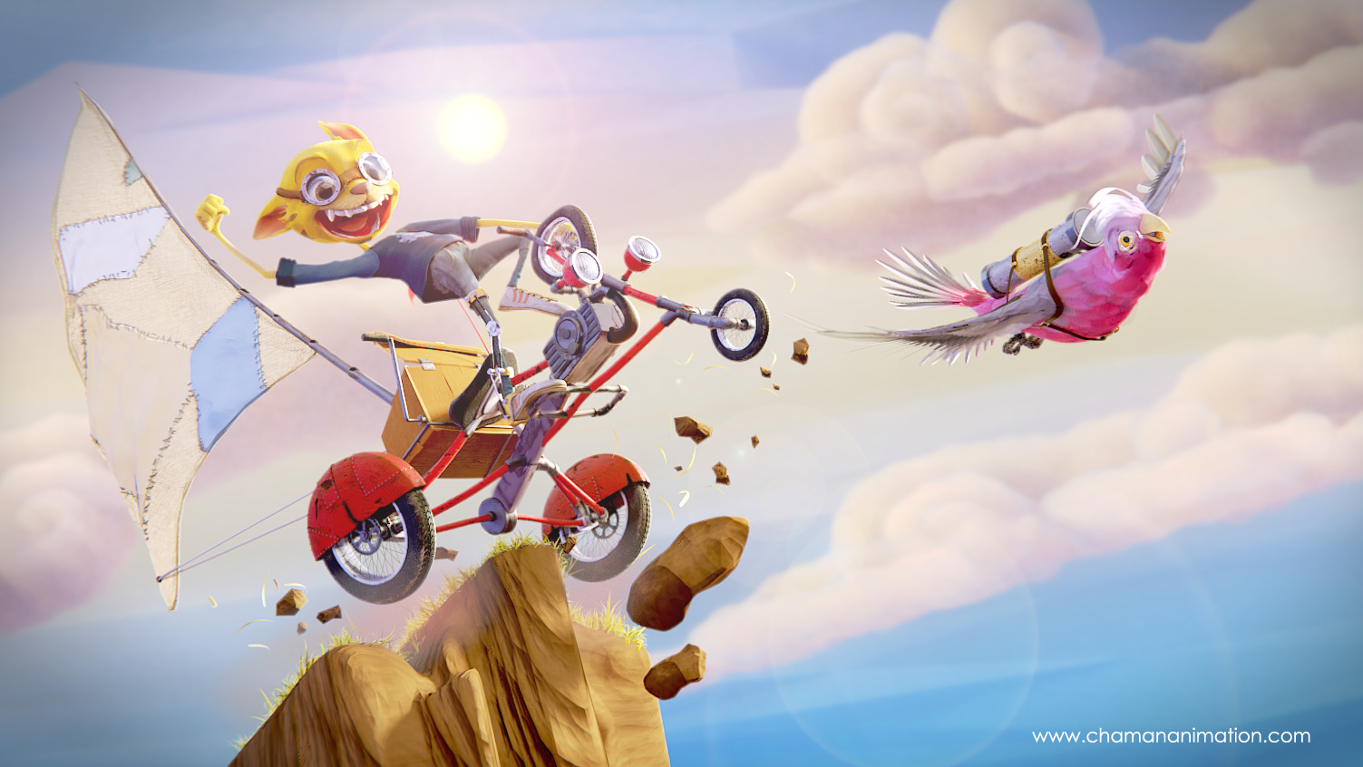
Hi, I’ve been working on this idea, but not convinced. It is supposed to be about the badges (community contributing to the development fund) together forming a vehicle, and making it stable.
The basket needs more details, but I came to this point to know how does it it feels, what do you guys think? There is something here? I would like to know your thoughts and comments.
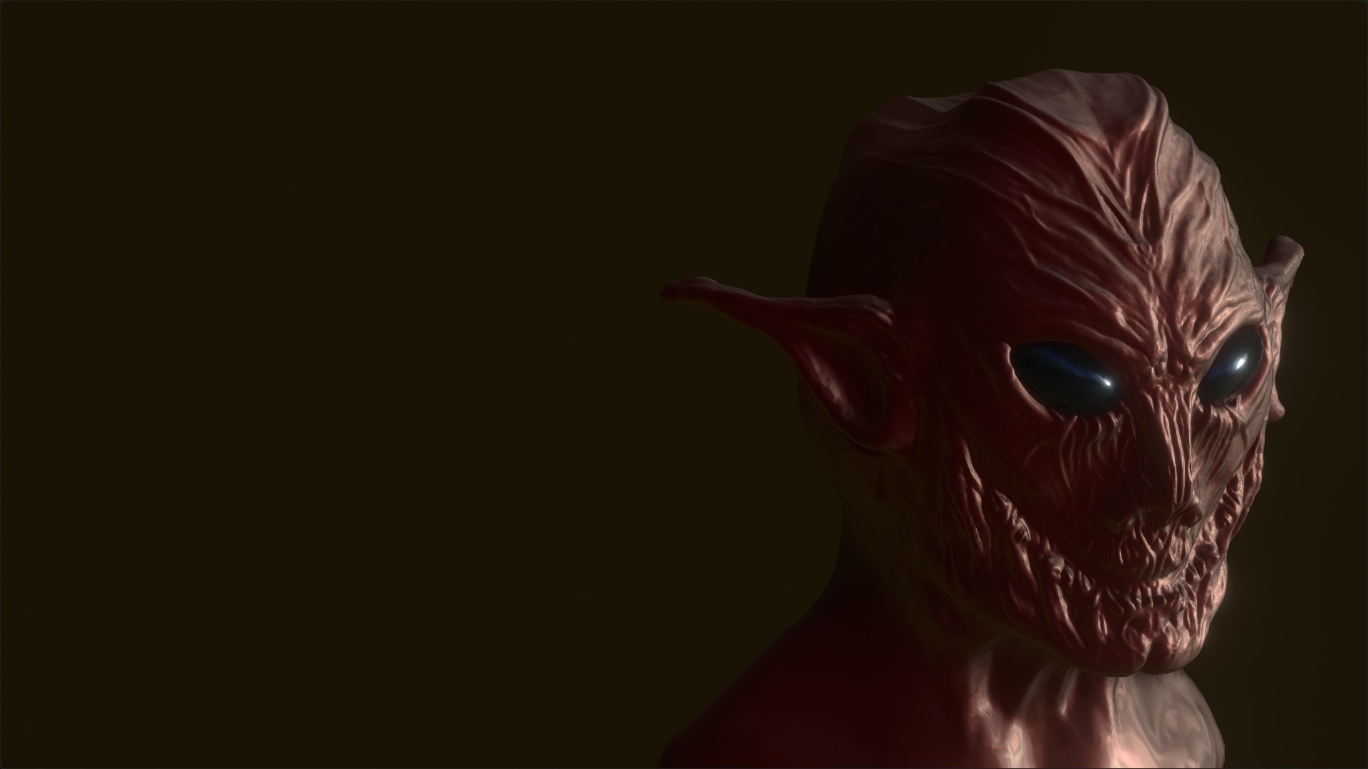
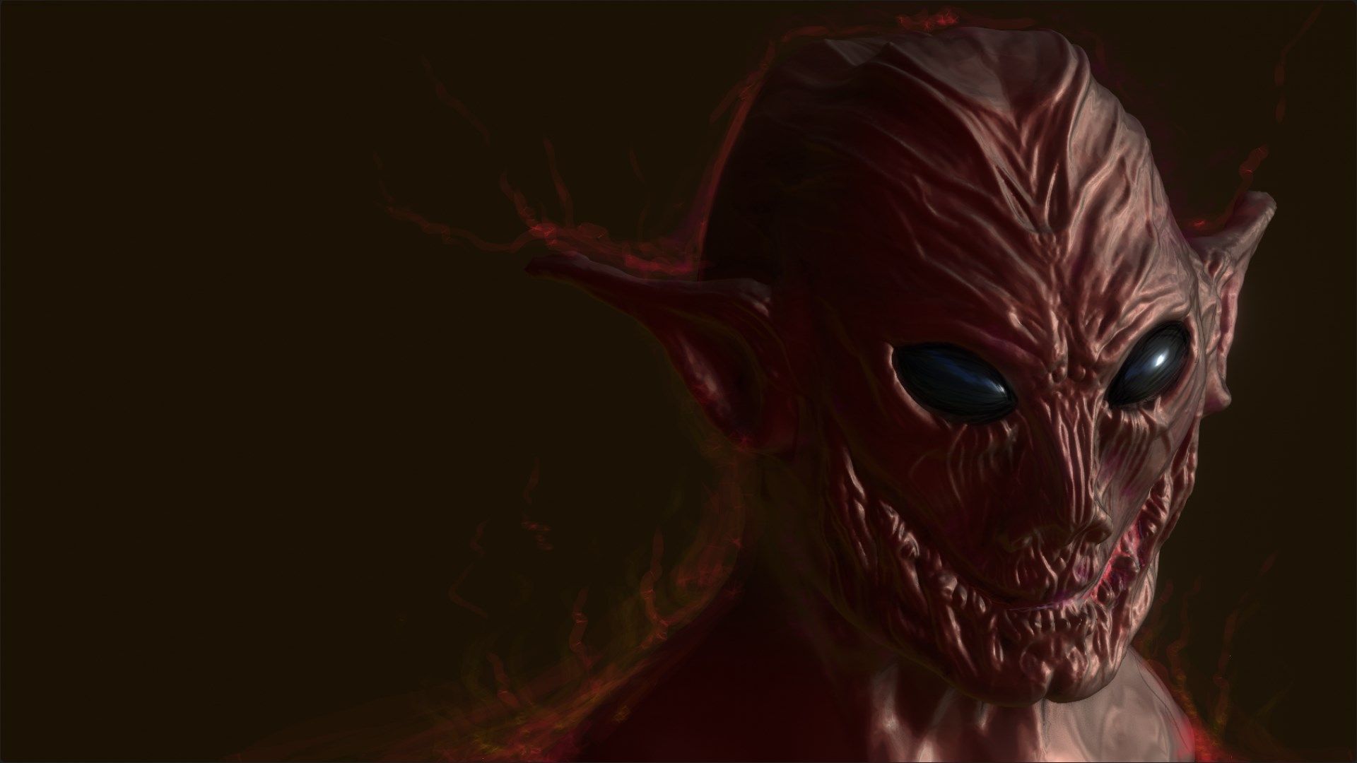
I try to draw onto 3D sculpt geometry (410 000 tris), with some grease pencil’s lines to give more beast-contrast, but Blender crash every time ;-(, but i found an alternative way…
Hey there I’m a little bit late and I don’t exactly know, if I’m going to pull it off before midnight … but here’s my current progress … excuse me, while I go have some dinner
(btw … I hope noone is mad about me posting something about my submission before I finished it, I just like to get some thoughts…)
[Edit: Also a quick sidenote: the finished project is CC0 and a file will be provided]
The Blender logo could be monochromatic (dark grey or white, depending on the artwork behind), so that it follows Blender’s new UI language.
In the lower part there could be a Development Fund tracker, as @koloved suggested. It’s visible, yet if you open Blender everyday it’s not annoying.
Another thing that would help clean the look of the Splash Screen would be to not have that extra info on it (Date, Hash, Branch). Instead if you hover the cursor above the logo that information will pop up for who needs it.