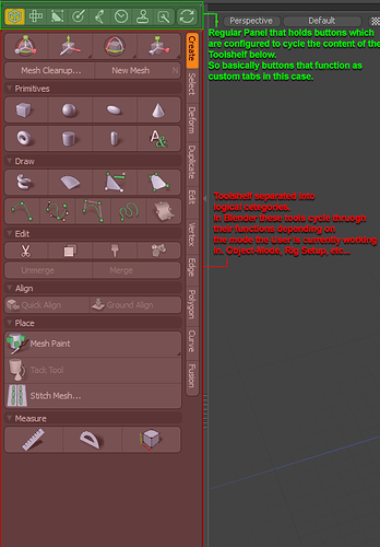
Let me go on a little tangent for everybody else here, mostly fromo a Modo user’s perspective. ![]()
As a reference: That’s very close to what Modo has introduced since Version 13. They added panels to the sides and bottom that can be collapsed or opened by ring menu. To be fair - this was always able and is more of a preset, since Modo’s UI is entirely modular and based around the toolset the developers used to create thw workspaces.
Since they don’t have an equivalent of Blender’s N- or T-Panel integrated into the 3D view they made it as a regular window that can be hidden/shown and pretty much hold any data, UI or whatever you want. Not just a UI shelf but just as much a UV editor, a secondary othographic view, timeline, whatever …
Like so: https://i.imgur.com/6yoTvoZ.mp4
(Yes - Modo has terrible, teriible UI lag when resizing viewports)
Make that easily extendable/modifyable with a good UI editor so that not only Add-On developers but also the regular users can customize their most used tools and UIs to their liking.
Looks like this in action: https://i.imgur.com/yS5blCv.mp4
It felt kind of weird at first but essentially it gets rid of a lot of the workspaces and flows very fluently where you basically don’t even have to switch workspaces any more because you have most windows and toolboxes available anywhere.
BUT - this is Modo. And as much as this works for Modo Blender has a different mentality
When applying this to Blender’s way of working, though, I am not sure if this should really eliminate the N- and T-Panels alltogether. Don’t get me wrong:
I am totally for an empty shelf that is user customizable but it’s maybe not a good idea to have it replace the existing panels. That could for one break too many existing workflows, plugins and compatibilities, probably.
But secondly: Blender isn’t Modo. I’d even go so far as to alledge that Modo took it’s inspiration from Blender’s T-Panel in the first place and merely adapted it to the existing workflow and own modular paradigms. So when we (assumingly take it back) from Modo and adapt it again we might get a sort of GoogleTranslate situation where a concept was adapted for one software and now comes back into the original one.
As Alberto pointed out: In Fullscreen mode a logical panel split would most likely not work. The Sidepanels have the benefit of being integrated into the 3D view and also being not only quick bt very unobtrusive. And yes - I am aware that I even proposed an empty shelf myself a few posts up. ![]() I didn’t think of the Fullscreen mode, then.
I didn’t think of the Fullscreen mode, then.
For the sake of an empty customizable panel - here’s an idea:
- Assuming the N-Panel gets used for options and statistics as proposed a few times
- The T-Panel is used for tools and Plugin UIs and…
- …maybe leter on gets a flexible UI editor so that users can extend it themselves
- An empty custom shelf is introduced that can be edited the same way.
The T-Shelf remains it’s own layout, though. So in the empty shelf you could introduce for example:
- Dedicated Rigging Utilities and macros you created yourself
- UIs with the best-of commands from all the tools and Plugins you use the most.
- but also have a mirror of the T-Shelf. The t-shelf would basically be its own datablock.
Then again I am not sure if we’d really need a mirror of the T-Shelf if it’s customizable.
I am also not sure how it would behave with Blender’s different edit modes.
