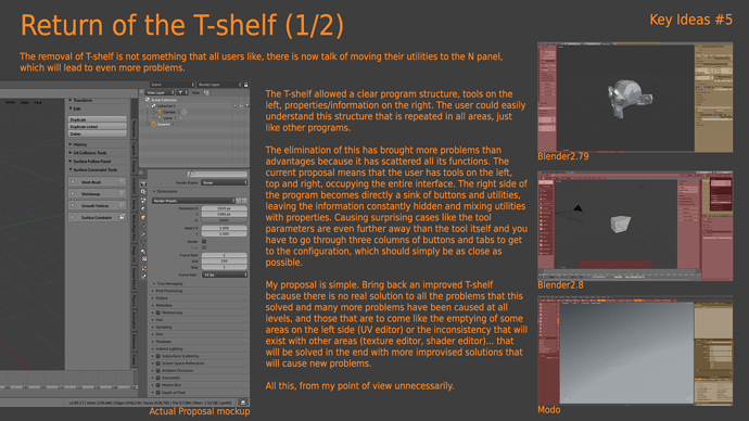
That is a old problem that cause the elimination of the T-shelf
…and also this year the Google Summer Of Code has started …
Pity that nobody thought of proposing a well improved sidebar/addon manager, it would have been an interesting project …
I see 2 cons in your proposal:
It don’t get rid of these awful vertical tabs that break the design and are hard to read.
If you want access to an addon that is not in the quick access list you have to first click on the hidden tab, then activate the addon you want, close this menu, then click on the addon. I feel it less comfortable that the William proposal where you just have to scroll and click.
- Yes, it don’t discard tabs because few people want to discard tabs and it is the only way to have direct access. That’s why there are a dozen counterproposals and they all have tabs.
- No, it doesn’t work like that, you just have to make two clicks.
have you raised the issue that with that version, no matter what happens, you always have to scroll, search for an entry in a list and click? No matter what you want to see, thing, view, tool,… as soon as you have more than 4-5 addons is a must? Not only in the 3D view, same problem in all views.
In other words, what used to be a problem that happens sometimes becomes a problem that happens always. And the solution is also worst if you want to hide the sidebar, every time that you want to use the sidebar will be this.
- Press N
- scroll
- search
- click
With the proposal that other people told, include my proposal, the way is this
- Search
- click
And a lot of times the search is not necessary because you will know where the tabs are because don’t move.
You are right, pop-overs are not a replacement for the properties sidebar. However for some addons, or possibly even just some of the things implemented by an addon pop overs might be a good solution.
The issue is though that once you have too many of them you have to start scrolling the top/bottom bar for them. So you’d still face the same issue, however where most users these days might realize that a bar full of tabs might be scrollable, most would probably not consider that for the popovers.
Personally I want to discard the tabs mainly because I have difficulty to read vertical and I spend “lot” of time trying to read them. I’m at the point that sometimes I click randomly on tabs to find the one I want!
Other proposal would be to have the William’s list on one N panel then the result in the left panel. One shortcut two panel at the same time! Haha
If you see my proposal it solve the problem that you have. Because you always will have a icon where to click and see the list of all addons actually activated. So instead of a panel where you click you have a icon that show exact the same.
Maybe is better understanded with a little modification
Top icon - Panel list
The rest of buttons are favorites tabs that you can chose.
Since everyone seems to post their suggestions again in this thread on apparently the odd chance that a developer will actually look at it now, guess I’ll hop on the train:
- First off is the low visibility. No beginner knows how to press N:
- Second, why have this cramped menu at all? Why not just make a new proper panel out of it?
- I mean, some tabs don’t have a lot of unique stuff in it anyway…
But they should realize that menus are worth exploring. View > Sidebar
With that said though, I agree that something more visible would be preferred.
Because it’s half a solution for those of us who want to work in maximized area.
I agree, this is part of the problem.
For those working in a maximized area I think the preferred way would really be more
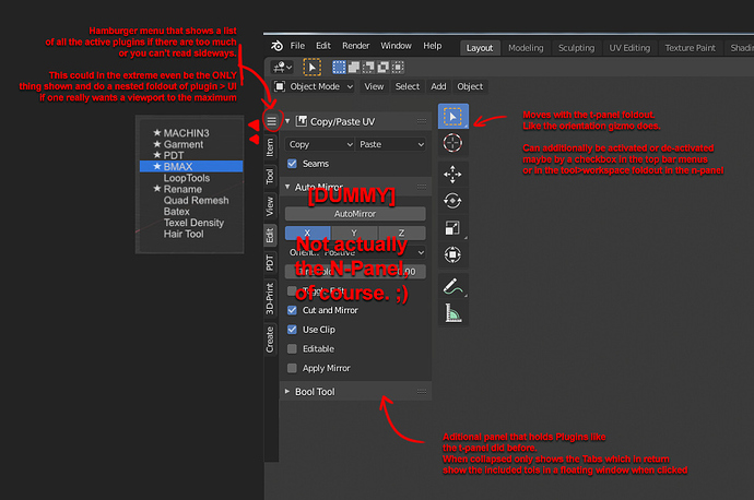
- a t-panel that folds out behind the tools for more (and structured) organization
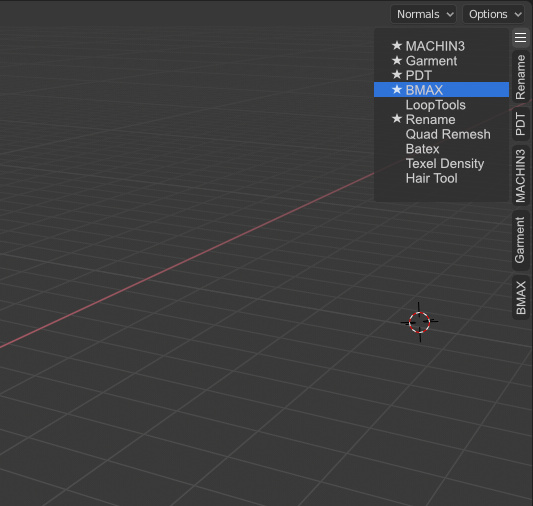
I took Alberto’s Hamburger Menu idea and incorporated it in this tweak:
(edit)
Ah dammit - I just realized that this has also been pretty much been proposed already.
I’ll still keep it since it tweaks a few designs together. ![]()
(/edit)
- a way to create customized floating menues (radials, lists or even n- and t-menu entries) with an editor istead of python code.
If we gained the ability of nested menus like Houdini or Maya (personally not a fan but they DO have their merits) - then one could propagete these with the most used Plugins and standard commands themselves.
There’s a proposal on RCS but doesn’t include nested menues or easier UI creation for custom toolshelfs, yet:
It already has a design task, though. ![]()
https://developer.blender.org/T73178
(And, albeid related, it might be getting a little bit too far from the N-Panel discussion, now).
I like official proposal and kinda surprised how many people want to keep vertical tabs with text. Even with fixes they are inherently not very good design with worse readability since you need to tilt you head to read them.
My proposals at least could just as well work with Icons like the properties panel has. It’s more about distribution of information and UI. Interface design is a very finnicky thing and I fully admit that my proposals aren’t new nor do I consider them to be the definitive solution. There’s a reason UX Designer is a dedicated job title.
So just to be clear from my side: My proposals are about placement of information, travel distances for the cursor and familiarity with other software and even older Blender versions. The text part is not set in stone. Like. At all. And I do have the impression that’S true for more than just my proposal, here. 
And ultimately we can theorize all we want. When we have a version to work with it might still turn out to be better or worse than expected.
Jakob Nielsen said: “Pay attention to what users do, not what they say.”
In that regard I like Pablo Dobarro’s request to show off videos or workflows and where problems arise in practice. Theory can get occluded by things that sound nice but turn out to be not so nice when applied.
Maxon for example say they do this for new interface designs as well. Let people try to get by and just watch. Then see what works and what doesn’t.
I do not really have a strong opinion regarding if they should stay or not, but the hard to read argument is generally not a valid one. From (not only) my experience, you usually read the vertical text only once, and then already remember what the text looks like and your brain saves it just as a rough silhouette.
So when you see the text again you don’t really have to read it again. You remember the shape of that vertical text almost like an icon. It works that way with horizontal text too, as long as it’s just solitary words. You usually read it once, and subsequently you just recall that visual memory. That’s why the vertical tabs in other software are not that big of a deal either. You don’t see people tilting their head every time they go to switch a tab 
That might be applicable to some users but not all, still at the very least a optional alternative for those who have a hard time with it would be good.
But I think what @billrey has proposed is probably a good alternative anyways. Some might find it a huge waste of panel space, but it doesn’t have to be. We could have an option to have the collapsible sections auto-collapse. Not all at once, but per section that is. I’d certainly use that on the “tab” list section.
Long term, the n panel is really not an appropriate place for everything to go. There really should be an ‘addon’ or ‘tool settings’ editor type (quibble about the naming later) that can be placed in a side bar. In the present, though, Alberto’s tab filtering is pretty nice.
Of all the suggestions I think Alberto’s design is my favorite way to improve the current implementation of the sidebar and I greatly prefer it over the list-type proposal.
Though I understand the reservations people have towards the vertical tabs and do see the need for a more fundamental design change in how we organize our add-ons.
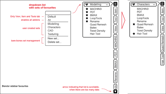
To add to Alberto’s idea: With the ability to mark favorites to make the tabs permanently visible, it could be nice to also have a way to save different sets of favorites to allow for quick switching to different permanently visible tabs depending on the current part of your workflow. Something like this maybe:
Hi,
I think the concept of a dedicated editor type for addons and misc tools worth the reflexion. I will go even further by removing the N sidebar completely! (seriously)
The idea came up recently since I decided to get rid of the existing split between the outliner and the property panel. I realized that when I’m working I need to pull up and down the one or the other all the time to see what I need. That’s why now I only have the 3D view and the outliner on the right and I toggle the property panel like a sidebar.
So the idea is to have two editor type (property panel and addons/misc tools) that can be toggleable like the sidebar. Say you press N toggle the addons/misc tool (with the Wiliam mockup design), say now you press Q and you have the property panel. And if you need both at the same time you could open the one you want on the left side.
I will try to post a mockup tomorrow
Good night
Here is the mockup but you have to imagine that the text editor represent an editor type with the Addon’s William mockup…
or Alberto Proposal
I forgot to show the Active tools so here with Active tools sidebar
I don’t quite understand the idea of adding new piemenu to show a common element that you have to be using all the time when it can be on screen all the time without a problem.
I made a pie menu but it could be a hotkey system of course 
To me there is a problem because having the split between outliner and property panel don’t work well for me because I need always to pull up or down to gain enough space depending of what you want to see. (the outliner or the property). With this propsal you have access to the full vertical space available for outliner and properties or addons or both at the same time.
If your want to have the panel property all the time you have the choice (right or left of the 3D View). Then if you need the addons editor you can quickly switch to it or choose to put it on the opposite side.
