My bookshelf looks different. Speaking of a books there is no conventional design standards, it is regional.
Indeed, but logically it follows that those of us who don’t read CAD drawings all day find that standard to be equally odd/backwards.
Sure. But CAD drawings are not for casual people walking by. They are for CAD reading people.
Just because some people don’t understand the standard, doesn’t mean it’s wrong.
Before you start writing which direction of vertical text is better, it would be nice if you learned how to read simple horizontal text, and read a few previous posts.
No, I’m simply saying: using the stance of “CAD drawing = a standard, and therefore that is the standard to be applied here” , isn’t the case.
There aren’t any “international design standards” about this. It is a compromised situation that should be avoided. But when it can’t be avoided we have some loose conventions that vary by language, region, and usage.
In English and in the west we generally use bottom-up for technical notation. Books and related things like CDs are top-down. Signage meant to be read above your head is almost always bottom-up. Things at eye level and below are generally top-down.
But again, best avoided if possible because any solution will result in complaints.
But we can’t avoid it already ![]()
We can’t place text on tabs
l
i
k
e
t
h
i
s
Why not have the user pick the orientation he best feels comfortable with then, would that not be a universal solution ?
Sure. We’re against hardcoded changes here.
Technical notation has such kind of standards because it is the most dependent on it.
It is the area where such a problem became critical, unlike situation with books or cds which are free for interpretation.
It turns out that it’s impossible to please everyone.
So it is necessary to make an option, leaving the default current normal human version, to which all have long been accustomed.
You don’t have to drag everything out of Maya and break something that has been working well for a long time.
Indeed. For more than 20 years, without your opinion, we couldn’t decide what to do.
You’re right. Because they’re not designers, but people who read blueprints all the time. They just had to come to an agreement.
As an engineer I can say that I have no problem reading drawings in another language, because the design style is similar and only the set of letters changes.
But then someone comes along who has the books upside down on the shelf and ruins everything).
I can agree that options that provide Maya UI compatibility are better be optional.
When you work with realworld objects represented by drawings you need to work with lots of left-side rotated texts, and this is indeed a problem in Maya which was solved in Blender.
I also prefer the one on the right because unlike left to right, Top to bottom seems to be universal .
And that only works with left facing bottom of the words.
I know we try not to have too many system setings but in this case it seems like the only real solution seems to be “let the user chose based on their individual reading habits or capabilities”. It seems we have crossed from theoretical discussions about standards into more of “individual accessibility”.
Optionally just reignite the discussion about optional Icons. Those come with their own problems but at least never need to be rotated and keep the TabSpace small.
Irrelevant side note: Chinese and Japanese are at a real advantage to the whole discussion as with the writing system simply being able to be regularly writen top to bottom.
It’s cool that there’s a disagreement about the direction of vertical text, but I made this thread originally in 2018 because while Blender UI got a big redesign with 2.8, the sidebar panel got partially stuck in 2.79 look.
It’s now 4 and a half years. Yes, over 4 years, and this still hasn’t been addressed. Blender really needs functioning UI team again, dammit ![]()
It will soon be half a decade it’s taking for someone to make tab bar and corners of a single UI panel round.
And it’s not even that this is in a “needs design” stage. I posted a mockup of the design!
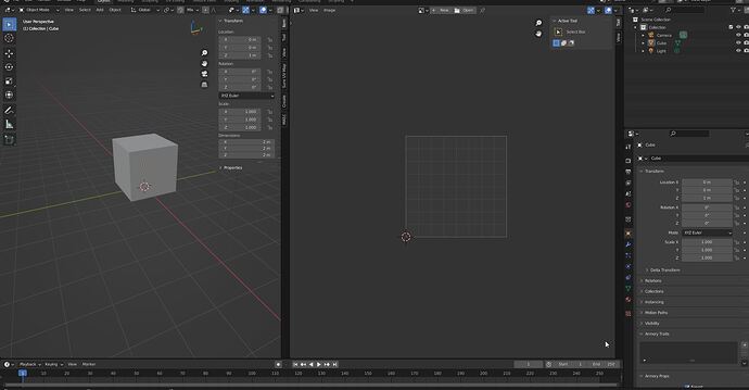
Sometimes (often) you have to separate work areas and each has its own tabs.
Would it be convenient to write from top to bottom in the left window?
Hi!
Just want to say that I also understand readability issues in Maya - when you model using technical documentation from clients and the UI and documentation text are aligned on different sides.
Moderation notice: Keep it civilized guys!

